-
Interactive DashboardsCreate interactive BI dashboards with dynamic visuals.
-
End-User BI ReportsCreate and deploy enterprise BI reports for use in any vertical.
-
Wyn AlertsSet up always-on threshold notifications and alerts.
-
Localization SupportChange titles, labels, text explanations, and more.
-
Wyn ArchitectureA lightweight server offers flexible deployment.
-
 Wyn Enterprise 7.1 is ReleasedThis release emphasizes Wyn document embedding and enhanced analytical express...
 -
 Choosing an Embedded BI Solution for SaaS ProvidersAdding BI features to your applications will improve your products, better serve your customers, and more. But where to start? In this guide, we discuss the many options.
-
Visual GalleryInteractive sample dashboards and reports.
-
BlogExplore Wyn, BI trends, and more.
-
WebinarsDiscover live and on-demand webinars.
-
Customer SuccessVisualize operational efficiency and streamline manufacturing processes.
-
Knowledge BaseGet quick answers with articles and guides.
-
VideosVideo tutorials, trends and best practices.
-
WhitepapersDetailed reports on the latest trends in BI.
-
 Choosing an Embedded BI Solution for SaaS ProvidersAdding BI features to your applications will impr...
 -

- Getting Started
- Administration Guide
-
User Guide
- An Introduction to Wyn Enterprise
- Document Portal for End Users
- Data Governance and Modeling
- View and Manage Documents
- Working with Resources
- Working with Reports
- Working with Dashboards
- Working with Notebooks
- Wyn Analytical Expressions
- Section 508 Compliance
- Subscribe to RSS Feed for Wyn Builds Site
- Developer Guide
Pivot Table
The Data Binding tab for the Pivot Table controls how data is grouped, summarized, and displayed. It includes four binding slots: Values, Rows, Columns, and Tooltip.
1. Values
The Values slot defines the measures that will be aggregated in the Pivot Table (for example:
Sales Amount,Profit,Order Quantity).Each measure you drag here becomes the content of the pivot cells.
You can apply aggregation functions (Sum, Count, Average, etc.) to customize how the data is summarized.
2. Rows
The slot defines the categories that appear on the left-hand side of the Pivot Table.
Drag dimensions here (for example:
Product Category,Region,Year).Multiple attributes can be nested — the first becomes the outer grouping, the next becomes the sub-grouping, and so on.
3. Columns
The Columns slot defines the categories that appear across the top of the Pivot Table.
Drag dimensions here (for example:
Order Year,Quarter,Channel).Columns combined with Rows determine how the data in the Values slot is broken down.
4. Tooltip
The Tooltip slot adds extra data to the pivot cells.
Drag attributes here to display them when a user hovers over a cell (for example:
Manager Name,Forecast,Supplier).Tooltip data does not directly affect the pivot structure — it only enriches the hover experience.
Customization
You can further customize your pivot table using the following properties.
Table Setting
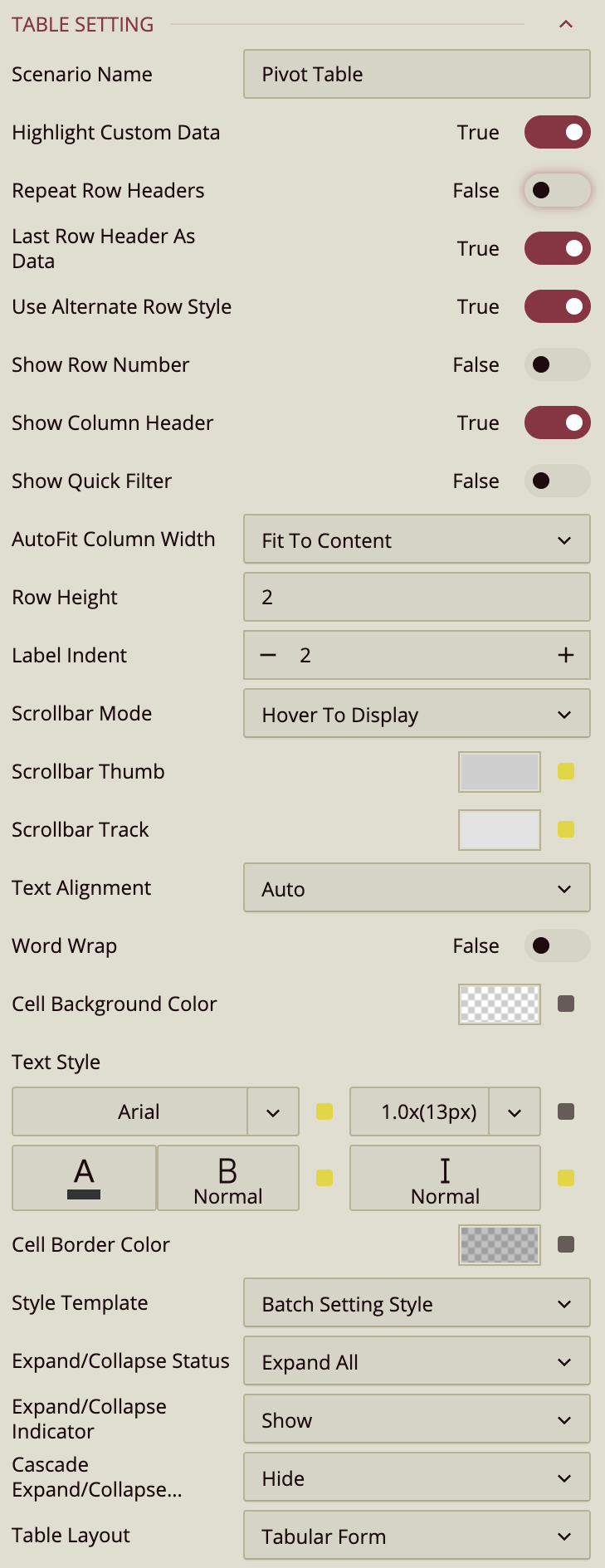
Scenario Name – Controls how the table scenario appears in the Explorer.
By default, the scenario name is Pivot Table, but you can enter a custom name to better reflect the purpose of the table, such as Sales by Country or Product Profit Summary. Renaming the scenario helps keep complex dashboards organized, especially when working with multiple tables or pivot-based visuals.
Highlight Custom Data – Highlights values that come from custom or user-defined data.
This option is enabled (True) by default and visually distinguishes values that are generated through calculated fields, expressions, or overrides rather than coming directly from the original dataset. This is especially useful when reviewing or validating tables that mix raw data with customized logic, making it easier to identify values that were derived or modified.
Repeat Row Headers – Controls whether parent row headers are merged or repeated for each row.
When disabled (False, default), parent row headers automatically merge across their child rows, creating a hierarchical layout that emphasizes grouping. When enabled, parent values repeat for every row, producing a flatter, row-by-row layout that can be easier to scan, filter, or export.
Last Row Header As Data – Determines whether the deepest (child) row header is treated as hierarchical structure or as row-level data.
When enabled (True, default), the last row header behaves like a normal data column. Each row is rendered as an independent record, which enables row-based behaviors such as alternating row styles, row-level formatting, sorting, and clearer interaction patterns.
When disabled, the last row header is treated purely as a grouping level. The table emphasizes hierarchical structure rather than individual rows, which is useful for report-style layouts where grouping is more important than row-by-row readability.
This setting directly impacts how the table is rendered and customized. Enabling it makes the table behave more like a flat data table, while disabling it preserves a grouped, hierarchical presentation.
Use Alternate Row Style – Toggles alternating background colors for rows to improve readability.
Enabled (True) by default.
The behavior of this setting depends on Last Row Header As Data:
When Last Row Header As Data is enabled, alternate row styling applies only to value rows, because each row is treated as a distinct data record.
When Last Row Header As Data is disabled, alternate row styling applies uniformly across all rows, including grouped rows, since the table is rendered hierarchically rather than as independent records.
Show Row Number – Toggles a row number column on the left side of the table.
Disabled (False) by default.
Show Column Header – Toggles the display of column headers.
Enabled (True) by default.
Show Quick Filter – Toggles a quick filter control for filtering visible data without adjusting the main filters.
Disabled (False) by default.
AutoFit Column Width – Determines how columns adjust their width.
Fit to Content (default) – Adjusts each column to fit its cell contents.
Fit to Header – Adjusts columns to fit the header text.
None – Keeps columns at a fixed width.
Row Height – Sets the height of table rows.
Enter a numeric value in pixels.
Scrollbar Mode – Controls when scrollbars appear.
Hover to Display (default) – Shows scrollbars only when hovering over the table.
Auto – Displays scrollbars when content exceeds the table bounds.
Hidden – Hides scrollbars entirely.
Visible – Always shows scrollbars.
Scrollbar Thumb – Sets the color of the draggable portion of the scrollbar.
Scrollbar Track – Sets the color of the scrollbar track background.
Text Alignment – Aligns text within cells.
Options are Auto (default), Left, Center, or Right.
Word Wrap – Toggles wrapping text within cells so long content appears on multiple lines.
Disabled (False) by default.
Cell Background Color – Sets the background color for table cells.
Text Style – Configures font family, size, color, weight, and style (normal or italic) for table text.
Cell Border Color – Sets the color of cell borders.
Style Template – Applies a predefined style template to the table.
Options include Batch Setting Style, built-in Excel-style templates, or Add New Style… to create a custom style.
Image Layout – Controls how images are displayed in table cells.
Zoom (default) – Scales the image proportionally to fill the cell as much as possible without cropping.
Origin – Displays the image at its original size and position.
Fill – Stretches the image to completely fill the cell, which may change its aspect ratio.
Interaction
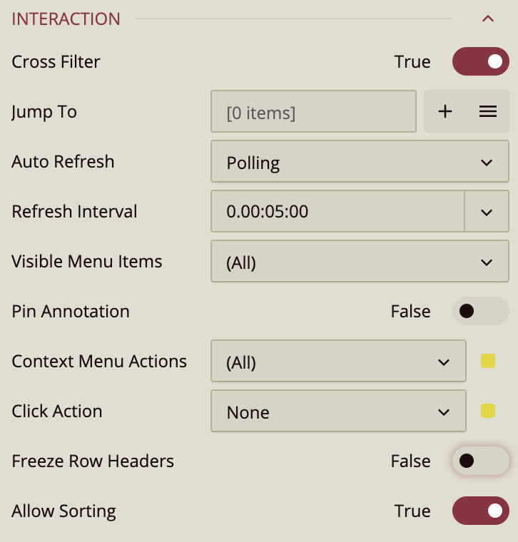
The Interaction section defines how users can interact with a Pivot Table at runtime. Rather than controlling visual appearance or data structure, these settings enable behaviors such as filtering, navigation, refresh logic, and user actions. Many of the items in this section open additional menus or configuration windows and are part of a broader interaction workflow.
Cross-Filter
Cross-Filter controls whether the Pivot Table participates in cross-filtering with other visualizations on the dashboard. When enabled, selecting data within the Pivot Table applies corresponding filters to other visuals, allowing selections to stay synchronized across the dashboard. When disabled, interactions with the Pivot Table do not affect other visualizations.
Jump To
Jump To allows you to configure navigation actions that users can trigger from the Pivot Table. You can add a new Jump To action using the Add (+) button, which opens the Jump To configuration window, or manage existing actions from the Jump To list menu (accessed via the menu button with three horizontal lines).
In the Jump To window, you define a name for the action and associate it with a target dimension. You then specify a destination, which can be another dashboard, a report, or an external URL, selected from the Document dropdown. Additional options let you control how the destination opens, such as in a dialog, a new window, or other supported modes.
Auto Refresh
Auto Refresh applies when the Pivot Table is bound to a streaming dataset, meaning the underlying data is continuously or periodically updated in near real time.
Three modes are available:
None: Disables automatic refreshing.
Polling: Refreshes data at a fixed interval, which you can configure in days, hours, minutes, and seconds.
Real Time: Updates automatically as new data becomes available.
Visible Menu Items
Visible Menu Items controls which interaction buttons appear when a user hovers over the Pivot Table in preview mode. You can show all available items or selectively enable specific ones.
Common menu items include:
Clear Selection, which appears only when a selection is active and allows users to remove the current filter.
Focus, which expands the visualization to fill the dashboard preview area.
Export, which enables data export options.
Additional actions are available through the ellipsis ( … ) menu, which opens a side panel containing less frequently used commands.
Click Action
Click Action defines what happens when a user clicks within the Pivot Table. By default, no action is applied. Available actions include showing a tooltip, keeping or excluding selected data, triggering a Jump To action, or executing a command. Each option determines how click interactions are handled during dashboard viewing.
Freeze Row Headers
Freeze Row Headers keeps the row header area fixed while the Pivot Table is scrolled vertically or horizontally. This ensures that row labels remain visible when working with large tables, making it easier to understand which data each row corresponds to as users scroll through the table content.
Allow Sorting
Allow Sorting controls whether users can sort the Pivot Table by clicking column headers. When enabled (the default), clicking a header sorts the table by that column. Disabling this option prevents sorting interactions, which can be useful if accidental header clicks would disrupt a carefully designed data order.
Pagination Setting
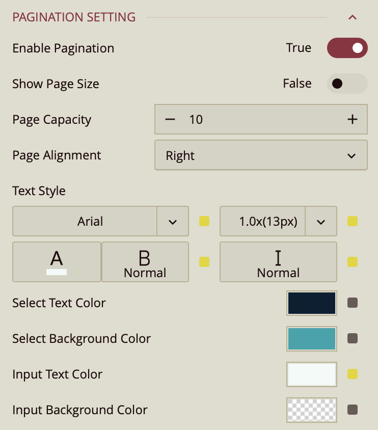
Enable Pagination – Toggles whether the pivot table displays results across multiple pages (True by default).
Show Page Size – Toggles visibility of the page size selector (False by default).
Page Capacity – Sets the maximum number of records displayed per page.
Page Alignment – Sets the alignment of pagination controls: Right (default), Left, or Center.
Text Style – Configures font family, size, color, weight, and style for pagination text.
Select Text Color – Sets the text color for the selected page number.
Select Background Color – Sets the background color for the selected page number.
Input Text Color – Sets the text color for the page input box.
Input Background Color – Sets the background color for the page input box.
Tooltip
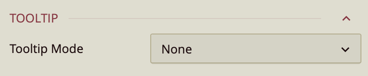
Tooltip Mode – Determines how tooltips are displayed when hovering over the chart:
None – Disables tooltips.
Data Point (default) – Shows a tooltip for the specific data point under the pointer.
Category – Shows a tooltip for all data points that share the same category value.
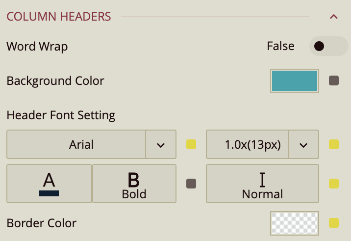
Column Headers
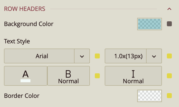
Row Headers
Corner Area
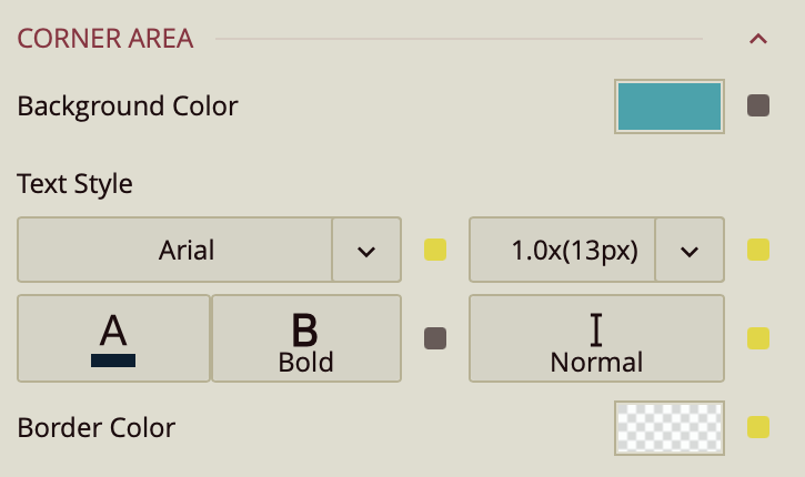
Column Headers, Row Headers, and Corner Area share the following settings:
Word Wrap – Toggles wrapping of header text (False by default).
Background Color – Sets the background color for the header area.
Header Font Setting – Configures font family, size, color, weight, and style for header text.
Border Color – Sets the border color for the header area.
Sub Totals Area
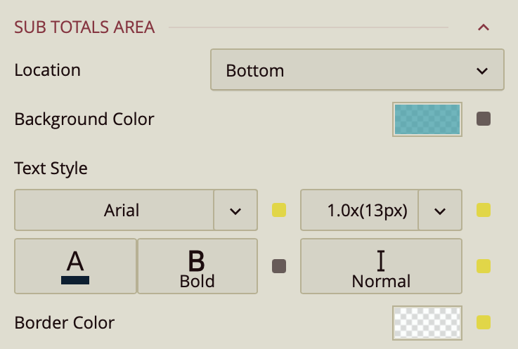
Location – Sets the placement of subtotals: Bottom (default), Top, or Hidden.
Background Color – Sets the background color for the subtotal area.
Text Style – Configures font family, size, color, weight, and style for subtotal text.
Border Color – Sets the border color for the subtotal area.
Grand Totals Area
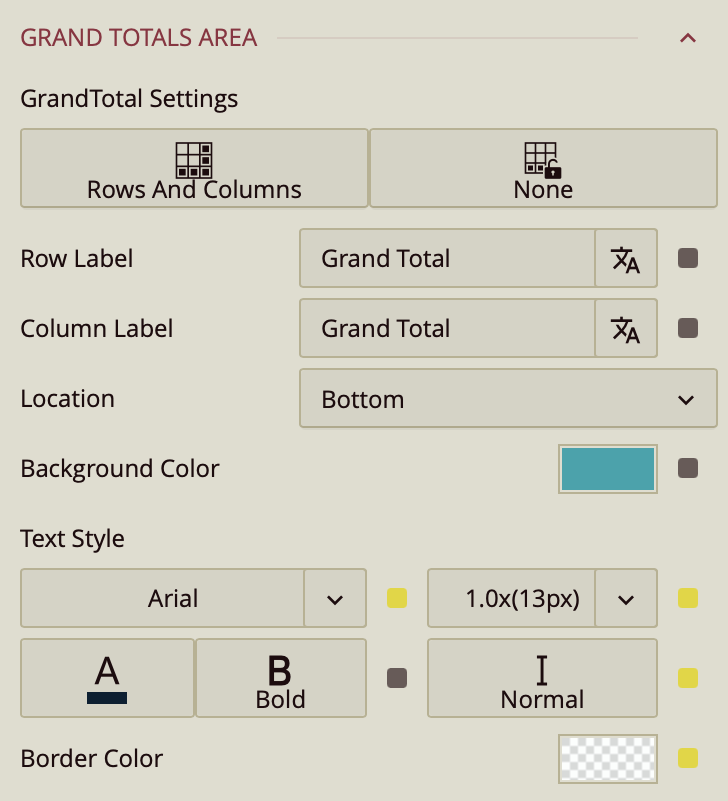
Grand Total Settings – Sets whether grand totals are shown for rows, columns, or not at all.
Row Label – Sets the label for the row grand total (Grand Total by default).
Column Label – Sets the label for the column grand total (Grand Total by default).
Location – Places the grand total at the Bottom or Top of the table.
Background Color – Sets the background color for the grand total area.
Text Style – Configures font family, size, color, weight, and style for grand total text.
Border Color – Sets the border color for the grand total area.
First Data Stripe
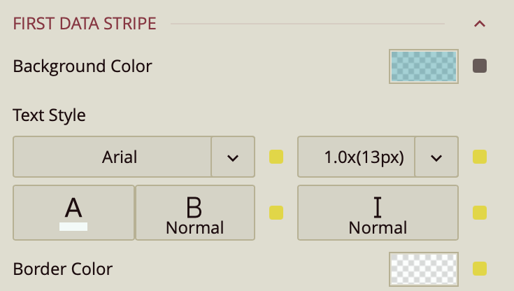
First Data Stripe – Sets the background color, text style, and border color for alternating data rows in the first stripe pattern.
Second Data Stripe
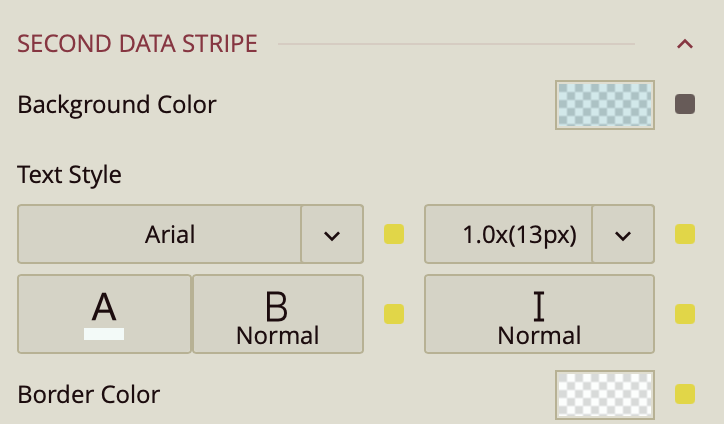
Second Data Stripe – Sets the background color, text style, and border color for alternating data rows in the second stripe pattern.