-
Interactive DashboardsCreate interactive BI dashboards with dynamic visuals.
-
End-User BI ReportsCreate and deploy enterprise BI reports for use in any vertical.
-
Wyn AlertsSet up always-on threshold notifications and alerts.
-
Localization SupportChange titles, labels, text explanations, and more.
-
Wyn ArchitectureA lightweight server offers flexible deployment.
-
 Wyn Enterprise 7.1 is ReleasedThis release emphasizes Wyn document embedding and enhanced analytical express...
 -
 Choosing an Embedded BI Solution for SaaS ProvidersAdding BI features to your applications will improve your products, better serve your customers, and more. But where to start? In this guide, we discuss the many options.
-
Visual GalleryInteractive sample dashboards and reports.
-
BlogExplore Wyn, BI trends, and more.
-
WebinarsDiscover live and on-demand webinars.
-
Customer SuccessVisualize operational efficiency and streamline manufacturing processes.
-
Knowledge BaseGet quick answers with articles and guides.
-
VideosVideo tutorials, trends and best practices.
-
WhitepapersDetailed reports on the latest trends in BI.
-
 Choosing an Embedded BI Solution for SaaS ProvidersAdding BI features to your applications will impr...
 -

- Getting Started
- Administration Guide
-
User Guide
- An Introduction to Wyn Enterprise
- Document Portal for End Users
- Data Governance and Modeling
- View and Manage Documents
- Working with Resources
- Working with Reports
- Working with Dashboards
- Working with Notebooks
- Wyn Analytical Expressions
- Section 508 Compliance
- Subscribe to RSS Feed for Wyn Builds Site
- Developer Guide
Aggregation Method
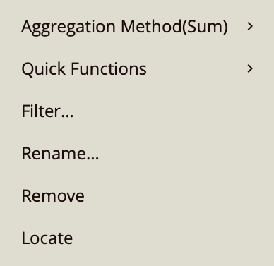
When working with data bound to the Values field, the aggregation method determines how individual records are summarized into a single value for each category on the chart. This setting is available through the gear icon next to the bound data attribute and is one of the more advanced options in the settings menu.
In most cases, the default aggregation (Sum) is sufficient. However, changing the aggregation method allows you to explore the data from different perspectives, such as understanding averages, identifying extremes, or counting records.
To demonstrate how aggregation affects the chart, the following examples use a Column Chart with the Adventure Works data model. The chart structure remains consistent, and only the aggregation method or value field is changed where necessary.
Change to Average, Max, or Min
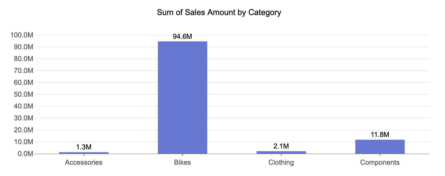
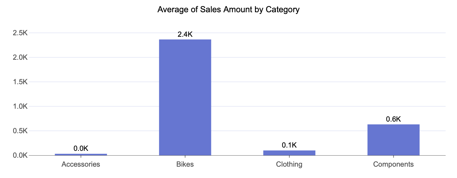
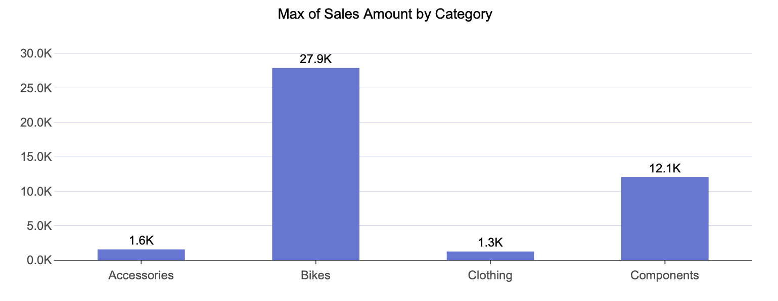
In this example, the chart is configured as follows:
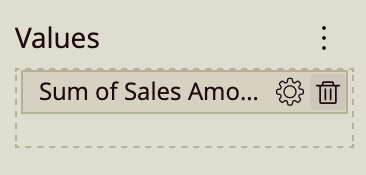
Axis (Category): Category
Values: Sales Amount
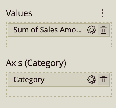
To change how the Sales Amount is aggregated:
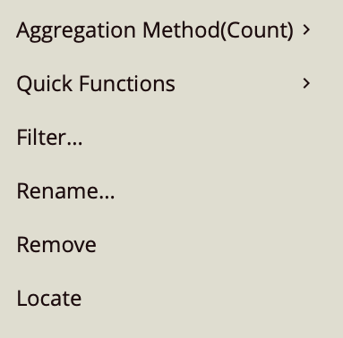
Click the gear icon next to Sales Amount in the Values data binding slot.
From the dropdown menu, hover over Aggregation Method.
Select Average.
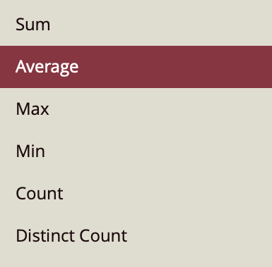
You can repeat the same steps to select Max or Min instead.
Changing the aggregation method adjusts how the chart summarizes the underlying data for each category:
Average Sales Amount by Category shows the typical sales value within each category, rather than the total. This is useful when you want to understand the general level of sales without the result being influenced by the number of transactions.
Max Sales Amount by Category shows the highest individual sales value recorded within each category. This helps highlight peak transactions or outliers that represent the upper bound of performance.
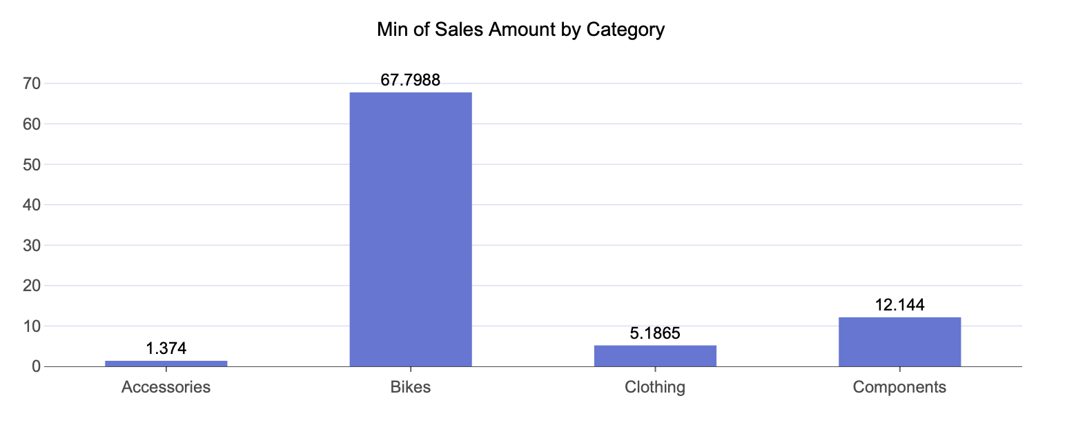
Min Sales Amount by Category shows the lowest individual sales value within each category. This can be used to identify the lower bound, including very small transactions or potential anomalies.
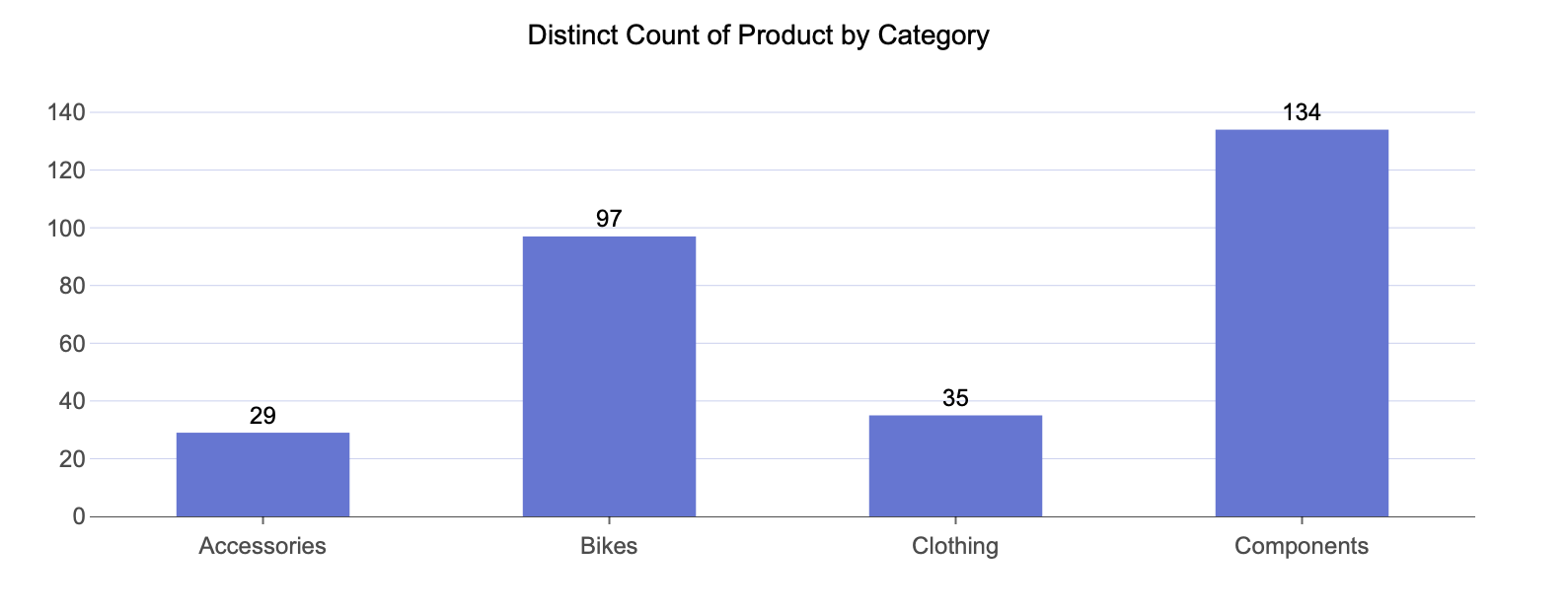
Count and Distinct Count Aggregation
In this example, the chart displays a different type of measurement:
Axis (Category): Category
Values: Product
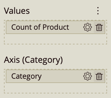
Since Product is a categorical field, the chart automatically aggregates it as a Count. This means you do not need to manually select an aggregation method to get a count-based result.
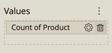
To display Count of Product by Category:
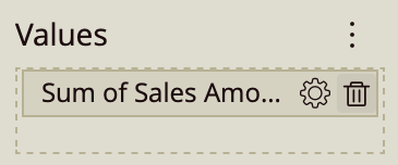
Click the Remove (trash) icon on the Sales Amount field in the Values data binding slot.
From the data model, locate Product.
Drag Product into the Values data binding slot.
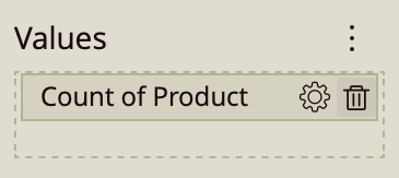
This configuration displays the number of product records within each category. In practical terms, it shows how many entries (rows) are associated with each category, which can reflect volume, frequency, or distribution depending on the dataset.
To change this to a Distinct Count:
Click the gear icon next to Product in the Values data binding slot.
Hover over Aggregation Method.
Select Distinct Count.
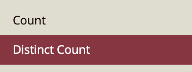
Distinct Count of Product by Category shows the number of unique products within each category. Instead of counting every occurrence, it counts each product only once per category. This is useful when you want to understand variety or diversity, rather than total volume.