- Getting Started
- Administration Guide
-
User Guide
- An Introduction to Wyn Enterprise
- Document Portal for End Users
- Data Governance and Modeling
- Working with Resources
- Working with Reports
-
Working with Dashboards
- Dashboard Designer
- Selecting a Dataset
- Data Attributes
- Dashboard Scenarios
- Dashboard Templates
- Component Templates
- 3D Scene
- Explorer
- Visualization Wizard
- Data Analysis and Interactivity
- Dashboard Appearance
- Preview Dashboard
- Export Dashboard
- Dashboard Lite Viewer
- Using Dashboard Designer
- Animating Dashboard Components
- Document Binder
- Dashboard Insights
- View and Manage Documents
- Understanding Wyn Analytical Expressions
- Section 508 Compliance
- Subscribe to RSS Feed for Wyn Builds Site
- Developer Guide
Binding a Date to a Dashboard Scenario
If you are working with Dashboards, you will likely be displaying data that changes over time, i.e. a measurement of data across years, quarters, months, days, or even hours. This means that you will have to bind your data visualization to a date.
When it comes to dates, Wyn Enterprise supports two types of formats: Flat Date and Hierarchical Date. Depending on which format you choose, your visualization is going to look a bit different.
To illustrate the difference in visualization, we have provided the following example using a column chart.
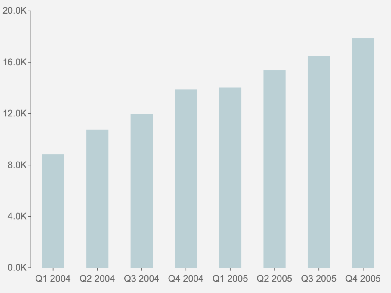
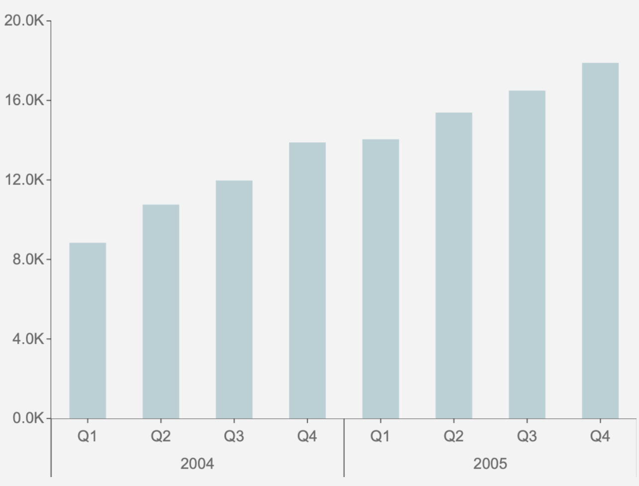
Flat Date vs. Hierarchical Date in a Column Chart
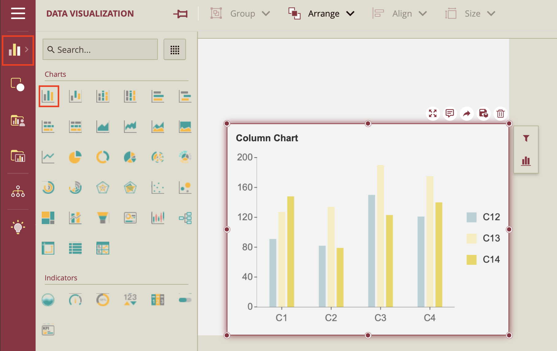
To create a column chart, simply click on the Data Visualization node and drag and drop the first data visualization type, the Column Chart, onto the dashboard designer.
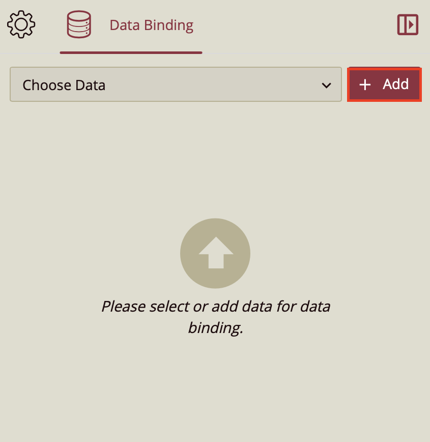
Following this action, you will notice the Data Binding tab open on the right-hand side. Click on the Add button to bind a dataset to your column chart.
From the dataset that you have chosen, you are going to want to drag and drop your date data to the category axis. This example uses a sample dataset CustomerOrders and the data added to the category axis is SaleDate.
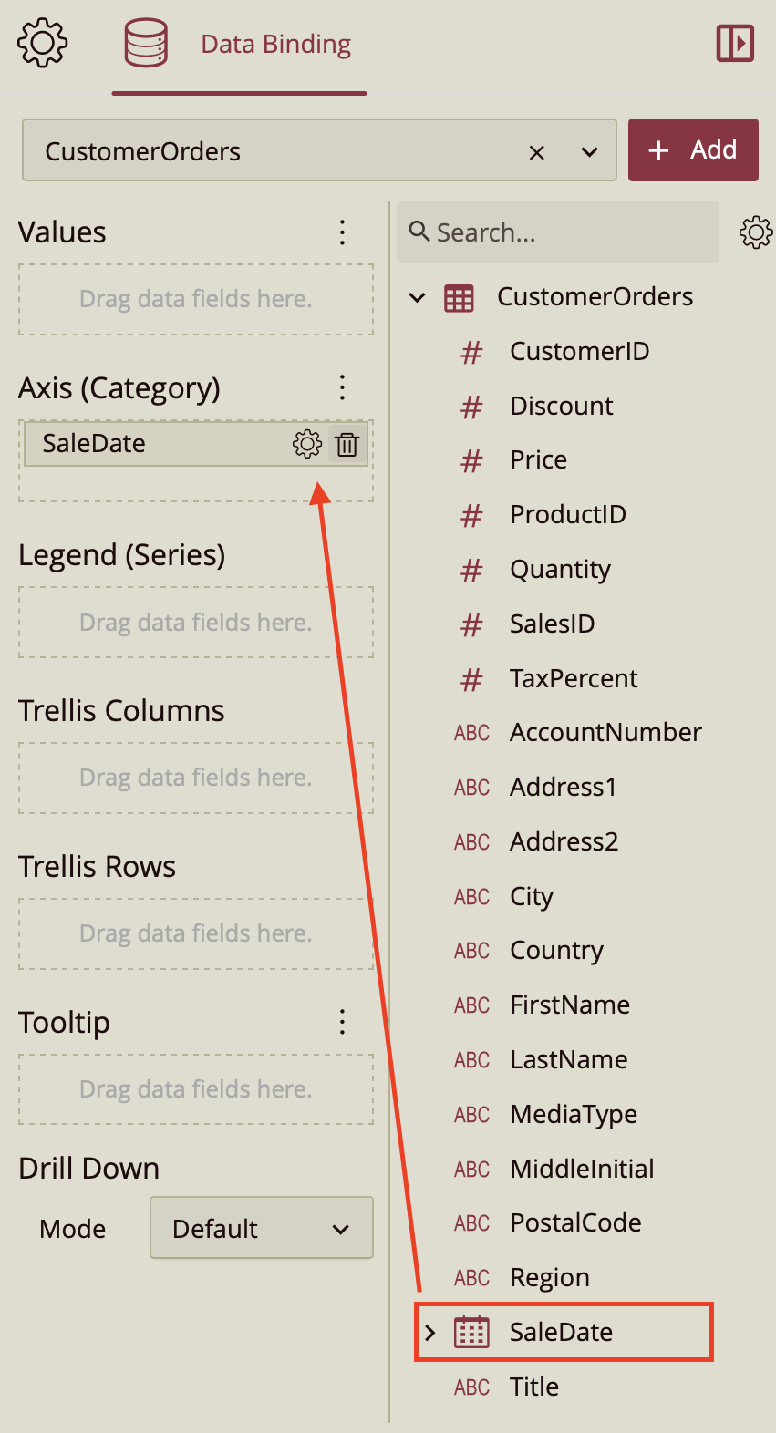
Click on the gear icon to open the dropdown. From there you can see the options of binding your chart to a Flat Date or a Hierarchical Date.
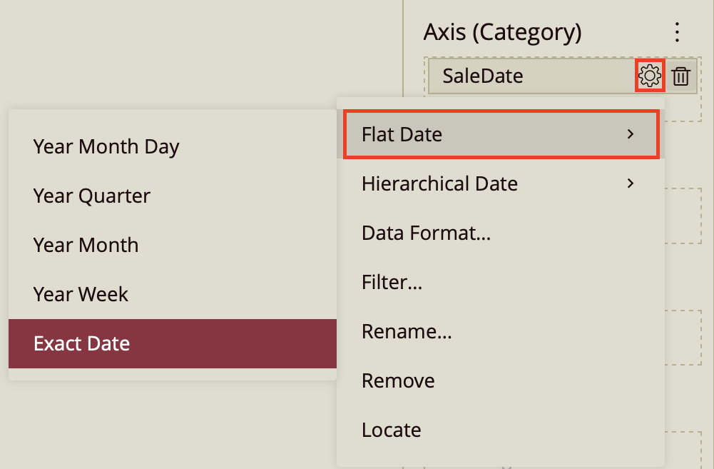
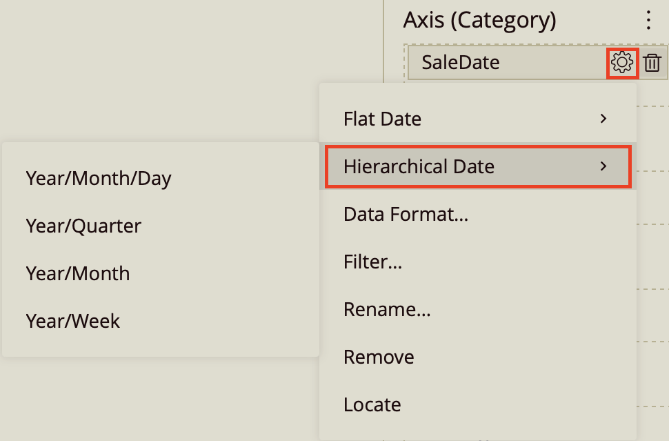
For example, regardless if you choose Year Quarter either as a flat date or as a hierarchical date, your data will still be categorized by quarter of each year. But different from the flat date, the hierarchical date will display the quarters as aggregated by year. Whereas selecting a flat date, no such aggregation will occur.