-
Interactive DashboardsCreate interactive BI dashboards with dynamic visuals.
-
End-User BI ReportsCreate and deploy enterprise BI reports for use in any vertical.
-
Wyn AlertsSet up always-on threshold notifications and alerts.
-
Localization SupportChange titles, labels, text explanations, and more.
-
Wyn ArchitectureA lightweight server offers flexible deployment.
-
 Wyn Enterprise 7.1 is ReleasedThis release emphasizes Wyn document embedding and enhanced analytical express...
 -
 Choosing an Embedded BI Solution for SaaS ProvidersAdding BI features to your applications will improve your products, better serve your customers, and more. But where to start? In this guide, we discuss the many options.
-
Visual GalleryInteractive sample dashboards and reports.
-
BlogExplore Wyn, BI trends, and more.
-
WebinarsDiscover live and on-demand webinars.
-
Customer SuccessVisualize operational efficiency and streamline manufacturing processes.
-
Knowledge BaseGet quick answers with articles and guides.
-
VideosVideo tutorials, trends and best practices.
-
WhitepapersDetailed reports on the latest trends in BI.
-
 Choosing an Embedded BI Solution for SaaS ProvidersAdding BI features to your applications will impr...
 -

- Getting Started
- Administration Guide
-
User Guide
- An Introduction to Wyn Enterprise
- Document Portal for End Users
- Data Governance and Modeling
- View and Manage Documents
- Working with Resources
- Working with Reports
- Working with Dashboards
- Working with Notebooks
- Wyn Analytical Expressions
- Section 508 Compliance
- Subscribe to RSS Feed for Wyn Builds Site
- Developer Guide
Bubble Map
Bubble Map Overview
A Bubble Map visualizes data across geographic regions using symbols instead of filled areas. Each region is represented by a bubble positioned on the map, allowing you to encode multiple measures at once. Typically, a Bubble Map uses geographic context from a region field, color to differentiate categories or values, and size to represent a secondary quantitative measure. This makes Bubble Maps especially useful when you want to compare magnitude and distribution simultaneously without filling entire geographic areas.
This article focuses on Data Binding for Bubble Maps as well as the Bubble Map–specific property groups: Map Style, Cluster Setting, Bubble Style, and Data Labels for Maps. Other property groups behave consistently across visualizations and are documented separately.
Data Binding
The Data Binding tab defines how fields from your dataset are mapped to the Bubble Map. Each binding slot plays a specific role in determining where bubbles appear, how large they are, and how they are visually differentiated.
At a minimum, a Bubble Map requires either a Region field or a combination of Latitude and Longitude, along with a Size value to render bubbles. Additional bindings, such as Color and Tooltip, enhance visual encoding and interactivity but are optional.
Region
The Region slot accepts geographic fields such as country, state or province, county, or city. This binding determines the geographic location of each bubble based on recognized place names.
If Region is used, latitude and longitude values are not required.
Latitude and Longitude
The Latitude and Longitude slots accept numeric coordinate values and are used together to position bubbles precisely on the map. This approach is useful when your dataset does not contain named geographic regions.
Latitude and Longitude must always be provided as a pair.
Long/Lat Label
Long/Lat Label accepts a text or categorical field, such as a store name, site ID, or location code. This value is used to identify each coordinate-based point and is displayed in tooltips or data labels.
For example, when plotting store locations by latitude and longitude, the Long/Lat Label can display the store name instead of raw coordinate values.
Size
The Size slot accepts a numeric field and controls the relative size of each bubble. Larger values produce proportionally larger bubbles, making this slot the primary way to represent magnitude in a Bubble Map.
While the map can render without Size, this binding is required if you want bubbles to vary in size based on data.
Color
The Color slot accepts either numeric or categorical fields and applies color encoding to bubbles.
When a numeric field is bound, colors are rendered using a gradient scale, where intensity reflects value. When a categorical field is bound, colors are assigned from a palette, with a distinct color for each category.
You can use Color independently or together with Size to represent one or multiple measures.
Tooltip
The Tooltip slot accepts any number of fields and defines the information displayed when users hover over a bubble. Tooltips are commonly used to provide additional context, such as revenue, population, or category details, without adding visual clutter to the map.
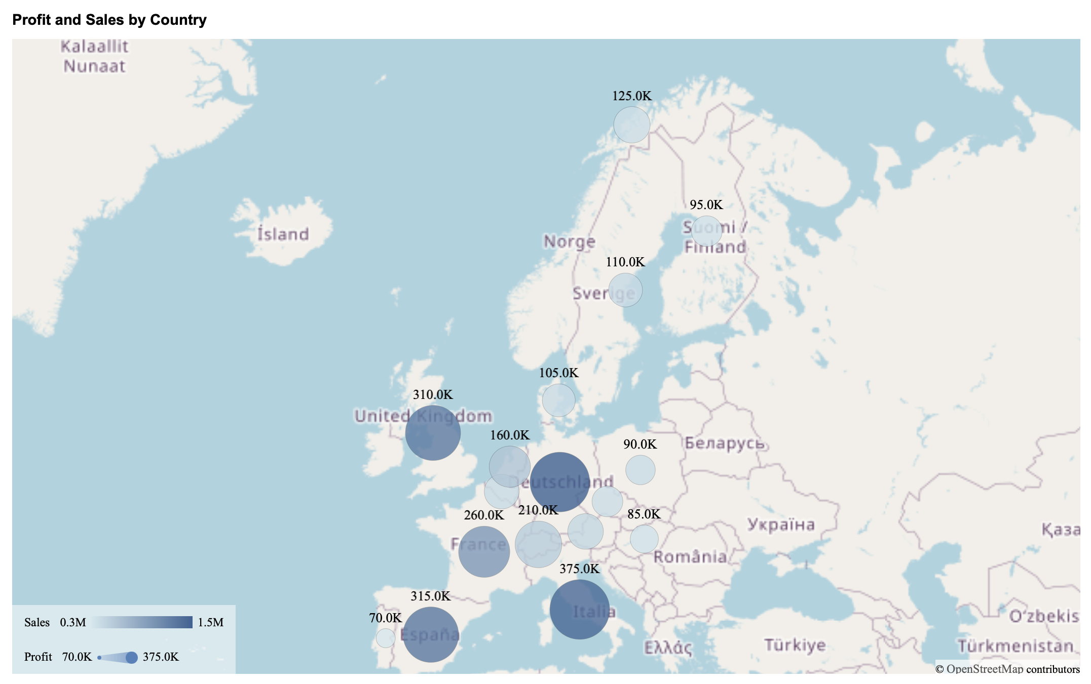
Example
This is an example of a Bubble Map with Country bound to Region, Profit bound to Size, and Sales bound to Color.
Map Style
Map Style controls the overall map canvas and navigation behavior. These settings are functionally equivalent to those used by Area Maps.
Scenario Name: Defines how the Bubble Map appears in the Explorer tab.
Show Base Map: Toggles display of the full base map. When disabled, only regions associated with data are shown.
Base Map Type: Selects the underlying map source. The default is OpenStreetMap, with support for CustomGIS base styles uploaded through the Resource Portal.
Scroll to Zoom: Enables or disables zooming using the mouse wheel or trackpad.
Tilt Angle: Tilts the map up to approximately 60 degrees for a perspective view.
Display Area: Controls the initial viewport using Auto, By Area, or By Longitude & Latitude.
Show Boundary: Toggles display of geographic boundaries on the map.
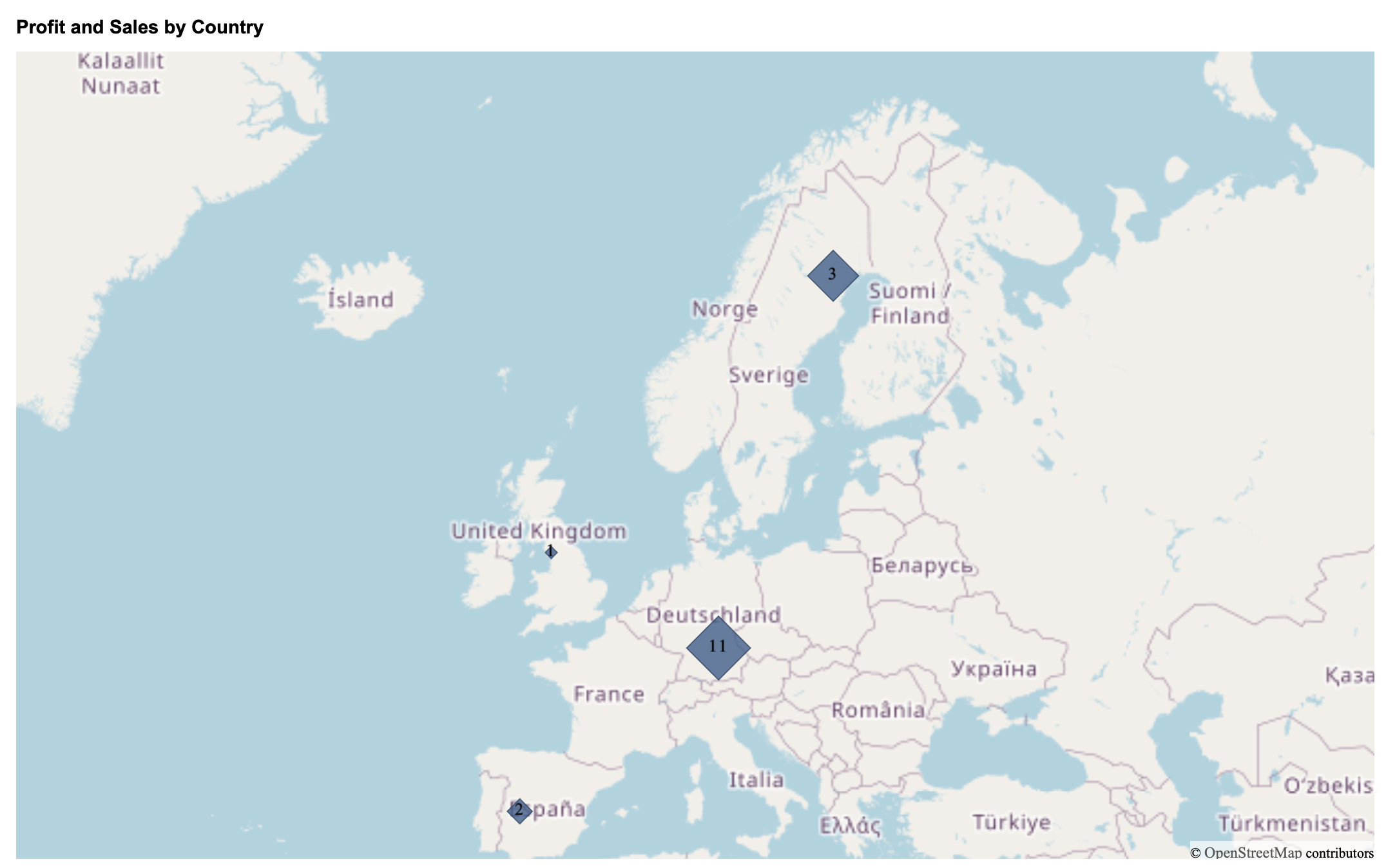
Cluster Setting
Clusters group nearby bubbles into a single visual marker when the map contains many data points in close proximity. Instead of showing every individual bubble, clustering reduces visual clutter by combining bubbles that fall within the same geographic area at the current zoom level.
Clusters are not created at the region level. Instead, they represent a collection of bubbles that are spatially close to one another. For example, when viewing Europe, bubbles from multiple nearby countries may be grouped into a single cluster. As users zoom in or out, clusters dynamically break apart or merge based on spatial density.
Clustering is commonly used to improve readability and performance, especially when working with dense geographic data.
To enable clustering, toggle Show Cluster to True. The following properties become available:
Cluster Color: Defines the color used for all clusters. A single color is applied consistently across the map.
Data Label Font Setting: Controls the appearance of the numeric label displayed on each cluster. You can configure the font family, size, color, and weight.
When clustering is enabled, each cluster displays a number indicating how many individual bubbles are included in that cluster. You can change the cluster shape and cluster border color under the Bubble Style settings.
Example
This is an example where Show Cluster has been enabled, and the shape of the cluster has been set to a diamond and the border color to a darker blue shade.
Bubble Style
Bubble Style controls the appearance of individual bubbles. Available properties vary slightly depending on whether clustering is enabled.
Bubble Style (Show Cluster Disabled)
When Show Cluster is disabled, each data point is rendered as an individual bubble.
Shape determines the visual form of the bubble. Available options include:
Circle (default)
Oval
Square
Diamond
Triangle
Pentagon
Pointy Top Hexagon
Star
Octagon
Size Range defines the minimum and maximum size of bubbles, in pixels. By default, bubbles range from 10 to 30 pixels, with sizes scaled according to the value bound to the Size data binding slot.
Show Zero controls whether a bubble is rendered for regions where the bound value evaluates to zero. When enabled, zero-value regions still display a bubble.
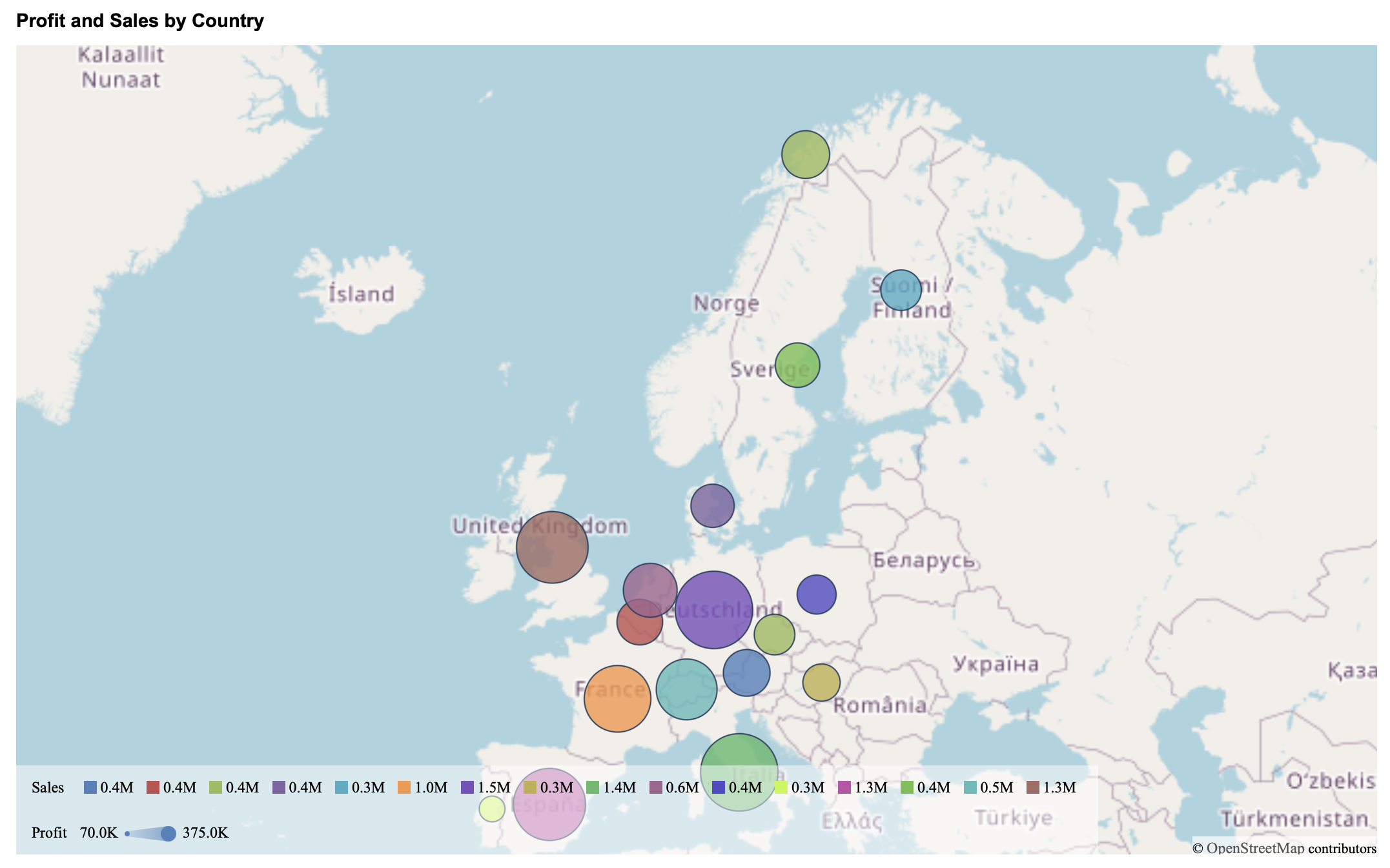
Color Preference determines how bubble colors are assigned:
Gradient: Colors are derived from a single base color. When selected, the Color property appears, allowing you to choose the gradient color using the color picker.
Palette: Colors are assigned from a set of distinct colors. When selected, two additional properties become available:
Maintain Color Assignments: Disabled by default. When enabled, the Palette option is replaced by Color Assignments, allowing you to manually assign colors to individual values.
Palette: Available when Maintain Color Assignments is disabled. You can choose a palette from the dashboard theme, a standard palette, or a custom palette.
Border Color defines the outline color of bubbles. You can select the color and adjust its opacity using the color picker.
Example
This is an example where the Color Preference has been set to Palette.
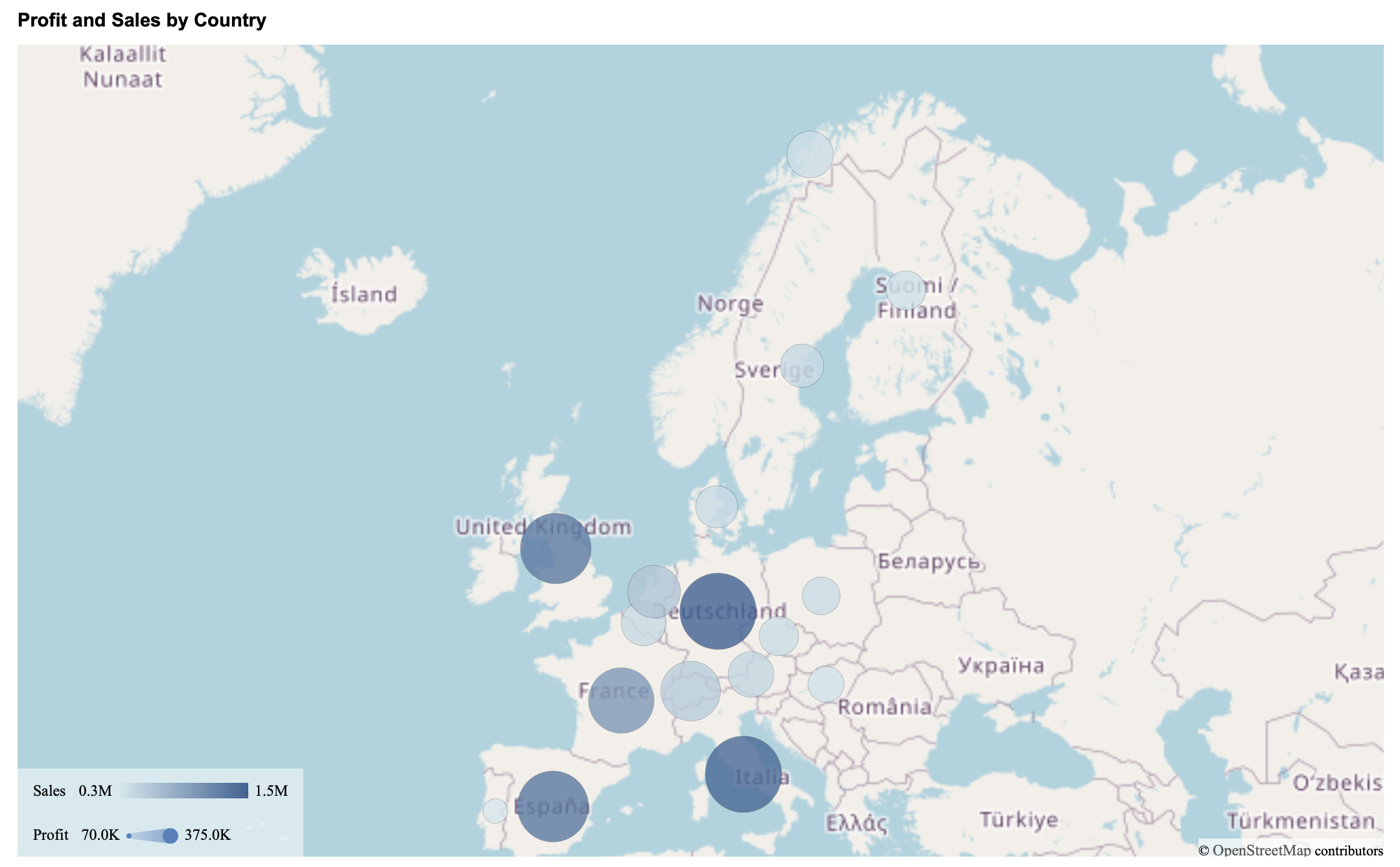
Data Labels for Maps
Bubble Maps support data labels that can be displayed directly on individual bubbles. Data labels are independent of clustering and remain a separate feature.
To enable data labels, toggle Show Data Label to True. Once enabled, labels appear for bubbles associated with regions that have data.
You can control what information is shown in the labels using the following options:
Show Location: Displays the geographic name associated with the bubble, based on the value bound to the Region field.
Show Measure: Displays the numeric value associated with the bubble, typically derived from the measure used for color or size.
You can enable either option individually or display both together.
The Display Mode property controls how labels are rendered when multiple bubbles are present:
Smart: Displays as many labels as possible while minimizing overlap and visual clutter.
All: Displays all labels, even if they overlap.
Finally, Data Label Font Setting allows you to customize the appearance of data labels. You can configure the font family, size, color, weight, and style (such as italic) to ensure labels remain readable at different zoom levels.
Example
This is an example where Show Data Label has been enabled and Show Measure is toggle to True, but not Show Location.