-
Interactive DashboardsCreate interactive BI dashboards with dynamic visuals.
-
End-User BI ReportsCreate and deploy enterprise BI reports for use in any vertical.
-
Wyn AlertsSet up always-on threshold notifications and alerts.
-
Localization SupportChange titles, labels, text explanations, and more.
-
Wyn ArchitectureA lightweight server offers flexible deployment.
-
 Wyn Enterprise 7.1 is ReleasedThis release emphasizes Wyn document embedding and enhanced analytical express...
 -
 Choosing an Embedded BI Solution for SaaS ProvidersAdding BI features to your applications will improve your products, better serve your customers, and more. But where to start? In this guide, we discuss the many options.
-
Visual GalleryInteractive sample dashboards and reports.
-
BlogExplore Wyn, BI trends, and more.
-
WebinarsDiscover live and on-demand webinars.
-
Customer SuccessVisualize operational efficiency and streamline manufacturing processes.
-
Knowledge BaseGet quick answers with articles and guides.
-
VideosVideo tutorials, trends and best practices.
-
WhitepapersDetailed reports on the latest trends in BI.
-
 Choosing an Embedded BI Solution for SaaS ProvidersAdding BI features to your applications will impr...
 -

- Getting Started
- Administration Guide
-
User Guide
- An Introduction to Wyn Enterprise
- Document Portal for End Users
- Data Governance and Modeling
- View and Manage Documents
- Working with Resources
- Working with Reports
-
Working with Dashboards
- Tour the Dashboard Designer
- Create a Dashboard
- Configure Dashboard
- Dashboard Data Binding
- Scenarios
- Appearance
- Component Management
- Parameters
- Interactions
- Finalize Your Dashboard
- Using AI in Wyn
- Working with Notebooks
- Wyn Analytical Expressions
- Section 508 Compliance
- Subscribe to RSS Feed for Wyn Builds Site
- Developer Guide
Data Range Slicer
The Date Range Slicer is highly configurable date slicer that supports filtering by multiple date granularities and two display modes: single period and date range. It allows users to filter data in the dashboard dataset by a single period (Date, Year, Year-Quarter, Year-Month) or filtering on a selected range of dates. It’s ideal for dashboards that track trends over time—such as sales, performance, or activity logs.
This slicer is useful when:
You need to filter data by a specific time period (e.g., last 30 days, Q1 2024).
Users need the flexibility to adjust time filters.
You’re analyzing trends across months, quarters, or years.
Examples:
Filter sales by fiscal quarter.
View support tickets created within the last 7 days.
Data Binding
Columns – Bind a date field to use for filtering.
Date Range Slicer Properties
The Date Range Slicer enables users to filter dashboard data based on a selected time period. You can configure its behavior, default state, interaction options, and visual appearance through the properties described below.
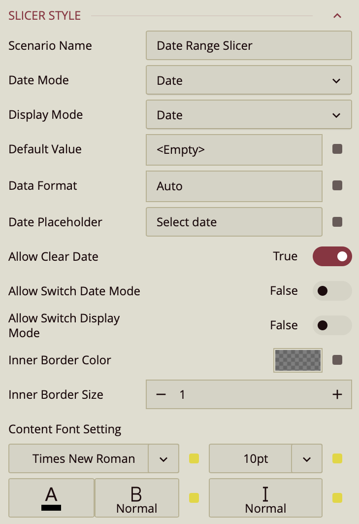
Scenario Name
The Scenario Name property defines how the slicer appears in the Explorer panel.
By default, the name reflects the scenario type (for example, Date Range Slicer). You can change it to a more descriptive label, such as Order Date, Invoice Period, or Reporting Range, to make its purpose clearer—especially when multiple slicers exist on the same dashboard.
Date Mode
The Date Mode property specifies the time granularity users can use to filter the dashboard. Supported modes include:
Date
Year
Year–Quarter
Year–Month
Date Time
By default, users can filter only by the mode you select.
Allow Switch Date Mode
When you enable Allow Switch Date Mode, a calendar icon appears on the right side of the slicer in Preview mode. This icon contains two small directional arrows (one pointing upward and one downward).
When users click this icon, they can switch the date granularity at runtime—for example, from Date to Year or from Year–Month to Date Time. This allows greater flexibility without requiring changes in the designer.
Display Mode
The Display Mode property controls whether users select a single period or a range of periods.
In single selection mode, users pick one date (or one year, quarter, etc.).
In range mode, users select a start and end period.
Allow Switch Display Mode
When Allow Switch Display Mode is enabled, another calendar icon appears in the slicer during Preview. This icon includes arrows facing each other, indicating a switch between selection types.
Users can toggle between:
A single-period selector
A range selector (displayed as Start Date ~ End Date)
When range mode is active, a calendar icon with three dots appears. Clicking this icon opens a dropdown where users can:
Select from predefined quick ranges
Create a custom range
This provides a streamlined way to switch between flexible range filtering and single-value filtering without redesigning the slicer.
Default Value
The Default Value property defines the initial value of the Date Range Slicer without binding it to a data attribute in the Data Binding panel.
You would typically set a default value when:
The dashboard should open with a predefined reporting period (for example, This Month or Previous Quarter).
You want a consistent starting point for all users.
The date logic should be dynamic and relative to the current date.
The slicer is not directly driven by a bound date field.
To configure it, click the value slot next to Default Value. This opens the Set Default Value window, where you choose a Value Type.
Value Type: Static Date
When set to Static Date, you manually select a fixed date from the calendar.
This value remains constant until you change it in the designer.
(Insert screenshot here – Static Date configuration)
This option is useful when the dashboard must always open with a specific, unchanging date.
Value Type: Relative Date
When set to Relative Date, the default value is calculated dynamically using a relative rule.
First, select a Date Unit:
Day
Week
Month
Quarter
Year
Then choose the relative position (for example, Yesterday, Today, Previous Month, This Quarter, Next Year, and so on).
(Insert screenshot here – Relative Date configuration)
Anchor Relative To
If you enable Anchor relative to, the relative calculation is based on a specific reference date instead of the system date. You select the anchor date from the calendar.
This is useful when reporting logic must be tied to a fixed cutoff date or fiscal reference date.
Add Offset
The Add Offset option lets you shift the calculated relative date forward or backward by a specific number of units.
For example:
If the unit is Month and the selection is This Month, adding an offset of -1 moves the result to the previous month.
If the unit is Week and the selection is This Week, adding an offset of +2 shifts it two weeks forward.
This gives you finer control beyond the predefined relative options.
Instead of manually entering an offset value, you can click the pencil icon and select Use a new parameter…. This allows the offset to be dynamically controlled by a dashboard parameter.
Data Format
The Data Format property controls how the date values are displayed inside the slicer.
By default, it is set to Auto, but you can change it to:
Date
Time
Custom Format (using patterns such as
MM/dd/yyyy)
Date Placeholder
If no default value is specified, you can define a Date Placeholder string (for example, Pick a Start Date). This text appears inside the control until a date is selected.
Appearance Settings
You can customize the visual styling of the Date Range Slicer using the following properties:
Border Color
The Border Color property controls the outer border of the slicer box.
You can select a color and adjust its opacity. Setting the opacity to 0 makes the border completely invisible.
Inner Border Size
The Inner Border Size property adjusts the thickness of the inner border inside the dropdown.
Content Font Settings
The Content Font Settings allow you to configure:
Font family
Font size
Font color
Font weight
Font style (italic or normal)
These options help ensure the slicer aligns visually with the overall dashboard design and branding.