-
Interactive DashboardsCreate interactive BI dashboards with dynamic visuals.
-
End-User BI ReportsCreate and deploy enterprise BI reports for use in any vertical.
-
Wyn AlertsSet up always-on threshold notifications and alerts.
-
Localization SupportChange titles, labels, text explanations, and more.
-
Wyn ArchitectureA lightweight server offers flexible deployment.
-
 Wyn Enterprise 7.1 is ReleasedThis release emphasizes Wyn document embedding and enhanced analytical express...
 -
 Choosing an Embedded BI Solution for SaaS ProvidersAdding BI features to your applications will improve your products, better serve your customers, and more. But where to start? In this guide, we discuss the many options.
-
Visual GalleryInteractive sample dashboards and reports.
-
BlogExplore Wyn, BI trends, and more.
-
WebinarsDiscover live and on-demand webinars.
-
Customer SuccessVisualize operational efficiency and streamline manufacturing processes.
-
Knowledge BaseGet quick answers with articles and guides.
-
VideosVideo tutorials, trends and best practices.
-
WhitepapersDetailed reports on the latest trends in BI.
-
 Choosing an Embedded BI Solution for SaaS ProvidersAdding BI features to your applications will impr...
 -

- Getting Started
- Administration Guide
-
User Guide
- An Introduction to Wyn Enterprise
- Document Portal for End Users
- Data Governance and Modeling
- View and Manage Documents
- Working with Resources
- Working with Reports
-
Working with Dashboards
- Tour the Dashboard Designer
- Create a Dashboard
- Configure Dashboard
- Dashboard Data Binding
- Scenarios
- Appearance
- Component Management
- Parameters
- Interactions
- Finalize Your Dashboard
- Using AI in Wyn
- Working with Notebooks
- Wyn Analytical Expressions
- Section 508 Compliance
- Subscribe to RSS Feed for Wyn Builds Site
- Developer Guide
Multi-dimensional Dropdown Slicer
The Multi-dimensional Dropdown Slicer allows you to filter your chart by data attributes displayed in the dropdown. It is most useful when you want the user to be able to filter the dashboard with multiple categories or when you want to save space for charts and tables.
Data Binding
Use the ellipsis menu next to the data binding menu to choose the binding mode. Each mode displays specific binding slots:
Multi-Dimensions (default)
Dimensions – Bind the fields you want to use as filtering dimensions. Each selected field becomes a separate filtering category in the slicer.
Parent-Child
ParentId – Bind the field containing the parent node identifier for each item.
Id – Bind the field containing the unique identifier for each item.
Display – Bind the field containing the label or name to display for each item in the slicer.
Hierarchy
Hierarchy – Bind the field containing the hierarchical structure used for navigation and filtering.
Display – Bind the field containing the label or name to display for each level in the hierarchy.
Customize Slicer
You can customize the appearance and behavior of the Multi-dimensional Dropdown Slicer using the Inspector Panel. Make sure the slicer is selected to see the available styling options.
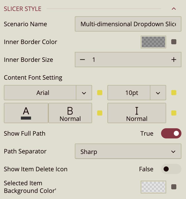
Slicer Style
Slicer Style Properties
The Style properties control the appearance and labeling behavior of the Multi-dimensional Dropdown Slicer.
Scenario Name
Scenario Name specifies how the slicer appears in the dashboard designer explorer.
By default, this value is set to the scenario type name, Multi-dimensional Dropdown Slicer, but you can rename it to better reflect its purpose in the dashboard.
Inner Border Color
Inner Border Color defines the color of the dropdown’s inner border.
You can select a color from the dashboard theme, choose a custom color, or enter a web color. Opacity is also supported, allowing you to make the border partially transparent or completely invisible by setting opacity to 0%.
Inner Border Size
Inner Border Size controls the thickness of the inner border.
The default value is 1, and increasing this value makes the border more prominent.
Content Font Setting
Content Font Setting controls the typography of the slicer’s displayed content.
You can configure the font family, font size, font color, font weight, and font style (italic or normal).
Show Full Path
Show Full Path is a toggle property that is enabled by default.
This setting applies only when two data fields are bound to the slicer and those fields form a hierarchy (for example, Product Line → Product).
When enabled, selected child values are displayed with their full hierarchical path.
For example, selecting Firefly Charger under Climbing Accessories displays:
Climbing Accessories / Firefly Charger
When disabled, only the child value is shown:
Firefly Charger
Path Separator
Path Separator controls how hierarchical paths are visually separated when Show Full Path is enabled.
This setting determines the character displayed between the parent and child values.
The available options are:
Sharp: Displays an angle bracket (
>)Line: Displays a dash (
-)Plus: Displays a plus sign (
+)Diagonal: Displays a forward slash (
/)
For example, depending on the selected separator, a value may appear as:
Climbing Accessories > Firefly ChargerClimbing Accessories - Firefly ChargerClimbing Accessories + Firefly ChargerClimbing Accessories / Firefly Charger
Show Item Delete Icon
Show Item Delete Icon is a toggle property that is disabled by default.
When enabled, a small delete (×) icon appears next to each selected item, allowing users to remove individual selections directly from the slicer without reopening the dropdown.
Selected Item Background Color
Selected Item Background Color defines the background color of selected values displayed in the slicer.
When a value is selected, it appears as a pill-shaped item with rounded corners inside the slicer input area. This property controls the color of that background.