- Getting Started
- Administration Guide
-
User Guide
- An Introduction to Wyn Enterprise
- Document Portal for End Users
- Data Governance and Modeling
- View and Manage Documents
- Working with Resources
- Working with Reports
- Working with Dashboards
- Working with Notebooks
- Wyn Analytical Expressions
- Section 508 Compliance
- Subscribe to RSS Feed for Wyn Builds Site
- Developer Guide
Topology
Wyn Enterprises introduces Topology which includes the visual components that you can add to your dashboards to improve their appearance and functionality. Using these shapes you can quickly draw Flow charts, Network diagrams, etc. You can create the whole UI by adding, and resizing different shapes in the designer. You can add Animation, Conditional Format, Bind Dataset, etc. to different shapes.
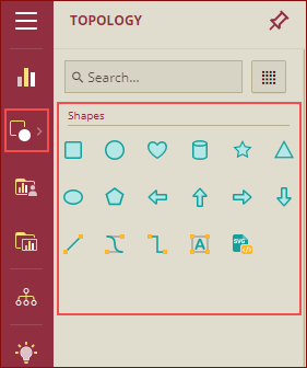
The following shapes are supported in Wyn Enterprise:
Rectangle
Circle
Heart
Cylinder
Star
Triangle
Ellipse
Polygon
Left Arrow
Up Arrow
Right Arrow
Down Arrow
Line, Bezier Curve
Polyline
Text
SVG Shape
Examples using Shapes
In this example, we have taken a Rich Text, Tab Container, and used the following shapes as shown below:
Rectangle
Text
User Defined shapes
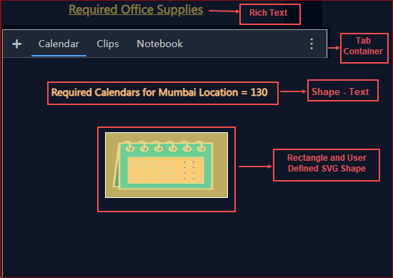
We have applied properties like conditional formatting, shape style, animation, etc. on the shapes. The preview of the dashboard will be as shown below.
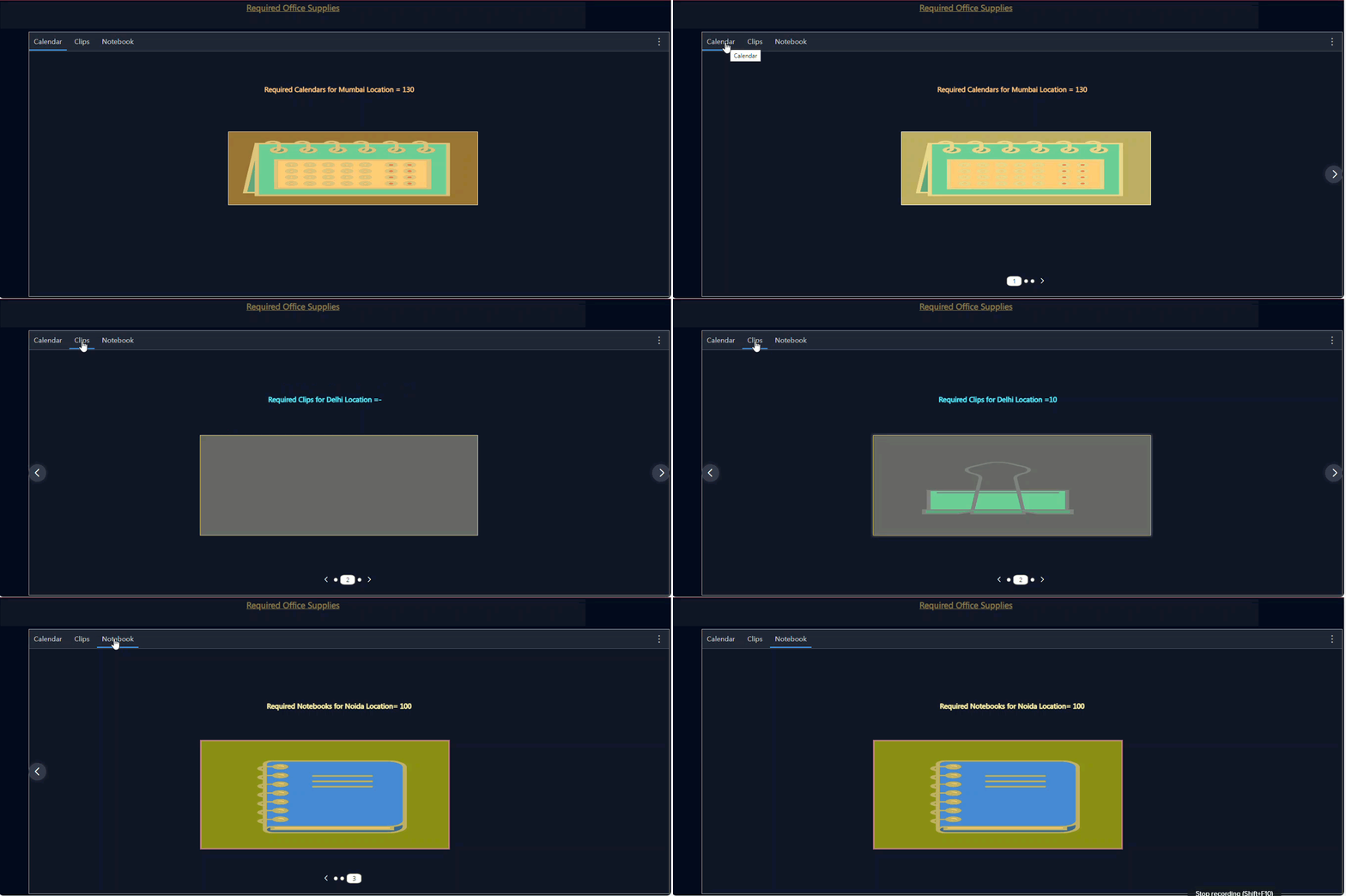
Please note the following important points related to Topology:
The Topology option will be visible in the dashboard designer only if it is enabled by the Admin in the Admin Portal.
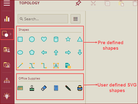
If Admin has uploaded some user-defined SVG images in the Topology, then those shapes will also be visible in the dashboard designer.
Property Reference
Listed below are the common properties for all the shapes except for the Arrows, Line, Bezier Curve, Polyline, Text, and SVG Shape.
Shape Style
Property | Description |
|---|---|
Rounded Corner | Set the radius from 0 to the desired roundness of the corners of the shape using this property. |
Background Color | Select the background color of the shape using this property. |
Background Gradient | Set the background gradient style and the gradient color of the shape using this property. |
Background Image | Add an image as a background image to the shape. |
Border Color | Set the border color of the shape using this property. |
Border Width | Set the border width of the shape using this property. |
Border Style | Set a border style using this property. You can choose the Solid or Dashed option from the dropdown list. If you select the Dashed option, then you need to set the gap between the dashes using the property Dashed Gap. |
Show Shadow | To create a shadow of the shape, set this property to True. By default, this property is set to False. When this property is set to Ture, you can set the Shadow Color and Shadow Offset. |
Opacity | Set the opacity of the shape background color and border color from 0 to 100% using this property. |
Horizontal Flip | To flip the shape horizontally set this property to True. By default, it is set to False. |
Vertical Flip | To flip the shape vertically set this property to True. By default, it is set to False. |
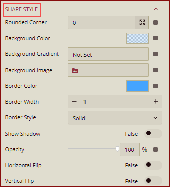
Note: The Rounded Corner property under the Shape Style is applicable only for Rectangle. For the Star shape, there is another property Start Vertex Count. For the Polygon shape, there is another property Edge Count.
Interaction
Property | Description |
|---|---|
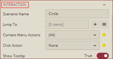
Scenario Name | Add a name for the shape using this property. By default, it displays the shape that is selected like a Rectangle, if the rectangle is selected, etc. |
Jump To | To create a shortcut to another dashboard scenario, report, or URL, use this property. See the Jump To help article for more information. |
Auto Refresh | Set None, Polling, or Real Time option from the dropdown to refresh the shape data. Dropdown options are described below: None - Select None to disable auto-refresh of the shape data. Polling - Select Polling to enable auto refresh and set an interval to refresh shape data in the Refresh Interval property. Real Time - Select Real-time to enable automatic refreshing of the shape in real-time. By default, None is selected. |
Context Menu Actions | Select multiple Context Menu Options from the dropdown list. Context Menu Options include -All, Keep, Exclude, Jump, and Add Data Monitoring. By default, the All option is selected. |
Click Action | Select None, Jump, or Command option from the dropdown list to perform an action on click. |
Show Tooltip | To hide the tooltip of the shape set this property to False. By default, this property is set as True. |
Animation
Property | Description |
|---|---|
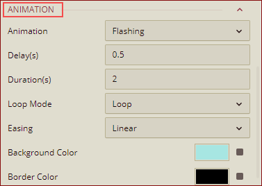
Animation | You can add the animation to the shape scenario under the Animation. You can select any of the following options from the dropdown list: None, Flashing, Glow, Flow, or Breath. By default, None is selected. |
Delay(s) | This property is displayed when the animation is set to other than None. By default, it is set to 0.5 seconds. You can set the time before an animation runs, using this property. |
Durations(s) | This property is displayed when the animation is set to other than None. By default, it is set to 2 seconds. You can set the loading Duration (in seconds) here. |
Loop Mode | You can set the animation loop mode by selecting the option Loop or Single from the dropdown list. By, default, it is set to Loop. |
Easing | Set the animation easing for setting the motion of the shape, using this property. You can select the options from the dropdown list. |
Background Color | Set the background color for animation easing by using this property. |
Border Color | Set the border color for animation easing by using this property. |
Text Label
Property | Description |
|---|---|
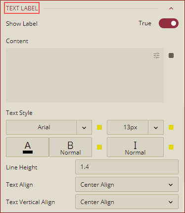
Show Label | Set this property to True to display the content in the shape. By default, it is set to False. |
Content | Add the display content here. You can Insert Data Field, and write any text as per your requirement. |
Text Style | You can customize the text font size, color, type, etc. for the content in the shape using this property. |
Line Height | Set line height to control the vertical space between the lines of text in the shape content. By default, it is set to 1.4. |
Text Align | Select the Center Align, Left Align, or Right Align option from the dropdown to align the content text in the shape. By default, it is set to Center Align. |
Text Vertical Align | Set the vertical alignment of the content using this property. By default, it is set to Center Align. |
Special Data
Property | Description |
|---|---|
Show Null As | Set the content to display in place of null data in the shape using this property. |
Show Blank As | Set the content to display in place of blank data in the shape using this property. |

Appearance
Property | Description |
|---|---|
Visibility | To hide the shape from the dashboard scenario, set this property to False. By default, the Visibility property is set as True. |
Padding | To create space around the shape, set a padding value. |

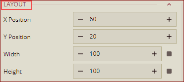
Layout
Property | Description |
|---|---|
X Position | Set the horizontal position of the shape using the X Position property. |
Y Position | Set the vertical position of the shape using the Y Position property. |
Width | Set the width of the shape using this property. |
Height | Set the height of the shape using this property. |
Shape specific properties
Listed below are the properties that are specific to the shapes.
Arrows
All the common properties except for the Rounded Corner property under Shape Style is applicable to all the arrows: Left Arrow, Up Arrow, Right Arrow, and Down Arrow.
Line
The following properties are applicable for Line.
Shape Style
Property | Description |
|---|---|
Line Color | Set the line color of the shape using this property. |
Line Width | Set the line width of the shape using this property. |
Line Style | Set a line style using this property. You can choose the Solid or Dashed option from the dropdown list. If you select the Dashed option, then you need to set the gap between the dashes using the property Dashed Gap. |
Show Shadow | To create a shadow of the shape, set this property to True. By default, this property is set to False. You can set the using this property. When this property is set to True, you can set the Shadow Color and Shadow Offset. |
Opacity | Set the opacity of the shape background color and border color from 0 to 100% using this property. |
Start Arrow | You can add an arrow at the beginning of a line by using the property. |
End Arrow | You can add an arrow at the end of the line by using this property. |
Animation
Property | Description |
|---|---|
Animation | You can add the animation to the shape scenario under the Animation. You can select any of the following options from the dropdown list: None, Flashing, Glow, Flow, or Breath. By default, None is selected. |
Delay(s) | This property is displayed when the animation is set to other than None. By default, it is set to 0.5 seconds. You can set the time before an animation runs, using this property. |
Durations(s) | This property is displayed when the animation is set to other than None. By default, it is set to 2 seconds. You can set the loading Duration (in seconds) here. |
Loop Mode | You can set the animation loop mode by selecting the option Loop or Single from the dropdown list. By, default, it is set to Loop. |
Easing | Set the animation easing for setting the motion of the shape, using this property. You can select the options from the dropdown list. |
Line Color | Set the line color for animation easing by using this property. |
Appearance
Property | Description |
|---|---|
Visibility | To hide the shape from the dashboard scenario, set this property to False. By default, the Visibility property is set as True. |
Layout
Property | Description |
|---|---|
X Position | Set the horizontal position of the shape using the X Position property. |
Y Position | Set the vertical position of the shape using the Y Position property. |
Width | Set the width of the shape using this property. |
Height | Set the height of the shape using this property. |
Bezier Curve
The following properties are applicable to Bezier Curve.
Shape Style
Property | Description |
|---|---|
Line Color | Set the line color of the shape using this property. |
Line Width | Set the line width of the shape using this property. |
Line Style | Set a line style using this property. You can choose the Solid or Dashed option from the dropdown list. If you select the Dashed option, then you need to set the gap between the dashes using the property Dashed Gap. |
Show Shadow | To create a shadow of the shape, set this property to True. By default, this property is set to False. You can set the using this property. When this property is set to True, you can set the Shadow Color and Shadow Offset. |
Opacity | Set the opacity of the shape background color and border color from 0 to 100% using this property. |
Start Arrow | You can add an arrow at the beginning of a line by using the property. |
End Arrow | You can add an arrow at the end of the line by using this property. |
Animation
Property | Description |
|---|---|
Animation | You can add the animation to the shape scenario under the Animation. You can select any of the following options from the dropdown list: None, Flashing, Glow, Flow, or Breath. By default, None is selected. |
Delay(s) | This property is displayed when the animation is set to other than None. By default, it is set to 0.5 seconds. You can set the time before an animation runs, using this property. |
Durations(s) | This property is displayed when the animation is set to other than None. By default, it is set to 2 seconds. You can set the loading Duration (in seconds) here. |
Loop Mode | You can set the animation loop mode by selecting the option Loop or Single from the dropdown list. By, default, it is set to Loop. |
Easing | Set the animation easing for setting the motion of the shape, using this property. You can select the options from the dropdown list. |
Line Color | Set the line color for animation easing by using this property. |
Appearance
Property | Description |
|---|---|
Visibility | To hide the shape from the dashboard scenario, set this property to False. By default, the Visibility property is set as True. |
Layout
Property | Description |
|---|---|
X Position | Set the horizontal position of the shape using the X Position property. |
Y Position | Set the vertical position of the shape using the Y Position property. |
Width | Set the width of the shape using this property. |
Height | Set the height of the shape using this property. |
Polyline
The following properties are applicable for Polyline.
Shape Style
Property | Description |
|---|---|
Line Color | Set the line color of the shape using this property. |
Line Width | Set the line width of the shape using this property. |
Line Style | Set a line style using this property. You can choose the Solid or Dashed option from the dropdown list. If you select the Dashed option, then you need to set the gap between the dashes using the property Dashed Gap. |
Show Shadow | To create a shadow of the shape, set this property to True. By default, this property is set to False. You can set the using this property. When this property is set to Ture, you can set the Shadow Color and Shadow Offset. |
Opacity | Set the opacity of the shape background color and border color from 0 to 100% using this property. |
Start Arrow | You can add an arrow at the beginning of a line by using the property. |
End Arrow | You can add an arrow at the end of the line by using this property. |
Rounded Corner | Set the radius from 0 to the desired roundness of the polyline corners using this property. |
Animation
Property | Description |
|---|---|
Animation | You can add the animation to the shape scenario under the Animation. You can select any of the following options from the dropdown list: None, Flashing, Glow, Flow, or Breath. By default, None is selected. |
Delay(s) | This property is displayed when the animation is set to other than None. By default, it is set to 0.5 seconds. You can set the time before an animation runs, using this property. |
Durations(s) | This property is displayed when the animation is set to other than None. By default, it is set to 2 seconds. You can set the loading Duration (in seconds) here. |
Loop Mode | You can set the animation loop mode by selecting the option Loop or Single from the dropdown list. By, default, it is set to Loop. |
Easing | Set the animation easing for setting the motion of the shape, using this property. You can select the options from the dropdown list. |
Line Color | Set the line color for animation easing by using this property. |
Appearance
Property | Description |
|---|---|
Visibility | To hide the shape from the dashboard scenario, set this property to False. By default, the Visibility property is set as True. |
Layout
Property | Description |
|---|---|
X Position | Set the horizontal position of the shape using the X Position property. |
Y Position | Set the vertical position of the shape using the Y Position property. |
Width | Set the width of the shape using this property. |
Height | Set the height of the shape using this property. |
Text
The following properties are applicable for Text.
Text Label
Property | Description |
|---|---|
Content | Add the display content here. You can Insert Data Field, and write any text as per your requirement. |
Text Style | You can customize the text font size, color, type, etc. for the content in the shape using this property. |
Line Height | Set line height to control the vertical space between the lines of text in the shape content. By default, it is set to 1.4. |
Text Align | Select the Center Align, Left Align, or Right Align option from the dropdown to align the content text in the shape. By default, it is set to Center Align. |
Text Vertical Align | Set the vertical alignment of the content using this property. By default, it is set to Center Align. |
Special Data
Property | Description |
|---|---|
Show Null As | Set the content to display in place of null data in the shape using this property. |
Show Blank As | Set the content to display in place of blank data in the shape using this property. |
Appearance
Property | Description |
|---|---|
Visibility | To hide the shape from the dashboard scenario, set this property to False. By default, the Visibility property is set as True. |
Layout
Property | Description |
|---|---|
X Position | Set the horizontal position of the shape using the X Position property. |
Y Position | Set the vertical position of the shape using the Y Position property. |
Width | Set the width of the shape using this property. |
Height | Set the height of the shape using this property. |
SVG Shape
The following properties are applicable for SVG Shape.
Shape Style
Property | Description |
|---|---|
Background Color | Select the background color of the shape using this property. |
Border Color | Set the border color of the shape using this property. |
Opacity | Set the opacity of the shape background color and border color from 0 to 100% using this property. |
Horizontal Flip | To flip the shape horizontally set this property to True. By default, it is set to False. |
Vertical Flip | To flip the shape vertically set this property to True. By default, it is set to False. |
SVG | Add the SVG file here. |
Interaction
Property | Description |
|---|---|
Scenario Name | Add a name for the shape using this property. By default, it displays the shape that is selected like a Rectangle, if the rectangle is selected, etc. |
Jump To | To create a shortcut to another dashboard scenario, report, or URL, use this property. See the Jump To help article for more information. |
Context Menu Actions | Select multiple Context Menu Options from the dropdown list. Context Menu Options include -All, Keep, Exclude, Jump, and Add Data Monitoring. By default, the All option is selected. |
Click Action | Select None, Jump, or Command option from the dropdown list to perform an action on click. |
Show Tooltip | To hide the tooltip of the shape set this property to False. By default, this property is set as True. |
Text Label
Property | Description |
|---|---|
Show Label | Set this property to True to display the content in the shape. By default, it is set to False. |
Content | Add the display content here. You can Insert Data Field, and write any text as per your requirement. |
Text Style | You can customize the text font size, color, type, etc. for the content in the shape using this property. |
Line Height | Set line height to control the vertical space between the lines of text in the shape content. By default, it is set to 1.4. |
Text Align | Select the Center Align, Left Align, or Right Align option from the dropdown to align the content text in the shape. By default, it is set to Center Align. |
Text Vertical Align | Set the vertical alignment of the content using this property. By default, it is set to Center Align. |
Special Data
Property | Description |
|---|---|
Show Null As | Set the content to display in place of null data in the shape using this property. |
Show Blank As | Set the content to display in place of blank data in the shape using this property. |
Appearance
Property | Description |
|---|---|
Visibility | To hide the shape from the dashboard scenario, set this property to False. By default, the Visibility property is set as True. |
Padding | To create space around the shape, set a padding value. |
Layout
Property | Description |
|---|---|
X Position | Set the horizontal position of the shape using the X Position property. |
Y Position | Set the vertical position of the shape using the Y Position property. |
Width | Set the width of the shape using this property. |
Height | Set the height of the shape using this property. |


