-
Interactive DashboardsCreate interactive BI dashboards with dynamic visuals.
-
End-User BI ReportsCreate and deploy enterprise BI reports for use in any vertical.
-
Wyn AlertsSet up always-on threshold notifications and alerts.
-
Localization SupportChange titles, labels, text explanations, and more.
-
Wyn ArchitectureA lightweight server offers flexible deployment.
-
 Wyn Enterprise 7.1 is ReleasedThis release emphasizes Wyn document embedding and enhanced analytical express...
 -
 Choosing an Embedded BI Solution for SaaS ProvidersAdding BI features to your applications will improve your products, better serve your customers, and more. But where to start? In this guide, we discuss the many options.
-
Visual GalleryInteractive sample dashboards and reports.
-
BlogExplore Wyn, BI trends, and more.
-
WebinarsDiscover live and on-demand webinars.
-
Customer SuccessVisualize operational efficiency and streamline manufacturing processes.
-
Knowledge BaseGet quick answers with articles and guides.
-
VideosVideo tutorials, trends and best practices.
-
WhitepapersDetailed reports on the latest trends in BI.
-
 Choosing an Embedded BI Solution for SaaS ProvidersAdding BI features to your applications will impr...
 -

- Getting Started
- Administration Guide
-
User Guide
- An Introduction to Wyn Enterprise
- Document Portal for End Users
- Data Governance and Modeling
- View and Manage Documents
- Working with Resources
- Working with Reports
- Working with Dashboards
- Working with Notebooks
- Wyn Analytical Expressions
- Section 508 Compliance
- Subscribe to RSS Feed for Wyn Builds Site
- Developer Guide
Introduction to Dashboard Scenarios
Wyn Enterprise provides a rich library of dashboard scenarios—the building blocks you use to design compelling, interactive, and data-driven dashboards. Scenarios are visual or functional components like charts, tables, maps, slicers, and indicators, each with specific use cases that help you tell a complete story with your data.
Whether you're tracking KPIs, exploring geospatial trends, analyzing time series, or building dynamic filters, there's a scenario for every visualization and interaction need.
Available Scenario Types
Wyn Enterprise offers a wide range of scenario types so you can choose the visual or interactive component that best supports your analysis. These scenarios include traditional charts, advanced visualizations, layout tools, and specialized components designed for geospatial, hierarchical, or three-dimensional exploration. The following list provides an overview of all available scenario types, each linking to its own detailed article:
Component Templates (not standalone scenarios; reusable structures you can convert scenarios into)
Why Use Dashboard Scenarios?
Each scenario serves a unique purpose in how data is explored and understood. By combining scenarios strategically, you can:
Highlight trends and outliers
Enable interactive filtering
Compare performance across time or regions
Provide high-level KPIs with drill-down options
Organize complex data into clean layouts
Embed custom or third-party visuals
Use Cases by Scenario Type
Charts: Compare revenue trends, breakdown sales by category, visualize customer behavior.
Maps: Analyze sales by region, plot customer locations, monitor service coverage.
Indicators: Show daily active users, goal completion status, or revenue vs. target.
Tables: Present transactional records or use as drill-down from charts.
Slicers: Allow users to dynamically filter by region, product, time period, or more.
Calc Charts: Perform YoY, MoM, or custom aggregation comparisons.
Topology: Model relationships such as IT infrastructure, supply chains, or business org charts.
Common Scenario Properties
All Dashboard scenarios have common property groups that control the position of the control, special data, no data as well as properties to control animations and interactions with the control. The following sections describe these properties.
Title
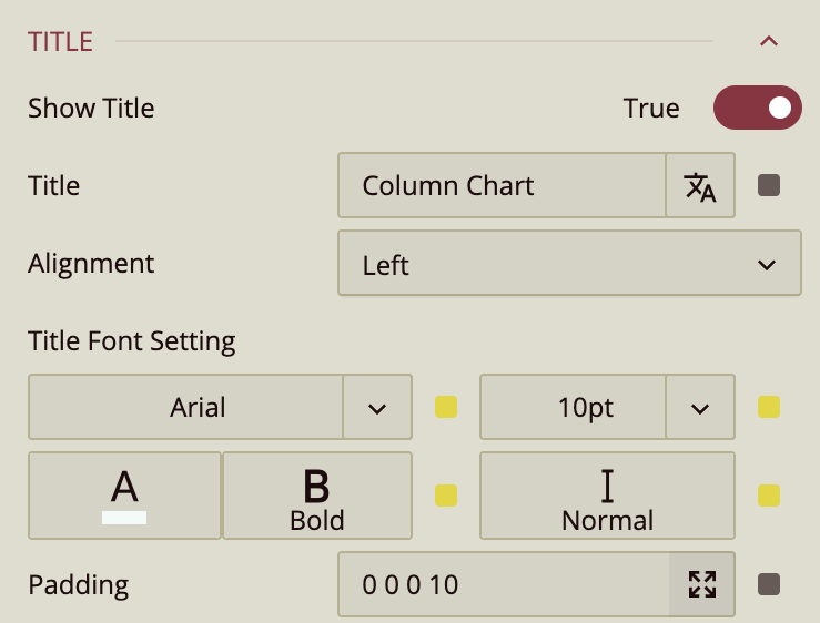
The Show Title property can be set to False to hide the chart’s title. By default, the Title displays the name of the chart type, but you can replace it with custom text.
You can adjust the Alignment of the title to Left, Center, or Right. The Title Font Settings let you customize the font family, size, color, weight, and style. Use the Padding property to add space around the title.
Layout
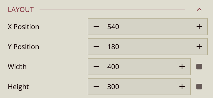
In the Layout properties, you can set the X Position, Y Position, the Width, and the Height of the chart.
Appearance
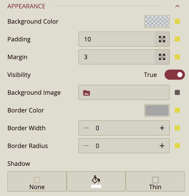
The Appearance properties control the visual styling of the chart. You can set a Background Color and apply Padding and Margin to adjust spacing inside and around the slicer. To hide the column chart from view, set the Visibility property to False.
You can also upload a Background Image and customize the Border Color.
To display a border, make sure the Border Width is set to a value greater than 0. Use the Border Radius property to round the corners of the chart—the higher the value, the more curved the corners. The Shadow property allows you to add a drop shadow. You can configure its visibility, color, and intensity using the corresponding settings.
Special Data
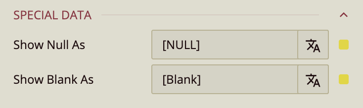
The Show Null As and Show Blank As properties control what the chart displays when there is a null or a blank value, respectively. You can customize the messaging using these properties.
No Data Content
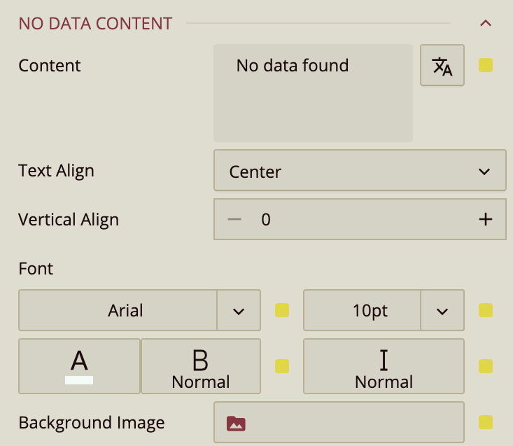
The No Data Content properties control what the chart displays when its data source is empty. You can customize the message using the Content property.
Use Text Align to position the text (Left, Center, or Right), and Vertical Align to adjust its placement up or down within the slicer.
You can also customize the appearance of the text by setting the Font family, size, color, weight, and style. Additionally, you can upload a Background Image to be shown when no data is available.
Animation
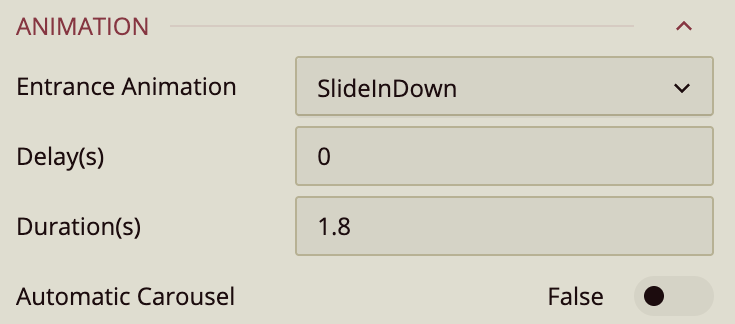
The Animation section allows you to add entrance animations to the slicer. Available options include:
SlideInDown,SlideInLeft,SlideInRight,SlideInUpBackInDown,BackInLeft,BackInRight
You can also set the Delay and Duration (in seconds) to control the timing of the animation. Set an Automatic Carousel to highlight each column sequentially in the preview.