-
Interactive DashboardsCreate interactive BI dashboards with dynamic visuals.
-
End-User BI ReportsCreate and deploy enterprise BI reports for use in any vertical.
-
Wyn AlertsSet up always-on threshold notifications and alerts.
-
Localization SupportChange titles, labels, text explanations, and more.
-
Wyn ArchitectureA lightweight server offers flexible deployment.
-
 Wyn Enterprise 7.1 is ReleasedThis release emphasizes Wyn document embedding and enhanced analytical express...
 -
 Choosing an Embedded BI Solution for SaaS ProvidersAdding BI features to your applications will improve your products, better serve your customers, and more. But where to start? In this guide, we discuss the many options.
-
Visual GalleryInteractive sample dashboards and reports.
-
BlogExplore Wyn, BI trends, and more.
-
WebinarsDiscover live and on-demand webinars.
-
Customer SuccessVisualize operational efficiency and streamline manufacturing processes.
-
Knowledge BaseGet quick answers with articles and guides.
-
VideosVideo tutorials, trends and best practices.
-
WhitepapersDetailed reports on the latest trends in BI.
-
 Choosing an Embedded BI Solution for SaaS ProvidersAdding BI features to your applications will impr...
 -

- Getting Started
- Administration Guide
-
User Guide
- An Introduction to Wyn Enterprise
- Document Portal for End Users
- Data Governance and Modeling
- View and Manage Documents
- Working with Resources
- Working with Reports
- Working with Dashboards
-
Working with Notebooks
- Notebook Designer
- Connect to Data
- Blocks
-
Chart Blocks
- Customize Charts
- Column Chart
- Stacked Column Chart
- Percent Stacked Column Chart
- Bar Chart
- Stacked Bar Chart
- Percent Stacked Bar Chart
- Line Chart
- Area Chart
- Stacked Area Chart
- Percent Stacked Area Chart
- Combined Chart
- Pie Chart
- Donut Chart
- Scatter Chart
- Bubble Chart
- Funnel Chart
- Treemap Chart
- KPI Chart
- Pivot Table
- Data Table
- KPI Matrix
- Label Slicer
- Map
- Wyn Analytical Expressions
- Section 508 Compliance
- Subscribe to RSS Feed for Wyn Builds Site
- Developer Guide
Map
The Map visualization in Notebooks supports both area-based and point-based geographic analysis. Depending on how data is bound, the map can behave as an Area Map or as a Bubble Map. Each behavior uses its own set of bindings and visual rules.
The following sections describe each behavior independently, followed by a summary explaining how they coexist within the same visualization.
Area Map
The Area Map behavior is used to shade geographic regions based on values in your dataset. This approach is useful for comparing measures across broader geographic areas such as countries, states, or counties.
You configure the Area Map behavior using the Data Binding tab.
Region
Bind a geographic field, such as country, state or province, county, or city, to define the areas displayed on the map. The Region binding determines which geographic shapes are rendered.
This binding is required for the Area Map behavior.
Color
Bind a numeric measure to control how each region is shaded. Regions with higher or lower values are represented using stronger or lighter color intensity, making it easy to identify geographic patterns and trends.
Common examples include sales, population, or density.
Tooltip
Bind additional fields to display contextual information when hovering over a region. Tooltips allow you to provide detail without adding visual clutter to the map.
Minimum Required Bindings (Area Map)
At minimum, the Area Map requires a Region binding.
The Color binding is typically used to drive the main visual comparison, while Tooltip is optional.
Example
The following map has been created using this native query dataset from the AdventureWorks Data Warehouse:
SELECT
    st.SalesTerritoryRegion AS Region,
    SUM(fact.SalesAmount) AS TotalSales
FROM
    dbo.FactInternetSales fact
INNER JOIN
    dbo.DimSalesTerritory st
    ON fact.SalesTerritoryKey = st.SalesTerritoryKey
GROUP BY
    st.SalesTerritoryRegion
ORDER BY
    TotalSales DESC;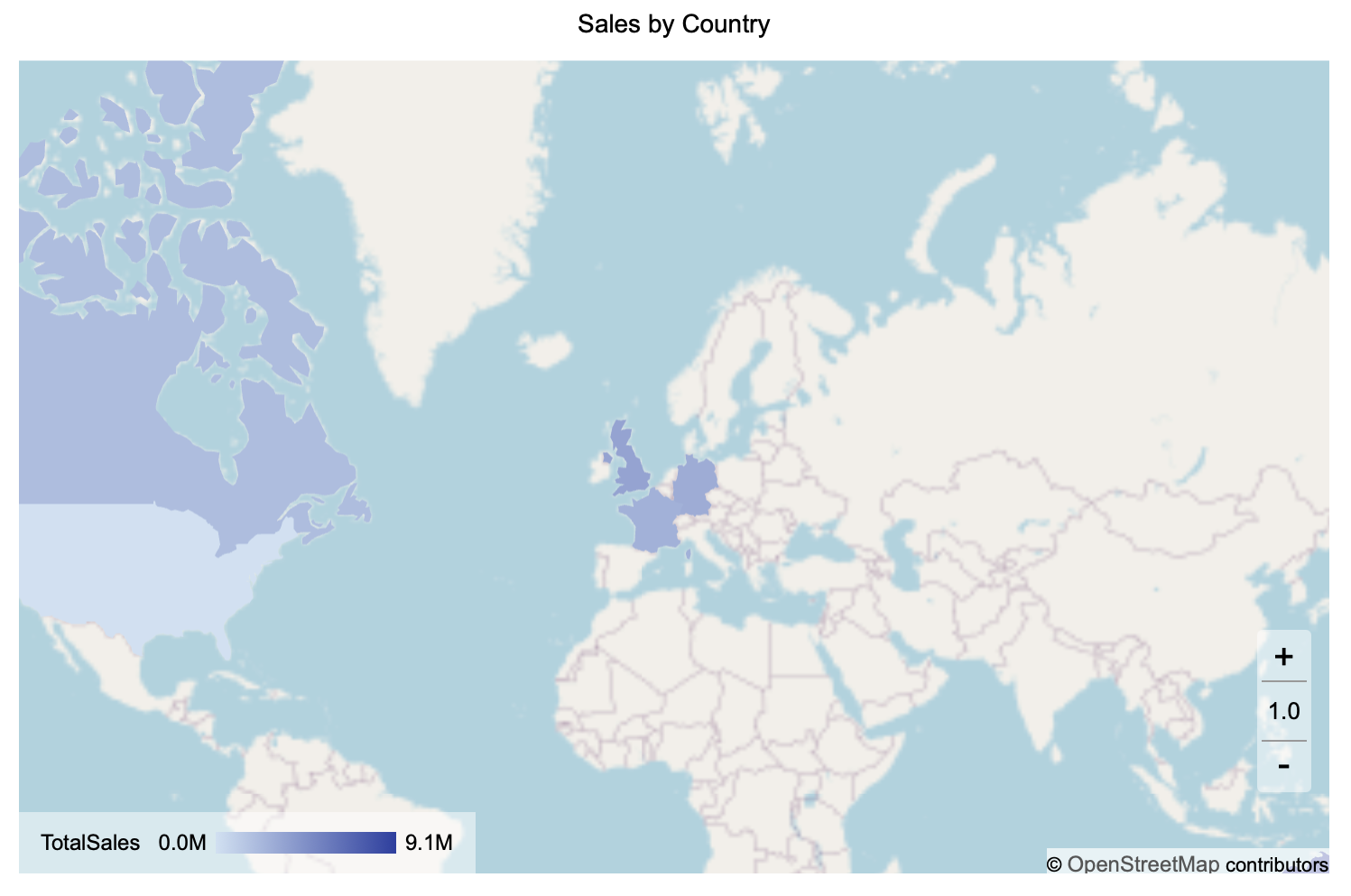
Bubble Map
The Bubble Map behavior is used to display individual locations or aggregated points as circles on the map. Bubble size and color can be used to represent the magnitude or category of a measure.
You configure the Bubble Map behavior using the same Data Binding tab.
Region
Bind a geographic field to place bubbles based on recognized geographic categories. Each distinct region value is represented by a bubble.
This binding is required unless Latitude and Longitude are used instead.
Latitude
Bind a numeric latitude field to define the vertical position of each bubble. Latitude must be used together with Longitude and is typically used when the dataset does not contain named geographic regions.
Longitude
Bind a numeric longitude field to define the horizontal position of each bubble. Longitude must be paired with Latitude.
Long/Lat Label
Bind a text or categorical field, such as a store name or site identifier, to label each coordinate-based bubble. This label is commonly shown in tooltips or data labels and provides context beyond raw coordinates.
Size
Bind a numeric field to control bubble size. Larger values produce proportionally larger bubbles, making this binding useful for highlighting volume, magnitude, or intensity.
This binding is required to create proportional bubbles.
Color
Bind a numeric or categorical field to apply color to bubbles.
Numeric fields use a gradient color scale.
Categorical fields use a discrete color palette.
You can use Color independently or alongside Size to represent different aspects of your data.
Tooltip
Bind any additional fields you want to display when hovering over a bubble, such as revenue, category, or manager name.
Minimum Required Bindings (Bubble Map)
To create a Bubble Map, you must bind either:
Region, or
Latitude and Longitude
To display proportional bubbles, a Size binding is also required. All other bindings are optional.
Example
The following map has been created using this native query dataset from the AdventureWorks Data Warehouse:
SELECT
    st.SalesTerritoryRegion AS Region,
    SUM(fact.SalesAmount) AS TotalSales
FROM
    dbo.FactInternetSales fact
INNER JOIN
    dbo.DimSalesTerritory st
    ON fact.SalesTerritoryKey = st.SalesTerritoryKey
GROUP BY
    st.SalesTerritoryRegion
ORDER BY
    TotalSales DESC;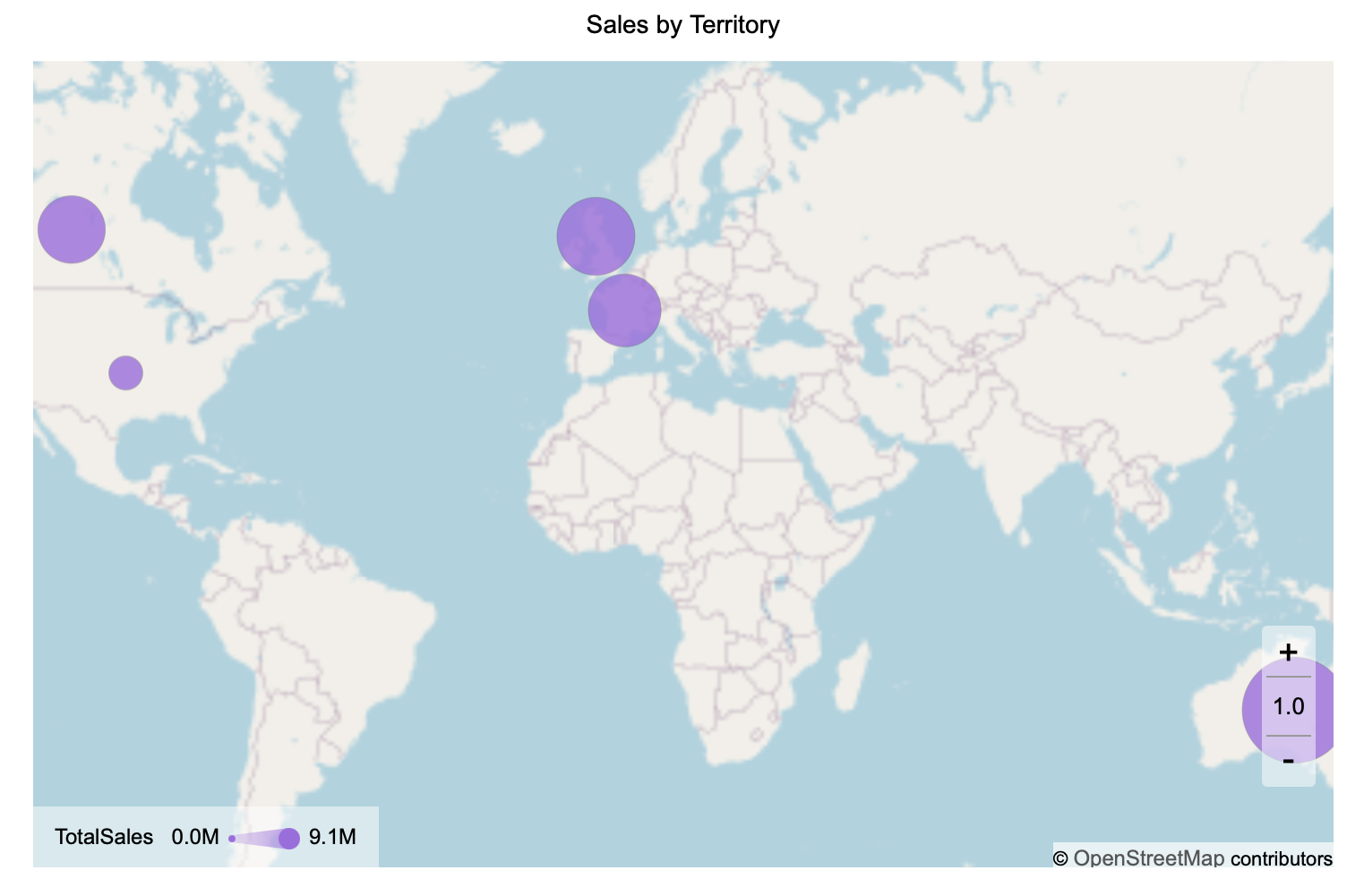
Summary
In Notebooks, the Map visualization supports both Area Map and Bubble Map behaviors within a single visual. Each behavior is configured independently through the Data Binding tab and follows its own binding rules.
This design allows you to analyze regional trends using shaded areas while also highlighting specific locations or aggregated points using bubbles, without requiring separate visualizations.