


- Getting Started
- Administration Guide
-
User Guide
- An Introduction to Wyn Enterprise
- Document Portal for End Users
- Data Governance and Modeling
- Working-with-Resources
- Working with Reports
- Working with Dashboards
- View and Manage Documents
- Understanding Wyn Analytical Expressions
- Section 508 Compliance
- Developer Guide
Simple Report with Chart
Let us see how easy it is to represent data in charts.
What You Will Learn
This tutorial guides you through the steps to create a report using a Chart data region.
Note: This tutorial uses Product data set.
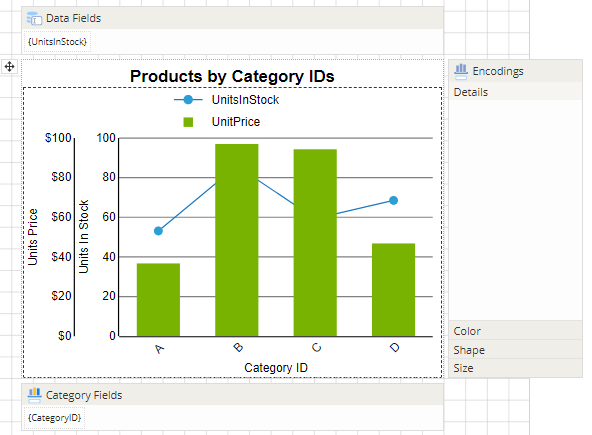
After you complete this tutorial, you will have a report that looks similar to the following.

Create Report Layout
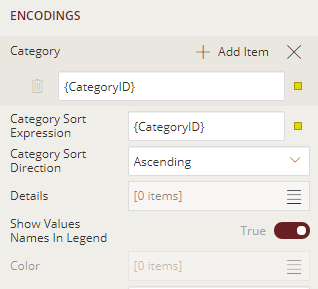
The report uses the Chart data region to display data. Drag and drop the Chart data region onto the design area of the report.
Define Plots
We will create a chart with two series plotted along the Y-axis. For that, we need to add two plots to the chart area.
Go to the Properties tab and click Show Items next to Plots property. You see that default Plot1 is already added.
Add one more plot and set its Name as 'Plot2'. Now you have two chart plots - Plot1 and Plot2.
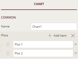
Let us now set the properties for the plots.
From the Report Explorer, select Plot - Plot1 and go to Properties tab.
In the Values property, click Show Items, and then select Add Item.
Click
 to display the Value properties.
Again, in the Values property, click Show Items, and select Add Item.
Click the radio button to display the fields and select UnitsInStock.
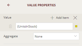
Note: You can now see that the UnitsInStock field is added to the Data Fields adorner.
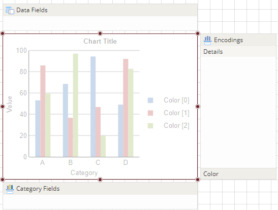
With Plot - Plot 1 selected, go to ENCODINGS - Category property and click Show Items, and then select Add Item.
Click the radio button to display the fields and select CategoryID.
Now, specify the sorting details for the category axis for Plot1. Click the radio button next to Category Sort Expression property and select 'CategoryID' from the list.
Then, in the Category Sort Expression property, click the drop-down and choose 'Ascending' from the list.
Set Show Values Names in Legend property to 'True'.
The encoding settings for Plot1 will now look as shown below.
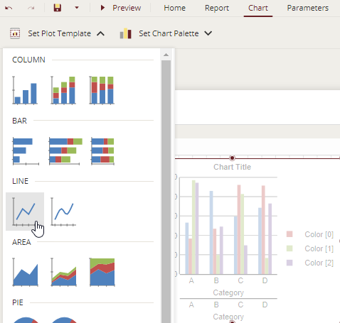
Go to Chart tab and from Set Plot Template, select 'Line'.
From the Report Explorer, select Plot - Plot2 and go to Properties pane to set the properties for Plot2.
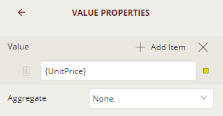
Similarly, set the Values property for Plot2 to UnitPrice as shown in the following image.
Go to ENCODINGS - Category property and click Show Items, and then select Add Item.
Click the radio button to display the fields and select CategoryID.
Now, specify the sorting details for the category axis for Plot2. Click the radio button next to Category Sort Expression property and select 'CategoryID' from the list.
Then, in the Category Sort Expression property, click the drop-down and choose 'Ascending' from the list.
Set Show Values Names in Legend property to 'True'.
The encoding settings for Plot2 will now look as shown below.
Go to Chart tab and from Set Plot Template, choose 'Column' (default template).
Note: The Data Set Name property of the chart is automatically set to Products data set.
Define Axes, Labels and Legends
From the Explorer
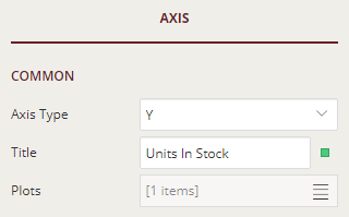
 , select Y Axis - [Plot 1].
Set the COMMON - Title property to 'Units In Stock'.
Similarly, select Y Axis - [Plot 2] and set COMMON - Title property to 'Unit Price'.
Set the LABELS - Format property to 'Currency'.

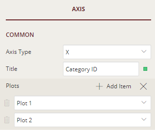
From the Report Explorer, select X Axis - Plot 1.
Set the Title of the X axis to 'Category ID'.
From the Properties pane, set Plots property to two plots as 'Plot 1' and 'Plot 2':
Set LABELS - Label Angle property to '-45' degrees.
From the Report Explorer, select Global Legend and set its Common - Position property to 'Top'.

Add Titles
Let us add titles to our chart, and to the X and Y axes.
From the Explorer
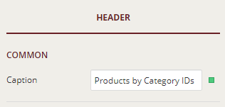
, select Header under Chart1 (or the name of your chart).
From the Properties pane, set the Caption property to 'Products by Category IDs'.
Customize the Appearance of the Report
Note: You may need to resize and reposition the chart control on the report to accommodate data, and for a cleaner look.
Set the font size for the chart title using the Text - Font Size property, let say, set the font size to 16pt.
Select a suitable color palette for the chart using the Set Color Palette tab available on the top of designer. In this example, we have chosen 'Cyborg'.
Customize the grid line settings for the chart plots using the MAJOR GRID - Style, MAJOR GRID - Color, and MAJOR GRID - Width properties.
Set the line color for the line chart for the Plot - Plot1 using the STYLE - Line Color property (Blue).
Change the TEXT - Format property for the UnitPrice field to 'Currency'. This property displays the price values in currency format.
Preview and Save Report
Click Preview to view your report in the final output.
Exit the preview mode by clicking Back on the top left side of the designer.
Click Save to open the Save dialog box. Enter the report name and click Save Report.