


- Getting Started
- Administration Guide
-
User Guide
- An Introduction to Wyn Enterprise
- Document Portal for End Users
- Data Governance and Modeling
- Working with Resources
- Working with Reports
-
Working with Dashboards
- Dashboard Designer
- Selecting a Dataset
- Data Attributes
- Dashboard Scenarios
- Dashboard Templates
- Component Templates
- 3D Scene
- Explorer
- Visualization Wizard
- Data Analysis and Interactivity
- Dashboard Appearance
- Preview Dashboard
- Export Dashboard
- Dashboard Lite Viewer
- Using Dashboard Designer
- Animating Dashboard Components
- Document Binder
- Dashboard Insights
- View and Manage Documents
- Understanding Wyn Analytical Expressions
- Section 508 Compliance
- Subscribe to RSS Feed for Wyn Builds Site
- Developer Guide
Candlestick EChart
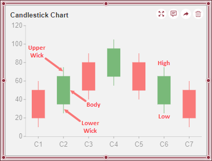
Candlestick ECharts are a type of financial charts used to monitor price fluctuations over a period of time and is useful in predicting market trends. Candlestick ECharts display price information such as the open, close, high, and low prices of an asset over time. These price values are depicted on a candlestick that has the following parts:
Body: The main rectangle in the candle-like symbol of the chart is known as the Body. The body is used to display the open and close prices during that time period.
Wicks: The lines extending from the top to the bottom of the body are known as the wicks (lower and upper). Wicks represent the highest or lowest prices traded in the defined time.
Moving Average Line (MA Line): The MA Line represents the average transaction price over a defined time. Its main purpose is to predict the market trend.
Two major market trends are represented in a Candlestick Chart,
Bullish: When the Close price is higher than the Open price, the market trend is bullish and, the body is generally represented in green or white color.
Bearish: When the Close price is lower than the Open price, the market trend is bearish and, the body is generally represented in red or black color.
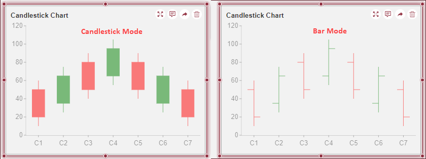
Wyn Enterprise supports Candlestick Charts in dashboard scenarios with two modes,
Candlestick: This is comprised of a candlestick-like body and wicks to represent the open, close, high, and low prices.
Bar: This is comprised of vertical lines along with small horizontal lines projecting from each side, with the opening price represented by the horizontal line on the left and, the closing price on the right.
In this help article you will find the following information;
Create a Candlestick EChart
To create a Candlestick EChart in Wyn Enterprise, navigate to the dashboard designer page and follow the instructions below,
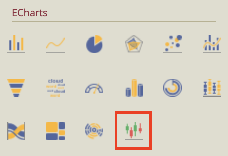
On the left-side menu, click the Custom Visualization icon to open the ECharts menu.

Find the Candlestick EChart from the menu and drag and drop it on the dashboard designer.
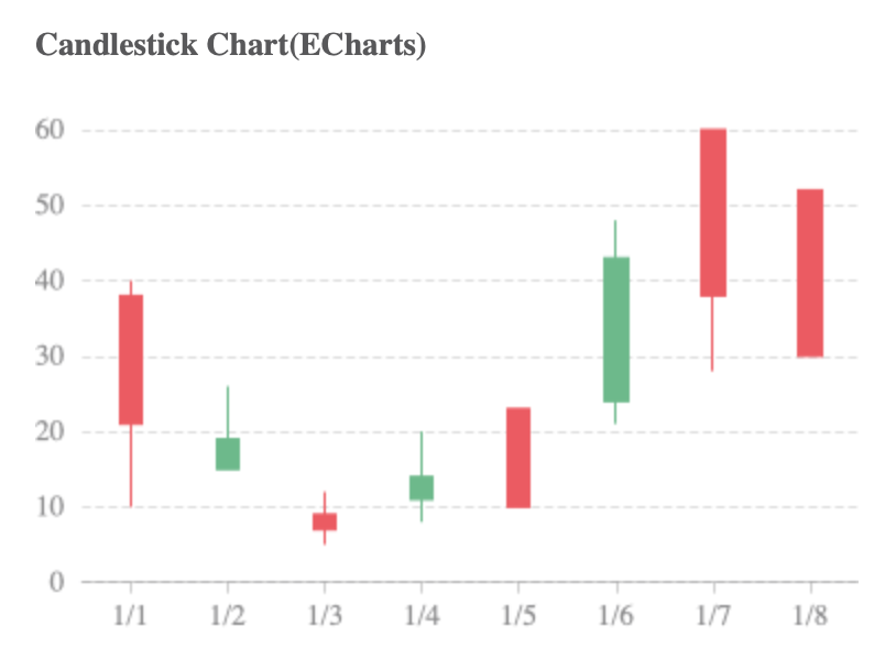
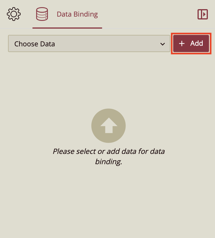
Your initial Echart should look like the image below.
On the right-hand side of the screen, you will find that this action has opened the Data Binding Tab. Select Add to select the data you want to bind to your EChart.
Upon selecting the data you want to use in the menu, drag and drop the values onto the data binding fields for Date, High, Low, Open, and Close, to set the dates, high price, low price, open price, and close price respectively.
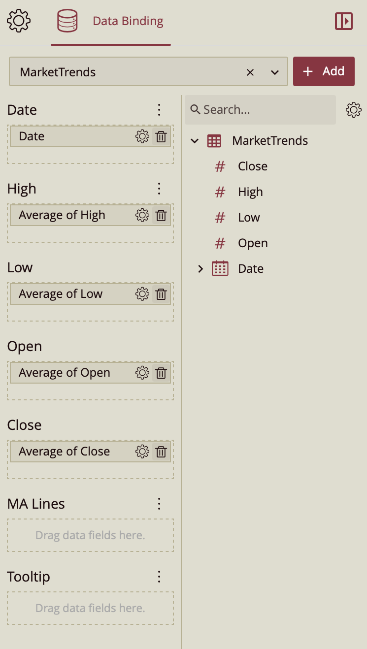
To add a moving average line to your chart, simply click on the gear icon
 next to the Average of Close data item and select Add MA Line from the dropdown.
Format Data Attributes
You can perform various operations in a Candlestick EChart to format the data attributes and control data display. Use the settings icon in the Data Field containers to format data attributes. The following operations are included in the Candlestick EChart scenario;
Aggregation Method: Use the Aggregation Method option to display a summarized value by aggregating multiple values of a data attribute. Aggregation Method supports Sum, Average, Max, Min, Count, and Distinct Count methods. See the Aggregation Method help article for more information.
Quick Functions: Use the Quick Functions option to highlight key indicators in your chart scenario by applying powerful calculations on measures. Quick Functions in Wyn Enterprise support Date-Based Functions, Ranking Calculation, Percentile Calculation, Running Calculation, Moving Calculation, and Original Value. See the Quick Functions help article for more information.
Filter: Use the Filter option to display relevant data in your chart scenario. See the Filter Data help article for more information.
Rename: Use the Rename option to change the name of a data attribute to make it comprehensible and meaningful. See the Rename a Data Attribute help article for more information.
Remove: Use the Remove option to remove a data attribute from the chart scenario.
Tooltip Setting: Use the Tooltip setting to customize the tooltips. You can customize the background image, color, and font style, add new data fields, modify the data fields, and modify expressions for data binding.
Analyze Data
Wyn dashboard scenarios support rich data analysis and exploration capabilities to help you analyze massive amounts of information and make data-driven decisions. The following analysis operations are available in the Action Bar corresponding to each scenario in the designer;
Filter: To filter out relevant data in your chart scenario. See the Filter Data help article, for information on using the filter options in a dashboard scenario.
Sort: To arrange the chart data in a more meaningful order. See the Sort help article for information on using the sort options in a dashboard scenario.
Conditional Visualization: To filter, compare, and rank the data in a dashboard scenario. See the Conditional Visualization help article for information on using various visualization options.
Data Binding: To modify the data binding of the dashboard scenario with new attributes use the Data Binding option. See the Modify Data Binding help article for more information.
Reference Line: To add a static line as a reference line on the chart use the Reference Line option. See the Reference Line help article for information on using various formatting options.
Customize Appearance
Navigate to the Inspector Panel to modify the settings as per your requirements. The properties of the Column EChart are listed and described below.
Chart Style
Property | Description |
|---|---|
Graph Opacity | Allows you to set the opacity level of the EChart. Its value ranges from 0% to 100%. |
Auto Gradient | To set the automatic color gradient in the chart, set the toggle item to True. By default, the value of this property is set False. |
Canvas Padding | Allows you to add padding between individual sides of the dashboard and the dashboard edges. |
Custom ECharts Option | Use the Custom ECharts Option to customize the chart using JavaScript code. |
Custom Behavior | Use the Custom Behavior option to directly write JavaScript code and use setTimeout/setInterval/myChart (echart instance), etc., to customize the behavior of the chart, to dynamically change the chart content in real-time. Refer to section the ECharts Custom Behavior for more details. |
Candlestick Style
Property | Description |
|---|---|
Mode | Allows you to set the display to either the traditional Candlestick chart or a Bar chart. |
Line Width | Allows you to specify the line width of the candlestick chart, i.e. the wicks. |
Candlestick Bar Width | Allows you to specify the width of the bar, i.e. the candlestick. |
Bullish Fill Color | Allows you to set the color of the bullish candlestick bar, i.e., when the closing price is lower than the opening price. The default color of this is green. To display your candlestick chart in the traditional black and white colors, set this color to white. |
Bullish Border Color | Allows you to set the color of the bullish border color, i.e. upper wick. The default color of this is green. To display your candlestick chart in the traditional black and white colors, set this color to black. |
Bearish Fill Color | Allows you to set the color of the bearish candlestick bar, i.e. when the close price is higher than the opening price. The default color of this is red. To display your candlestick chart in the traditional black and white colors, set this color to black. |
Bearish Border Color | Allows you to set the color of the bearish border color, i.e. the lower wick. The default color of this is red. To display your candlestick chart in the traditional black and white colors, set this color to black. |
Moving Average Style
Property | Description |
|---|---|
Maintain Color Assignments | To change the color assignments of the MA line, turn the toggle item to True and change the color of the MA line from the Palette property below. To use the default theme color, turn the toggle item to False. By default, the value of the Maintain Color Assignment property is set to False. |
Palette | Choose the palette for the color of the MA line. |
Line Style | Change the appearance of the line to that of a spline or a step. |
Line Type | Change the line type to either solid or dashed. |
Line Thickness | Set the line thickness. |
Show Null as | Choose to show null values as either connected, gaps, or zeros. |
Show Symbol | Choose to show the average value with a symbol. By default, this is set to False. The settings below appear when it is set to True. |
Symbol Shape | Set the symbol shape. Choose from circle, hollow circle, rectangle, rounded rectangle, triangle, or diamond. |
Symbol Size | Set the symbol size. |
Symbol Fill | Set the color of the symbol fill. |
Symbol Border Color | Set the color of the symbol border color. |
Symbol Border Width | Set width of the symbol border. |
Animation
Property | Description |
|---|---|
Entrance Animation | Select an option from the dropdown to set the animation style of the appearance of the chart scenario. After selecting an option from the dropdown, set the delay and duration of the animation using the Delay(s) and Duration(s) properties respectively. |
Automatic Carousel | To highlight the columns one at a time and display the tooltip, set the Automatic Carousel property to True. By default, this property is set to False. |
Data Visualization
Property | Description |
|---|---|
Include All Dimensions | To include the labels with Null values in the chart scenario, set this property to True. |
Show Zoom Axis | To display the Zoom Axis on the chart scenario set the Show Zoom Axis property to True. |
Interaction
Property | Description |
|---|---|
Scenario Name | Add a name to the chart scenario using this property. |
Cross Filter | To reflect the filtered data throughout the dashboard, set this property to True. Cross filters provide a simplified and deeper analysis of what you want to observe. |
Jump To | To create a shortcut to another dashboard scenario, report, or URL use this property. See the Jump To help article for more information. |
Auto Refresh | Set None, Polling, or Real Time option from the dropdown to refresh the chart data. Dropdown options are described below, None - Select None to disable auto-refresh of the chart data. Polling - Select Polling to enable auto refresh and set an interval to refresh chart data in the Refresh Interval property. |
Visible Menu Items | Select the filtering and sorting options you wish to display on the chart scenario from the dropdown. |
Pin Annotation | To pin the annotation to the chart scenario, set this property to True. By default, this property is set as False. |
Context Menu Actions | Select multiple Context Menu Options from the dropdown. Context Menu Options include - Keep, Exclude, Jump, and Add Data Monitoring. |
Click Action | Select None, Show Tooltip, Keep, Exclude, or Jump option from the dropdown to perform an action on click. |
Single Selection | Set to True if you want users to select only one parameter at a time for your dashboard. |
Title
Property | Description |
|---|---|
Show Title | To hide the title of the chart scenario set this property to False. By default, this property is set as True. |
Title | Add or edit the title of the chart scenario using this property. |
Alignment | Select the Left, Center, or Right alignment of the title. |
Title Font Setting | Set the font family, size, color, weight, and style of the title using the Title Font Setting options. |
Padding | To create space around the title of the chart scenario use the Padding property. It supports Padding Left, Padding Top, Padding Right, and Padding Bottom. Their values can be different. |
Tooltip
Property | Description |
|---|---|
Tooltip Mode | Set this property to Data Point to display the tooltip in the preview. The tooltip is a feature that allows you to display a certain value when you hover over your chart in the preview. For more information on setting up a tooltip, read the Customize Dashboard Tooltip help doc. |
Show Axis Pointer | Set to True to show the data point with regards to the X-Axis and/or Y-Axis. |
Axis Pointer Type | Select the axis pointer type you would like to display, whether that is a Line or Shadow. |
Line Type | Select the line type you would like to display with the tooltip, whether that is Solid or Dashed. This displays when you select a line axis pointer. |
Line Color | Select the color you want for the axis pointer. This displays when you select a line axis pointer. |
Line Width | Select the line width of the axis pointer. This displays when you select a line axis pointer. |
Shadow Color | Select the color you want for the axis pointer. This displays when you select the shadow axis pointer. |
Axis Category
Property | Description |
|---|---|
Show Axis | To hide the Category (X) Axis, set this property to False. By default, this property is set as True. |
Axis Position | Select the Zero, Bottom, or Top option from the dropdown to set the position of the Category (X) Axis. |
Show Axis Line | To hide the Category (X) Axis line, set this property to False. By default, this property is set as True. |
Axis Line Type | Select the Solid or Dashed line type for the Category (X) Axis line from the dropdown. |
Axis Line Color | Set the color of the Category (X) Axis line using this property. |
Axis Line Width | Set the Category (X) Axis line width using this property. |
Show Grid Lines | To show the grid line of the Category (X) Axis, set this property to True. By default, this property is set as False. |
Show Split Area | To highlight the split area on the chart, set the Show Split Area property to True. By default, the property is set to False. |
Show Tick Labels | To hide the tick labels of the Category (X) Axis, set this property to False. By default, this property is set as True. |
Label Direction | Select the Horizontal, Vertical, or Diagonal option from the dropdown to set the direction of the Category (X) Axis labels. |
Label Overflow Setting | Select the Hide, Ellipsis, or Wrap option from the dropdown for the overflowing text of the labels. |
Show Tick Marks | To hide the tick marks of the Category (X) Axis, set this property to False. By default, this property is set as True. |
Show Title | To show the title of the Category (X) Axis, set this property to True. By default, this property is set as False. |
Axis Font Setting | Set the font family, size, color, weight, and style of the Category (X) Axis labels using the Axis Font Setting options. |
Value Axis
Property | Description |
|---|---|
Show Axis | To hide the Value (Y) Axis, set this property to False. By default, this property is set as True. |
Max Value | Set the maximum value of the Value (Y) Axis labels using the Max Value property. |
Min Value | Set the minimum value of the Value (Y) Axis labels using the Min Value property. |
Interval | Set the interval between two labels of the Value (Y) Axis using the Interval property. |
Reversed | To reverse the appearance of the chart scenario, set this property to True. By default, this property is set as False. |
Axis Position | Select the Left or Right option from the dropdown to set the position of the Value (Y) Axis. |
Show Axis Line | To hide the Value (Y) Axis line, set this property to False. By default, this property is set as True. |
Show Grid Lines | To show the Value (Y) Axis grid line, set this property to True. By default, this property is set as False. |
Grid Line Type | Select Solid or Dashed type of grid lines for the Value (Y) Axis from the dropdown. |
Grid Line Color | Set the color of the grid lines of the Value (Y) Axis. |
Grid Line Width | Set the width of the grid lines of the Value (Y) Axis. |
Show Split Area | To highlight the split area on the chart, set the Show Split Area property to True. By default, the property is set to False |
Show Tick Labels | To hide the tick labels of the Value (Y) Axis, set this property to False. By default, this property is set as True. |
Format | Set a general, number, currency, percentage, or custom format for the labels of the Value (Y) Axis. |
Display Unit | Select a display unit option from the dropdown. The available options are Auto, None, Thousands, Millions, Billions, and Trillions. |
Label Direction | Select the Horizontal, Vertical, or Diagonal option from the dropdown to set the direction of the Value (Y) Axis labels. |
Show Tick Marks | To hide the tick marks of the Value (Y) Axis, set this property to False. By default, this property is set as True. |
Show Title | To show the title of the Value (Y) Axis, set this property to True. By default, this property is set as False. |
Axis Font Setting | Set the font family, size, color, weight, and style of the Value (Y) Axis labels using the Axis Font Setting options. |
Legend
Property | Description |
|---|---|
Show Legend | Set the value to True to display the chart legend. |
Special Data
Property | Description |
|---|---|
Show Null As | Allows you to replace missing or undefined values with a placeholder. |
Show Blank As | Allows you to replace values left empty with a placeholder. |
No Data Content
Property | Description |
|---|---|
Content | Set the display content in case no data is found in the chart scenario. |
Text Align | Select the Left, Right, or Center option from the dropdown to align the no data content text. |
Vertical Align | Set the vertical alignment of the no-data content. |
Font | Set the font family, size, color, weight, and style of the no-data content using this property option. |
Background Image | Add an embedded, shared, or external image as a background image for the no-data content. |
Layout
Property | Description |
|---|---|
X Position | Set the horizontal position of the chart scenario using the X Position property. |
Y Position | Set the vertical position of the chart scenario using the Y Position property. |
Width | Set the width of the chart scenario using this property. |
Height | Set the height of the chart scenario using this property. |
Appearance
Property | Description |
|---|---|
Background Color | Set a background color of the chart scenario using this property. |
Padding | To create space around the chart scenario, set a padding value. |
Margin | Set the margin value for the chart scenario using this property. |
Visibility | To hide the chart from the dashboard scenario, set this property to False . By default, the Visibility property is set as True. |
Background Image | Add an embedded, shared, or external image as a background image to the chart scenario. |
Border Color | Set the border color using this property. |
Border Width | Set the border width using this property. |
Border Radius | Set the border radius using this property. |
Shadow | Add a shadow using this property. |