-
Interactive DashboardsCreate interactive BI dashboards with dynamic visuals.
-
End-User BI ReportsCreate and deploy enterprise BI reports for use in any vertical.
-
Wyn AlertsSet up always-on threshold notifications and alerts.
-
Localization SupportChange titles, labels, text explanations, and more.
-
Wyn ArchitectureA lightweight server offers flexible deployment.
-
 Wyn Enterprise 7.1 is ReleasedThis release emphasizes Wyn document embedding and enhanced analytical express...
 -
 Choosing an Embedded BI Solution for SaaS ProvidersAdding BI features to your applications will improve your products, better serve your customers, and more. But where to start? In this guide, we discuss the many options.
-
Visual GalleryInteractive sample dashboards and reports.
-
BlogExplore Wyn, BI trends, and more.
-
WebinarsDiscover live and on-demand webinars.
-
Customer SuccessVisualize operational efficiency and streamline manufacturing processes.
-
Knowledge BaseGet quick answers with articles and guides.
-
VideosVideo tutorials, trends and best practices.
-
WhitepapersDetailed reports on the latest trends in BI.
-
 Choosing an Embedded BI Solution for SaaS ProvidersAdding BI features to your applications will impr...
 -

- Getting Started
- Administration Guide
-
User Guide
- An Introduction to Wyn Enterprise
- Document Portal for End Users
- Data Governance and Modeling
- View and Manage Documents
- Working with Resources
- Working with Reports
- Working with Dashboards
- Working with Notebooks
- Wyn Analytical Expressions
- Section 508 Compliance
- Subscribe to RSS Feed for Wyn Builds Site
- Developer Guide
Tour the Dashboard Designer
Here is a video walkthrough of our Dashboard Designer.
Dashboard Designer Elements
The dashboard designer comprises five main elements and sections.
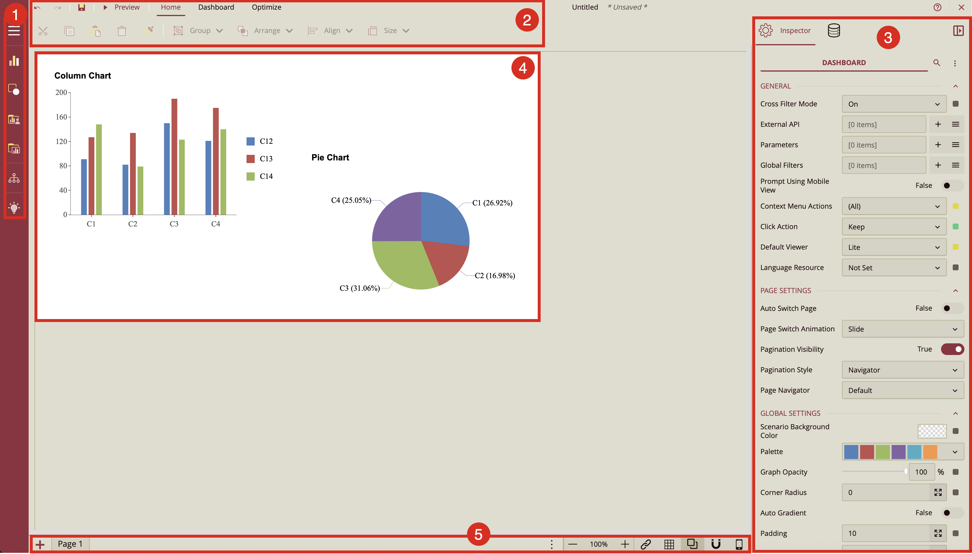
Dashboard Toolbox
The Dashboard Toolbox contains the visualizations that you can drop to the dashboard canvas to work with the dashboard elements. The toolbox can be pinned or set to auto-hide to give the dashboard canvas more space. It contains the following elements:
Data Visualization: Provides a selection of charts, indicators, maps, and slicers, allowing for intuitive drag-and-drop integration into the designer.
Custom Visualization: Offers a selection of charts from the open source ECharts visualization library that can be easily dragged and dropped onto the designer.
Component Template: contains any preformatted scenarios that you have saved as components. You can drag and drop them onto the designer of new dashboards, like other visualizations. Component Template. Please note: Visual Gallery is replaced by Component Template from Wyn 7.0.
Explorer: The explorer displays a tree of all the visualizations and containers that are on your dashboard. You can search for and select any of the visualizations or containers. For more details, refer to Explorer.
Visualization Wizard: Click here to access the Visualization Wizard, a tool that automatically generates an optimal scenario based on the selected data values, making it ideal for new users without prior BI tool experience. For more details, refer to Visualization Wizard.
Menu Bar
The menu bar that the top of the designer has few buttons and two tabs (Home and Dashboard) that enable working the dashboards. In the first row of the menu bar, we have the following buttons:
Undo: Undo an action in the designer.
Redo: Redo an action in the designer.
Save: Save a dashboard in the designer.
Preview: Preview the dashboard in the designer.
Home Tab
The Home tab has the following document editing options.
Cut: Cut the dashboard scenario(s) in the designer.
Copy: Copy the dashboard scenario(s) in the designer.
Paste: Paste the dashboard scenario(s) in the designer.
Delete: Delete the dashboard scenario(s) in the designer.
Format Painter: With a scenario selected, click the Format Painter, then select a second scenario to apply the same formatting. Refer to Format Painter for details.
Group: Select two or more scenarios and use this menu to group or ungroup them.
Arrange: Arrange the position of the scenario(s) to front or back in the canvas.
Align: Align a group of select scenarios on the left, right, middle, top, and bottom of the first selected item.
Size: The Size menu is used to quickly set equal dimensions of multiple components on the designer. Select two or more scenarios and use the Size menu to adjust the size of the selected scenarios. See the Layout and Alignment help article for more information on resizing multiple scenarios in Wyn.
Dashboard Tab
In the Dashboard tab, we have the following settings:
Document Settings: Allows you to specify properties for the dashboard, such as general, document appearance, layout, and global settings.
Data Binding: Opens the Data Binding panel. For more details, refer to the following article: Dashboard Data Binding
Theme: Change the theme of your dashboard (this, by default, applies to all scenarios).
Optimize Tab
The Optimize tab provides controls that help improve dashboard-building performance when working with DirectQuery datasets, especially those containing large volumes of data.
Pause Refresh Scenarios – Temporarily stops scenarios from automatically reloading data whenever you make design changes. This allows you to adjust layouts, formatting, or configuration without triggering costly data queries. When paused, data is only refreshed during Preview or when manually requested.
Refresh Current Page – When refresh is paused, this option reloads data for all scenarios on the currently active page.
Refresh Selected Scenarios – When refresh is paused, this option reloads data only for the scenarios you choose.
Use the Optimize tab to prevent unnecessary performance slowdowns during dashboard design, loading data only when you need to verify results.
Inspector and Data Binding Panels
You can switch between these two panels by clicking the required tab in the designer.
Data Binding: This panel is where you select the datasets or data models that you will bind to your dashboard. It is also used to set the data binding properties of the selected scenario.
Inspector: You can set the appearance and properties of the scenario through the items in the Inspector panel, which mainly includes setting the chart style, data settings, titles, legend, appearance styles, labels, and layout.
Due to the large number of properties each scenario or dashboard has, it sometimes becomes difficult to find a specific property. You can search for properties in Inspector panel,
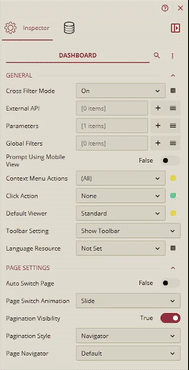
You can also use the Expand All or Collapse All button to collapse and expand property groups.
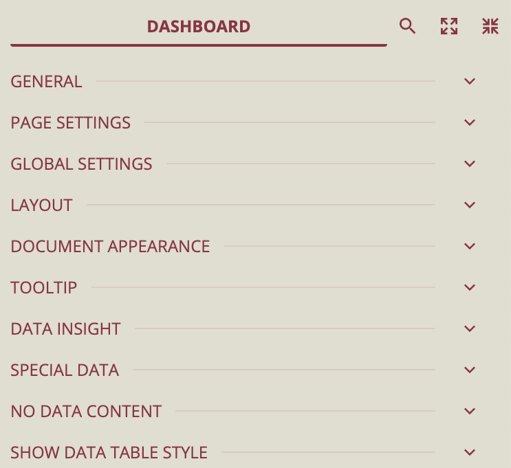
To collapse the scenario property group, select the scenario, click the Collapse All option. All the properties will be collapsed.
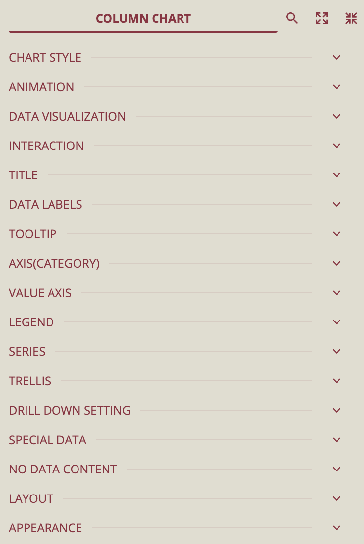
You can click on a property group's Expand/Collapse icon, Category Name, or Split Line to expand that property group.
Design Area
This is the main area of the dashboard designer, where you create and edit the dashboard by dragging and dropping scenarios from the Toolbox onto the design area and editing their properties in the Inspector and Data Binding panels. Refer to the Position Components topics to find out to use the tools available in the designer to accurately position scenarios on the dashboard canvas.
Page Setup Bar
Page Setup Bar: Allows you to add new pages, navigate between pages, zoom in/out, manage the Interaction Settings between slicers and other scenarios, show grid line, enable overlap, manage snap to grid/snap to guides, snap to guides, and switch to the mobile designer.
Add Page: Add a new page in the dashboard. See the Add Pages help article for more information on adding new blank page or new page from dashboard templates.
Navigation Button: Switch between multiple pages in a dashboard.
Zoom: Change the zoom percentage of the design area by clicking the zoom-in and zoom-out buttons.
Interaction Setting: Click this button to manage the interactivity between slicers and scenarios.
Show Grid Line: Displays or hides the grid lines in the design area.
Enable Overlap: Enables overlapping of the scenarios in the dashboard.
Snap:
Snap to Grid enables the scenarios to automatically snap to the closest grids when you drag them onto the design area. You can move the components using the keyboard arrow keys.
Snap to Guides allows you to align visuals across dashboard sections by displaying dynamic alignment lines that help match positions, sizes, and spacing between elements.
Mobile Designer: Allows you to switch to the mobile designer view of the dashboard designer. The default is Web Designer. See the Mobile Designer help doc for more information.