- Getting Started
- Administration Guide
- User Guide
- Developer Guide
Dashboard Designer
Wyn Dashboards Designer provides a friendly user interface to create highly interactive dashboards. It makes it easy for the users to create and edit the dashboards without any prior knowledge.
Here is a video walkthrough of our Dashboard Designer.
Dashboard Designer Elements
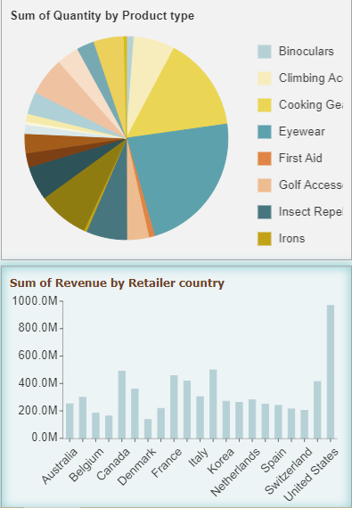
Wyn Dashboards Designer contains Toolbox, Menu bar, Data Binding and Properties panels, Design area, and a Page Setup bar as shown in the following image.
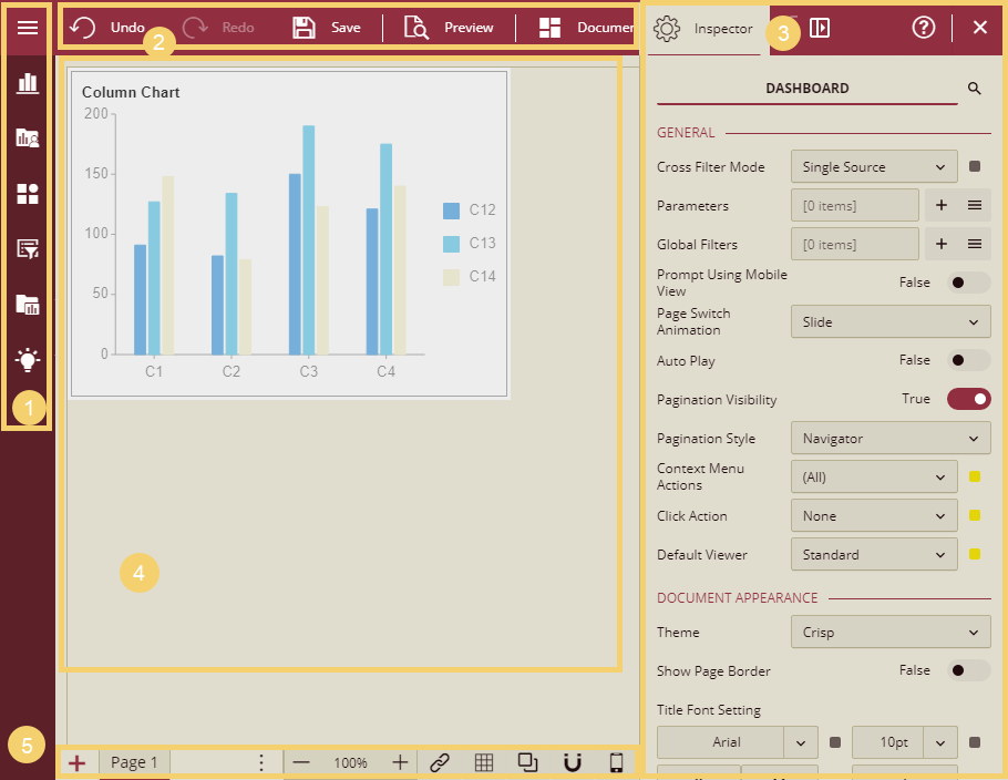
Dashboard Toolbox: Contains scenarios, components, and slicers to build dashboards.
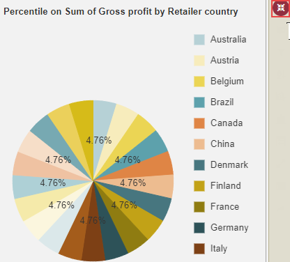
- Data Visualization: Contains built-in scenarios such as charts, tables, maps, etc.
- Custom Visualization: Contains user-defined scenarios.
- Components: Contains components such as containers, tab containers, rich text, and image, that organize the data in the dashboards.
- Slicers: Contains label slicer, multi-dimensional slicer, multi-dimensional dropdown slicer, data range slicer, and relative dates slicer, that are used to filter the data dynamically.
- Visual Gallery: Lists the widgets (scenarios, containers, and grouped components) available in other dashboards that you can reuse in the current dashboard. The copied widget (dashboard scenario, container, or grouped component) retains all the settings of the initial widget such as title, appearance, data binding, and others. For details about reusing the widgets, refer topic Visual Gallery.
- Visualization Wizard: Generates smart scenarios for better data visualization. This is extremely beneficial for the new users who have no prior knowledge of the BI tools.
Menu Bar: It allows you to undo and redo actions, save a dashboard, preview dashboard, and specify document settings.
- Undo: Undo an action in the designer.
- Redo: Redo an action in the designer.
- Save: Save a dashboard in the designer.
- Preview: Preview the dashboard in the designer.
- Document Settings: Allows you to specify properties for the dashboard such as general, document appearance, layout, and global settings.
Data Binding and Inspector Panels: You can switch between these two panels by clicking the required tab in the designer.
Data Binding: This panel contains the dataset and associated data attributes, and the data binding area. In the databinding area, you bind the data to the scenarios, and set the properties associated with measures and dimensions. It should be noted that each dashboard scenario has a set of data sections, such as Values for Chart and Pivot table; Columns, and Rows for KPI Matrix and Pivot table; and Columns for Slicers.
Inspector: This panel contains the properties of the selected scenario in the designer to enhance its appearance.
Use the Collapse/Expand toggle button to collapse and expand the panels in the designer.
Design Area: Create and edit dashboards by simply dragging and dropping the scenarios from the Toolbox into the design area.
Page Setup Bar: Lets you add new pages, set zoom percentage, switch between multiple pages, etc.
- Add Page: Add a new page in the dashboard.
- Navigation Button: Switch between multiple pages in a dashboard.
- Zoom: Change the zoom percentage of the design area by clicking the zoom-in and zoom-out buttons.
- Interaction Setting: Set a relationship between scenarios in the dashboard.
- Show Grid Line: Displays or hides the grid lines in the design area.
- Enable Overlap: Enables overlapping of the scenarios in the dashboard.
- Snap: Enables the scenarios to automatically snap to the closest grids and guides when you drag them in the design area. You can move the components using the keyboard arrow keys.
- Mobile Designer: Switch to the mobile designer view of the dashboard designer. The default is Web Designer. See this help doc to learn more about using the Mobile Designer for your dashboard scenarios.
Dashboard Component Operations
This section will explain the basic operations of dashboard components, which will help you in creating the dashboards. Listed below are the basic operations.
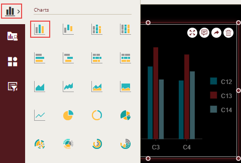
Adding a Component
From the Dashboard Toolbox, open the Data Visualization node, to add a component. A list of built-in scenarios such as charts, tables, maps, etc. is displayed. Select the desired component and simply drag and drop it into the design area.
Selecting Multiple Components
You can select multiple components in the design area and set their common properties like the Appearance, Title, etc. on the Inspector tab. There are two ways for selecting the components:
- Ctrl key + Mouse click.
- Drag the mouse to select a frame.
Adjusting the Position of a Component
You can adjust the positioning of the component by selecting the component and dragging it to the target position and then releasing the mouse button.
Swap Positions
You can exchange the positions of the components in the design area. To exchange the positions, select two components, then right-click and select the Swap Positions option.
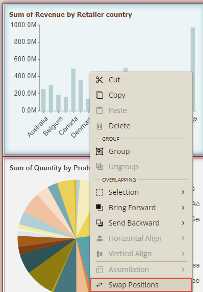
The position of the components will be exchanged.
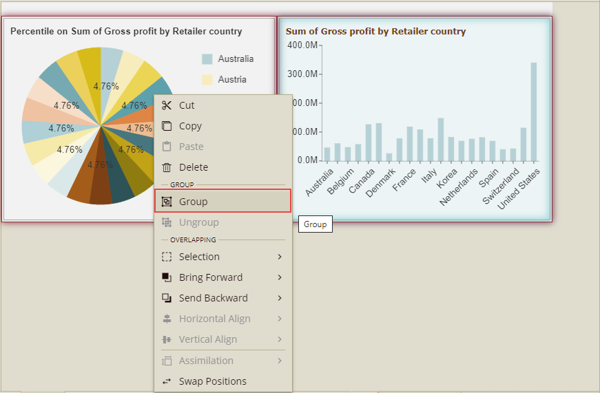
Group/Ungroup Components
In various cases, you might use multiple components in a dashboard to display the same kind of analysis. So, in such cases, you can combine multiple components together which will be more convenient for further operations.
Group: To combine multiple components, select the components by mouse frame selection or by mouse click + keyboard CTRL method, and then right-click and select the option, Group.
You can also select the individual component in the group. For this, click any component in the group to select the combination, and then click the particular component again to select it.
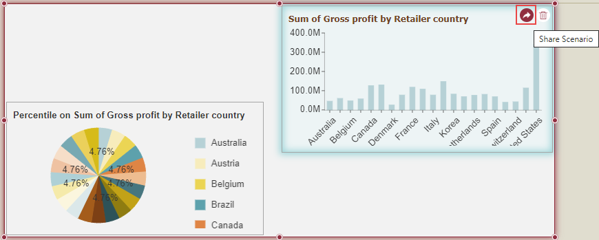
Example: In the image below, there are two components (1 and 2) grouped together. Click component 1. Both the components are selected as a group.
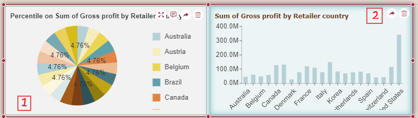
Now again click component 1. Component 1 will be selected individually in that group, and you can move, resize, scale, etc. this component in the group.
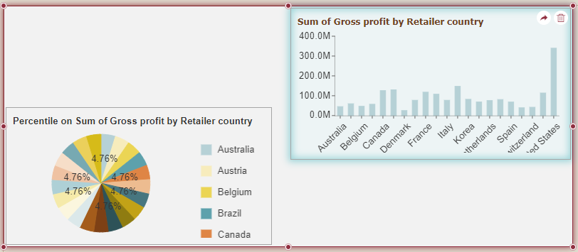
If you again want to select components 1 and 2 as a group, then just click outside the component and again click any component, it will be selected as a group.
You can also integrate this group into other applications through URL and DIV.
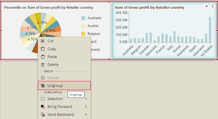
Ungroup: You can ungroup the grouped components. Select the group, right-click the mouse, and select the option Ungroup.
Cut, Copy, Paste, and Delete Components
Select the component(s), right-click the mouse, and select the corresponding operation.
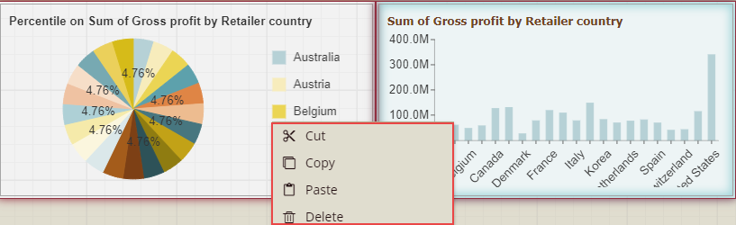
Alternatively, you can use keyboard shortcuts to operate: Ctrl+C→copy; Ctrl+X→cut, Ctrl+V→paste, Delete key→delete.
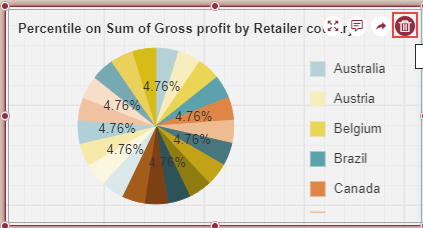
When only one component is selected, then you can delete it by clicking the delete icon in the upper right corner of the component.
Focus On a Component
This option lets you focus on an individual dashboard component. Click the Focus icon in the upper right corner of the component, to enter the focus mode.
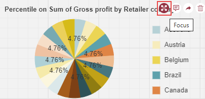
In focus mode, the entire editing area displays only the currently focused component. Click Back to Designer, to exit the focus mode.