


- Getting Started
- Administration Guide
-
User Guide
- An Introduction to Wyn Enterprise
- Document Portal for End Users
- Data Governance and Modeling
- Working with Resources
- Working with Reports
- Working with Dashboards
- View and Manage Documents
- Understanding Wyn Analytical Expressions
- Section 508 Compliance
- Subscribe to RSS Feed for Wyn Builds Site
- Developer Guide
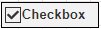
CheckBox
CheckBox control is used to represent a Boolean value in a report. It has two parts: "Icon" and "Text", as shown below in the following figure.
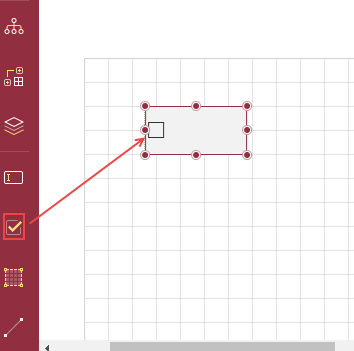
To add a CheckBox in a Report Designer
Follow the below steps to add a Checkbox.
From the Report Toolbox on the left, drag and drop the CheckBox control onto the design area.
To add the text directly into the control, double-click the CheckBox control and enter text. Alternatively, you can enter the text in the Text field on the Properties tab under the Common section. You can also select the fields and bind the fields to the dataset.
You can format text in the CheckBox control using the toolbar or you can modify using the Properties tab.
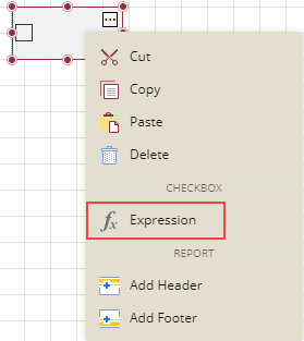
You can use expressions also in the checkbox. Right-click the checkbox and select the option Expression.
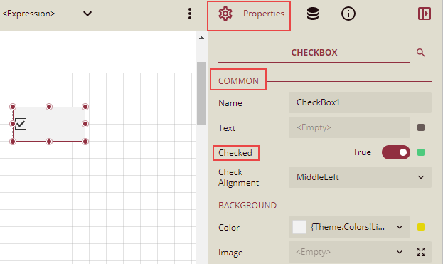
Select the check box and set the Checked option on the Properties tab under the section Common to True to be checked, and set it to False to be unchecked. If the Checked option is set to True, then a small box appears with a tick mark in it; and if the Checked option is set to False, then the box is empty. By default, the checkbox is empty without any tick mark.
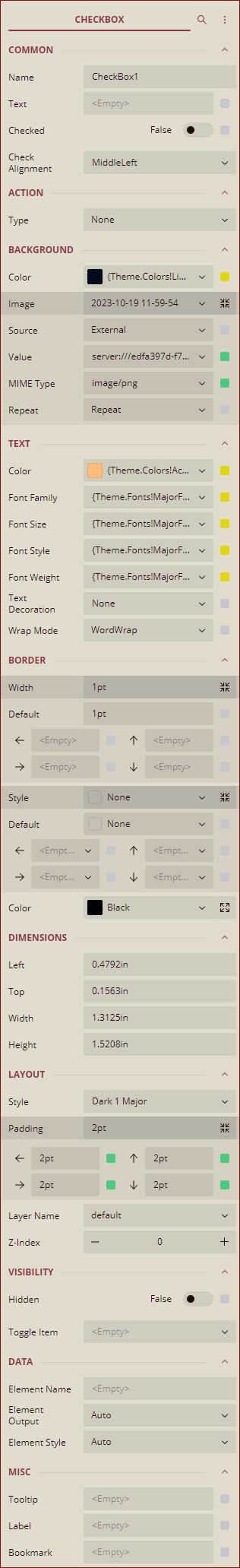
Inspector Panel Properties
The Inspector Panel properties of the CheckBox control are listed and described in the below tables.
Common
Property | Description |
|---|---|
Name | Sets the name of the selected checkbox. |
Text | Enter the text to be displayed in the checkbox box. You can enter text directly, or click to select a field, add an expression, and so on. |
Checked | This sets whether the checkbox will be checked or not. You can set it to True to select the checkbox and set it to False to be unchecked. |
Check Alignment | This sets the alignment of the checkbox text and icon within the control area. |
Action
Property | Description |
|---|---|
Type | This sets the action to be taken when clicking on the checkbox. The dropdown list has five options. None: This option means no action is to be taken. Apply Parameters: This option is used to re-render the report with new parameters. Choose the Apply Parameters option from the dropdown, click + Add, select a parameter, and action type, and name the action. The action types are explained below: Set: Used to set a specific value to a specific parameter. Toggle: Used to add or remove value to the multi-value parameter collection. Reset: Used to reset the parameter to its default value. See the Apply Parameters section for more information. Jump to Report: This option allows you to jump from the current report to another report. You can link any text in the report. When a user clicks the linked text, it will jump to the report linked with that text. Jump to Bookmark: This option is used for jumping within the current report. You can define the bookmark and then select the jump to bookmark settings, to make it easier to jump between report content. You can bookmark any element in the report to make it a destination anchor for the jump. Jump to URL: This option is used to jump to an external web page. |
Background
Property | Description |
|---|---|
Color | This option sets the background color of the checkbox. You can select the color by clicking the dropdown list. |
Image | This option sets the background image of the checkbox. Click the dropdown list to select the image source: Shared refers to the images uploaded on the portal. Embedded refers to the new images you can select and upload here. Database refers to the database graphics field. Click the Expand |
Source | This is the source from which the image is coming. |
Value | This refers to the image selected from the source. Example: If the image source is "Shared", then you need to select the specific shared image here. |
MIME Type | This refers to the image format like png, gif, etc. |
Repeat | This defines how the image is covering the textbox. It has four options. Repeat: This option repeats the image both height-wise and width-wise until the background area is covered. NoRepeat: When this option is selected, then the image is not repeated and is displayed only once. RepeatX: This option repeats the picture horizontally (width-wise). RepeatY: This option repeats the picture vertically( height-wise). |
 icon to display more image properties: Source, Value, MIME Type, Repeat.
Text
Property | Description |
|---|---|
Color | Select the font color of the text data in the checkbox. |
Font Family | Select the font family of the text data in the Checkbox. |
Font Size | Select a font size from the dropdown. |
Font Style | Select a style option for the text data in the checkbox. |
Font weight | Select a font weight to display the text data in the checkbox. |
Text Decoration | Select a decoration option for the text data in the checkbox. |
Wrap Mode | Select the text wrap mode for the text data in the checkbox to fit into the available width. |
Border
Property | Description |
|---|---|
Width | You can set the width of the checkbox border using this option. By clicking the Expand option, you can set the width of the border of all the sides of the checkbox in case required. |
Style | Select the border style from the dropdown list. By clicking the Expand option, you can set the style of the border of all the sides of the checkbox in case required. |
Color | Select the border color from the dropdown list. By clicking the Expand option, you can set the color of the border of all the sides of the checkbox in case required. |
Dimensions
Property | Description |
|---|---|
Left | This option sets the distance to be maintained from the upper left side of the checkbox horizontally. |
Top | This option sets the distance to be maintained from the top of the checkbox vertically. |
Width | This option sets the width of the checkbox. |
Height | This option sets the height of the checkbox. |
Layout
Property | Description |
|---|---|
Style | This option sets the theme of the checkbox in the report. |
Padding | Padding refers to the space between the checkbox content and the border. You can set the padding from - Top: Sets the top padding in points, Left: Sets the left padding in points, Right: Sets the right padding in points, Bottom: Sets the bottom padding in points. |
Layer Name | Sets the report layer. |
Z-Index | This property sets the position of the checkbox when there are multiple checkboxes that are stacked together. The checkbox with a greater Z-Index value will always be in front of the checkbox that has a lower Z-Index value. |
Visibility
Property | Description |
|---|---|
Hidden | This option sets whether to hide the checkbox or not on the preview. |
Toggle Item | Visibility can be toggled by another report item. This option sets another item, as a toggle button to whether display the current checkbox or not. |
Data
Property | Description |
|---|---|
Element Name | You can enter a name to be used in the XML output for this checkbox. |
Element Output | You can select Auto, Output, or NoOutput to decide whether to include this checkbox in the XML output or not. Auto exports the contents of the checkbox only when the value is not a constant. |
Element Style | You can select Auto, AttributeNormal, or ElementNormal to decide whether to render checkboxes as Attributes or Elements in the exported XML file. Auto uses the report's setting for this property. |
Misc Options
Property | Description |
|---|---|
Tooltip | Sets the textual label of the checkbox when the mouse is moved over the cell. |
Label | Sets a text content that is used as display text for report catalog items. The report catalog is made using the Table of Contents element in the toolbox, and the table of contents is used for quick positioning jumps in multi-page reports. |
Bookmark | Enter text or an expression to use as a positioning identifier to jump to this element. You can define the bookmark and then select the "jump to bookmark" setting, to make it easier to jump between report content. You can bookmark any element in the report to make it a destination anchor for the jump. |
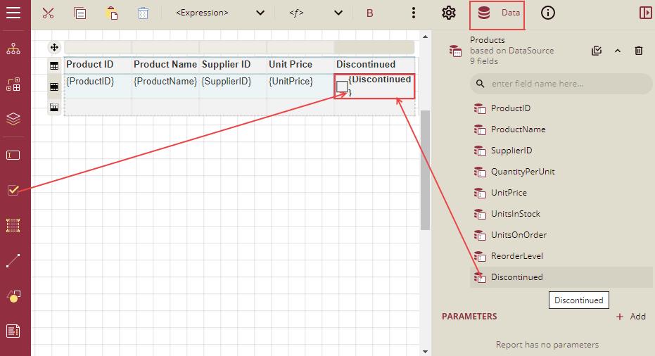
Example: In the below example, we will create a report that displays information on products that are Discontinued. The checkbox against the products that are discontinued will be checked in the table.
Follow the steps below to create this report using the Checkbox control:
Drag and drop a table on the report designer and bind it to the dataset.
Drag and drop the desired data fields in the table.
Add another column to the right of the last column( Unit Price) and drag a Checkbox control in the details cell.
Now drag and drop the data field Discontinued in this checkbox control.
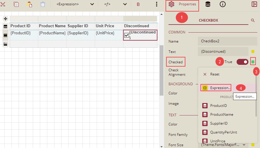
Select the checkbox control and go to the Properties tab. Under the section Common, set the Checked property to True click the Data Binding option, and then click the Expression option from the list.
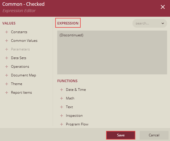
Expression Editor is displayed. Write the field name Discontinued in the expression editor and click the Save button.
Now you can format the report and click Preview. The report will look similar to the one shown below.
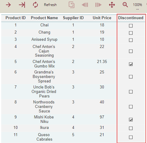
So, we can see that in the product list, the products that are discontinued have checkboxes that are checked under the column Discontinued.