- Getting Started
- Administration Guide
-
User Guide
- An Introduction to Wyn Enterprise
- Document Portal for End Users
- Data Governance and Modeling
- Working with Resources
- Working with Reports
- Working with Dashboards
- View and Manage Documents
- Understanding Wyn Analytical Expressions
- Section 508 Compliance
- Subscribe to RSS Feed for Wyn Builds Site
- Developer Guide
Input Field
In Wyn Enterprise, the Input Field control is used to provide editable fields in an exported PDF. The Input Field control can be of two types: Text or CheckBox which can be chosen from the Type property of the Inspector Panel.
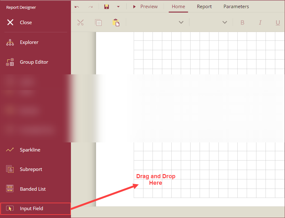
To add an Input Field control to a report, navigate to the Report Designer and follow the below instructions:
Drag and drop the Input Field control onto the design area from the Designer Toolbar.

Using the Inspector Panel on the right side of your screen, customize the appearance of the Input Field control. See the Inspector Panel Properties section for more information on the properties of the Input Field control.

Inspector Panel Properties
Common
Property | Description |
|---|---|
Name | Add a unique name to the Input Field control. Special characters such as period (.), space ( ), forward slash (/), backslash (\), exclamation marks (!), and hyphens (-) are not supported. You can use an underscore (_) in the name of the control. |
Input
Property | Description |
|---|---|
Type | Select a type of form field from the dropdown. The following two options are available - Text and CheckBox. The Type specific properties are explained in the Input Type - Text and Input Type: CheckBox sections. |
Field Name | Add a unique name to the field to be displayed in the resulting PDF. |
Read-Only | To prevent users from changing the content in the resulting PDF, set this option to True. By default, this option is set to False. |
Required | To force the users to fill in the selected input field, set this property to True. By default, this property is set to False. |
Input Type - Text
Property | Description |
|---|---|
Value | Enter a value or an expression to display as the value of the Input Field control. |
Max Length | Set the maximum length of the text that can be entered in the Input Field. The text is not restricted to any specific length when this property is left empty. |
Spell-Check | To spell-check the text in the Input Field, set this property to True. By default, this property is set to False. |
Multiline | To allow the text to break into multiple lines in the exported PDF file, set this property to True. By default, this property is set to False. |
Password | To display the user entered text as a series of asterisks, set this property to True. By default, this property is set to False. |
Input Type - CheckBox
Property | Description |
|---|---|
Checked | To display the checkbox as checked, set this property to True. By default, this property is set to False. |
Check Style | Select the style of the check symbol inside the CheckBox from the dropdown. The following options are available in the dropdown: Check, Circle, Cross, Diamond, Square, and Star. |
Check Size | Select the size of the check symbol from the dropdown. |
Background
Property | Description |
|---|---|
Color | Select the background color of the Input Field control. |
Border
Property | Description |
|---|---|
Width | Set the width of the borderline ranging from 1pt to 20pt. |
Style | Select a style for the border from the following options: None, Dashed, Solid, and Inset. |
Color | Select a color for the borderline. |
Text
Property | Description |
|---|---|
Color | Select a color for the text in the Input Field control. |
Font Family | Select a font family for the text in the Input Field control. This option is available only when the Type property under the Input section is set to Text. |
Font Size | Select the size of the font for the text in the Input Field control. This option is available only when the Type property under the Input section is set to Text. |
Font Style | Select a font style for the text in the Input Field control. This option is available only when the Type property under the Input section is set to Text. |
Font Weight | Select the thickness of the text in the Input Field control. This option is available only when the Type property under the Input section is set to Text. |
Format | Select a numeric format from the dropdown to apply to the text in the Input Field control. This option is available only when the Type property under the Input section is set to Text. |
Dimensions
Property | Description |
|---|---|
Left | Set the left margin of the Input Field control. |
Top | Set the top margin of the Input Field control. |
Width | Set the width of the Input Field control. |
Height | Set the height of the Input Field control. |
Layout
Property | Description |
|---|---|
Style | Select a color theme for the Input Field control from the dropdown. |


