- Getting Started
- Administration Guide
-
User Guide
- An Introduction to Wyn Enterprise
- Document Portal for End Users
- Data Governance and Modeling
- Working with Resources
- Working with Reports
-
Working with Dashboards
- Dashboard Designer
- Selecting a Dataset
- Data Attributes
- Dashboard Scenarios
- Dashboard Templates
- Component Templates
- 3D Scene
- Explorer
- Visualization Wizard
- Data Analysis and Interactivity
- Dashboard Appearance
- Preview Dashboard
- Export Dashboard
- Dashboard Lite Viewer
- Using Dashboard Designer
- Animating Dashboard Components
- Document Binder
- Dashboard Insights
- View and Manage Documents
- Understanding Wyn Analytical Expressions
- Section 508 Compliance
- Subscribe to RSS Feed for Wyn Builds Site
- Developer Guide
KPI Card
A KPI card is a visualization tool that allows you to compare key indicator's actual value to a target value. The values displayed can either come from a data set or be a custom value defined by the users.
On this page you will find the following topics:
Creating Your KPI Card
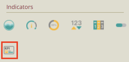
From the Dashboard Toolbox, open the Data Visualization node  and drag and drop the KPI Card scenario onto the dashboard designer.
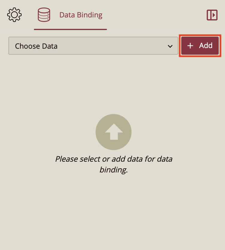
Bind Dataset to KPI Card Scenario
Upon completing the aforementioned actions, you will notice the Data Binding tab has opened on the right-hand side. Click Add to add your dataset.
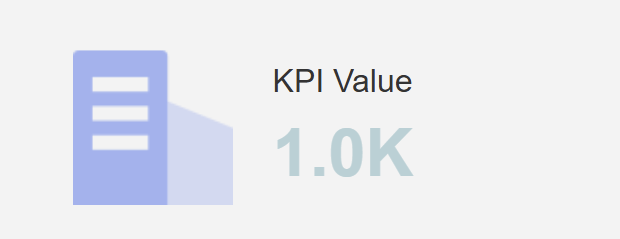
Drag and drop the values that you wish to display onto the dataset. Your chart should look something like this.
Customize Appearance
You can customize the appearance of your KPI Card. Just click on the gear icon  next to the Data Binding tab to open the Inspector tab.
These properties of the KPI card that can be customized are grouped in the inspector tab into section. The following sections describe these properties.
Change Icon Style
The first thing you can do is change the icon. You may choose if you want your KPI Card to display an icon or not.
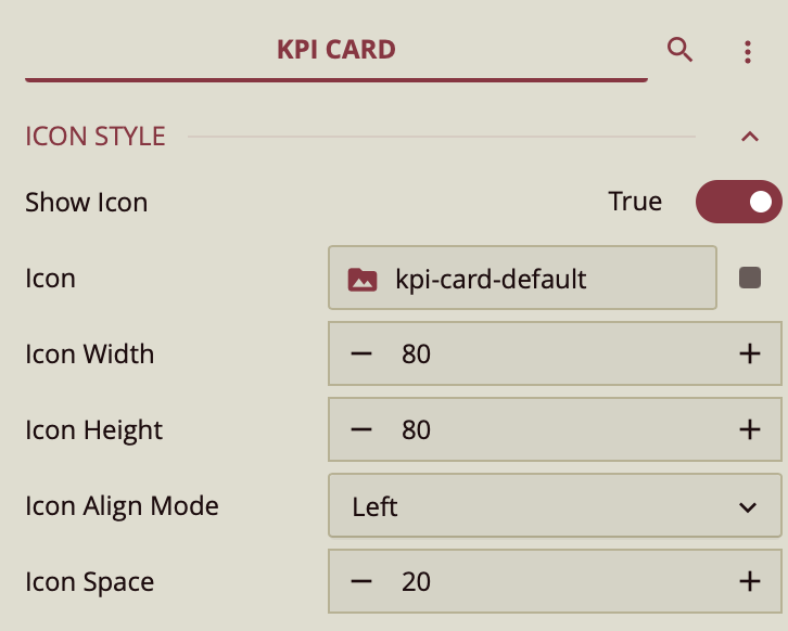
To upload your own icon to the KPI Card, simply click on the Icon data binding slot to open the Upload Image window.
You may select from the images already uploaded to Wyn Enterprise or you may click on "Upload Image" to upload an image from your local files.
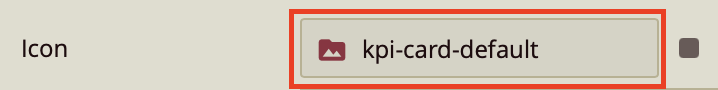
Once you have uploaded your image or even if you would like to use the default icon, you can change the icon width, height, and alignment, as well as the space between the icon and the displayed values.
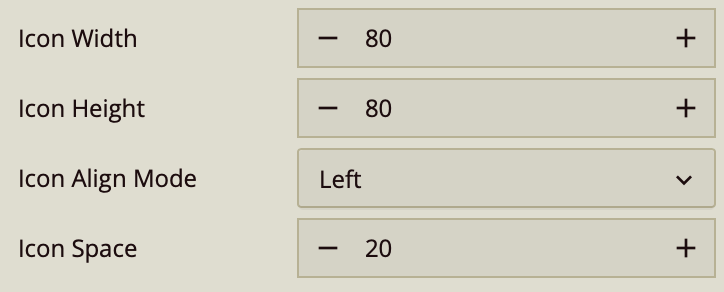
Change Indicator Style
If you would like to change the style of text or values displayed, you can do that under the Indicator Style properties.
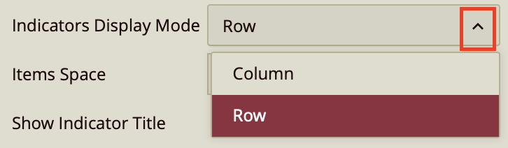
If you choose to display two or more values, you can choose whether you want to display them in a row or in a column using the Indicators Display Mode.
The Items Space property serves to increase or decrease the space between your data values. You can choose whether or not you want to show a title alongside your values by switching the Show Indicator Title property to either True or False.
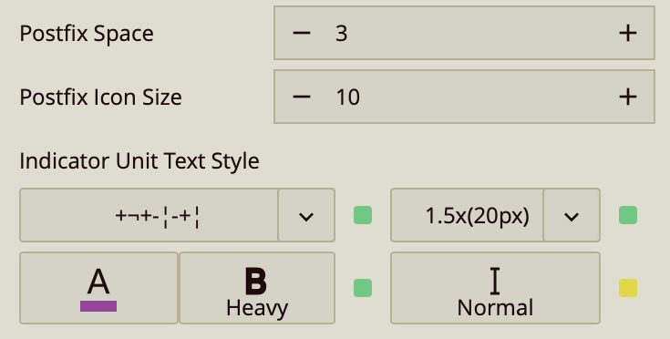
The Indicator Title can be displayed on the Top, Bottom, or to the Left of your value, depending on which option you choose from the dropdown. You can also change the alignment of the title text from the Indicator Title Align Mode property. You can change the title text color or the value text color independently, as well as the font, size, weight, as well as italicize.
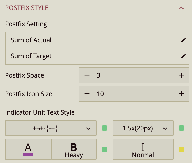
Setting a Postfix
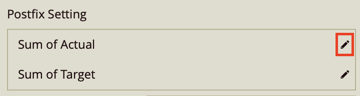
The Postfix Style property refers number value and/or icon that can be added next to your KPI value.

Simply click on the pencil icon to open the Postfix Editor.
Click on the Postfix Unit slot to set your unit value and on the Postfix Icon slot to set an icon.
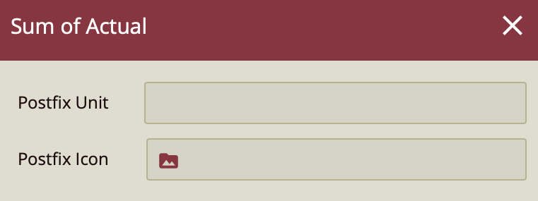
Then, click OK to save.
The settings Postfix Space, Postfix Icon Size, and Indicator Unit Text Style customize the space between the value and the postfix, the size of the postfix icon, and the style of the postfix text respectively.
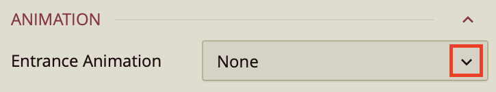
Animation
You can choose from a number of animation styles to customize the way your chart appears on the Preview. This includes chart sliding in, backing in, fading in, bouncing in, or zooming in. Simply open the dropdown and scroll through to choose one.
Interaction
The Interaction properties go through the ways you can make your chart more interactive. Your Scenario name is the name by which you will refer to your chart.
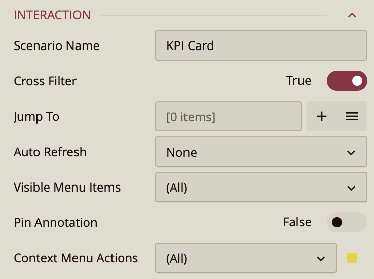
The Cross Filter property allows you to sync the interactivity between all charts added to your dashboard. For more information, read the following article: Preview Dashboard.
If you want to add a Jump To action to your chart, simply click the + Add button. For more information, read the following article: Jump To.
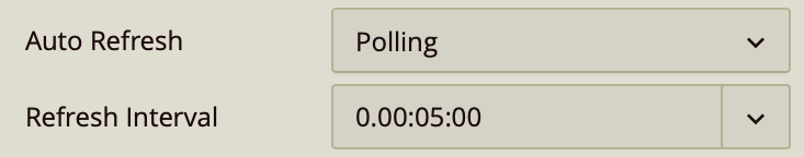
If your dataset is constantly updated, you want to set a Refresh Interval for your chart. Simply click on the Auto Refresh tab and select Polling. This will open the Refresh Interval property, from where you can set how often you want your chart to be refreshed.
For Visible Menu Items refer to the actions that are available to you when you click on the ellipsis menu that appears when you hover over the upper right corner of the visualization in the dashboard preview. To preview your dashboard, click Preview on the top ribbon.
Context Menu Action refers to the actions that are available to you when you right-click on your dashboard visualization in the preview.
Title
If you want to change your title settings or simply not have a title at all, you can do so in the Title property section.
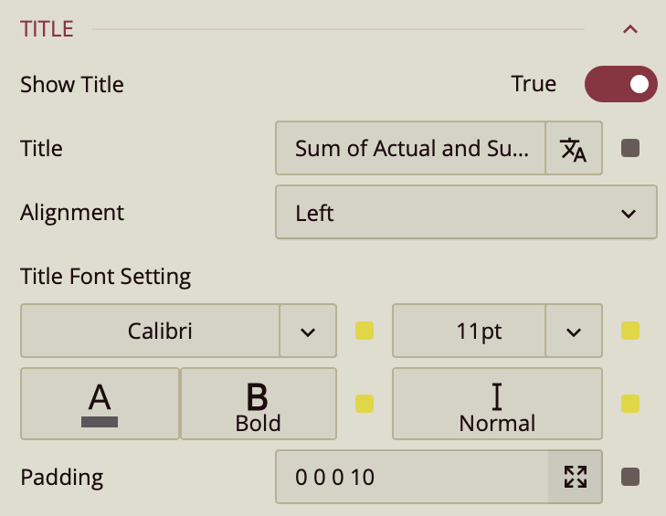
Simply switch the Show Title toggle item to False if you wish to remove the title. If you want to add a title, double-click the default title to select it and then type in your desired KPI Card Title.
The following properties change the alignment and the font settings respectively.
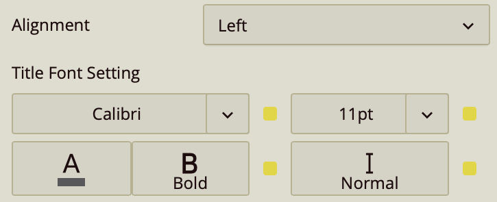
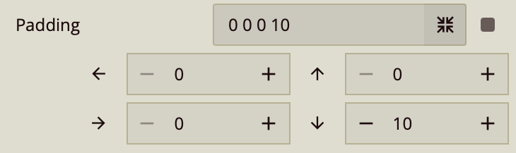
To add space around your title and the rest of the chart elements, increase the Padding setting. Simply click the arrows icon  to open the padding settings for each side
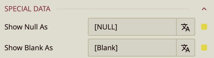
Special Data
When working with large datasets, you might have values that are undefined or blank. The Special Data settings allow you to customize how you wish those values to be displayed.
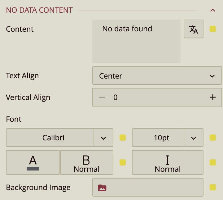
No Data Content
You also may happen to bind your dashboard to an empty dataset. In the case of that happening, you can customize what you want to appear in the preview. By default, Wyn displays "No data found". You may change the content that is displayed and customize its alignment, font, and background image.
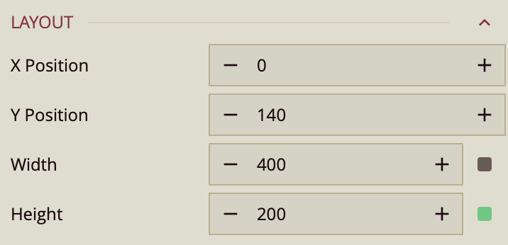
Layout
In addition to dragging and dropping your visualization across the dashboard designer, you can manually select its position using the X Position and Y Position properties. You can also change the width and the height of your visualization. You can either click the + or - buttons to the sides of the value slot or double-click on the predefined value to select it in its entirety and type your value to replace it.
Appearance
In addition to customizing your KPI Chart elements, you can further enhance its appearance with the following settings.
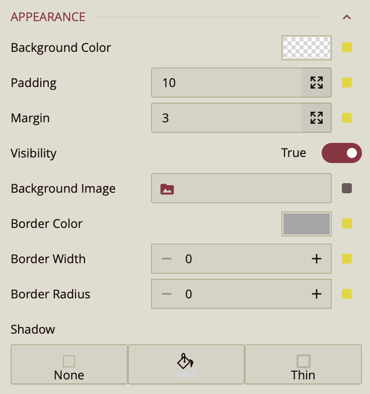
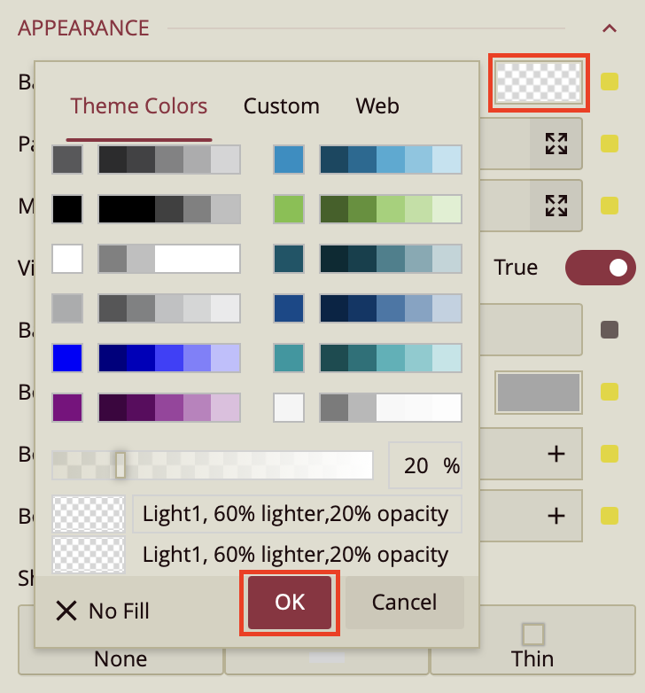
You can apply a background color to your KPI chart. Simply click on the background color value slot to open the color editor. Whatever color you choose, make sure to click OK.
If you wish to change the padding on your dashboard visualization, click on the arrows button  to open the Padding settings. Increase or decrease those values accordingly.

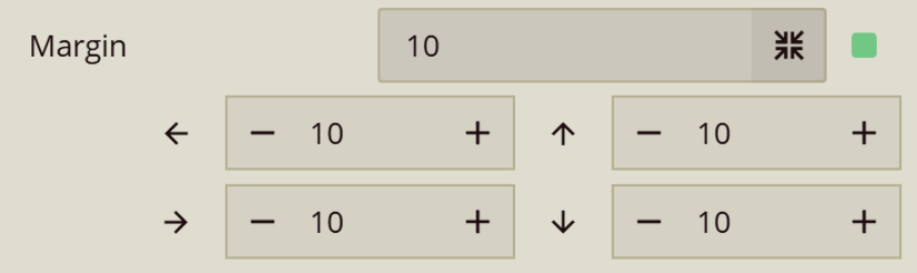
If you wish to change the margins on your dashboard visualization, click on the arrows button to open the Margins settings. Increase or decrease those values accordingly.
You can choose whether you want, at some point, to make your dashboard scenario invisible. Simply set the Visibility property to False. Also, you can set a background image to your KPI Chart. Simply click on the Background Image slot to open the Choose Image window.
To set a border, the following properties will assist you: Border Color, Border Width, and Border Radius.
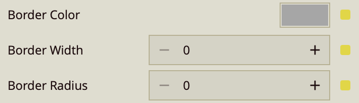
To set a border, first, you have to increase the Border Width. By default, the value is set to zero. Increase the border width to the desired size. You can add the Border Color to the KPI Chart by clicking on the color value slot. This will open the color editor. Make sure to click OK after selecting your desired color. If you would like to round the edges of the border you have created, this is what the Border Radius property is for. Simply increase the size or insert it manually, by double-clicking the default value to select and typing in your desired Border Radius value.
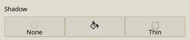
To cast a shadow on the KPI Chart, you can do so by using the Shadow property. By default, it is set to None. Click on the first icon to open the dropdown menu and select either Inner, Outer, or Both. To select the color of the shadow click on the paint bucket icon to give your shadow a color. Click on the third icon to choose the weight of your Shadow, whether you would prefer it to be Thin, Medium, or Thick.
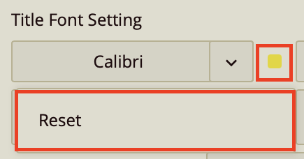
Reset Values
If at any point you are not happy with the setting that you have selected or you would like to return it to its setting value, click on the adorner next to the value slot, to open the menu dropdown and click Reset. This applies to all value buttons.