- Getting Started
- Administration Guide
-
User Guide
- An Introduction to Wyn Enterprise
- Document Portal for End Users
- Data Governance and Modeling
- Working with Resources
- Working with Reports
-
Working with Dashboards
- Dashboard Designer
- Selecting a Dataset
- Data Attributes
- Dashboard Scenarios
- Dashboard Templates
- Component Templates
- 3D Scene
- Explorer
- Visualization Wizard
- Data Analysis and Interactivity
- Dashboard Appearance
- Preview Dashboard
- Export Dashboard
- Dashboard Lite Viewer
- Using Dashboard Designer
- Animating Dashboard Components
- Document Binder
- Dashboard Insights
- View and Manage Documents
- Understanding Wyn Analytical Expressions
- Section 508 Compliance
- Subscribe to RSS Feed for Wyn Builds Site
- Developer Guide
Progress Bar
The Progress Bar can be a valuable addition to the dashboard you are designing. It displays the progress of a given metric that you have selected.
This section covers the following topics:
Creating Your Progress Bar
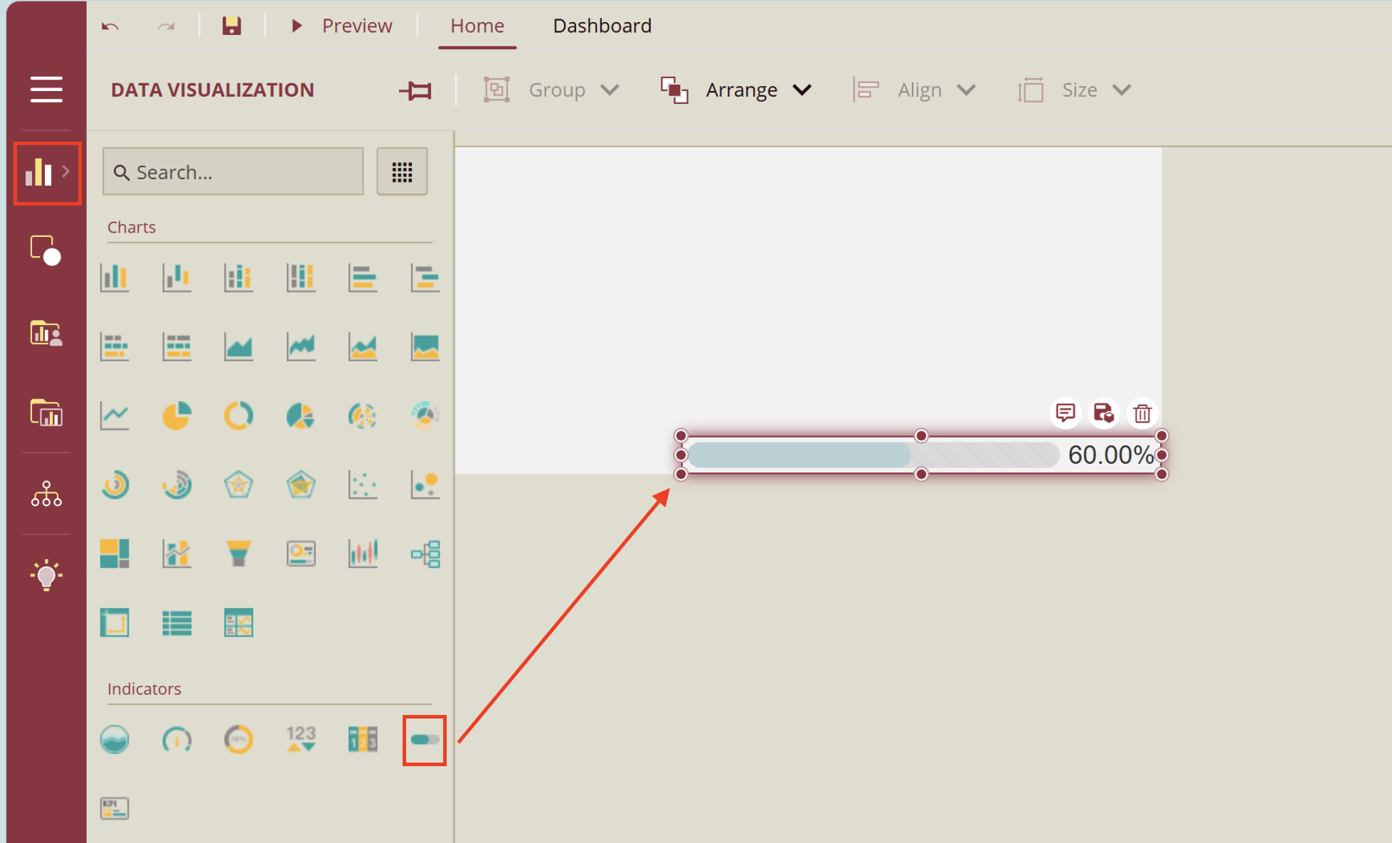
From the Dashboard Toolbox, open the Data Visualization node and drag and drop the KPI Card scenario onto the dashboard designer.
Customizing Your Progress Bar
You can customize your progress bar in a variety of ways. To learn more, simply click on the property you would like to know about and you will directed to its respective section.
Chart Style
In this section you will find descriptions of the following settings:
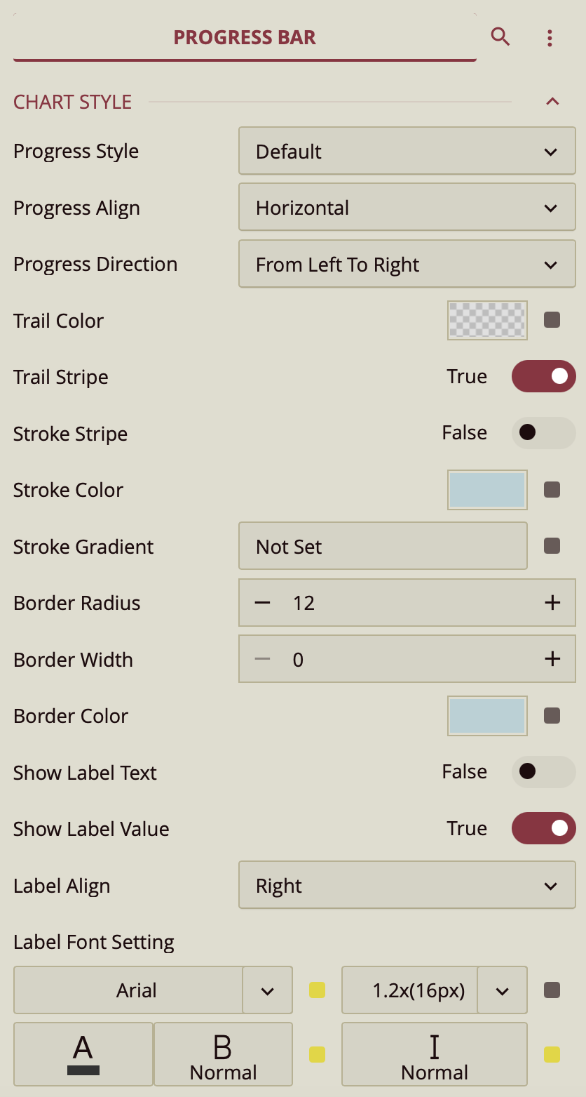
Progress Style
You can customize your chart in a variety of ways using the Chart Style properties. For example, you can have your progress bar appear in segments as opposed to a uniform bar. Simply click on the Progress Style value slot to open the dropdown menu and select Segmented. Selecting this style will reveal the menus, Segment Count, and Segment Space where you can increase the number of segments and the space between them respectively.
You can choose whether you would like your progress to be shown as horizontally or vertically using the Progress Align property. If this property is set to Vertical, the direction in which your progress is shown can be switched either From Left To Right or From Right to Left. If it is set to Horizontal, the direction can be switched either From Top to Bottom or From Bottom To Top.
Trail Style
The Trail Color property allows you to change the color of the progress bar trail. Simply select the color slot to open the color editor window. Make sure to click Ok after you choose a color. You can also choose whether to make the trail striped. Simply set the toggle item to True.
Stroke Style
To make the stroke to appear striped, simply set the Stroke Stripe toggle item to True for either or both the Trailer Stripe and Stroke Stripe property. The stroke color can be changed in the same way as the trail color, using the Stroke Color property.
You can add a Stroke Gradient to your progress bar. Just click on the value slot to open the Style Editor. Click on the Color value slot to open the color editor window.
Border Style
Your Border Radius is the degree to which the sides of your progress bar are curved. By default it is set to 15. Decreasing it will cause your progress bar to have squarer edges, causing your progress bar to resemble a rectangle. Set it to 0, if you would like your progress bar to be completely rectangular.
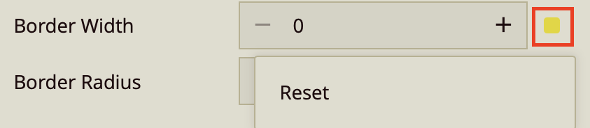
To mark the border of your progress bar, simply increase the value of the Border Width. By default, it is set to 0. You can add a Border Color similarly to the way previous color properties were added.
Label Style
If you would like to label your progress bar, set the Show Label Text value to True. To remove any number of value from appearing on your progress bar, set the Show Label Value to False.
You can always choose the alignment of your labels, simply click on the value slot next to the Label Align property to open the dropdown menu and choose from Left, Right, Inner Left, Inner Center, and Inner Right. It's important to note that Left and Right will make your labels appear outside of your progress bar.
Your Label Font Setting property simply helps you change the appearance of your labels. You can select the font, the color, the size, and whether you would like to have your label text display in Bold or Italics. Simply click on the property value to open the dropdown menu for the property you have selected.
Animation
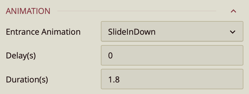
The Animation property modifies the way your visualization component is previewed. You can click on the property value slot to select an Entrance Animation. You can have your dashboard slide in, back in, fade in, bounce in, rotate in, and more.
Once you select an animation, the Delay(s) and Duration(s) properties will appear. Select the delay and the duration of the entrance animation you have chosen (in seconds).
Interaction
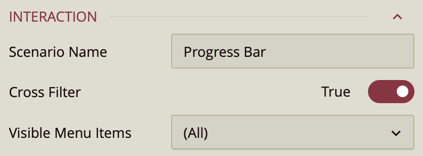
The Interaction properties control the way your visualization component interacts with other visualization components in the dashboard. The Scenario Name is the name of your visualization component. The Cross Filter property allows you to sync the interactivity between all charts added to your dashboard. For more information refer to the following article: Preview Dashboard.
The Visible Menu Items property controls the items visible to you when you click on the ellipsis icon, which you will find when you hover on the upper right-hand corner of the data visualization in the preview. To preview a dashboard, click the Preview button on the dashboard designer ribbon.
Layout
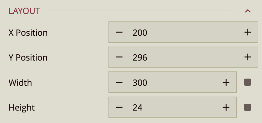
In addition to dragging and dropping your visualization across the dashboard designer, you can manually select its position using the X Position and Y Position properties. You can also change the width and the height of your visualization. You can either click the + or - buttons to the sides of the value slot or double-click on the predefined value to select it in its entirety and type your value to replace it.
Appearance
In addition to customizing your Progress Bar elements, you can further enhance its appearance with the following settings
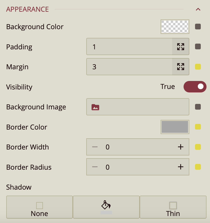
Background Color Settings
You can apply a background color to your KPI chart. Simply click on the background color value slot to open the color editor. Whatever color you choose, make sure to click OK.
Padding Settings
If you want to add padding to your visualization, change the Padding settings. Increase or decrease those values accordingly.
Margin Settings
Alternatively, if you want to increase the margins of your visualization, change the Margin settings.
Visibility Setting
If you wish to make this dashboard visualization invisible, simply set the Visibility property to False.
Background Image
You can also set a background image to your KPI Chart. Simply click on the Background Image slot to open the Choose Image window.
Border Style
The following properties will assist you in setting a border: Border Color, Border Width, and Border Radius.
To set a border, first, you have to increase the Border Width. By default, the value is set to zero. Increase the border width to the desired size. You can add the Border Color to the KPI Chart by clicking on the color value slot. This will open the color editor. Make sure to click OK after selecting your desired color. If you would like to round the edges of the border you have created, this is what the Border Radius property is for. Simply increase the size or insert it manually, by double-clicking the default value to select and typing in your desired Border Radius value.
Shadow Settings
To cast a shadow on the KPI Chart, you can do so by using the Shadow property. By default, it is set to None. Click on the first icon Insert Image to open the dropdown menu and select either Inner, Outer, or Both. To select the color of the shadow, click on the paint bucket icon to give your shadow a color. Click on the third icon to choose the weight of your Shadow, whether you would prefer it to be Thin, Medium, or Thick.
Reset Values
If at any point you are not happy with the setting that you have selected or you would like to return it to its setting value, click on the adorner next to the value slot, to open the menu dropdown and click Reset. This applies to all value buttons.