[]
        
(Showing Draft Content)

Combined Map

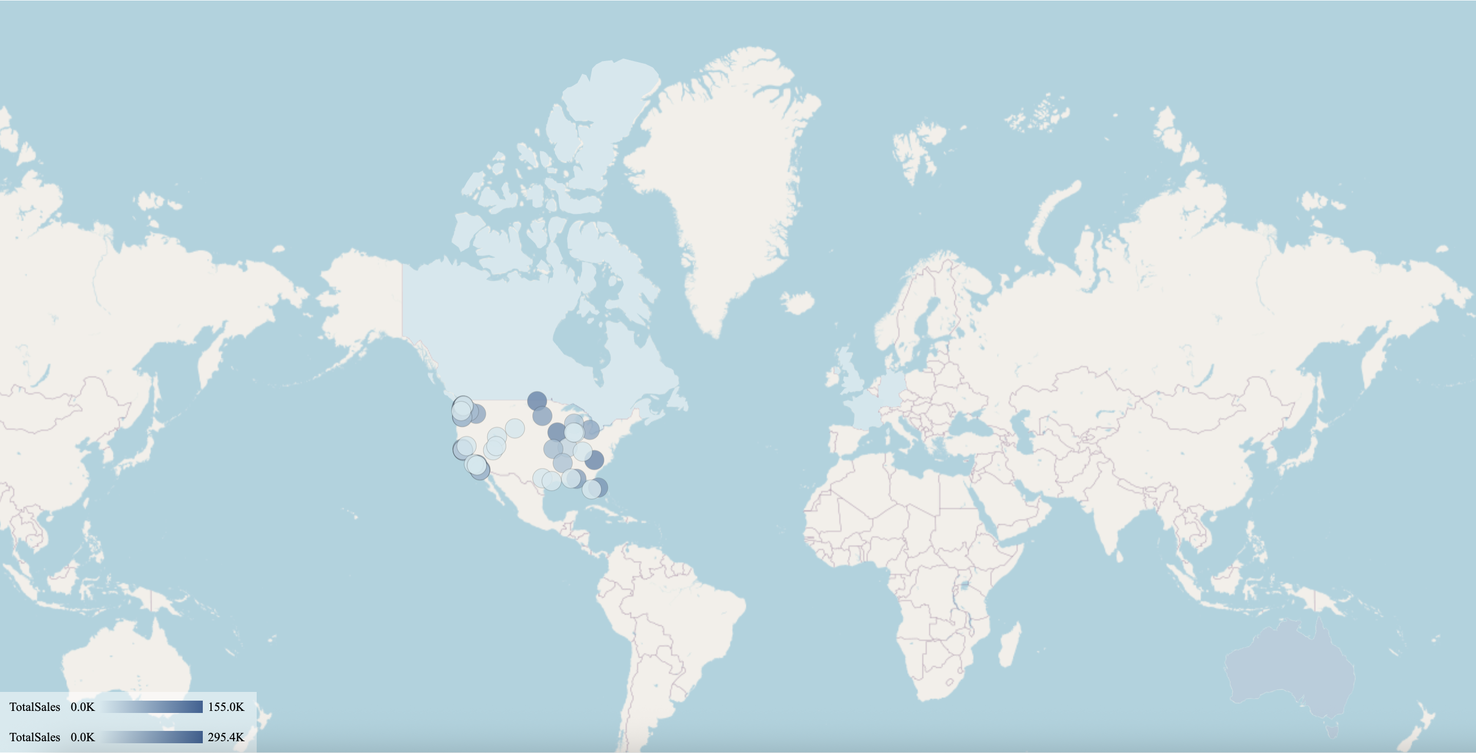
Combined Map scenarios are extremely helpful in displaying more than one measure on one map with different visuals, like Flow Line Layer, Bubble Layer, Area Layer, Heat Layer, etc. You can set the style and control the interaction separately.

Example: Using the Combined Map, you can show the sales amount with the area layer, and the revenue with the bubble layer.

Combined Map example

By using the Combined Map you can meet the following requirements:

  • Overlay and display multiple map visuals like Area, Flow Line, Bubble, Heat, etc.

  • Bind the data on each map visual, and it can come from different datasets.

  • Customize the map style separately.

  • Add the jump-to and other interactions on each map visual.

  • Control to show or hide each map visual when viewing the dashboard. Example: you can show the Area map by default and would like to click on a button or an image component to trigger to show the Flow Line map.

Design a Combined Map

Let us create a Combined Map scenario that uses the Area to highlight the different geographical regions in the map based on their Sales and Bubbles to represent their Revenue in those regions.

Navigate to the Data Visualization tools and drag and drop the Combined Map scenario onto the dashboard designer area.

Drag and Drop Combined Map

Bind Dataset to the Combined Map

  1. With the Combined Map scenario selected, navigate to the Data Binding panel. Click the Add button, Choose Data dialog box is displayed. Select a dataset and click the OK button.

    Click Add Button


  2. The selected dataset will be added to the dropdown list. Select the dataset to bind to the scenario. When the dataset loads successfully, the data binding panel automatically expands and displays the data attributes available for data binding.

    Dataset added


  3. Add a map layer: In the map field binding area, click the plus icon Plus icon to add a new map layer.

    Add Map Layer


    You can adjust the order of the layer Z direction. Click the menu button to the right of the layer name, and the Move Up and Down buttons will appear to adjust the Z-order of the layer. You can also drag and drop to reorder map layers. You can delete a layer using the Delete option.

    Manage Layer Direction


    Layers supported are the Area Layer, Bubble Layer, Heat Layer, Symbol Layer, Flow Line Layer, and Path Layer. Each layer can be individually bound and styled.

    In this example, we have added two layers Area Layer and Bubble Layer.


  4. Layer data binding: Expand the layer data settings to add data binding to the layer. Drag and drop the appropriate data fields. In this example, we have taken the Sum of Sales to be displayed by Area Layer and the Sum of Revenue by Bubble Layer.

    drag fields


    The map will be displayed according to the data.

    Map displayed


    You can customize the map appearance from the Inspector tab as per your requirements and preview it.

    Preview Map

    Note: The selection status of multiple layers cannot exist simultaneously.

Customizing a Combined Map

Listed below are a few properties to customize a combined map.

Zoom Control

Set the Zoom Control to True in the Map Setting. You can set the Zoom Control text Font Color, Background Color, and Position as well.

Zoom Control True


A zoom control panel is displayed on the combined map.

Zoom Control


On the layer editor of a particular layer, the Visible Zoom property defines the visible extent of the current layer, and the layer will be dynamically displayed and hidden when you zoom in and out of the map with the mouse in the viewer. For details refer to Visible Zoom Control as defined below in Customize Layer Style and Settings.

Drill Down Setting

You can drill down the Combined Maps based on a map layer. Select a specific layer, and drill down in the viewer.

Drilldown setting 1

Customize Layer Style and Settings

You can customize the Combined Map setting for each layer. On the Inspector tab, under the Map Setting, you can see the list of all the layers.

Layer List

Click the pencil icon against the layer to edit the layer's style. The layer editing screen is displayed. In this example, we have selected the Area Layer.

Layer Editing screen

Visible Zoom Control

As a Combined map includes multiple different types of layers, the display zoom range of different layers may be different. As the zoom changes, the display and hiding of different layers need to be controlled. Therefore, the Visible Zoom option is used to configure the visible zoom range of each layer.

Visible Zoom

The default range is between 1 to 19. When the zoom of the map changes, the layer will be dynamically displayed or hidden based on the value of this attribute.

Data Labels and Legend

The Data Labels and Legend for each layer can be shown or hidden depending on its style, and other setting options such as Data Label Font Setting or Legend Position. Each layer uses these unified options.

Data Labels and Legends Layers

Show/Hide Layer with Commands

From the Click Action dropdown list, you can select any of the following options to perform an action on click: None, Show Tooltip, Keep, Exclude, Drill Down, Jump, or Command. You can configure the Click Action and Command settings separately at each layer. For example, in some scenarios, you need to interactively control whether a layer in the combined map should be displayed or hidden. The command in the command list to Show/Hide the combined map layer is used to control the display or hiding of the map layer.

Show Hide Layer

Customize Appearance

You can customize the appearance of the Combined Map scenario using the Inspector Panel properties on the right side of the dashboard designer window, listed and described in the following tables.

MAP SETTING

Option

Description

Show Base Map

To enable or disable the reference map use the Show Base Map property. In Wyn Enterprise, Mapbox GIS is used as a base map. By default, the value of this property is set to True.

Zoom Control

Combined maps include different types of layers, and the display zoom range of different layers may be different. As the zoom changes, the display and hiding of different layers need to be controlled. Zoom Control is used to configure the visible zoom range of each layer. If this property is set to True, then the zoom control panel is displayed on the map. The default range is between 1 to 19.

Zoom Font Color

This property is displayed when the Zoom Control is set to True. You can set the font color for the zoom control text using this property.

Zoom Background Color

This property is displayed when the Zoom Control is set to True. You can set the background color for the zoom control using this property.

Zoom Control Position

This property is displayed when the Zoom Control is set to True. You can set the position of the zoom control in the map by using this property. It has two options - Left and Right.

Tilt Angle

Using this property, you can set the up/down angle at which the map view will be displayed. By default, it is set to 0.

Display Area

Select an option from the dropdown.

Auto: Automatically controls the map range that displays all data points.

By Area: Displays the area selector on the map. When you click on a bubble, the map boundary range will display the selected area bubble.

By Longitude & Latitude: You can manually set the zoom level, longitude, and latitude of the area bubbles. When the By Longitude & Latitude option is selected the Zoom Level, Longitude, and Latitude options will appear in the Inspector Panel.

- Zoom Level: Set the default zoom level for the map ranging between 2 to 16.

- Longitude: Set a longitude value using the slider or the input box.

- Latitude: Set a latitude value using the slider or the input box.

Show Boundary

Set this property to True, to show the map boundary. When this property is set to True, then you can see 3 more boundary properties: Boundary Area - the area where you want to show the boundary. Boundary Color - Select the color in which you want to show the boundary. Boundary Width- Select the boundary width from here.

Layers

You can manage layer style and other settings for each layer, using this property.

Map Setting

Animation

Option

Description

Entrance Animation

Select an option from the dropdown to set the animation style of the appearance of the map scenario. After selecting an option (SlideInDown, SlideInLeft, SlideInRight, SlideInUp, SlideInDown, BackInDown, BackInLeft, or BackInRight) from the dropdown, set the delay and duration of the animation using the Delay(s) and Duration(s) properties respectively.

Automatic Carousel

To highlight a region in the map and display the tooltip, set the Automatic Carousel property to True. By default, this property is set to False.

Animation

Interaction

Option

Description

Scenario Name

Add a name to the map scenario using this property.

Cross Filter

To disable the filtered data throughout the dashboard, set this property to False. Cross filters provide a simplified and deeper analysis of what you want to observe. By default, the value of the Cross Filter property is set to True.

Jump To

To create a shortcut to another dashboard scenario, report, or URL use this property. See the Jump To help article for more information.

Auto Refresh

Set the None, Polling, or Real Time option from the dropdown to refresh the map data. Dropdown options are described below.

- None: Select None to disable auto-refresh of the map data.

- Polling: Select Polling to enable auto refresh and set an interval to refresh map data in the Refresh Interval property.

- Real Time: Select Real-time to display the data in real-time.

Visible Menu Items

Select the filtering and sorting options you wish to display on the map scenario from the dropdown.

Pin Annotation

To pin the annotation to the map scenario, set this property to True. By default, this property is set as False.

Context Menu Actions

Select multiple Context Menu Options from the dropdown. Context Menu Options include: All, Keep, Exclude, Drill Down, Jump, and Add Data Monitoring.

Single Selection

To allow a single selection of map items, set this property to True. By default, this property is set to False.

Interation

Tooltip

Option

Description

Tooltip Mode

To set the tooltip mode select the None or Data Point option from the dropdown. By default, the Data Point option is selected.

Tooltip

Data Labels

Option

Description

Show Data Label

To enable or disable the display of data labels on the map use the Show Data Label property. By default, the value of the Show Label Property is set to False.

Show Location

To disable the region or latitude and longitude display on the map, set the Show Location property to False. By default, the value of the Show Location property is set as True.

Show Measure

To disable the measure of the area map value, set the Show Measure property to False. By default, the value of the Show Measure property is set as True.

Show Symbol Field

To show the value of the Symbol field used in databinding for the Symbol layer, set Show Symbol Field to True. By default, this property is set to True. You can set it to False if you do not want to display the value of the Symbol field on the map.

Display Mode

Select an option from the dropdown to display the data labels. Smart option displays the maximum value and the All option displays all data labels in the region.

Data Label Font Setting

Set the font family, font size, font color, font weight, and font style of the data labels using this property.

Data Labels

Legend

Option

Description

Show Legend

To enable or disable the legend items on the map scenario use the Show Legend property. By default, the value of the Show Legend property is set to True.

Title

To disable the title of the legend in the map scenario, set the Title property to False. By default, the Title property is set to True.

Position

Select a position of the legend to be displayed in the map scenario from the dropdown. The available options are Top, Right, Bottom, and Left.

Background Color

Select the background color of the legend bar using the color picker.

Font Color

Select the font color of the legend text using the color picker.

Legend

Title

Option

Description

Show Title

To hide the title of the map scenario set this property to False. By default, this property is set to True.

Title

Add or edit the title of the map scenario using the Title property.

Alignment

Select the alignment option of the title from the dropdown.

Title Font Setting

Set the font family, size, color, weight, and style of the title using the Title Font Setting options.

Padding

To create space around the title of the map scenario use the Padding property. You can set the following: Padding Left, Padding Top, Padding Right, and Padding Bottom.

Title

Drill Down Setting

Option

Description

Position

You can set the display position for the drill-down bar using this property. The dropdown list has the following options: Top Left, Top Center, Top Right, Bottom Left, Bottom Center, and Bottom Right. By default, the Top left is selected.

Home Name

You can select the initialized text for drill down path to be displayed on the preview from here. By default, the value is Home.

Font

You can set the font for the drill down path from the font settings.

Current Level Font Color

You can pick the color for the current level text in the drill down path by using this property.

Other Levels Font Color

You can pick the color for the other level text in the drill down path by using this property.

Display In Map Area

Set this property to True, to display the drill down in the map area. By default, it is set to False.

Horizontal Offset

Sets the value of the horizontal distance between the start of the map area and the drill down path display.

Vertical Offset

Sets the value of the vertical distance between the start of the map area and the drill down path display.

Drill Down Setting

Layout

Option

Description

X Position

Set the horizontal position of the map scenario on the dashboard using the X Position property.

Y Position

Set the vertical position of the map scenario on the dashboard using the Y Position property.

Width

Set the width of the map scenario using the Width property. You can set the minimum width up to 8.

Height

Set the height of the map scenario using the Height property. You can set the minimum height up to 8.

Layout

Appearance

Option

Description

Background Color

Set a background color of the map scenario using this property.

Padding

To create space around the map scenario, set a padding value.

Margin

Set the margin value for the map scenario using this property.

Visibility

To hide the map from the dashboard, set this property to False. By default, the Visibility property is set as True.

Background Image

Add an embedded, shared, or external image as a background image to the map scenario.

Border Color

Set the border color using this property.

Border Width

Set the border width using this property.

Border Radius

Set the corner radius using this property.

Shadow

Create a shadow of the map scenario by setting the Shadow Type, Shadow Color, and thickness.

Appearance

Limitations

  • Path, Heat, and Flow Line type layers do not support conditional format settings.

  • Combined maps do not provide the Conditional Visualization setting.