-
Interactive DashboardsCreate interactive BI dashboards with dynamic visuals.
-
End-User BI ReportsCreate and deploy enterprise BI reports for use in any vertical.
-
Wyn AlertsSet up always-on threshold notifications and alerts.
-
Localization SupportChange titles, labels, text explanations, and more.
-
Wyn ArchitectureA lightweight server offers flexible deployment.
-
 Wyn Enterprise 7.1 is ReleasedThis release emphasizes Wyn document embedding and enhanced analytical express...
 -
 Choosing an Embedded BI Solution for SaaS ProvidersAdding BI features to your applications will improve your products, better serve your customers, and more. But where to start? In this guide, we discuss the many options.
-
Visual GalleryInteractive sample dashboards and reports.
-
BlogExplore Wyn, BI trends, and more.
-
WebinarsDiscover live and on-demand webinars.
-
Customer SuccessVisualize operational efficiency and streamline manufacturing processes.
-
Knowledge BaseGet quick answers with articles and guides.
-
VideosVideo tutorials, trends and best practices.
-
WhitepapersDetailed reports on the latest trends in BI.
-
 Choosing an Embedded BI Solution for SaaS ProvidersAdding BI features to your applications will impr...
 -

- Getting Started
- Administration Guide
-
User Guide
- An Introduction to Wyn Enterprise
- Document Portal for End Users
- Data Governance and Modeling
- View and Manage Documents
- Working with Resources
- Working with Reports
-
Working with Dashboards
- Tour the Dashboard Designer
- Create a Dashboard
- Configure Dashboard
- Dashboard Data Binding
- Scenarios
- Appearance
- Component Management
-
Parameters
- Filter Dashboard Visualization by a Date Parameter
- Filter Dashboard Visualization by a Parameter-Bound Slicer
- Filter Dashboard Visualization by a Query-Based Parameter
- Use an Image to Reset a Parameter Filter
- Dynamically Filter a Chart Using a Parameter
- Dynamically Change the Date Format in a Chart Using a Parameter
- Pass Dynamic Parameter to Native Query Dataset
- Pass Dynamic Parameter to Direct Dataset
- Filter Scenarios Using Parameter-Driven Text and Date Range Slicers
- Interactions
- Finalize Your Dashboard
- Using AI in Wyn
- Working with Notebooks
- Wyn Analytical Expressions
- Section 508 Compliance
- Subscribe to RSS Feed for Wyn Builds Site
- Developer Guide
Filter Dashboard Visualization by a Date Parameter
The following tutorial describes filtering a dashboard visualization by a date parameter.
This tutorial has been created using the Technology Dataset which can be downloaded here and uploaded to your Wyn instance.
Create Column Chart
Drag a column chart onto the canvas.
Bind Data
Add the dataset in the data binding tab and set the Value axis to
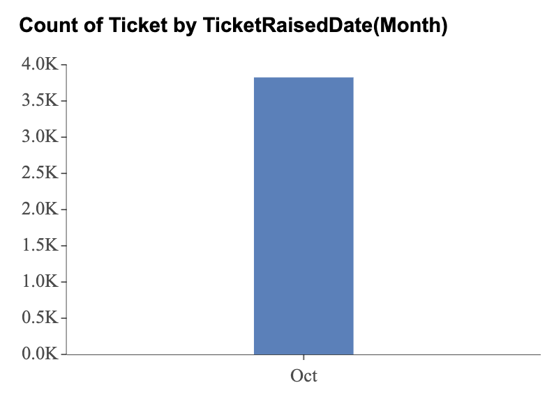
TicketsRaisedand the Category axis toTicketRaisedDate.Month. Set the aggregation method ofTicketsRaisedto Count.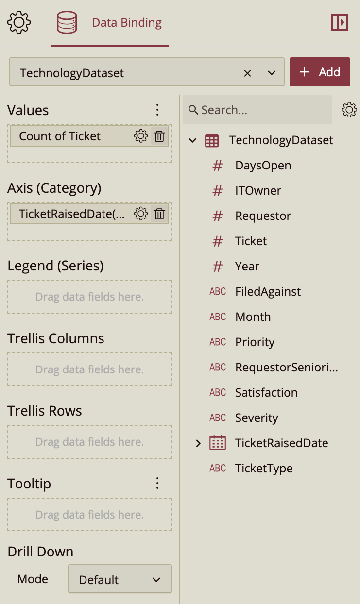
Create a Parameter
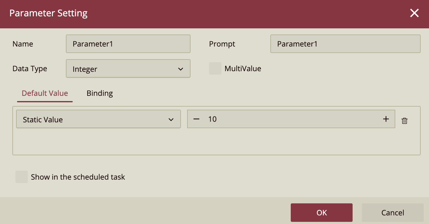
Click Document Settings in the toolbar or click anywhere on the canvas to show the Dashboard properties in the Inspector Panel. In the Inspector Panel, click the + next to the Parameters property under the General property group to add a parameter.
Configure the Parameter
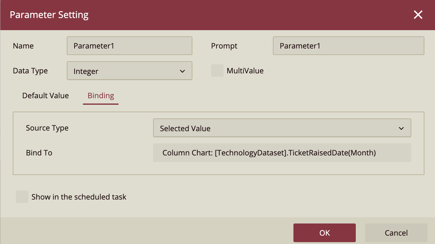
In the parameters window, set the Data Type to Integer and set its value to 10 (for October). In the Binding Tab, set the Source Type to Selected Value and bind to TicketRaisedDate(Month)
Filter By Parameter
Select the chart and locate the Filter button in the scenario's action toolbar. Under the General tab, click the edit button next to the search box and select Parameter1 from the dropdown.
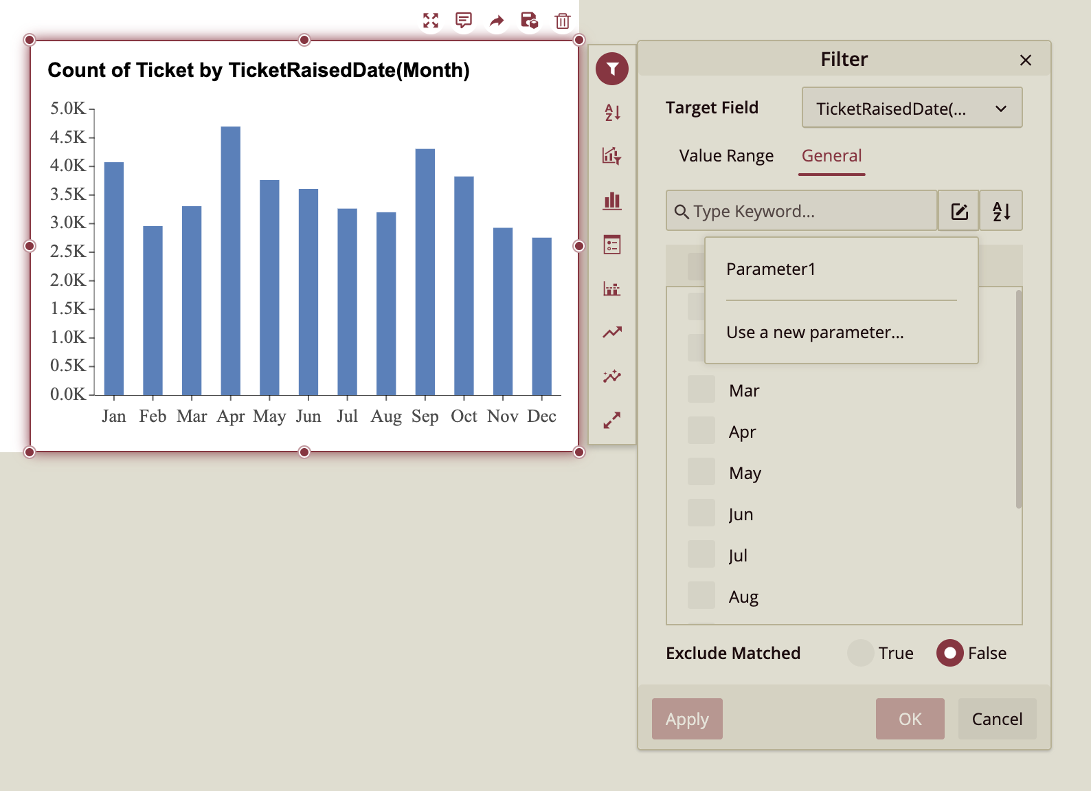
Preview Dashboard
The chart is filtered for the parameter set to October.