-
Interactive DashboardsCreate interactive BI dashboards with dynamic visuals.
-
End-User BI ReportsCreate and deploy enterprise BI reports for use in any vertical.
-
Wyn AlertsSet up always-on threshold notifications and alerts.
-
Localization SupportChange titles, labels, text explanations, and more.
-
Wyn ArchitectureA lightweight server offers flexible deployment.
-
 Wyn Enterprise 7.1 is ReleasedThis release emphasizes Wyn document embedding and enhanced analytical express...
 -
 Choosing an Embedded BI Solution for SaaS ProvidersAdding BI features to your applications will improve your products, better serve your customers, and more. But where to start? In this guide, we discuss the many options.
-
Visual GalleryInteractive sample dashboards and reports.
-
BlogExplore Wyn, BI trends, and more.
-
WebinarsDiscover live and on-demand webinars.
-
Customer SuccessVisualize operational efficiency and streamline manufacturing processes.
-
Knowledge BaseGet quick answers with articles and guides.
-
VideosVideo tutorials, trends and best practices.
-
WhitepapersDetailed reports on the latest trends in BI.
-
 Choosing an Embedded BI Solution for SaaS ProvidersAdding BI features to your applications will impr...
 -

- Getting Started
- Administration Guide
-
User Guide
- An Introduction to Wyn Enterprise
- Document Portal for End Users
- Data Governance and Modeling
- View and Manage Documents
- Working with Resources
- Working with Reports
- Working with Dashboards
- Working with Notebooks
- Wyn Analytical Expressions
- Section 508 Compliance
- Subscribe to RSS Feed for Wyn Builds Site
- Developer Guide
Customize Fonts and Label Styles
Customizing fonts and label styles in Wyn Enterprise dashboards helps improve readability and ensures that your visuals align with your brand or presentation style. You can modify the font family, size, color, alignment, and weight for titles, labels, and other text elements across scenarios.
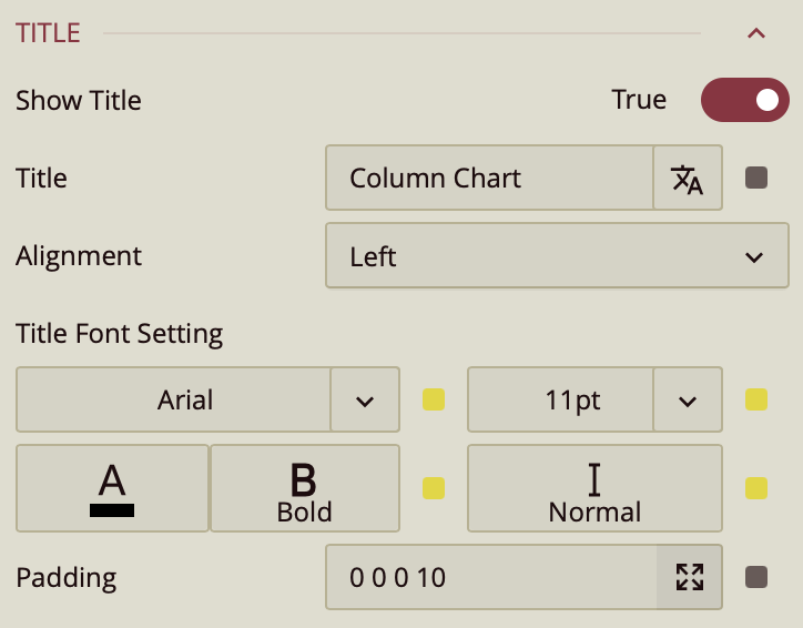
Change Fonts and Styles for Scenario Titles
To customize the title of a chart or visual scenario:
Select the scenario (e.g., a column chart or KPI).
In the Properties panel, locate the Title section.
Adjust the following options:
Font Family – Choose a font style (e.g., Arial, Roboto).
Font Size – Increase or decrease the title text size.
Font Weight – Set to Normal or Bold.
Font Style - Set to Normal or Italic.
Text Color – Pick a custom color using the color picker.
Alignment – Set the title alignment (left, center, or right).
Style Axis and Legend Labels (for Charts)
For chart scenarios like bar, line, or pie charts:
Select the chart.
In the Inspector Panel, find the settings for Axis(Category) or Value Axis.
Modify label options:
Font Size and Font Family
Axis Line Color
Label Direction – Useful for long labels
To customize legend text:
Scroll to the Legend section and adjust label styles similarly.
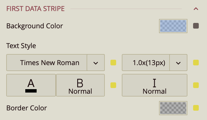
Customize Tables and Matrices
To style pivot tables, data tables, and matrices in Wyn Enterprise, select the visual and go to the Table Settings section in the Inspector.
All three table types share common styling options under Table Settings, including:
Cell Background Color
Text Style (font, size, color, weight, italic)
Cell Border Color
Style Template
Beyond that, each visual includes additional customization areas:
Title: Configure font style separately.
Column Headers and Row Headers: Set background color and text style.
Corner Area, Subtotals, and Grand Totals (Pivot Table & Matrix only): Customize background and text.
First Data Stripe and Second Data Stripe: Use alternating styles for row shading.
Tips for Effective Label Styling
Use larger font sizes for key metrics and titles.
Maintain consistent font styles across visuals for a professional appearance.
Use color sparingly—highlight important values, but avoid overwhelming the reader.