-
Interactive DashboardsCreate interactive BI dashboards with dynamic visuals.
-
End-User BI ReportsCreate and deploy enterprise BI reports for use in any vertical.
-
Wyn AlertsSet up always-on threshold notifications and alerts.
-
Localization SupportChange titles, labels, text explanations, and more.
-
Wyn ArchitectureA lightweight server offers flexible deployment.
-
 Wyn Enterprise 7.1 is ReleasedThis release emphasizes Wyn document embedding and enhanced analytical express...
 -
 Choosing an Embedded BI Solution for SaaS ProvidersAdding BI features to your applications will improve your products, better serve your customers, and more. But where to start? In this guide, we discuss the many options.
-
Visual GalleryInteractive sample dashboards and reports.
-
BlogExplore Wyn, BI trends, and more.
-
WebinarsDiscover live and on-demand webinars.
-
Customer SuccessVisualize operational efficiency and streamline manufacturing processes.
-
Knowledge BaseGet quick answers with articles and guides.
-
VideosVideo tutorials, trends and best practices.
-
WhitepapersDetailed reports on the latest trends in BI.
-
 Choosing an Embedded BI Solution for SaaS ProvidersAdding BI features to your applications will impr...
 -

- Getting Started
- Administration Guide
-
User Guide
- An Introduction to Wyn Enterprise
- Document Portal for End Users
- Data Governance and Modeling
- View and Manage Documents
- Working with Resources
- Working with Reports
- Working with Dashboards
- Working with Notebooks
- Wyn Analytical Expressions
- Section 508 Compliance
- Subscribe to RSS Feed for Wyn Builds Site
- Developer Guide
Bind Data and Add Scenarios
The first step in creating a dashboard is usually to connect your dashboard to data and then start adding visualizations. You can add visualizations to the dashboard by dragging them from the side bar or using the Visualization Wizard.
First, add datasets and data models to later bind them to visualizations.
Add a Dataset
Click +Add in the Data Binding panel.
Select Your Data
In the Choose Data window, select your dataset or data model, then click OK. Your data is now available in the designer.
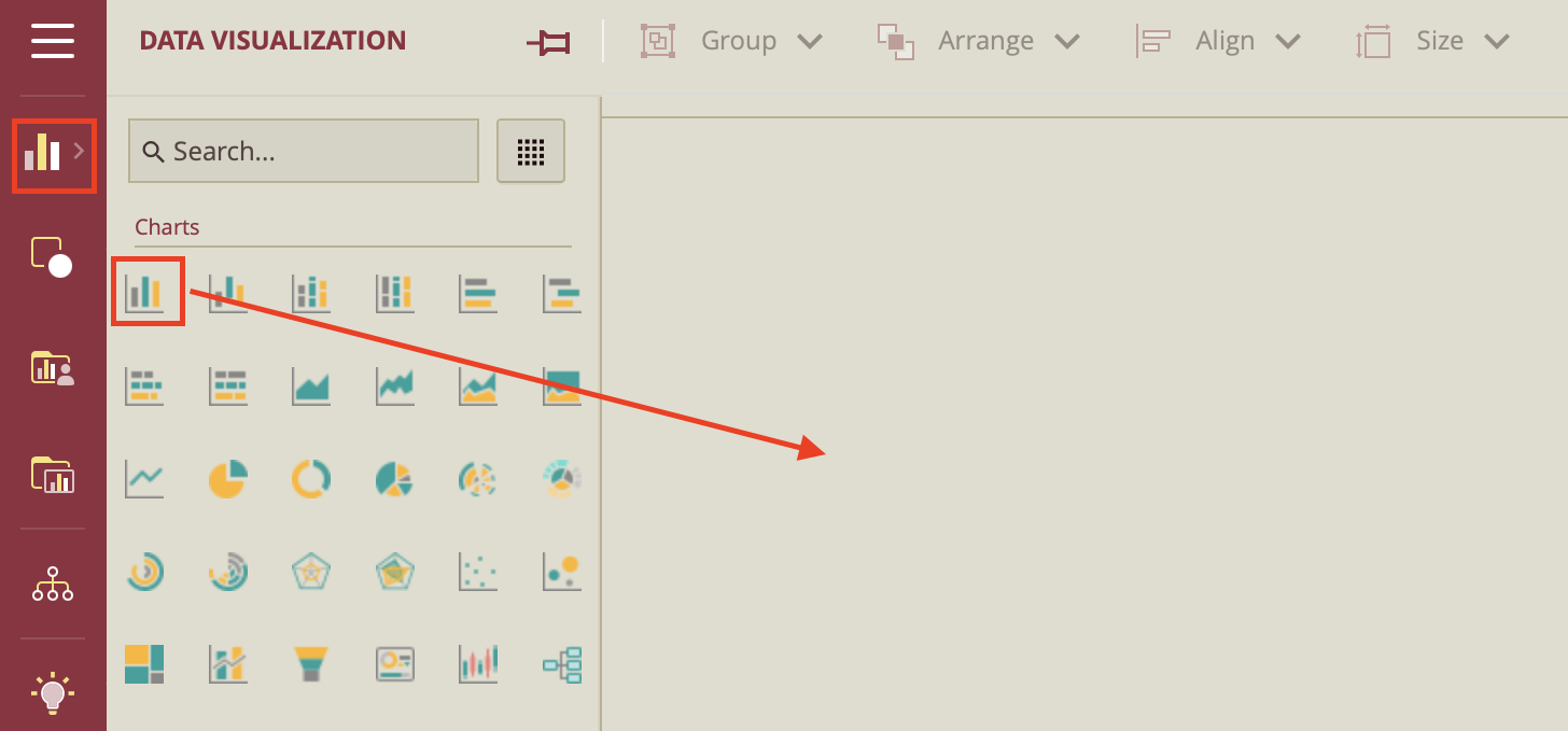
Choose a Scenario Type
In the Dashboard Toolbox, go to the Data Visualization tab, and drag a scenario (e.g., Column Chart) onto the design area.
Reposition the Scenario
To reposition the scenario, click the chart, drag it to the desired location, and release the mouse to place it.
Bind Data to the Scenario
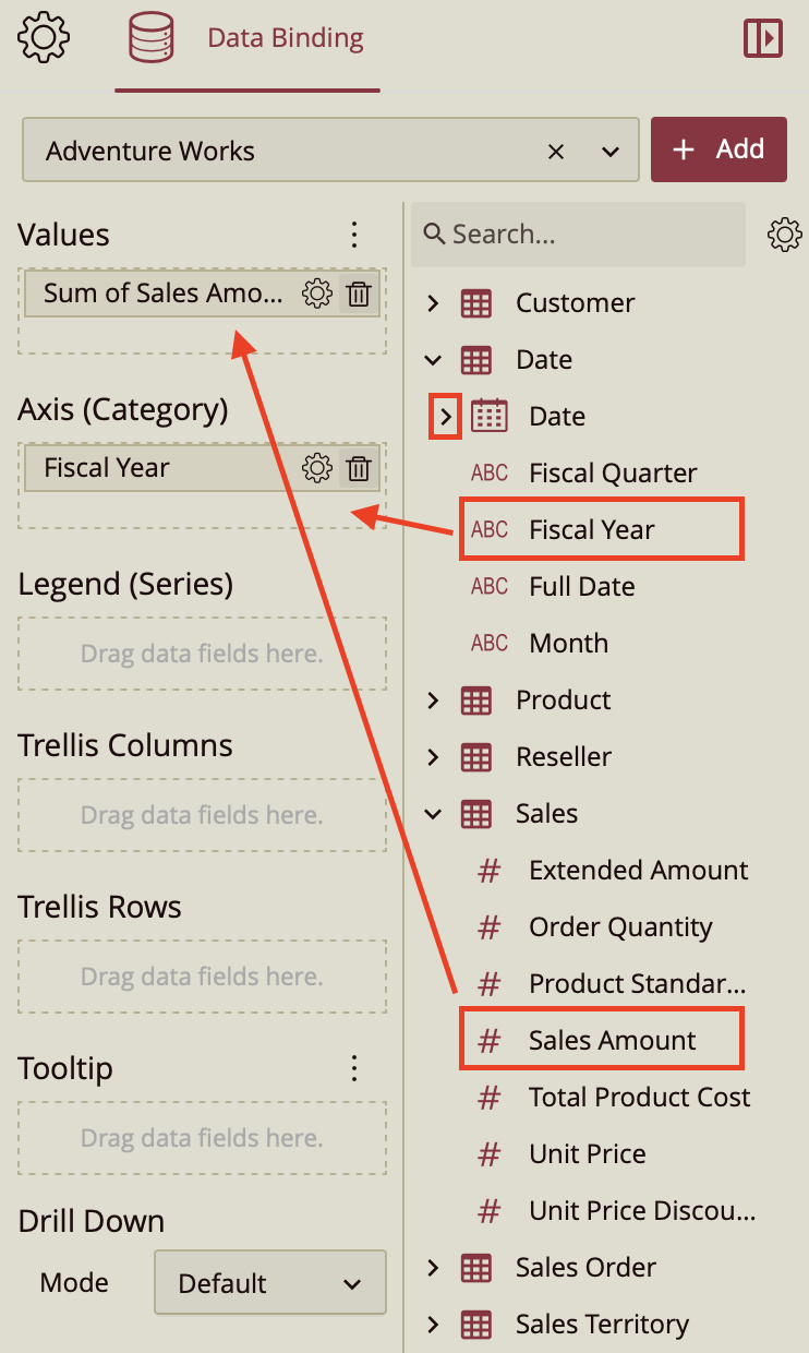
The Data Binding Panel opens automatically when the chart is added. Click Choose Data pull-down at the top to select the dataset for the scenario. The data attributes will appear where you can drag and drop them in the scenario data binding slots.
Map Data Fields
Drag and drop fields into the appropriate binding areas.
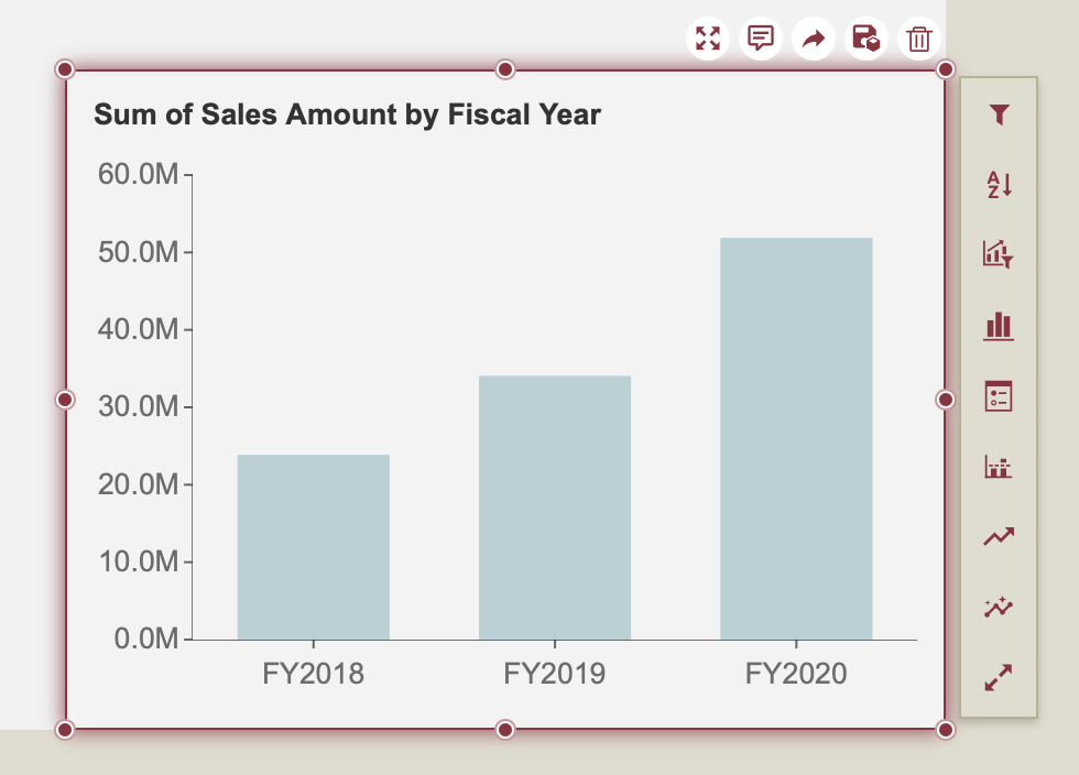
For example, drag "Fiscal Year" to the Category Axis, and "Sales Amount" to the Value Axis.
Preview Your Chart
The visualization updates automatically based on your selections.
It should resemble the example below.