-
Interactive DashboardsCreate interactive BI dashboards with dynamic visuals.
-
End-User BI ReportsCreate and deploy enterprise BI reports for use in any vertical.
-
Wyn AlertsSet up always-on threshold notifications and alerts.
-
Localization SupportChange titles, labels, text explanations, and more.
-
Wyn ArchitectureA lightweight server offers flexible deployment.
-
 Wyn Enterprise 7.1 is ReleasedThis release emphasizes Wyn document embedding and enhanced analytical express...
 -
 Choosing an Embedded BI Solution for SaaS ProvidersAdding BI features to your applications will improve your products, better serve your customers, and more. But where to start? In this guide, we discuss the many options.
-
Visual GalleryInteractive sample dashboards and reports.
-
BlogExplore Wyn, BI trends, and more.
-
WebinarsDiscover live and on-demand webinars.
-
Customer SuccessVisualize operational efficiency and streamline manufacturing processes.
-
Knowledge BaseGet quick answers with articles and guides.
-
VideosVideo tutorials, trends and best practices.
-
WhitepapersDetailed reports on the latest trends in BI.
-
 Choosing an Embedded BI Solution for SaaS ProvidersAdding BI features to your applications will impr...
 -

- Getting Started
- Administration Guide
-
User Guide
- An Introduction to Wyn Enterprise
- Document Portal for End Users
- Data Governance and Modeling
- View and Manage Documents
- Working with Resources
- Working with Reports
- Working with Dashboards
- Working with Notebooks
- Wyn Analytical Expressions
- Section 508 Compliance
- Subscribe to RSS Feed for Wyn Builds Site
- Developer Guide
Visualization Wizard
The Visualization Wizard helps you to quickly start creating a dashboard and guides you through creating charts. It generates a chart based on selected data. The Wyn administrator could have set it to start automatically when you create a new dashboard. You can also manually start it from this icon in the dashboard toolbox:

The Visualization Wizard has four sections:
Dataset Panel - Select the dataset or data model for your chart. If you've already added a dataset to the dashboard, it appears here automatically.
Render Panel - Displays a live preview of your chart based on the selected data attributes.
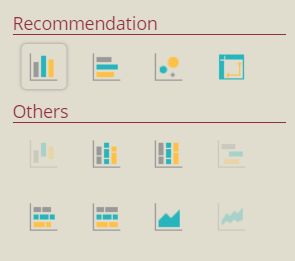
Recommendation Panel - Shows alternative chart types compatible with your data. Grayed-out options are not supported by the current selection.
Data Role Panel - Lets you adjust the fields used in the chart. Common tasks include:
Changing data formats or display units
Creating a hierarchical field
Applying aggregations
Using quick functions
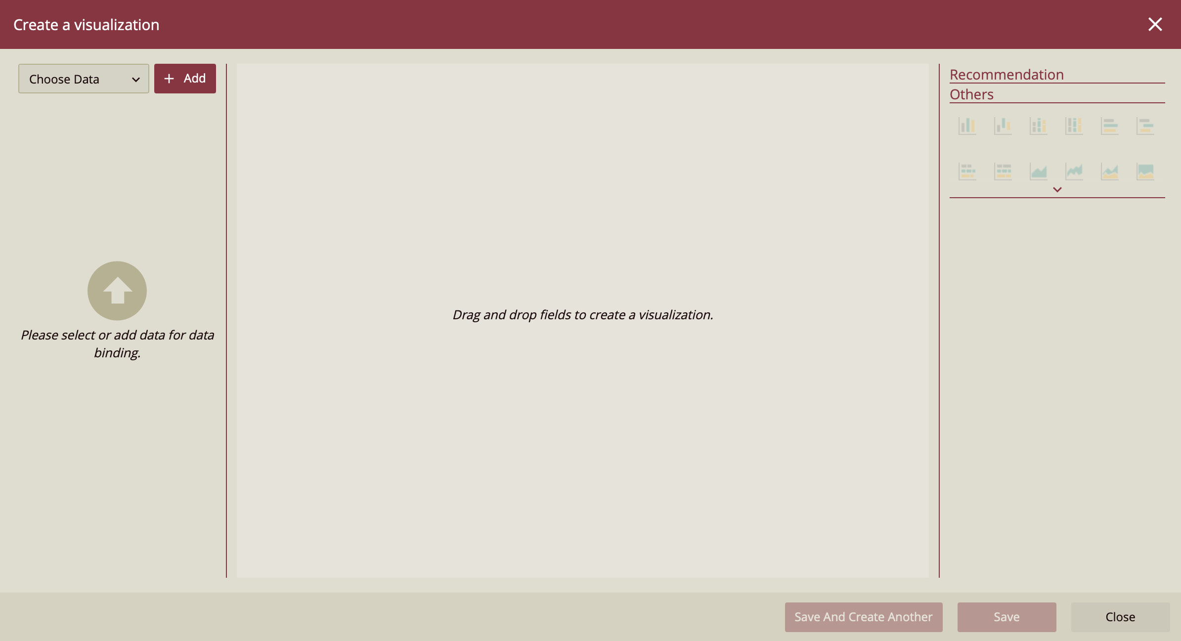
Steps to Create a Visualization
Open the Visualization Wizard
In the Dashboard Designer, click Visualization Wizard from the Dashboard Toolbox.
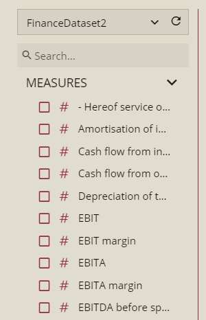
Select a Dataset
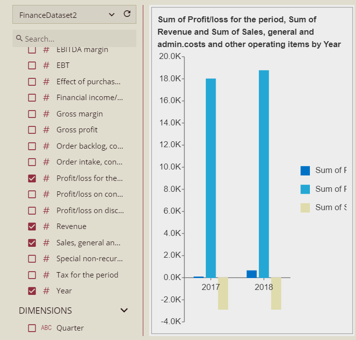
In the Dataset Panel, choose the dataset you want to use. Available attributes will appear automatically.
Example: "Profit/Loss", "Revenue", "SG&A Costs", "Year"
 .
.Choose Data Attributes
Click or drag your desired fields into the Render Panel to generate a chart preview.
Change the Chart Type (Optional)
Use the Recommendation Panel to select an alternative chart type.
Adjust Field Roles (Optional)
Use the Data Role Panel to customize how data fields are used. You can modify formats, apply aggregations, or create calculated fields.
Save the Chart
Click Save to add the visualization to your dashboard or Save and Create Another to build more.