-
Interactive DashboardsCreate interactive BI dashboards with dynamic visuals.
-
End-User BI ReportsCreate and deploy enterprise BI reports for use in any vertical.
-
Wyn AlertsSet up always-on threshold notifications and alerts.
-
Localization SupportChange titles, labels, text explanations, and more.
-
Wyn ArchitectureA lightweight server offers flexible deployment.
-
 Wyn Enterprise 7.1 is ReleasedThis release emphasizes Wyn document embedding and enhanced analytical express...
 -
 Choosing an Embedded BI Solution for SaaS ProvidersAdding BI features to your applications will improve your products, better serve your customers, and more. But where to start? In this guide, we discuss the many options.
-
Visual GalleryInteractive sample dashboards and reports.
-
BlogExplore Wyn, BI trends, and more.
-
WebinarsDiscover live and on-demand webinars.
-
Customer SuccessVisualize operational efficiency and streamline manufacturing processes.
-
Knowledge BaseGet quick answers with articles and guides.
-
VideosVideo tutorials, trends and best practices.
-
WhitepapersDetailed reports on the latest trends in BI.
-
 Choosing an Embedded BI Solution for SaaS ProvidersAdding BI features to your applications will impr...
 -

- Getting Started
- Administration Guide
-
User Guide
- An Introduction to Wyn Enterprise
- Document Portal for End Users
- Data Governance and Modeling
- View and Manage Documents
- Working with Resources
- Working with Reports
- Working with Dashboards
- Working with Notebooks
- Wyn Analytical Expressions
- Section 508 Compliance
- Subscribe to RSS Feed for Wyn Builds Site
- Developer Guide
Animating Dashboard Components
You can apply the entrance and exit animation on dashboard components, including all the built-in components and custom visuals.
Here is a video walkthrough of adding animations to the Dashboard components.
Add Entrance Animation to built in scenarios
You can add the Entrance Animation in two ways using the Inspector tab:
On the scenario itself using Entrance Animation property under Animation section.
Through Command option in the Click Action property under Interaction section.
Adding the entrance animation from the Animation section on the Inspector tab is elaborated below.
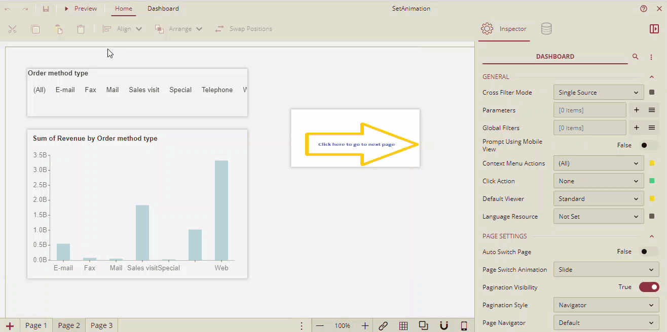
Let us assume that we have a dashboard with three pages. In the dashboard, on page 2, there is a Column Chart, a Label Slicer, and an Image component, and on page 3 there is a Tab Container.
On page 2, select the Column Chart and go to the Inspector tab.
Under the Animation section, go to the Entrance Animation property. By default, the property is set to None.
Select the entrance animation to be applied to the column chart from the dropdown list. After selecting the animation, two more fields Delay(s) and Duration(s) are displayed.
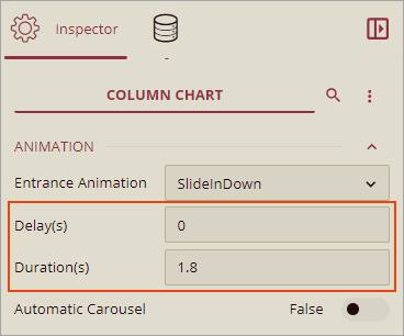
The default value of Delays(s) is 0 seconds, and the default value of Durations(s) is 1.8 seconds.
You can set the Delay and loading Duration (in seconds) for the selected animation from these fields.
Similarly, for the Label Slicer add the animation.
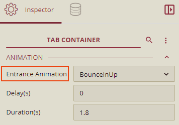
On page 3, select the Tab Container and add the animation.
List of available Entrance Animations
Entrance Animation |
|---|
backInDown, backInLeft,backInRight,backInUp |
bounceIn, bounceInDown, bounceInLeft, bounceInRight, bounceInUp |
fadeIn, fadeInDown, fadeInLeft, fadeInRight, fadeInUp |
slideInDown, slideInLeft, slideInRight, slideInUp |
lightSpeedInRight, lightSpeedInLeft |
rotateIn, rotateInDownLeft, rotateInDownRight,rotateInUpLeft, rotateInUpRight |
zoomIn, zoomInDown, zoomInLeft, zoomInRight, zoomInUp |
Note: Entrance Animation property is supported in all scenarios except the Card Chart scenario.
Adding Animation through the Command option in the Click Action property under Interaction section is elaborated below.
You can control the visibility of the scenarios while designing the dashboard and you can change their visibility on the viewer using the Click Action commands. So, you can display and hide some components dynamically. You can provide the animation effect for the show, hide, and toggle command components.
In this example, for the Image component on page 2, we will apply animation using the Command option in the Click Action property.
For the image component, on the Inspector tab, under the Interaction section, select the Click Action as Command. Now, add the Command Setting.
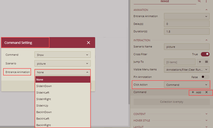
For more details on adding the animation on the Command Setting dialog, refer to the topic Dynamic Display of Components.
Preview
Go to page 2 and click the Preview button to preview the dashboard.
All the components will be shown with the entrance animation effects.