-
Interactive DashboardsCreate interactive BI dashboards with dynamic visuals.
-
End-User BI ReportsCreate and deploy enterprise BI reports for use in any vertical.
-
Wyn AlertsSet up always-on threshold notifications and alerts.
-
Localization SupportChange titles, labels, text explanations, and more.
-
Wyn ArchitectureA lightweight server offers flexible deployment.
-
 Wyn Enterprise 7.1 is ReleasedThis release emphasizes Wyn document embedding and enhanced analytical express...
 -
 Choosing an Embedded BI Solution for SaaS ProvidersAdding BI features to your applications will improve your products, better serve your customers, and more. But where to start? In this guide, we discuss the many options.
-
Visual GalleryInteractive sample dashboards and reports.
-
BlogExplore Wyn, BI trends, and more.
-
WebinarsDiscover live and on-demand webinars.
-
Customer SuccessVisualize operational efficiency and streamline manufacturing processes.
-
Knowledge BaseGet quick answers with articles and guides.
-
VideosVideo tutorials, trends and best practices.
-
WhitepapersDetailed reports on the latest trends in BI.
-
 Choosing an Embedded BI Solution for SaaS ProvidersAdding BI features to your applications will impr...
 -

- Getting Started
- Administration Guide
-
User Guide
- An Introduction to Wyn Enterprise
- Document Portal for End Users
- Data Governance and Modeling
- View and Manage Documents
- Working with Resources
- Working with Reports
- Working with Dashboards
- Working with Notebooks
- Wyn Analytical Expressions
- Section 508 Compliance
- Subscribe to RSS Feed for Wyn Builds Site
- Developer Guide
Data Blocks
Data Tables
The Table Block allows you to create and manage structured data directly within a notebook. You can add a table block via the Plus (+) button, which opens a dropdown menu of available block types.
Column Header Controls
Double Ellipsis Menu: Hover over any column header to reveal a stacked ellipsis menu.
Insert Left – Adds a column to the left of the selected column.
Insert Right – Adds a column to the right of the selected column.
Move Left – Moves the selected column one position to the left.
Move Right – Moves the selected column one position to the right.
Delete – Removes the selected column.
Row Controls
Three-Dot Menu: Hover over the first cell in a row to reveal a vertical ellipsis (three dots) menu.
Insert Above – Adds a row above the current row.
Insert Below – Adds a row below the current row.
Move Up – Moves the current row up.
Move Down – Moves the current row down.
Delete Row – Deletes the current row.
Table Block Menu
Hover over the table block to reveal a small ellipsis menu in the upper-right corner. This menu provides additional table-level actions:
Delete – Removes the entire table block.
Duplicate – Creates a copy of the table block.
Turn Into – Converts the table into another block type. Options include:
Text, Table, Accordion, Heading 1, Heading 2, Heading 3, Blockquote, Callout, Numbered List, Bulleted List, Todo List
Copy Link to Block – Copies a direct link to the table block.
Header Row – Toggles a header row. When enabled, the top row is highlighted (greyed out).
Header Column – Toggles a header column. When enabled, the first column is highlighted (greyed out).
Note: Header row and column toggles operate on a check/uncheck basis.
Pivot Tables
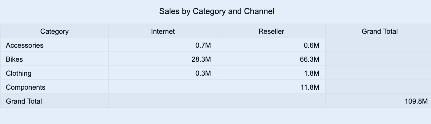
Pivot tables are a visualization used to display detailed, structured information in a flexible tabular format. They allow you to summarize, group, and analyze large datasets by organizing data into rows and columns, with values calculated at their intersections.
You can use pivot tables to explore data from multiple perspectives, identify trends, and compare metrics across categories or dimensions. Pivot tables are ideal when you need a data-driven view that supports aggregation, grouping, and drill-down analysis.
This article explains the requirements for creating pivot tables and provides an overview of key properties and configuration options available in Wyn Notebooks.
You can use pivot tables to summarize sales by region and product category, compare revenue by year and department, analyze expenses by account type and quarter, and display performance metrics by project and team.
This topic explains how to create and customize data tables and explains the most frequently used properties. Refer to the reference for all the column chart properties and configuration options.
Create a Pivot Table
To create a pivot table, click on the Plus (+) button, opening the dropdown from which you can select your table.
Bind Data to a Pivot Table
For a basic pivot table, you need to determine how your data is organized:
Values: The data displayed in the body of the table. These are typically numeric measures, such as Sales, Profit, or Quantity, that are aggregated across combinations of rows and columns.
Rows: The categories displayed along the left side of the table. These define how the data is grouped vertically (for example, Product, Region, or Employee).
Columns: The categories displayed across the top of the table. These define how the data is grouped horizontally (for example, Year, Month, or Quarter).
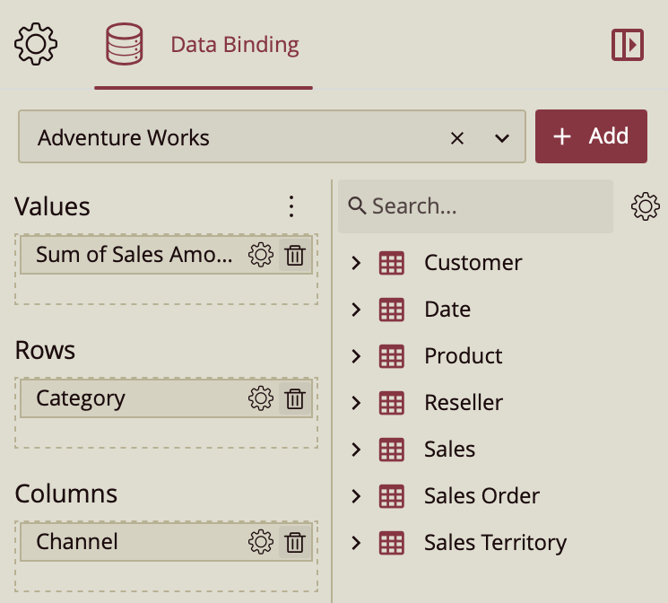
Once your data source is selected, all data attributes appear in the Data Binding tab. You can drag the following to the binding slots of the table:
Data attribute: Drag and drop any field from the data source.
Measure: Hover over the data source table name, click the gear icon (⚙), and select Add measure…. Define a name and an expression, click OK, then drag the measure to a binding slot.
Calculated column: Hover over the data source table name, click the gear icon (⚙), and select Add calculated column…. Define your calculation, click OK, then drag it to a binding slot.
Add Aggregations
You can control how data is aggregated and labeled in the pivot table:
Aggregation method: Click the gear icon (⚙) next to a bound data attribute and select an aggregation type (e.g., Sum, Average, Count).
Rename data attribute: Click the gear icon (⚙) next to a bound data attribute and select Rename to modify how it appears in the table.
Tip: You can apply different aggregation methods to different values, allowing for more complex summaries (for example, displaying both Sum of Sales and Average Profit).
Set Table Title
By default, Wyn generates a title based on the data attributes used in the visualization.
You can modify this title in the Inspector Panel:
Click the gear icon (⚙) next to the Data Binding tab to open the Inspector Panel.
Under Title, type a custom title for your table.
Note: Once a custom title is entered, changes to the data attributes will no longer automatically update the title.
Add Tooltip
To include additional information when hovering over table values, drag one or more data attributes into the Tooltipbinding slot. Tooltips can display supplementary details such as related metrics, descriptions, or contextual data without adding new columns to the table.
Customize Colors
You can customize the background colors and alternating stripe patterns of your pivot table to improve readability and visual contrast.
In the Inspector Panel, you can modify:
Column Headers: Background color of column headers
Row Headers: Background color of row headers
Corner Area: Background color of the corner intersection
Subtotals Area: Background color for subtotal rows or columns
Grand Totals Area: Background color for overall totals
Choose from:
Theme: A seven-color palette based on a theme.
Standard: A set of predefined color palettes.
Custom: Define your own palette to match brand or accessibility requirements.