-
Interactive DashboardsCreate interactive BI dashboards with dynamic visuals.
-
End-User BI ReportsCreate and deploy enterprise BI reports for use in any vertical.
-
Wyn AlertsSet up always-on threshold notifications and alerts.
-
Localization SupportChange titles, labels, text explanations, and more.
-
Wyn ArchitectureA lightweight server offers flexible deployment.
-
 Wyn Enterprise 7.1 is ReleasedThis release emphasizes Wyn document embedding and enhanced analytical express...
 -
 Choosing an Embedded BI Solution for SaaS ProvidersAdding BI features to your applications will improve your products, better serve your customers, and more. But where to start? In this guide, we discuss the many options.
-
Visual GalleryInteractive sample dashboards and reports.
-
BlogExplore Wyn, BI trends, and more.
-
WebinarsDiscover live and on-demand webinars.
-
Customer SuccessVisualize operational efficiency and streamline manufacturing processes.
-
Knowledge BaseGet quick answers with articles and guides.
-
VideosVideo tutorials, trends and best practices.
-
WhitepapersDetailed reports on the latest trends in BI.
-
 Choosing an Embedded BI Solution for SaaS ProvidersAdding BI features to your applications will impr...
 -

- Getting Started
- Administration Guide
-
User Guide
- An Introduction to Wyn Enterprise
- Document Portal for End Users
- Data Governance and Modeling
- View and Manage Documents
- Working with Resources
- Working with Reports
- Working with Dashboards
-
Working with Notebooks
- Notebook Designer
- Connect to Data
-
Blocks
- Content Blocks
- List Blocks
- Quote Blocks
- Structure Blocks
- Table Blocks
- Chart Blocks
- KPI
- Label Slicer
- Map
-
Property Reference
- Common Properties
- Stacked Column Chart Properties
- Percent Stacked Column Chart Properties
- Bar Chart Properties
- Stacked Bar Chart Properties
- Percent Stacked Bar Chart Properties
- Line Chart Properties
- Area Chart Properties
- Stacked Area Chart Properties
- Percent Stacked Area Properties
- Combined Chart Properties
- Pie Chart Properties
- Donut Chart Properties
- Scatter Chart Properties
- Bubble Chart Properties
- Funnel Chart Properties
- Treemap Chart Properties
- KPI Chart Properties
- Pivot Table Properties
- Data Table Properties
- KPI Matrix Properties
- Label Slicer Properties
- Map Properties
- Wyn Analytical Expressions
- Section 508 Compliance
- Subscribe to RSS Feed for Wyn Builds Site
- Developer Guide
Pivot Table Properties
Table Setting
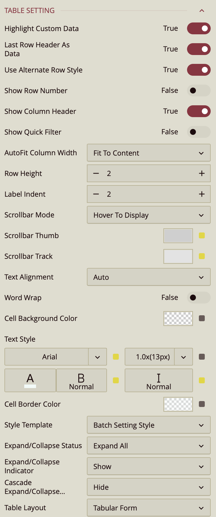
Highlight Custom Data – Toggles the highlight of cells that contain custom or manually entered data. When enabled (True by default), these cells are visually distinguished from calculated or imported data.
Last Row Header as Data – Toggles whether the last row header is treated as data. When enabled (True by default), the last header row is included in the data area of the pivot table.
Use Alternate Row Style – Toggles alternating background styles for rows to improve readability. Enabled (True) by default.
Show Row Number – Toggles the display of a row number column on the left side of the pivot table. Disabled (False) by default.
Show Column Header – Toggles the display of column headers at the top of the pivot table. Enabled (True) by default.
Show Quick Filter – Toggles the display of a quick filter control for the pivot table. When enabled (False by default), it allows users to quickly filter visible data without modifying the main filter settings.
AutoFit Column Width – Determines how column widths are adjusted:
Fit to content (default) – Columns resize automatically to fit the cell content.
None – Columns remain at their set width regardless of content.
Fit to header – Columns resize to fit the header text.
Row Height – Sets the height of rows in pixels.
Label Indent – Sets the indentation level (in pixels) for nested row labels.
Scrollbar Mode – Controls when scrollbars appear:
Hover to display (default) – Scrollbars appear when hovering over the table.
Auto – Scrollbars appear only when needed.
Hidden – Scrollbars are never displayed.
Visible – Scrollbars are always displayed.
Scrollbar Thumb – Sets the color of the scrollbar thumb (the draggable handle).
Scrollbar Track – Sets the color of the scrollbar track (the background path for the thumb).
Text Alignment – Sets text alignment in cells: Auto (default), Left, Center, or Right.
Word Wrap – Toggles whether text wraps to multiple lines when it exceeds the cell width (False by default).
Cell Background Color – Sets the background color of data cells.
Text Style – Configures font size, family, color, weight, and style for cell text.
Cell Border Color – Sets the border color for data cells.
Style Template – Applies a predefined table style:
Batch setting style (default) – Uses Wyn’s default table style.
Other options – Includes styles similar to Excel table themes.
Add new style – Allows creating and saving a custom style.
Expand/Collapse Status – Sets the default expansion state:
Expand all (default) – All groups are expanded.
Collapse all – All groups are collapsed.
Custom – Expansion state is user-defined.
Expand/Collapse Indicator – Controls visibility of expansion icons: Show (default), Auto, or Hide.
Cascade Expand/Collapse – Controls whether expanding/collapsing a group also affects its nested groups: Show(default), Auto, or Hide.
Table Layout – Sets table layout mode: Tabular form (default) or Compact form.
Pagination
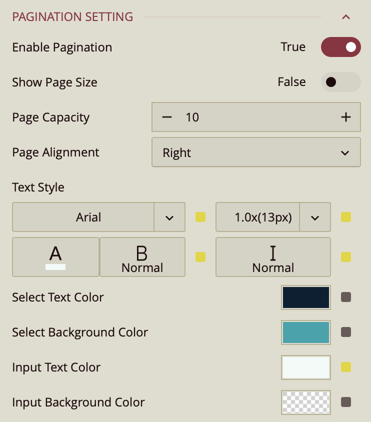
Enable Pagination – Toggles whether the pivot table displays results across multiple pages (True by default).
Show Page Size – Toggles visibility of the page size selector (False by default).
Page Capacity – Sets the maximum number of records displayed per page.
Page Alignment – Sets the alignment of pagination controls: Right (default), Left, or Center.
Text Style – Configures font family, size, color, weight, and style for pagination text.
Select Text Color – Sets the text color for the selected page number.
Select Background Color – Sets the background color for the selected page number.
Input Text Color – Sets the text color for the page input box.
Input Background Color – Sets the background color for the page input box.
Tooltip
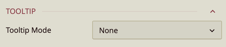
Tooltip Mode – Determines how tooltips are displayed when hovering over the chart:
None – Disables tooltips.
Data Point (default) – Shows a tooltip for the specific data point under the pointer.
Category – Shows a tooltip for all data points that share the same category value.
Column Headers
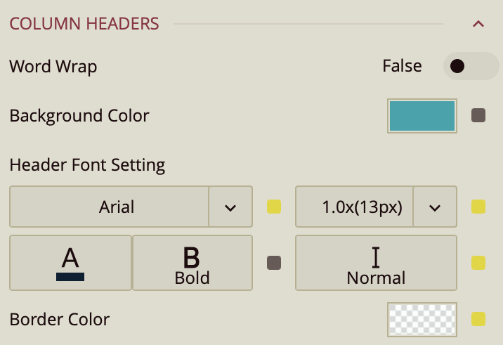
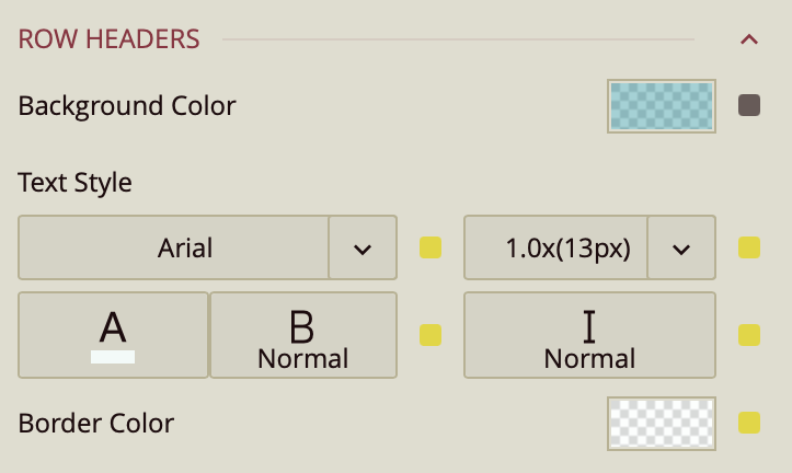
Row Headers
Corner Area
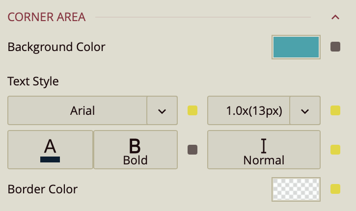
Column Headers, Row Headers, and Corner Area share the following settings:
Word Wrap – Toggles wrapping of header text (False by default).
Background Color – Sets the background color for the header area.
Header Font Setting – Configures font family, size, color, weight, and style for header text.
Border Color – Sets the border color for the header area.
Sub Totals Area
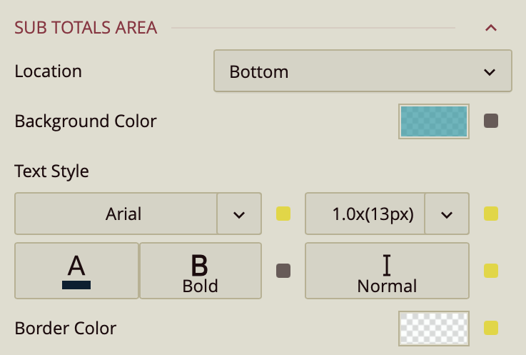
Location – Sets the placement of subtotals: Bottom (default), Top, or Hidden.
Background Color – Sets the background color for the subtotal area.
Text Style – Configures font family, size, color, weight, and style for subtotal text.
Border Color – Sets the border color for the subtotal area.
Grand Totals Area
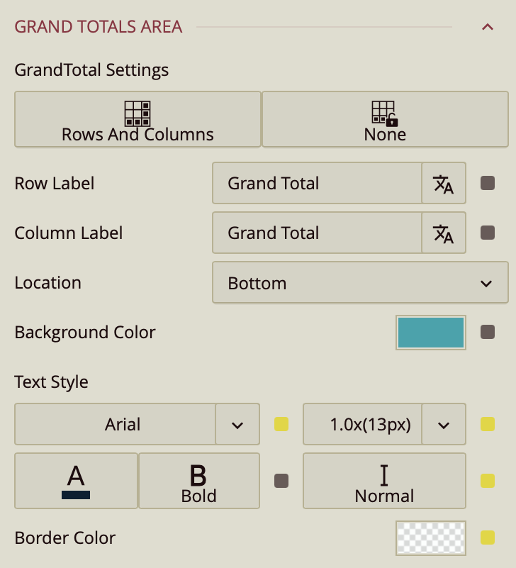
Grand Total Settings – Sets whether grand totals are shown for rows, columns, or not at all.
Row Label – Sets the label for the row grand total (Grand Total by default).
Column Label – Sets the label for the column grand total (Grand Total by default).
Location – Places the grand total at the Bottom or Top of the table.
Background Color – Sets the background color for the grand total area.
Text Style – Configures font family, size, color, weight, and style for grand total text.
Border Color – Sets the border color for the grand total area.
First Data Stripe
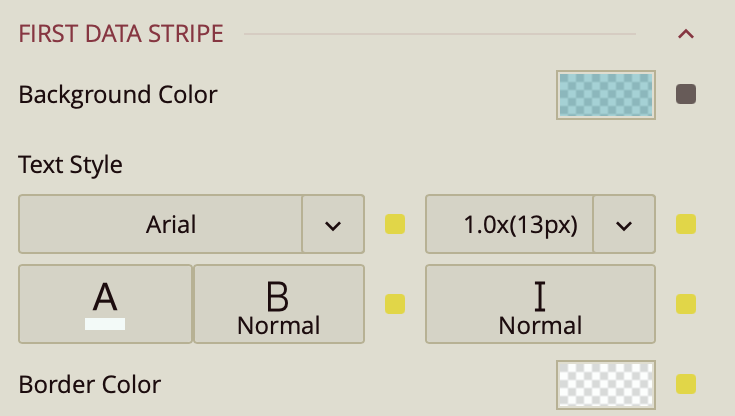
First Data Stripe – Sets the background color, text style, and border color for alternating data rows in the first stripe pattern.
Second Data Stripe
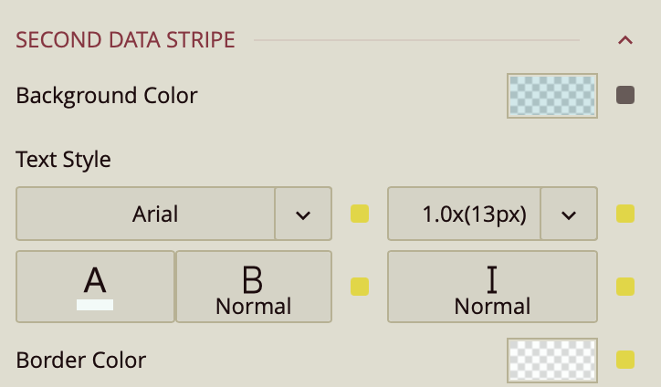
Second Data Stripe – Sets the background color, text style, and border color for alternating data rows in the second stripe pattern.