


- Getting Started
- Administration Guide
-
User Guide
- An Introduction to Wyn Enterprise
- Document Portal for End Users
- Data Governance and Modeling
- Working with Resources
- Working with Reports
-
Working with Dashboards
- Dashboard Designer
- Selecting a Dataset
- Data Attributes
- Dashboard Scenarios
- Dashboard Templates
- Component Templates
- 3D Scene
- Explorer
- Visualization Wizard
- Data Analysis and Interactivity
- Dashboard Appearance
- Preview Dashboard
- Export Dashboard
- Dashboard Lite Viewer
- Using Dashboard Designer
- Animating Dashboard Components
- Document Binder
- Dashboard Insights
- View and Manage Documents
- Understanding Wyn Analytical Expressions
- Section 508 Compliance
- Subscribe to RSS Feed for Wyn Builds Site
- Developer Guide
Funnel EChart
Funnel ECharts are dynamic and visually engaging visualization tools designed to illustrate and analyze sequential processes. Funnel ECharts offer a comprehensive view of the progression of events, actions, or stages in a business workflow. Funnel ECharts are used to track multi-step processes that culminate in a desired outcome. With their distinctive tapered shape, Funnel ECharts are used to represent the gradual narrowing of data as it moves through each successive stage of a process. The width of each section of the funnel corresponds to the relative magnitude or volume of data at a particular stage. Learn more about creating and using Funnel EChart in Wyn Enterprise below.
In this help article, you will find the following information,
Create a Funnel EChart
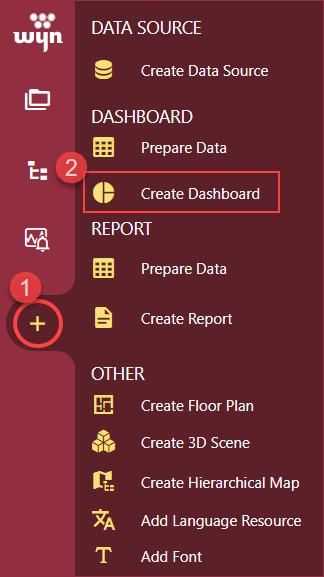
To create a Funnel EChart, navigate to the Resource or Document Portal and follow the below instructions,
Click the + Create button and then click the Create Dashboard option.
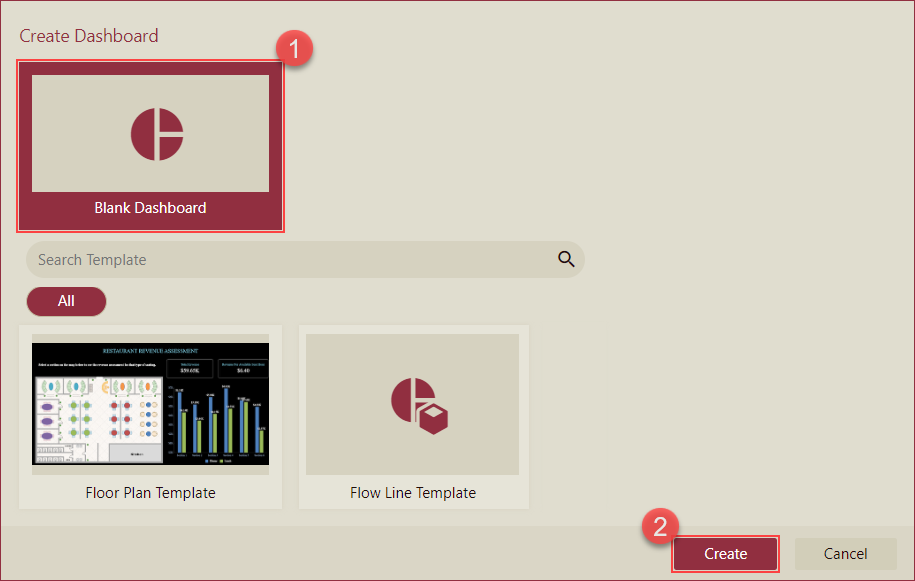
Select the Blank Dashboard option or select a template and click the Create button.
On the left-hand side of your dashboard designer, you will find the Custom Visualizations menu.
 Drag and drop the Funnel Chart(ECharts) onto the dashboard designer.
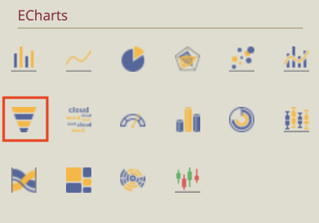
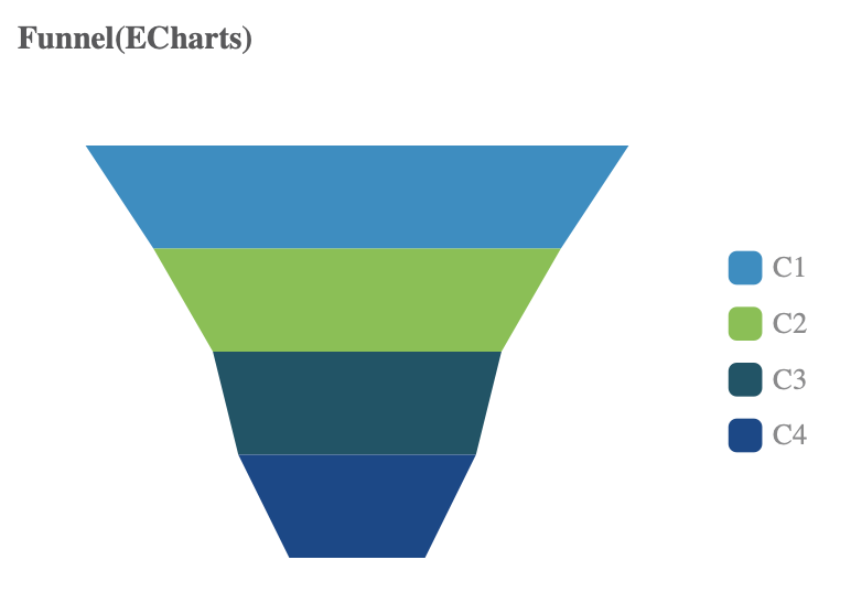
Your initial chart should look something like this.
Bind Dataset to Funnel EChart
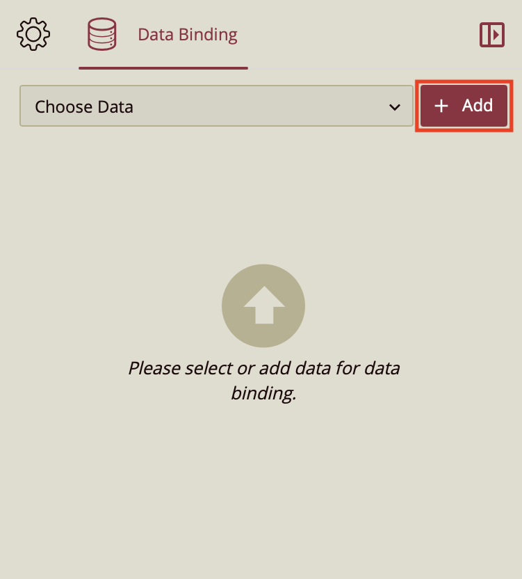
Upon completing the previous action, you will notice on the right-hand side that the Data Binding tab is opened. Click the Add button to choose your dataset.
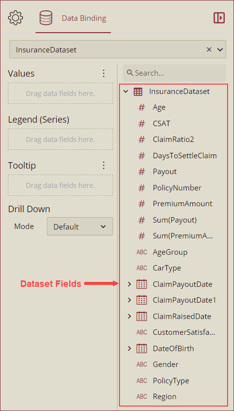
Now, drag and drop the applicable dataset fields in the Values, Legend (Series), and Tooltip data containers. You can also select a drill-down mode (Default, Pre-set Targets, or Pre-set Path) from the Mode dropdown under the Drill Down option. See theDrill Down help article for more information on drilling down in Wyn Enterprise.
Format Data Attributes
You can perform various operations in a Funnel EChart to format the data attributes and control data display. Use the settings icon in the Data Field containers to format data attributes. The following operations are included in the Funnel EChart scenario;
Aggregation Method: Use the Aggregation Method option to display a summarized value by aggregating multiple values of a data attribute. Aggregation Method supports Sum, Average, Max, Min, Count, and Distinct Count methods. See the Aggregation Method help article for more information.
Quick Functions: Use the Quick Functions option to highlight key indicators in your chart scenario by applying powerful calculations on measures. Quick Functions in Wyn Enterprise support Date Based Functions, Ranking Calculation, Percentile Calculation, Running Calculation, Moving Calculation, and Original Value. See the Quick Functions help article for more information.
Filter: Use the Filter option to display relevant data in your chart scenario. See the Filter Data help article for more information.
Rename: Use the Rename option to change the name of a data attribute to make it comprehensible and meaningful. See the Rename a Data Attribute help article for more information.
Remove: Use the Remove option to remove a data attribute from the chart scenario.
Tooltip Setting: Use the tooltip setting to customize the tooltips. You can customize the background image, color, and font style, add new data fields, modify the data fields, and modify expressions for data binding.
Analyze Data
Wyn dashboard scenarios support rich data analysis and exploration capabilities to help you analyze massive amounts of information and make data-driven decisions. The following analysis operations are available in the Action Bar corresponding to each scenario in the designer;
Filter: To filter out relevant data in your chart scenario. See the Filter Data help article, for information on using the filter options in a dashboard scenario.
Sort: To arrange the chart data in a more meaningful order. See the Sort help article for information on using the sort options in a dashboard scenario.
Conditional Visualization: To filter, compare, and rant the data in a dashboard scenario. See the Conditional Visualization help article for information on using various visualization options.
Data Binding: To modify the data binding of the dashboard scenario with new attributes use the Data Binding option. See the Modify Data Binding help article for more information.
Focus: To expand the chart scenario to full-screen size, use the Focus option.
Customize Appearance
Navigate to the Inspector Panel and modify the settings as per your requirements. The properties of the Funnel EChart are listed and described below.
CHART STYLE
Property | Description |
|---|---|
Maintain Color Assignments | To change the color assignments of the column bars, turn the flag to True and change the color of the data items from the Assign Colors popup using the Color Assignment property. To use the default color palettes for the column bars, turn the flag to False and select a default color palette from the Palette property. By default, the value of the Main Color Assignment property is set as False. |
Color Assignment | Color Assignment property is visible only when the Maintain Color Assignment property is set to True. This property is used to manage the colors of the data items of the column bars. |
Palette | Palette property is visible only when the Maintain Color Assignment property is set to False. Palette is used to select the group of colors for the column bars. |
Graph Opacity | Use the Graph Opacity property to set the opacity level of the EChart. The value of the Graph Opacity property ranges from 0% to 100%. |
Width Range | Set the funnel width using the range bar of the Width Range property. |
Symbol Sort | Select Default, Descending, or Ascending option from the dropdown to set the sorting option for the funnel symbols. |
Symbol Gap | Set the gap between the funnel symbols using this property. |
Symbol Align | Select Left, Right, or Center option from the dropdown to align the funnels on the chart scenario. |
Auto Gradient | To set an automatic color gradient in the chart, set the Auto Gradient property to True. By default, the value of this property is set as False. |
Canvas Padding | Set the Left, Right, Top, and Bottom positions of the chart canvas using the Canvas Padding property. |
Custom Echarts Option | Use the Custom Echarts Option to customize the chart using JavaScript code. |
Custom Behavior | Use the Custom Behavior option to directly write JavaScript code and use setTimeout/setInterval/myChart (echart instance), etc., to customize the behavior of the chart, to dynamically change the chart content in real-time. Refer to section ECharts Custom Behavior for more details. |
ANIMATION
Property | Description |
|---|---|
Entrance Animation | Select an option from the dropdown to set the animation style of the appearance of the chart scenario. After selecting an option (SlideInDown, SlideInLeft, SlideInRight, SlideInUp, SlideInDown, BackInDown, BackInLeft, or BackInRight) from the dropdown, set the delay and duration of the animation using the Delay(s) and Duration(s) properties respectively. |
DATA VISUALIZATION
Property | Description |
|---|---|
Include All Dimensions | To include the labels with Null values in the chart scenario, set this property to True. |
DATA LABELS
Property | Description |
|---|---|
Show Data Labels | To display data labels set the Show Data Label property to True. By default, the value of the Show Data Label property is set to False. |
Display Pattern | You can add a line break (, \n()) between Series and Value by using the Display Pattern property for the data labels. If you hide some parts of the label, like the value, and series the part will be removed from the pattern, and the related connector (the prefix , \n ()) will also be removed. The dropdown list has 2 display pattern options. By default, the display pattern selected is Series(Value). |
Value | To disable the display of the data label values set the Value property to True. By default, the value of the Value property is set to False. |
Display Unit | Select a display unit option from the dropdown. The available options are Auto, None, Thousands, Millions, Billions, and Trillions. |
Series Name | To display the name of the data label series set the Series Name property to True. By default, the property is set to False. |
Location | Select the Inside or Outside option from the dropdown to display the data labels inside or outside the column bars. |
Display Mode | Select an option from the dropdown to set the display mode of the data labels. The available options are Auto and All. |
Show Connecting Line | To disable the display of connecting lines of the data labels, set the Show Connecting Line property to False. By default, this property is set as True. |
Line Width | Set the width of the connecting line using this property. |
Connecting Line Color | Select the color of the connecting line using this property. |
Data Label Font Setting | Set the font family, font size, font color, font weight, and font style of the data labels using this property. |