-
Interactive DashboardsCreate interactive BI dashboards with dynamic visuals.
-
End-User BI ReportsCreate and deploy enterprise BI reports for use in any vertical.
-
Wyn AlertsSet up always-on threshold notifications and alerts.
-
Localization SupportChange titles, labels, text explanations, and more.
-
Wyn ArchitectureA lightweight server offers flexible deployment.
-
 Wyn Enterprise 7.1 is ReleasedThis release emphasizes Wyn document embedding and enhanced analytical express...
 -
 Choosing an Embedded BI Solution for SaaS ProvidersAdding BI features to your applications will improve your products, better serve your customers, and more. But where to start? In this guide, we discuss the many options.
-
Visual GalleryInteractive sample dashboards and reports.
-
BlogExplore Wyn, BI trends, and more.
-
WebinarsDiscover live and on-demand webinars.
-
Customer SuccessVisualize operational efficiency and streamline manufacturing processes.
-
Knowledge BaseGet quick answers with articles and guides.
-
VideosVideo tutorials, trends and best practices.
-
WhitepapersDetailed reports on the latest trends in BI.
-
 Choosing an Embedded BI Solution for SaaS ProvidersAdding BI features to your applications will impr...
 -

- Getting Started
- Administration Guide
-
User Guide
- An Introduction to Wyn Enterprise
- Document Portal for End Users
- Data Governance and Modeling
- View and Manage Documents
- Working with Resources
- Working with Reports
-
Working with Dashboards
- Tour the Dashboard Designer
- Create a Dashboard
- Configure Dashboard
- Dashboard Data Binding
- Scenarios
- Appearance
- Component Management
- Parameters
- Interactions
- Finalize Your Dashboard
- Using AI in Wyn
- Working with Notebooks
- Wyn Analytical Expressions
- Section 508 Compliance
- Subscribe to RSS Feed for Wyn Builds Site
- Developer Guide
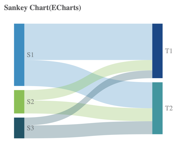
Sankey EChart
A Sankey E-Chart is a visualization tool that allows you to display the connection between any given element and the categories they are a part of. The chart shows the elements as flowing from their respective categories. Depending on the element the bands flowing from the categories will be thicker or thinner.
Create a Sankey E-Chart
To create a Sankey E-Chart in Wyn Enterprise, navigate to the dashboard designer page and follow the instructions below,
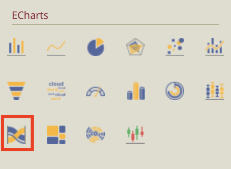
On the left-side menu, select the Custom Visualization icon to open the E-Chart menu.

Find the Sankey E-Chart from the menu and drag and drop it onto the dashboard designer.
Your initial chart should look like the image below.
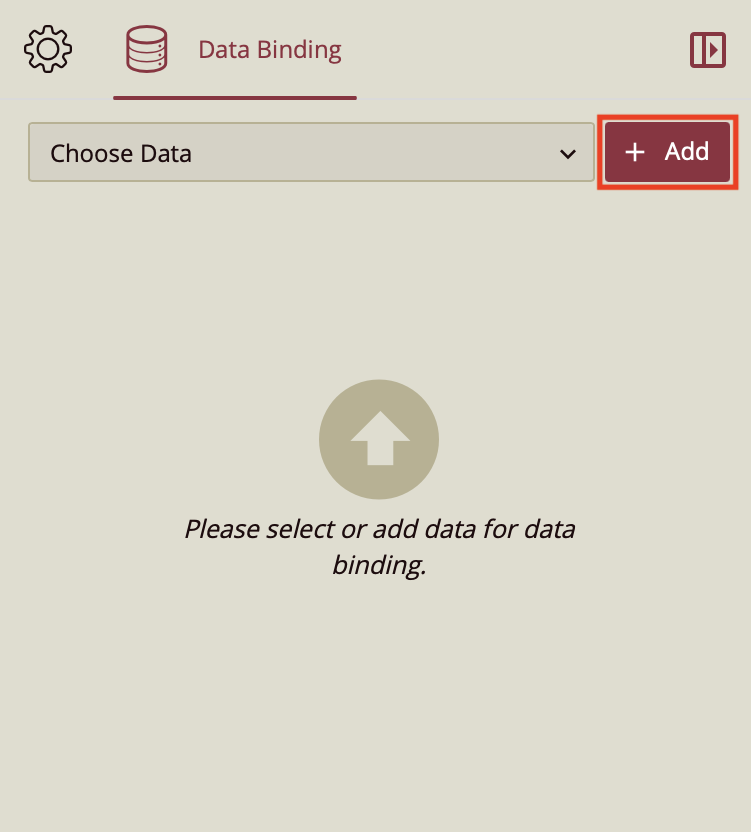
On the right-hand side, you will find that this action has opened the Data Binding tab. Select Add to select the data you want to bind to your E-chart.
Upon selecting the data you want to use in the menu, drag and drop the values onto the biding slots for Values and Source and Type. You are going to want to drop your quantitative data into the Values slot, the data that expresses what part of the category your elements take up. Your category is going to be placed in the Source slot and your elements in the Target slot.
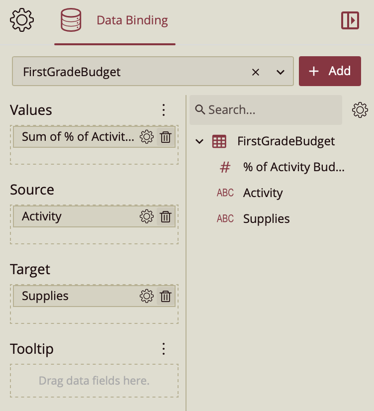
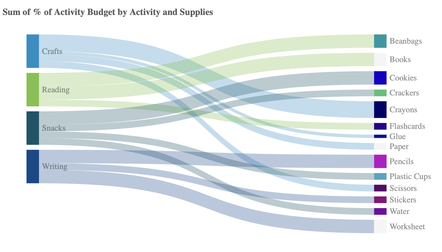
In this case, I have created a simple example from a small dataset that shows a first-grade class's supplies as a percentage of the activity budget for which they are needed.
Click Preview on the top ribbon.
 Now you have a Sankey E-Chart.
Format Data Attributes
You can perform various operations in a Sankey EChart to format the data attributes and control data display. Use the settings icon in the Data Field containers to format data attributes. The following operations are included in the Boxplot E-Chart scenario;
Aggregation Method: Use the Aggregation Method option to display a summarized value by aggregating multiple values of a data attribute. Aggregation Method supports Sum, Average, Max, Min, Count, and Distinct Count methods. See the Aggregation Method help article for more information.
Quick Functions: Use the Quick Functions option to highlight key indicators in your chart scenario by applying powerful calculations on measures. Quick Functions in Wyn Enterprise support Date Based Functions, Ranking Calculation, Percentile Calculation, Running Calculation, Moving Calculation, and Original Value. See the Quick Functions help article for more information.
Filter: Use the Filter option to display relevant data in your chart scenario. See the Filter Data help article for more information.
Rename: Use the Rename option to change the name of a data attribute to make it comprehensible and meaningful. See the Rename a Data Attribute help article for more information.
Remove: Use the Remove option to remove a data attribute from the chart scenario.
Tooltip Setting: Use the tooltip setting to customize the tooltips. You can customize the background image, color, and font style, add new data fields, modify the data fields, and modify expressions for data binding.
Analyze Data
Wyn dashboard scenarios support rich data analysis and exploration capabilities to help you analyze massive amounts of information and make data-driven decisions. The following analysis operations are available in the Action Bar corresponding to each scenario in the designer;
Filter: To filter out relevant data in your chart scenario. See the Filter Data help article, for information on using the filter options in a dashboard scenario.
Sort: To arrange the chart data in a more meaningful order. See the Sort help article for information on using the sort options in a dashboard scenario.
Conditional Visualization: To filter, compare, and rant the data in a dashboard scenario. See the Conditional Visualization help article for information on using various visualization options.
Data Binding: To modify the data binding of the dashboard scenario with new attributes use the Data Binding option. See the Modify Data Binding help article for more information.
Reference Line: To add a static line as a reference line on the chart use the Reference Line option. See the Reference Line help article for information on using various formatting options.
Customize Appearance
Under the Inspector Panel you will find the E-Chart settings. Modify them per your requirements. The properties of the Column E-Chart are listed and described below.
CHART STYLE
Property | Description |
|---|---|
Palette | Use this to set the colors for the chart. |
Graph Opacity | Allows you to set the opacity level of the E-chart. Its value ranges from 0% to 100%. |
Auto Gradient | To set the automatic color gradient in the chart, set the toggle item to True. By default, the value of this property is set to False. |
Custom ECharts Option | Use the Custom Echarts Option to customize the chart using JavaScript code. |
Custom Behavior | Use the Custom Behavior option to directly write JavaScript code and use setTimeout/setInterval/myChart (echart instance), etc., to customize the behavior of the chart, to dynamically change the chart content in real-time. Refer to the section E-Charts Custom Behavior for more details. |
Animation
Property | Description |
|---|---|
Entrance Animation | Select an option from the dropdown to set the animation style of the appearance of the chart scenario. After selecting an option from the dropdown, set the delay and duration of the animation using the Delay(s) and Duration(s) properties respectively. |
Automatic Carousel | To highlight the segments one at a time and display the tooltip, set the Automatic Carousel property to True. By default, this property is set to False. |
Interval(s) | Set the time interval (interval) between the segments being highlighted and the tooltip being displayed. |
DATA VISUALIZATION
Property | Description |
|---|---|
Show Zoom Axis | To display the Zoom Axis on the chart scenario set the Show Zoom Axis property to True. |
Zoom Axis Size | Use this property to set the zoom axis size. |
Zoom Axis Default Length | Use this property to change the zoom axis length. By default, it is set to 20%. |
Zoom Axis Color | Use this property to set the zoom axis color. |
Touch Zoom | Use this property to unable touch zoom |
INTERACTION
Property | Description |
|---|---|
Scenario Name | Add a name to the chart scenario using this property. |
Cross Filter | To reflect the filtered data throughout the dashboard, set this property to True. Cross filters provide a simplified and deeper analysis of what you want to observe. |
Jump To | To create a shortcut to another dashboard scenario, report, or URL use this property. See the Jump To help article for more information. |
Auto Refresh | Set None, Polling, or Real Time option from the dropdown to refresh the chart data. Dropdown options are described below, None - Select None to disable auto-refresh of the chart data. Polling - Select Polling to enable auto refresh and set an interval to refresh chart data in the Refresh Interval property. |
Visible Menu Items | Select the filtering and sorting options you wish to display on the chart scenario from the dropdown. |
Pin Annotation | To pin the annotation to the chart scenario, set this property to True. By default, this property is set as False. |
Context Menu Actions | Select multiple Context Menu Options from the dropdown. Context Menu Options include - Keep, Exclude, Jump, and Add Data Monitoring. |
Click Action | Select None, Show Tooltip, Keep, Exclude, or Jump option from the dropdown to perform an action on click. |
Single Selection | Set to True if you want users to select only one parameter at a time for your dashboard. |
TITLE
Property | Description |
|---|---|
Show Title | To hide the title of the chart set this property to False. By default, this property is set as True. |
Title | Add or edit the title of the chart using this property. |
Alignment | Select the Left, Center, or Right alignment of the title. |
Title Font Setting | Set the font family, size, color, weight, and style of the title using the Title Font Setting options. |
Padding | To create space around the title of the chart use the Padding property. It supports Padding Left, Padding Top, Padding Right, and Padding Bottom. Their values can be different. |
NODE STYLE
Property | Description |
|---|---|
Border Color | Use this property to set the border color on the right- and left-hand nodes. For this color to appear, you need to modify the Border Width property below. |
Border Width | Use this property to add a border to the nodes. By default, the border width is set to 0. Increase it to create a border. |
Border Style | Use this property to change the style of the border from Solid to Dashed. |
Border Radius | Use this property to round the edges of the border. |
Node Width | Use this property to increase or decrease the width of the nodes. |
Node Gap | Use this property to increase or decrease the gap between nodes |
Orient | Use this property to change the orientation of the chart from Horizontal to Vertical |
Show Node Label | Use this property to show or hide node labels. |
Node Label Font Setting | Set the font, size, and weight of the node label. |
LINE STYLE
Property | Description |
|---|---|
Line Opacity | Use this property to change the line opacity. |
Line Curvature | Use this property to change the line curvature. |
Show Data Label | Set the toggle item to True to show the data label on the chart. |
Display Unit | Use this setting to change the display unit of the data label. |
Data Label Font Setting | Use this to change the font, size, and weight of the data label. |
Display Mode | Switch this property from Auto to All if you would like the chart to display all data labels. |
TOOLTIP
Property | Description |
|---|---|
Tooltip Mode | Set this property to Data Point to display the tooltip in the preview. The tooltip is a feature that allows you to display a certain values when you hover over your chart in the preview, in this case the values displayed are the min, max, median, and upper and lower quartile values. For more information on setting up a tooltip, read the Customize Dashboard Tooltip help doc. |
SPECIAL DATA
Property | Description |
|---|---|
Show Null As | Allows you to replace missing or undefined values with a placeholder. |
Show Blank As | Allows you to replace values left empty with a placeholder. |
NO DATA CONTENT
Property | Description |
|---|---|
Content | Set the display content in case no data is found in the chart scenario. |
Text Align | Select the Left, Right, or Center option from the dropdown to align the no data content text. |
Vertical Align | Set the vertical alignment of the no-data content. |
Font | Set the font family, size, color, weight, and style of the no-data content using this property option. |
Background Image | Add an embedded, shared, or external image as a background image for the no-data content. |
LAYOUT
Property | Description |
|---|---|
X Position | Set the horizontal position of the chart scenario using the X Position property. |
Y Position | Set the vertical position of the chart scenario using the Y Position property. |
Width | Set the width of the chart scenario using this property. |
Height | Set the height of the chart scenario using this property. |
APPEARANCE
Property | Description |
|---|---|
Background Color | Set a background color of the chart scenario using this property. |
Padding | To create space around the chart scenario, set a padding value. |
Margin | Set the margin value for the chart scenario using this property. |
Visibility | To hide the chart from the dashboard scenario, set this property to False . By default, the Visibility property is set as True. |
Background Image | Add an embedded, shared, or external image as a background image to the chart scenario. |
Border Color | Set the border color using this property. |
Border Width | Set the border width using this property. |
Border Radius | Set the border radius using this property. |
Shadow | Add a shadow using this property. |