-
Interactive DashboardsCreate interactive BI dashboards with dynamic visuals.
-
End-User BI ReportsCreate and deploy enterprise BI reports for use in any vertical.
-
Wyn AlertsSet up always-on threshold notifications and alerts.
-
Localization SupportChange titles, labels, text explanations, and more.
-
Wyn ArchitectureA lightweight server offers flexible deployment.
-
 Wyn Enterprise 7.1 is ReleasedThis release emphasizes Wyn document embedding and enhanced analytical express...
 -
 Choosing an Embedded BI Solution for SaaS ProvidersAdding BI features to your applications will improve your products, better serve your customers, and more. But where to start? In this guide, we discuss the many options.
-
Visual GalleryInteractive sample dashboards and reports.
-
BlogExplore Wyn, BI trends, and more.
-
WebinarsDiscover live and on-demand webinars.
-
Customer SuccessVisualize operational efficiency and streamline manufacturing processes.
-
Knowledge BaseGet quick answers with articles and guides.
-
VideosVideo tutorials, trends and best practices.
-
WhitepapersDetailed reports on the latest trends in BI.
-
 Choosing an Embedded BI Solution for SaaS ProvidersAdding BI features to your applications will impr...
 -

- Getting Started
- Administration Guide
-
User Guide
- An Introduction to Wyn Enterprise
- Document Portal for End Users
- Data Governance and Modeling
- View and Manage Documents
- Working with Resources
- Working with Reports
- Working with Dashboards
- Working with Notebooks
- Wyn Analytical Expressions
- Section 508 Compliance
- Subscribe to RSS Feed for Wyn Builds Site
- Developer Guide
KPI Chart
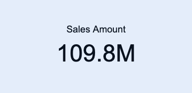
KPI charts are a visualization used to display key performance indicators at a glance, comparing an actual value against a target value. They provide an immediate understanding of progress toward goals, highlighting whether performance is on track, below expectations, or exceeding targets.
You can use KPI charts to communicate performance metrics clearly and concisely — ideal for dashboards where quick insights are essential.
This article explains the requirements for creating KPI charts and provides an overview of key properties and configuration options available in Wyn Notebooks.
You can use KPI charts to track Sales vs. Sales Target over time or across categories, measure Revenue vs. Forecast for financial performance monitoring, compare Production Output vs. Planned Output in manufacturing dashboards, or display Customer Satisfaction Score vs. Goal in service quality reports.
This topic explains how to create and customize charts and explains the most frequently used properties. Refer to the reference for all the column chart properties and configuration options.
Create a KPI Chart
To create a KPI chart, click the Plus (+) button to open the dropdown from which you can select your chart type.
Bind Data to KPI Chart
For a basic KPI chart, you need to determine the following bindings:
Actual Value: The primary measure representing the real or current performance. Examples include Actual Sales Amount, Current Revenue, or Measured Output.
Target Value: The benchmark or goal against which the actual value is compared. Examples include Sales Target, Forecasted Revenue, or Planned Output.
Once your data source is selected, all data attributes appear in the Data Binding tab. You can drag the following to the binding slots of the chart:
Data attribute: Drag and drop any field from the data source.
Measure: Hover over the data source table name, click the gear icon (⚙), and select Add measure…. Define a name and an expression, click OK, then drag the measure to a binding slot.
Calculated column: Hover over the data source table name, click the gear icon (⚙), and select Add calculated column…. Define your calculation, click OK, then drag it to a binding slot.
Add Aggregations
You can control how data is aggregated and displayed in the KPI chart:
Aggregation method: Click the gear icon (⚙) next to a bound data attribute, and select an aggregation type (e.g., Sum, Average, Count).
Rename data attribute: Click the gear icon (⚙) next to a bound data attribute and select Rename to modify how it appears in the chart.
Set Chart Title
By default, Wyn generates a chart title based on the selected data attributes.
You can modify this title in the Inspector Panel:
Click the gear icon (⚙) next to the Data Binding tab to open the Inspector Panel.
Under Title, type a custom title for your chart.
Note: Once a custom title is entered, changes to the data attributes will no longer automatically update the chart title.
Customize Appearance
You can adjust how KPI values and comparisons are displayed in Inspector Panel > Chart Style.
Options include:
Indicator Type: Choose from arrow, bar, or gauge-style indicators to represent performance.
Comparison Color: Configure color logic for positive and negative performance (e.g., green for above target, red for below target).
Threshold Display: Add visual markers for defined target ranges.
Font and Layout: Customize size, alignment, and formatting of actual and target values.
Add Tooltip
To include more context when hovering over the KPI display, drag one or more data attributes into the Tooltip binding slot.
Tooltips can display additional metrics, such as variance or percentage difference, without cluttering the main display.
Customize Colors
You can adjust the color scheme of your KPI chart in Inspector Panel > Chart Style > Palette.
Choose from:
Theme: A palette based on a theme.
Standard: A set of predefined palettes for clarity and contrast.
Custom: Define your own palette to match organizational branding or accessibility standards.