-
Interactive DashboardsCreate interactive BI dashboards with dynamic visuals.
-
End-User BI ReportsCreate and deploy enterprise BI reports for use in any vertical.
-
Wyn AlertsSet up always-on threshold notifications and alerts.
-
Localization SupportChange titles, labels, text explanations, and more.
-
Wyn ArchitectureA lightweight server offers flexible deployment.
-
 Wyn Enterprise 7.1 is ReleasedThis release emphasizes Wyn document embedding and enhanced analytical express...
 -
 Choosing an Embedded BI Solution for SaaS ProvidersAdding BI features to your applications will improve your products, better serve your customers, and more. But where to start? In this guide, we discuss the many options.
-
Visual GalleryInteractive sample dashboards and reports.
-
BlogExplore Wyn, BI trends, and more.
-
WebinarsDiscover live and on-demand webinars.
-
Customer SuccessVisualize operational efficiency and streamline manufacturing processes.
-
Knowledge BaseGet quick answers with articles and guides.
-
VideosVideo tutorials, trends and best practices.
-
WhitepapersDetailed reports on the latest trends in BI.
-
 Choosing an Embedded BI Solution for SaaS ProvidersAdding BI features to your applications will impr...
 -

- Getting Started
- Administration Guide
-
User Guide
- An Introduction to Wyn Enterprise
- Document Portal for End Users
- Data Governance and Modeling
- View and Manage Documents
- Working with Resources
- Working with Reports
- Working with Dashboards
-
Working with Notebooks
- Notebook Designer
- Connect to Data
-
Blocks
- Content Blocks
- List Blocks
- Quote Blocks
- Structure Blocks
- Table Blocks
- Chart Blocks
- KPI
- Label Slicer
- Map
-
Property Reference
- Common Properties
- Stacked Column Chart Properties
- Percent Stacked Column Chart Properties
- Bar Chart Properties
- Stacked Bar Chart Properties
- Percent Stacked Bar Chart Properties
- Line Chart Properties
- Area Chart Properties
- Stacked Area Chart Properties
- Percent Stacked Area Properties
- Combined Chart Properties
- Pie Chart Properties
- Donut Chart Properties
- Scatter Chart Properties
- Bubble Chart Properties
- Funnel Chart Properties
- Treemap Chart Properties
- KPI Chart Properties
- Pivot Table Properties
- Data Table Properties
- KPI Matrix Properties
- Label Slicer Properties
- Map Properties
- Wyn Analytical Expressions
- Section 508 Compliance
- Subscribe to RSS Feed for Wyn Builds Site
- Developer Guide
KPI Chart Properties
Data Binding
Actual Value – Bind the primary metric you want to display on the KPI chart.
Ellipsis Menu – Click the ellipsis to access:
Data Format – Opens the data format window to customize numeric or date formatting.
Display Unit – Choose how values are scaled: Auto (default), None, Thousands, Millions, Billions, or Trillions.
Target Value – Bind the comparison metric or target value for the KPI chart.
Trend Axis – Bind the data to represent the trend over a period, typically used for sparklines or trend lines within the KPI.
Trellis Columns – Bind a field to create multiple columns of KPI charts for different data segments.
Trellis Rows – Bind a field to create multiple rows of KPI charts for different data segments.
Customization
Value Setting
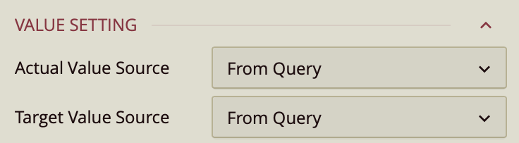
Value Settings
Actual Value Source – Dropdown:
From Query – Uses a field from the dataset.
Custom Input – Allows manual entry.
Value – Enter a numerical value.
Target Value Source – Same options as Actual Value Source.
Chart Style
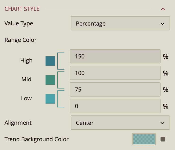
Value Type – Determines how the gauge interprets values:
Percentage (default) – Values are displayed relative to the range as a percentage.
Constant – Values are displayed as raw numbers on a fixed numeric scale.
Range Colors – Assigns colors to ranges within the gauge for visual context:
High: 100–150%
Mid: 75–100%
Low: 0–75%
(Thresholds are fully editable to match your data.)
The Properties tab allows you to customize the appearance and layout of the KPI chart.
Alignment – Determines the horizontal alignment of the KPI chart content. Options include Center (default), Left, or Right.
Trend Background Color – Sets the background color for the trend axis area.
Sub Title
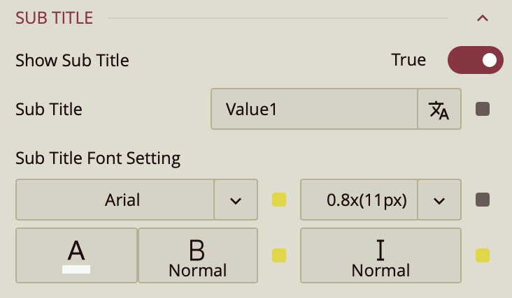
Show Subtitle – Toggles whether a subtitle is displayed.
Subtitle Text – Enter the text for the subtitle.
Font Setting – Set the subtitle’s font family, size, color, weight, and style.
Data Label
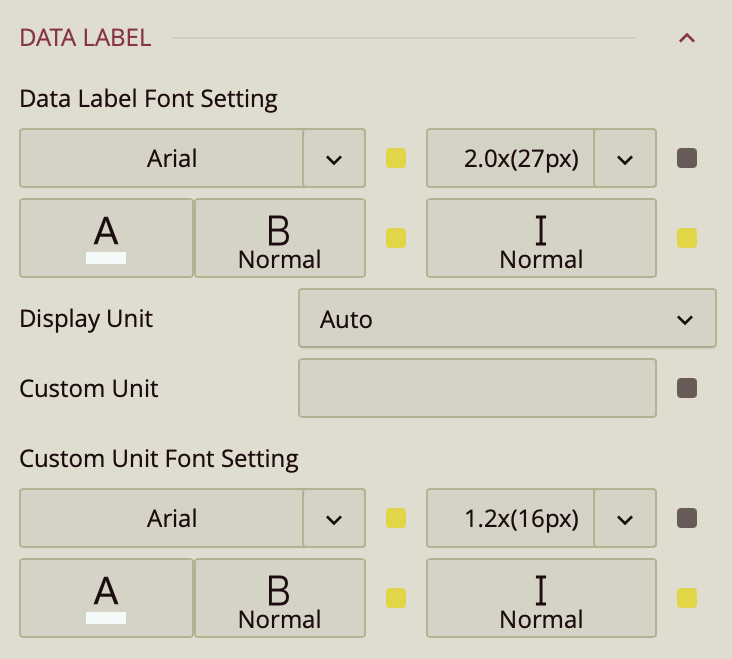
Font Settings – Font family, size, color, weight, style.
Display Unit – Auto (default), None, Thousands, Millions, Billions, Trillions.
Custom Unit – Enter a custom label (e.g., "kg").
Custom Unit Font Settings – Font family, size, color, weight, style.
Comparison Label
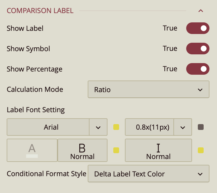
The Comparison Label displays additional information comparing the actual and target values on the KPI chart.
Show Label – Toggles visibility of the comparison label. Default is True.
Show Symbol – Toggles display of a symbol alongside the comparison label. Default is True.
Show Percentage – Toggles display of percentage information relative to the target value. Default is True.
Calculation Mode – Determines how the comparison is calculated:
Ratio (default) – Displays the ratio of actual to target value.
Delta – Displays the difference between the actual and target value.
Label Font Settings – Configures font family, size, color, weight, and style of the comparison label.