-
Interactive DashboardsCreate interactive BI dashboards with dynamic visuals.
-
End-User BI ReportsCreate and deploy enterprise BI reports for use in any vertical.
-
Wyn AlertsSet up always-on threshold notifications and alerts.
-
Localization SupportChange titles, labels, text explanations, and more.
-
Wyn ArchitectureA lightweight server offers flexible deployment.
-
 Wyn Enterprise 7.1 is ReleasedThis release emphasizes Wyn document embedding and enhanced analytical express...
 -
 Choosing an Embedded BI Solution for SaaS ProvidersAdding BI features to your applications will improve your products, better serve your customers, and more. But where to start? In this guide, we discuss the many options.
-
Visual GalleryInteractive sample dashboards and reports.
-
BlogExplore Wyn, BI trends, and more.
-
WebinarsDiscover live and on-demand webinars.
-
Customer SuccessVisualize operational efficiency and streamline manufacturing processes.
-
Knowledge BaseGet quick answers with articles and guides.
-
VideosVideo tutorials, trends and best practices.
-
WhitepapersDetailed reports on the latest trends in BI.
-
 Choosing an Embedded BI Solution for SaaS ProvidersAdding BI features to your applications will impr...
 -

- Getting Started
- Administration Guide
-
User Guide
- An Introduction to Wyn Enterprise
- Document Portal for End Users
- Data Governance and Modeling
- View and Manage Documents
- Working with Resources
- Working with Reports
- Working with Dashboards
- Working with Notebooks
- Wyn Analytical Expressions
- Section 508 Compliance
- Subscribe to RSS Feed for Wyn Builds Site
- Developer Guide
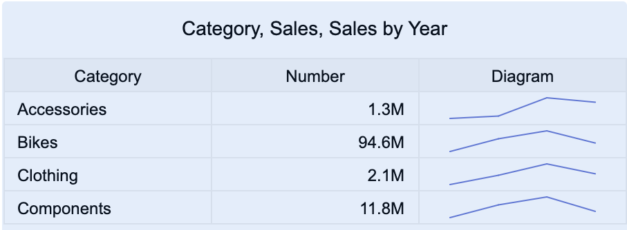
KPI Matrix
KPI Matrices are a visualization used to display multiple key performance indicators in a compact, comparative layout. Each cell in the matrix presents a KPI — such as sales, profit, or satisfaction rate — for a specific row and column category. This makes it easy to monitor performance across several dimensions at once.
You can use KPI Matrices to visualize metrics like Sales by Product Category and Region, Revenue and Profit by Department, Performance Score by Employee and Quarter, or Customer Satisfaction by Service Line and Month
This article explains the requirements for creating KPI Matrices and provides an overview of key properties and configuration options available in Wyn Notebooks.
This topic explains how to create and customize data tables and explains the most frequently used properties. Refer to the reference for all the column chart properties and configuration options.
Create a KPI Matrix
To create a KPI Matrix, click the Plus (+) button to open the dropdown from which you can select your chart.
Bind Data to KPI Matrix
The Data Binding tab in the KPI Matrix defines how data is structured into rows and columns, and what values are displayed in each cell.
Rows
Rows determine the categories that appear along the left side of the matrix — for example, Product Category, Region, or Department.
Drag and drop a data attribute into the Rows slot to group data by that dimension.
Columns
By default, the KPI Matrix includes one column named Number.
You can rename this column by hovering over the name, clicking the pencil icon, and entering a new label.
Beneath the column name is the Value slot. Drag and drop a measure (for example: Sales Amount, Profit, Order Quantity) here to display the numeric value for each row category.
Optional Sections
Diagram
Add a small in-cell chart to display trends or comparisons.
Value: The measure to visualize (e.g., Sales Amount).
Axis (Category): The dimension to plot along the horizontal axis (e.g., Year or Month).
You can select a Diagram Type from the column’s ellipsis menu (⋮):
Trend (Line)
Bar
Area
Win/Loss
Image
Add an image within each cell (e.g., a product photo or department logo).
Drag and drop an image field (URL or embedded image) into the Image slot.
Add More Columns
You can expand the KPI Matrix by adding additional columns alongside the default Number column.
To add a new column:
Click the + icon to the right of the Columns section.
Choose the type of column you want to add:
Number – Displays a numeric value.
HBar Graph – Displays a horizontal bar scaled to the measure value.
Pareto Graph – Displays a category’s contribution to the cumulative total (%).
Bullet Graph – Compares a measure against a target value.
Diagram – Adds a mini-chart with Value and Axis bindings.
Image – Displays an image.
Each column type offers unique visualization options and can be configured independently.
Add Aggregations
You can control how data is aggregated and labeled in the KPI Matrix:
Aggregation method: Click the gear icon (⚙) next to a bound data attribute and select an aggregation type (e.g., Sum, Average, Count).
Rename data attribute: Click the gear icon (⚙) next to a bound data attribute and select Rename to modify how it appears in the matrix.
Set Chart Title
By default, Wyn generates a matrix title based on the selected data attributes.
To customize it:
Click the gear icon (⚙) next to the Data Binding tab to open the Inspector Panel.
Under Title, enter a custom title for your KPI Matrix.
Note: Once a custom title is entered, changes to the data attributes will no longer automatically update the chart title.
Customize Appearance
You can adjust the style and behavior of the KPI Matrix in Inspector Panel > Table Settings.
Options include:
Show Row Number: Toggle to True to add a row number.
Scrollbar Mode: Click on the dropdown to change to either Hidden or Visible. By default, this is Hover to Display.
Cell Background Color: Choose a color from the color picker.
Add Tooltip
To include additional context for each KPI cell, drag one or more data attributes into the Tooltip binding slot.
Tooltips appear when hovering over a cell, displaying detailed metrics such as variance, percentage to goal, or related attributes.