-
Interactive DashboardsCreate interactive BI dashboards with dynamic visuals.
-
End-User BI ReportsCreate and deploy enterprise BI reports for use in any vertical.
-
Wyn AlertsSet up always-on threshold notifications and alerts.
-
Localization SupportChange titles, labels, text explanations, and more.
-
Wyn ArchitectureA lightweight server offers flexible deployment.
-
 Wyn Enterprise 7.1 is ReleasedThis release emphasizes Wyn document embedding and enhanced analytical express...
 -
 Choosing an Embedded BI Solution for SaaS ProvidersAdding BI features to your applications will improve your products, better serve your customers, and more. But where to start? In this guide, we discuss the many options.
-
Visual GalleryInteractive sample dashboards and reports.
-
BlogExplore Wyn, BI trends, and more.
-
WebinarsDiscover live and on-demand webinars.
-
Customer SuccessVisualize operational efficiency and streamline manufacturing processes.
-
Knowledge BaseGet quick answers with articles and guides.
-
VideosVideo tutorials, trends and best practices.
-
WhitepapersDetailed reports on the latest trends in BI.
-
 Choosing an Embedded BI Solution for SaaS ProvidersAdding BI features to your applications will impr...
 -

- Getting Started
- Administration Guide
-
User Guide
- An Introduction to Wyn Enterprise
- Document Portal for End Users
- Data Governance and Modeling
- View and Manage Documents
- Working with Resources
- Working with Reports
- Working with Dashboards
-
Working with Notebooks
- Notebook Designer
- Connect to Data
-
Blocks
- Content Blocks
- List Blocks
- Quote Blocks
- Structure Blocks
- Table Blocks
- Chart Blocks
- KPI
- Label Slicer
- Map
-
Property Reference
- Common Properties
- Stacked Column Chart Properties
- Percent Stacked Column Chart Properties
- Bar Chart Properties
- Stacked Bar Chart Properties
- Percent Stacked Bar Chart Properties
- Line Chart Properties
- Area Chart Properties
- Stacked Area Chart Properties
- Percent Stacked Area Properties
- Combined Chart Properties
- Pie Chart Properties
- Donut Chart Properties
- Scatter Chart Properties
- Bubble Chart Properties
- Funnel Chart Properties
- Treemap Chart Properties
- KPI Chart Properties
- Pivot Table Properties
- Data Table Properties
- KPI Matrix Properties
- Label Slicer Properties
- Map Properties
- Wyn Analytical Expressions
- Section 508 Compliance
- Subscribe to RSS Feed for Wyn Builds Site
- Developer Guide
KPI Matrix Properties
The Data Binding tab in the KPI Matrix controls how data is organized into rows and columns, and what content is displayed inside each cell.
1. Rows
Rows define the categories that appear down the left side of the KPI Matrix (for example:
Product Category,Region, orDepartment).Drag and drop a data attribute into the Rows slot to create your row groupings.
2. Columns (Default: Number)
By default, the KPI Matrix includes one Column named Number.
You can rename this column:
Hover over the column name.
Click the pencil icon that appears.
Enter your preferred label.
Value slot
Underneath the column name is the Value slot.
Drag and drop a measure (for example:
Sales Amount,Order Quantity, orProfit) to display it in the column.This is the simplest type of column and shows numeric values for each row category.
3. Optional Sections
Diagram
The Diagram section allows you to add a small chart inside each cell.
Two binding slots are available:
Value → the measure to plot (e.g.,
Sales Amount).Axis (Category) → the dimension to use as the horizontal axis (e.g.,
Year,Month).
Once bound, you can choose a diagram type from the column’s ellipsis menu (⋮):
Trend (line)
Bar
Area
Win/Loss
Image
The Image section lets you display an image in each cell.
Drag and drop an image field (such as a URL or embedded image attribute) into this slot.
This is optional, just like Diagram.
4. Adding More Columns
You can expand the KPI Matrix by adding additional columns next to the default Number column.
Click the + icon to the right of the Columns section.
Choose the type of column you want to add:
Number – a simple numeric column.
HBar Graph – displays a horizontal bar scaled to the measure value.
Pareto Graph– shows the category’s contribution to the cumulative total (%).
Bullet Graph– compares a measure against a target.
Diagram – adds a mini-chart with Value + Axis binding.
Image – displays an image.
For more information on these columns, you can reference the articles on the HBar Graph, Pareto Graph, Bullet Graph.
Customization
You can further customize your KPI Matrix using the following properties.
Table Setting
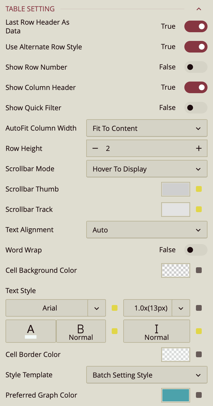
Use Alternate Row Style – Toggles alternating background colors for rows to improve readability. Enabled (True) by default.
Show Row Number – Toggles a row number column on the left side of the table. Disabled (False) by default.
Show Column Header – Toggles the display of column headers. Enabled (True) by default.
Show Quick Filter – Toggles a quick filter control for filtering visible data without adjusting main filters. Disabled (False) by default.
AutoFit Column Width – Determines how columns adjust their width.
Fit to Content (default) – Adjusts each column to fit its cell contents.
Fit to Header – Adjusts columns to fit the header text.
None – Keeps columns at a fixed width.
Row Height – Sets the height of table rows. Enter a numeric value in pixels.
Scrollbar Mode – Controls when scrollbars appear.
Hover to Display (default) – Shows scrollbars only when hovering over the table.
Auto – Displays scrollbars when content exceeds the table bounds.
Hidden – Hides scrollbars entirely.
Visible – Always shows scrollbars.
Scrollbar Thumb – Sets the color of the draggable portion of the scrollbar.
Scrollbar Track – Sets the color of the scrollbar track background.
Text Alignment – Aligns text within cells. Options are Auto (default), Left, Center, or Right.
Word Wrap – Toggles wrapping text within cells so long content appears on multiple lines. Disabled (False) by default.
Cell Background Color – Sets the background color for table cells.
Text Style – Configures font family, size, color, weight, and style (normal or italic) for table text.
Cell Border Color – Sets the color of cell borders.
Style Template – Applies a predefined style template to the table. Options include “Batch Setting Style,” built-in Excel-style templates, or Add New Style… to create a custom style.
Image Layout – Controls how images are displayed in table cells.
Zoom (default) – Scales the image proportionally to fill the cell as much as possible without cropping.
Origin – Displays the image at its original size and position.
Fill – Stretches the image to completely fill the cell, which may change its aspect ratio.
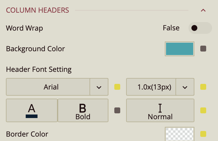
Column Headers
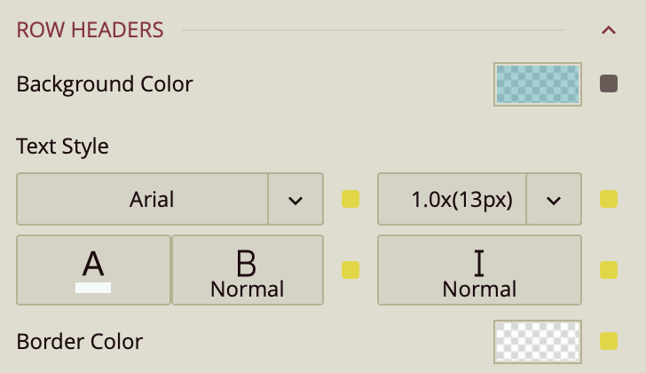
Row Headers
Corner Area
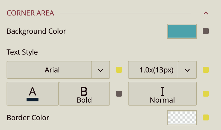
Column Headers, Row Headers, and Corner Area share the following settings:
Word Wrap – Toggles wrapping of header text (False by default).
Background Color – Sets the background color for the header area.
Header Font Setting – Configures font family, size, color, weight, and style for header text.
Border Color – Sets the border color for the header area.
First Data Stripe
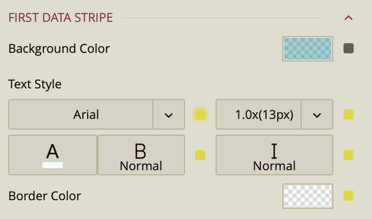
First Data Stripe – Sets the background color, text style, and border color for alternating data rows in the first stripe pattern.
Second Data Stripe
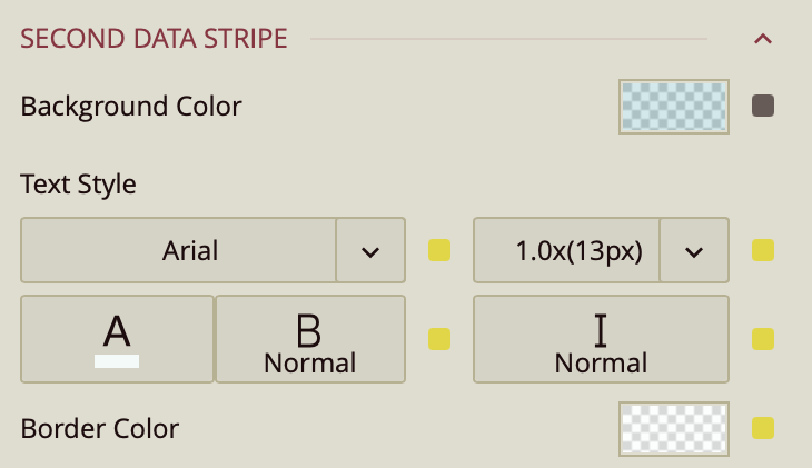
Second Data Stripe – Sets the background color, text style, and border color for alternating data rows in the second stripe pattern.