-
Interactive DashboardsCreate interactive BI dashboards with dynamic visuals.
-
End-User BI ReportsCreate and deploy enterprise BI reports for use in any vertical.
-
Wyn AlertsSet up always-on threshold notifications and alerts.
-
Localization SupportChange titles, labels, text explanations, and more.
-
Wyn ArchitectureA lightweight server offers flexible deployment.
-
 Wyn Enterprise 7.1 is ReleasedThis release emphasizes Wyn document embedding and enhanced analytical express...
 -
 Choosing an Embedded BI Solution for SaaS ProvidersAdding BI features to your applications will improve your products, better serve your customers, and more. But where to start? In this guide, we discuss the many options.
-
Visual GalleryInteractive sample dashboards and reports.
-
BlogExplore Wyn, BI trends, and more.
-
WebinarsDiscover live and on-demand webinars.
-
Customer SuccessVisualize operational efficiency and streamline manufacturing processes.
-
Knowledge BaseGet quick answers with articles and guides.
-
VideosVideo tutorials, trends and best practices.
-
WhitepapersDetailed reports on the latest trends in BI.
-
 Choosing an Embedded BI Solution for SaaS ProvidersAdding BI features to your applications will impr...
 -

- Getting Started
- Administration Guide
-
User Guide
- An Introduction to Wyn Enterprise
- Document Portal for End Users
- Data Governance and Modeling
- View and Manage Documents
- Working with Resources
- Working with Reports
- Working with Dashboards
-
Working with Notebooks
- Notebook Designer
- Connect to Data
- Blocks
-
Chart Blocks
- Customize Charts
- Column Chart
- Stacked Column Chart
- Percent Stacked Column Chart
- Bar Chart
- Stacked Bar Chart
- Percent Stacked Bar Chart
- Line Chart
- Area Chart
- Stacked Area Chart
- Percent Stacked Area Chart
- Combined Chart
- Pie Chart
- Donut Chart
- Scatter Chart
- Bubble Chart
- Funnel Chart
- Treemap Chart
- KPI Chart
- Pivot Table
- Data Table
- KPI Matrix
- Label Slicer
- Map
- Wyn Analytical Expressions
- Section 508 Compliance
- Subscribe to RSS Feed for Wyn Builds Site
- Developer Guide
Data Labels
Data labels are a configurable property available in the Inspector Panel. They allow you to display contextual information—such as values, categories, or series—directly on the chart, reducing the need to rely on axes or legends.
Data labels are enabled by default for all chart block types, except for the charts they don't apply to, namely the scatter chart, pivot table, data table, KPI matrix, and slicer
Display Pattern
Data labels support several display patterns that control how label content is arranged. These patterns correspond to the fields bound in the Data Binding tab. For example, you can display:
Category, Series (Value) on a single line
Category, Series on one line with Value displayed below
Category, Series, and Value stacked vertically from top to bottom
Note: Display patterns affect only the visual arrangement of label content. Whether a specific label element appears is controlled independently by the Value, Series Name, and Category Name toggle options.
Value Data Label
The Value data label displays the numeric measure bound to the Values data binding slot. To show values as labels, set the Value toggle to True.
When values are displayed as data labels, you may also choose to hide the value axis by setting Show Axis to False under Value Axis. This configuration is useful when the labels themselves provide sufficient quantitative context.
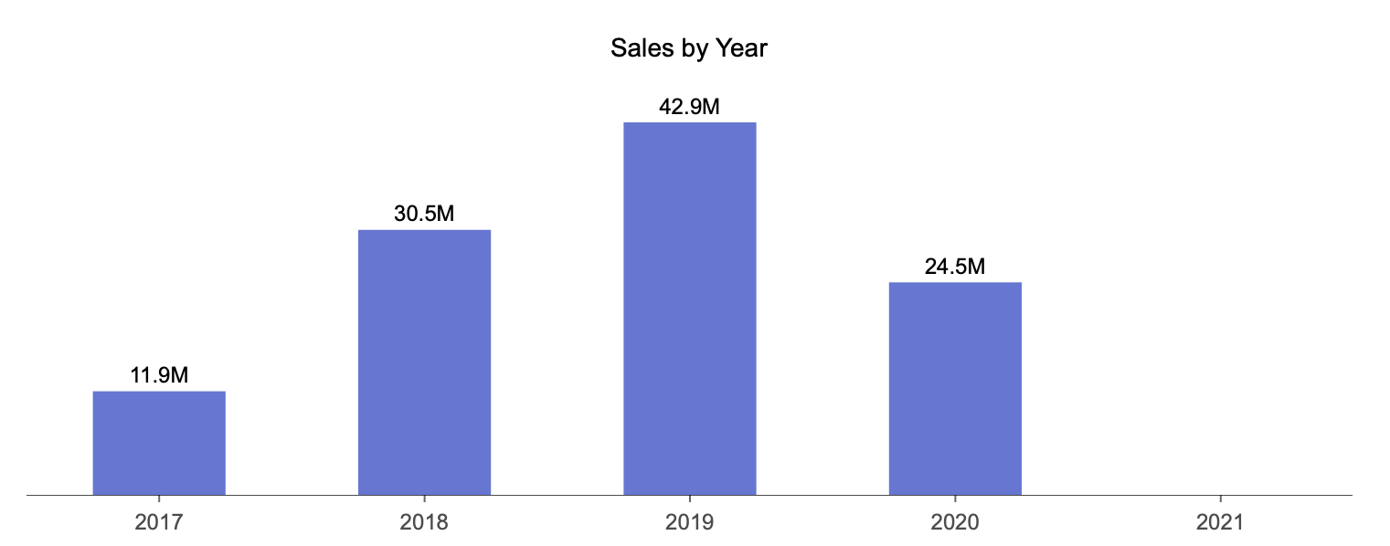
Note: If value labels are enabled, you can additionally control how numbers are presented by setting the Display Unit property. This allows you to manually define units such as thousands or millions.
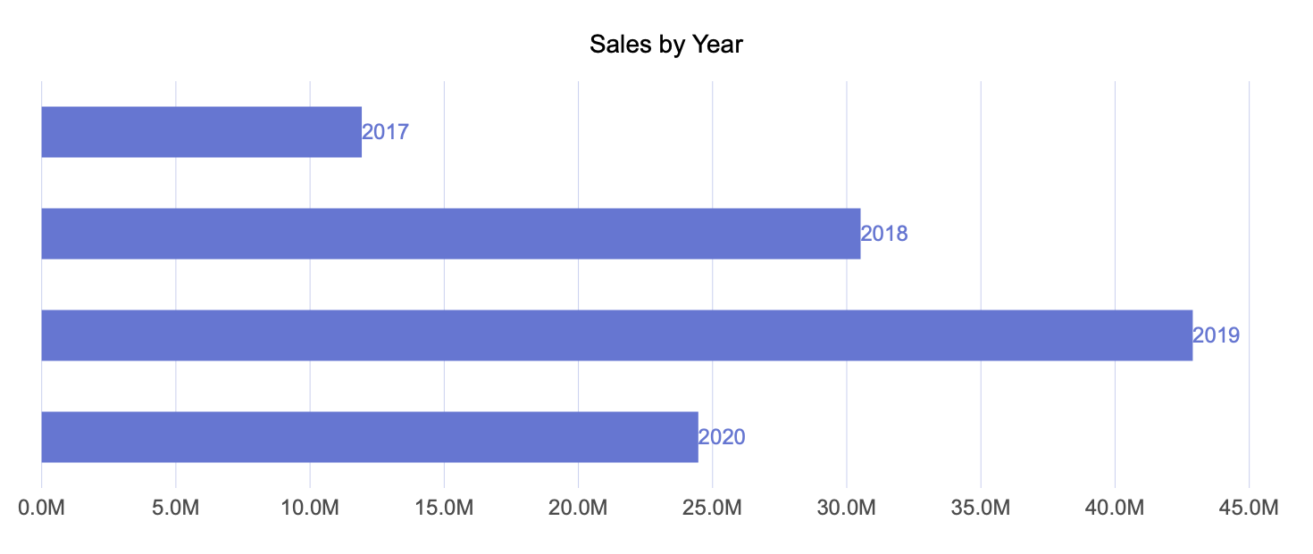
Series Name Data Label
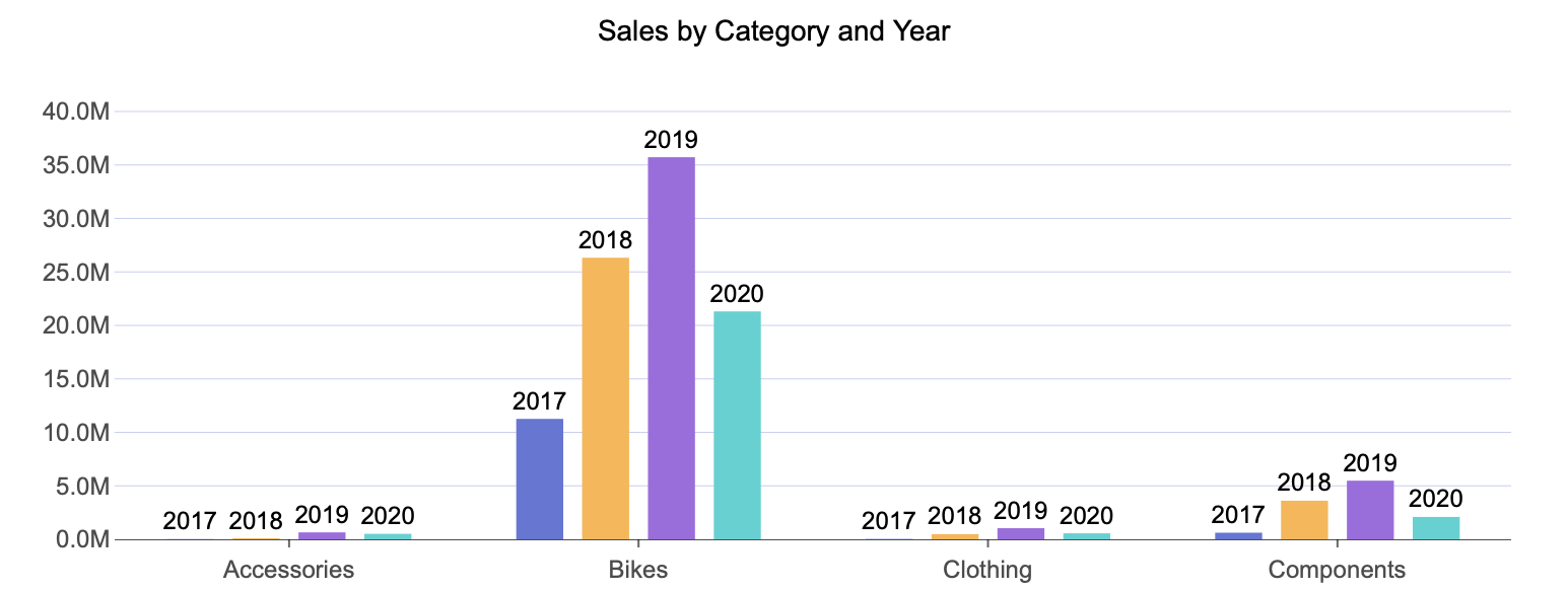
The Series Name data label displays a chart’s secondary grouping. This is commonly used in visualizations such as grouped column charts, where multiple series are compared within each category.
For example, in a grouped column chart, disabling Value and enabling Series Name results in labels that identify each series directly on the chart. The Legend for this chart has been removed by disabling Show Legend under the Legend properties.
Category Name Data Label
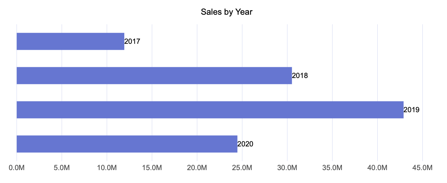
The Category Name data label displays a chart’s primary grouping. This is typically the field bound to the Axis (Category) data binding slot.
In scenarios where category labels are displayed directly on the chart, you may also choose to hide the category axis. To do this, set Show Axis to False under Axis (Category) properties.
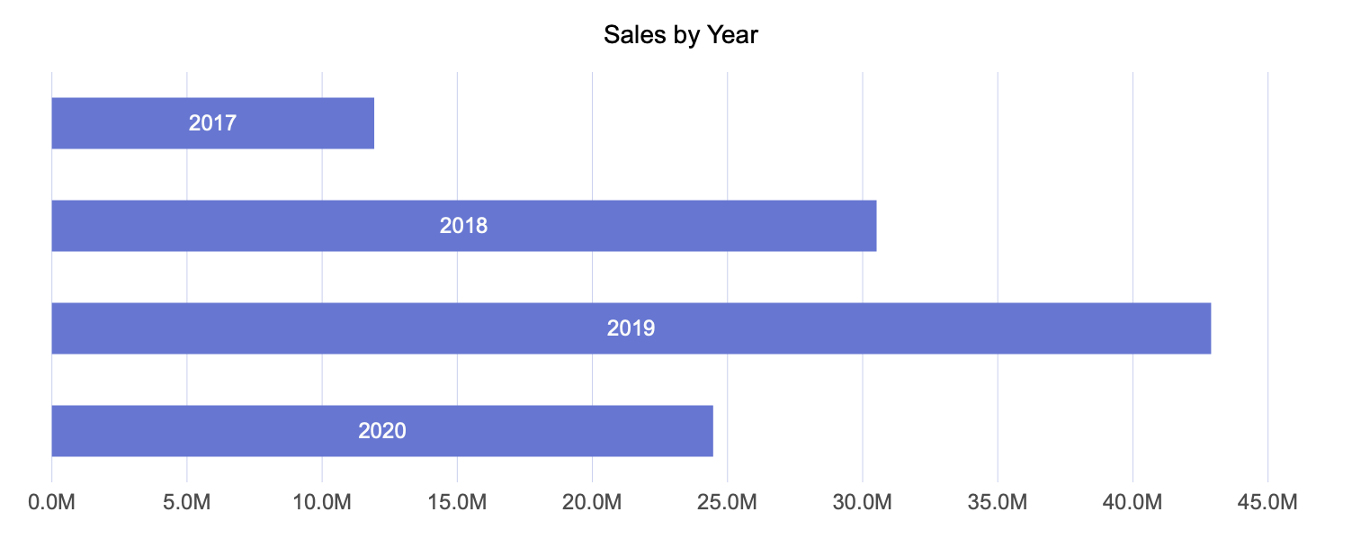
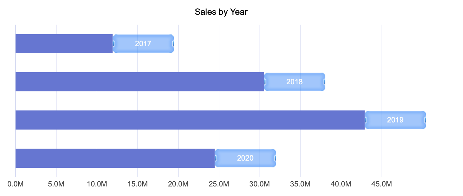
On Slice Label
You can further customize data labels by changing their location. For applicable chart types, setting the label location to On Slice places the label directly on the visual element itself.
Combined with chart style options—such as color themes—this configuration can improve readability for dense or compact charts.
By default, Wyn manages label visibility based on available space using the Display Mode setting, which is set to Auto. If needed, you can set this option to All to display all data labels regardless of space constraints.
Same Color Label
Data labels can inherit the color of their corresponding legend item by setting Same Color As Legend to True. This can help visually associate labels with their data points.
When using this option, it is recommended not to place labels On Slice, as matching colors may reduce contrast and cause labels to become difficult to read or visually disappear.
Label Font Settings
You can customize the appearance of data labels by adjusting font-related properties, including:
Font family
Font size
Font color
Font weight
Font style (italic or normal)
These settings allow you to align data labels with your dashboard's overall design and branding.
Label with Background Image
Data labels can also include a background shape or image. To enable this feature, set Show Shape to True.
Once enabled, you can specify an image in the Shape Image property. Images can be selected from your Wyn instance, sourced online, or uploaded manually.
You can further control image placement and size using the following properties:
Shape X-Center and Shape Y-Center to adjust positioning
Shape X-Scale and Shape Y-Scale to control image size
This configuration is useful when labels need additional visual emphasis or background contrast.
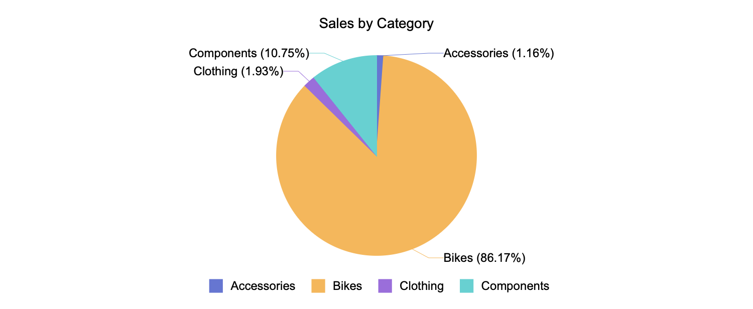
Data Labels for Pie Charts and Their Variations
Data labels behave slightly differently for pie charts and their variations. Pie chart data labels share many of the same properties, such as display patterns and value formatting. However, because pie charts do not use categories and series in the same way, the Series field represents the chart’s primary—and only—grouping.
Value as a Percentage Label
For pie charts, value labels can be displayed in two ways:
Value, which shows the exact numeric value represented by each slice
Value as a Percentage, which shows the percentage contribution of each slice to the whole
Label Line Properties
Pie charts include additional label-specific properties for connecting lines. These include:
Line Width, which controls the thickness of the line connecting a slice to its label
Connecting Line Color, which allows you to define a custom color for the line
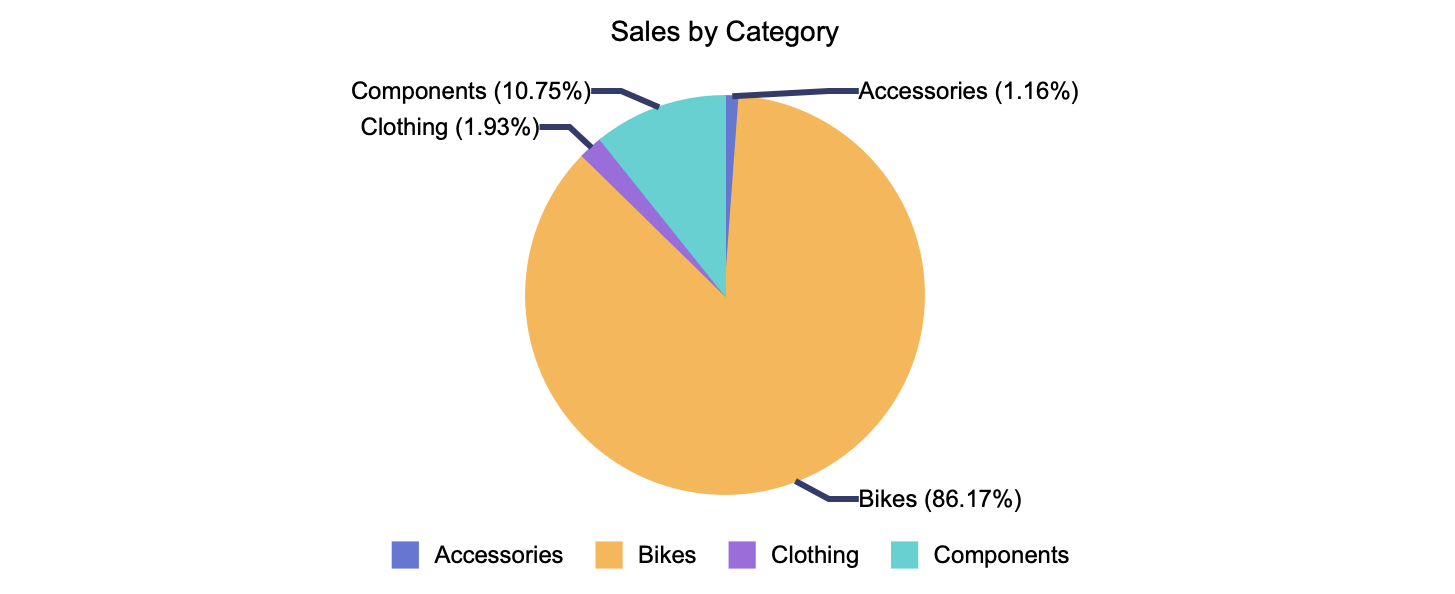
These settings help improve clarity when labels are positioned outside the slices, especially in charts with many segments.