-
Interactive DashboardsCreate interactive BI dashboards with dynamic visuals.
-
End-User BI ReportsCreate and deploy enterprise BI reports for use in any vertical.
-
Wyn AlertsSet up always-on threshold notifications and alerts.
-
Localization SupportChange titles, labels, text explanations, and more.
-
Wyn ArchitectureA lightweight server offers flexible deployment.
-
 Wyn Enterprise 7.1 is ReleasedThis release emphasizes Wyn document embedding and enhanced analytical express...
 -
 Choosing an Embedded BI Solution for SaaS ProvidersAdding BI features to your applications will improve your products, better serve your customers, and more. But where to start? In this guide, we discuss the many options.
-
Visual GalleryInteractive sample dashboards and reports.
-
BlogExplore Wyn, BI trends, and more.
-
WebinarsDiscover live and on-demand webinars.
-
Customer SuccessVisualize operational efficiency and streamline manufacturing processes.
-
Knowledge BaseGet quick answers with articles and guides.
-
VideosVideo tutorials, trends and best practices.
-
WhitepapersDetailed reports on the latest trends in BI.
-
 Choosing an Embedded BI Solution for SaaS ProvidersAdding BI features to your applications will impr...
 -

- Getting Started
- Administration Guide
-
User Guide
- An Introduction to Wyn Enterprise
- Document Portal for End Users
- Data Governance and Modeling
- View and Manage Documents
- Working with Resources
- Working with Reports
- Working with Dashboards
-
Working with Notebooks
- Notebook Designer
- Connect to Data
- Blocks
-
Chart Blocks
- Customize Charts
- Column Chart
- Stacked Column Chart
- Percent Stacked Column Chart
- Bar Chart
- Stacked Bar Chart
- Percent Stacked Bar Chart
- Line Chart
- Area Chart
- Stacked Area Chart
- Percent Stacked Area Chart
- Combined Chart
- Pie Chart
- Donut Chart
- Scatter Chart
- Bubble Chart
- Funnel Chart
- Treemap Chart
- KPI Chart
- Pivot Table
- Data Table
- KPI Matrix
- Label Slicer
- Map
- Wyn Analytical Expressions
- Section 508 Compliance
- Subscribe to RSS Feed for Wyn Builds Site
- Developer Guide
Legend
The Legend is a chart block feature that identifies how data points are grouped and distinguished, most commonly through color. Legends are available for nearly all chart blocks, except the Treemap, the KPI Chart, the Pivot Table, the Data Table, the KPI Matrix, and the Label Slicer.
While the Legend is a common feature across chart blocks, its appearance and behavior vary depending on how the chart is structured and how data is bound.
Legends and Grouped Charts
Legends most commonly appear when a chart includes a secondary grouping. A secondary grouping allows you to further break down data within each primary category.
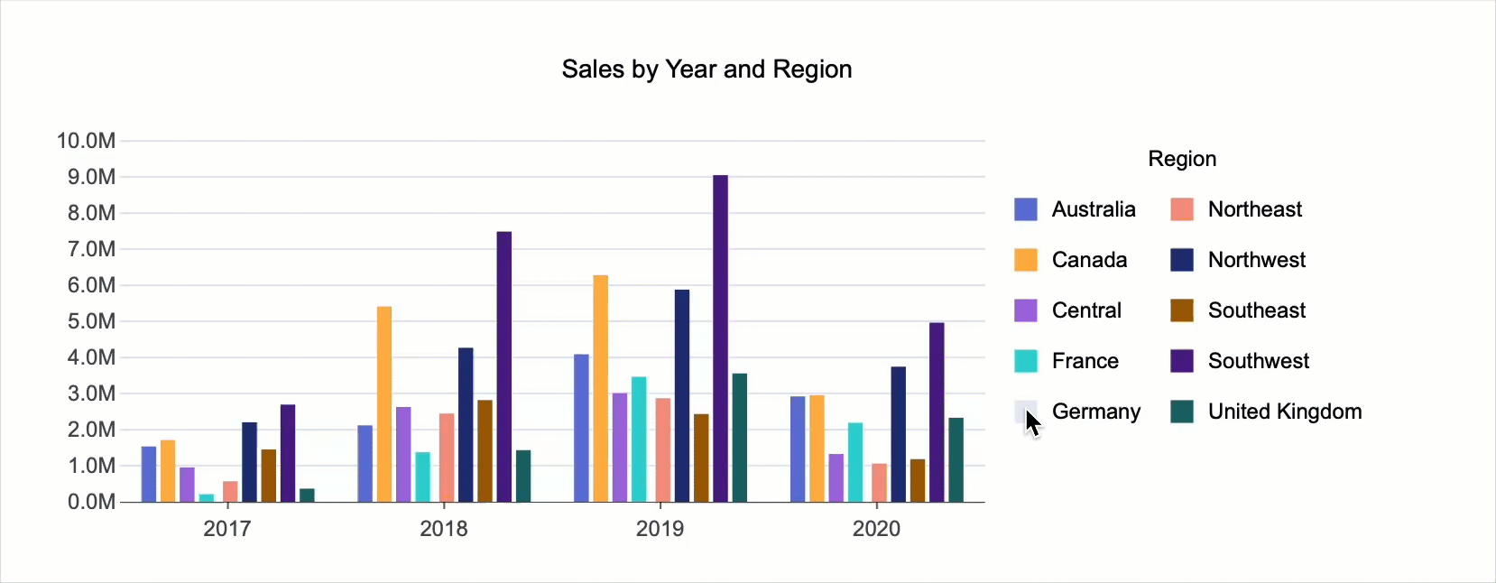
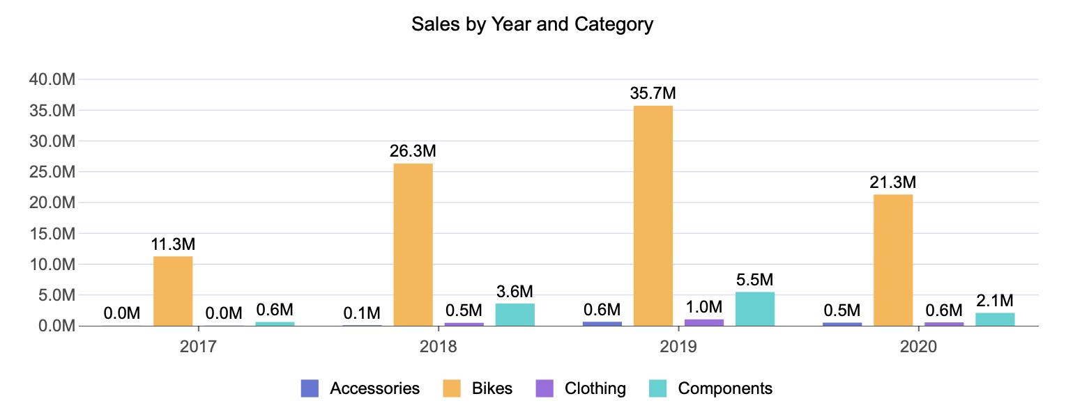
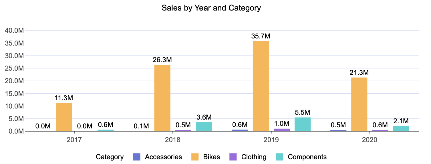
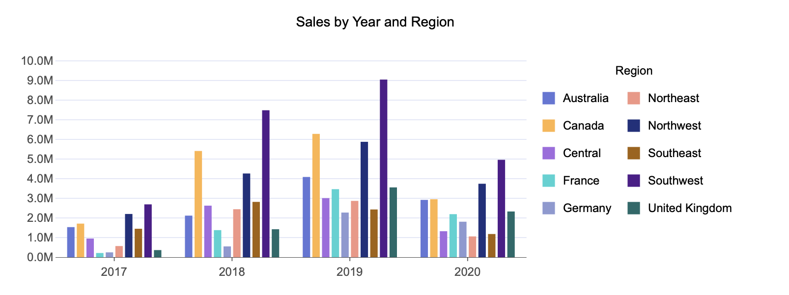
For example, if you want to visualize Sales by Year and by Product, the chart displays Year as the primary grouping and Product as the secondary grouping. This configuration typically produces what is known as a grouped chart.
A grouped column chart is created by binding:
A numerical field to the Values data binding slot
A categorical field to the Axis (Category) data binding slot
A second categorical field to the Legend (Series) data binding slot
This setup produces two results: it creates a grouped chart, and it automatically generates a legend. Each group is displayed using a different color, and the legend identifies what each color represents.
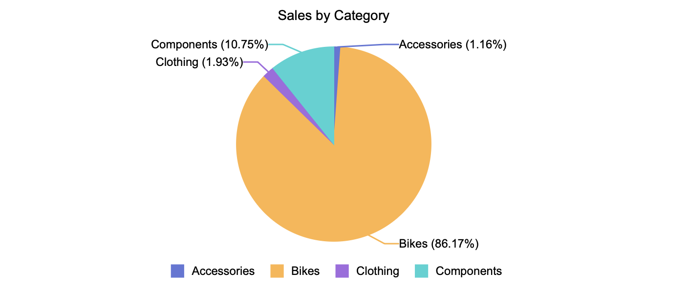
Pie Charts and Variants
Pie charts and their variants use numerical values bound to the Values data binding slot and categorical values bound to the Legend (Series) data binding slot. In these charts, the Legend (Series) represents the primary grouping.
Multiple categorical fields can be bound to the Legend (Series) slot, allowing the pie chart to be further broken down into subcategories. Either way, the Legend is enabled by default. To disable it, you must go to the Inspector Panel and toggle Show Legend to False.
Pie charts use data labels by default to distinguish slices. You can choose to remove the data labels and rely entirely on the legend.
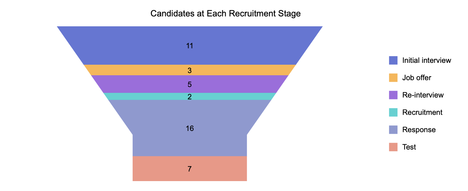
Funnel Charts
Funnel charts also use a Values data binding slot and a Legend (Series) data binding slot. When numerical values are bound to the Values slot and categorical values are bound to the Legend (Series) slot, the funnel chart automatically generates a legend.
In this case, the legend reflects the categorical breakdown of each stage in the funnel.
Show Legend
Show Legend is automatically enabled for the column chart, bar chart, area chart, line chart, scatter chart, and bubble chart when you add a secondary grouping. For example, this is a column chart with a legend.
For the pie chart and its variants, the Show Legend property is also enabled, but you only need a single primary grouping to display it.
The legend is also automatically enabled for the funnel chart. For example, this is a funnel chart where you can also see the legend.
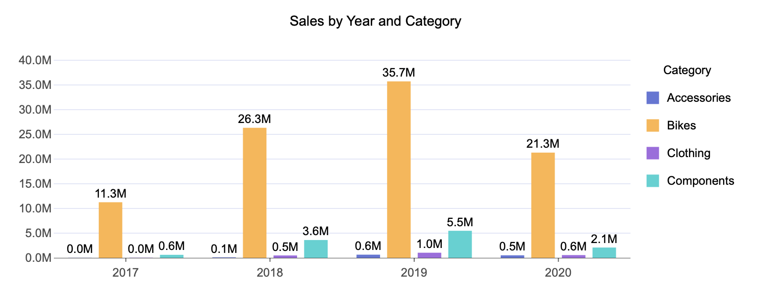
Title and Custom Title
By default, legends do not display a title. You can add one by toggling the Title property to True.
When enabled, the title is automatically generated from the name of the data field bound to the Legend (Series) slot in the Data Binding tab. You can override this value by specifying a Custom Title.
For example, this is a grouped column chart with a legend title set to "Category".
Legend Font Settings
You can further customize the appearance of the legend title by adjusting the following font-related properties:
Font family
Font size
Font color
Font weight
Font style (italic or normal)
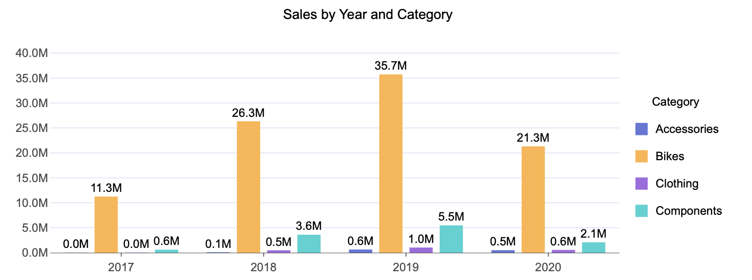
Legend Position
You can change where the legend appears relative to the chart. By default, the legend is displayed on the right.
You can set the legend position to Left, Right, Top, or Bottom. For example, this is a column chart with the legend positioned on the right.
Auto Size
By default, legends are sized automatically. You can override this behavior by toggling Auto Size to False.
Disabling Auto Size enables the Width property. This is useful when legend names overflow outside the bounds of the scenario, or when Wrap Legend is enabled, and legend items extend beyond the available space.
Adjusting the Width property increases the space allocated to the legend while simultaneously reducing the chart's size, ensuring that the legend content remains legible within the scenario.
For example, this is a scenario where the legend Width property has been set to 40%.
H-Align and V-Align
You can control the horizontal and vertical alignment of the legend using H-Align and V-Align.
H-Align can be set to left, center, or right
V-Align can be set to top, middle, or bottom
For example, this is a scenario where the legend is aligned to the center horizontally and to the top vertically.
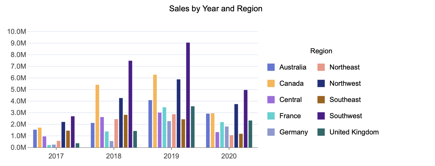
Wrap Legend
The Wrap Legend property allows legend items to wrap into multiple columns instead of appearing in a single vertical list.
For example, this is an example of a wrapped legend.
Click Action
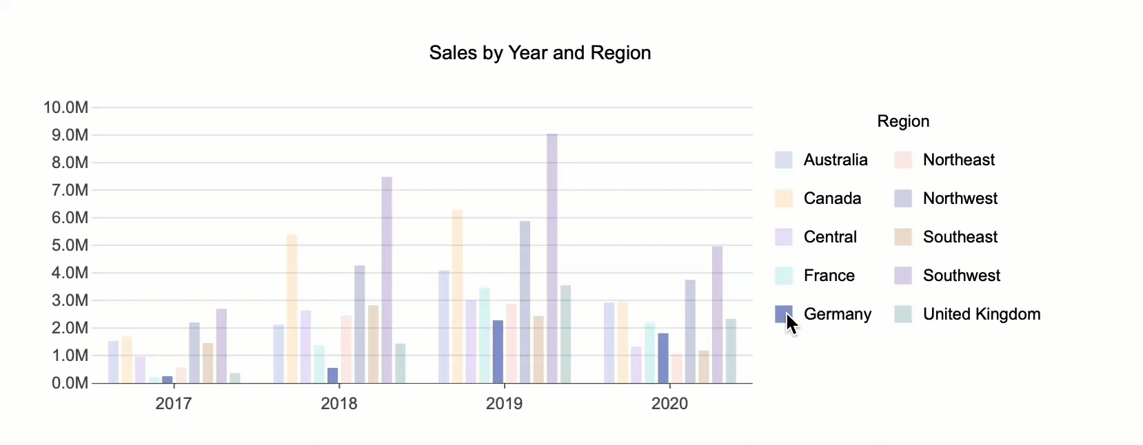
Click Action controls how users can interact with the legend. You can choose between two options: Select/Unselect or Hide/Show.
Select/Unselect allows you to select a single secondary grouping in the legend and view it isolated across the primary grouping. For example, see the GIF below.
Hide/Show allows you to hide a specific data series by clicking its legend item. Clicking the item again makes the data visible once more. For example, see the GIF below.