-
Interactive DashboardsCreate interactive BI dashboards with dynamic visuals.
-
End-User BI ReportsCreate and deploy enterprise BI reports for use in any vertical.
-
Wyn AlertsSet up always-on threshold notifications and alerts.
-
Localization SupportChange titles, labels, text explanations, and more.
-
Wyn ArchitectureA lightweight server offers flexible deployment.
-
 Wyn Enterprise 7.1 is ReleasedThis release emphasizes Wyn document embedding and enhanced analytical express...
 -
 Choosing an Embedded BI Solution for SaaS ProvidersAdding BI features to your applications will improve your products, better serve your customers, and more. But where to start? In this guide, we discuss the many options.
-
Visual GalleryInteractive sample dashboards and reports.
-
BlogExplore Wyn, BI trends, and more.
-
WebinarsDiscover live and on-demand webinars.
-
Customer SuccessVisualize operational efficiency and streamline manufacturing processes.
-
Knowledge BaseGet quick answers with articles and guides.
-
VideosVideo tutorials, trends and best practices.
-
WhitepapersDetailed reports on the latest trends in BI.
-
 Choosing an Embedded BI Solution for SaaS ProvidersAdding BI features to your applications will impr...
 -

- Getting Started
- Administration Guide
-
User Guide
- An Introduction to Wyn Enterprise
- Document Portal for End Users
- Data Governance and Modeling
- View and Manage Documents
- Working with Resources
- Working with Reports
- Working with Dashboards
-
Working with Notebooks
- Notebook Designer
- Connect to Data
- Blocks
-
Chart Blocks
- Customize Charts
- Column Chart
- Stacked Column Chart
- Percent Stacked Column Chart
- Bar Chart
- Stacked Bar Chart
- Percent Stacked Bar Chart
- Line Chart
- Area Chart
- Stacked Area Chart
- Percent Stacked Area Chart
- Combined Chart
- Pie Chart
- Donut Chart
- Scatter Chart
- Bubble Chart
- Funnel Chart
- Treemap Chart
- KPI Chart
- Pivot Table
- Data Table
- KPI Matrix
- Label Slicer
- Map
- Wyn Analytical Expressions
- Section 508 Compliance
- Subscribe to RSS Feed for Wyn Builds Site
- Developer Guide
Data Visualization
The Data Visualization settings control how categorical values and dimensions are displayed within a visualization. These options help you refine how data is grouped, highlighted, and represented—even in cases where certain categories have no underlying values. The two primary features in this section are Top N Grouping and Include All Dimensions.
Data Visualization properties apply to all notebook chart blocks except the Scatter Chart, the KPI Chart, the Pivot Table, the Data Table, the KPI Matrix, and the Label Slicer.
Top N Grouping
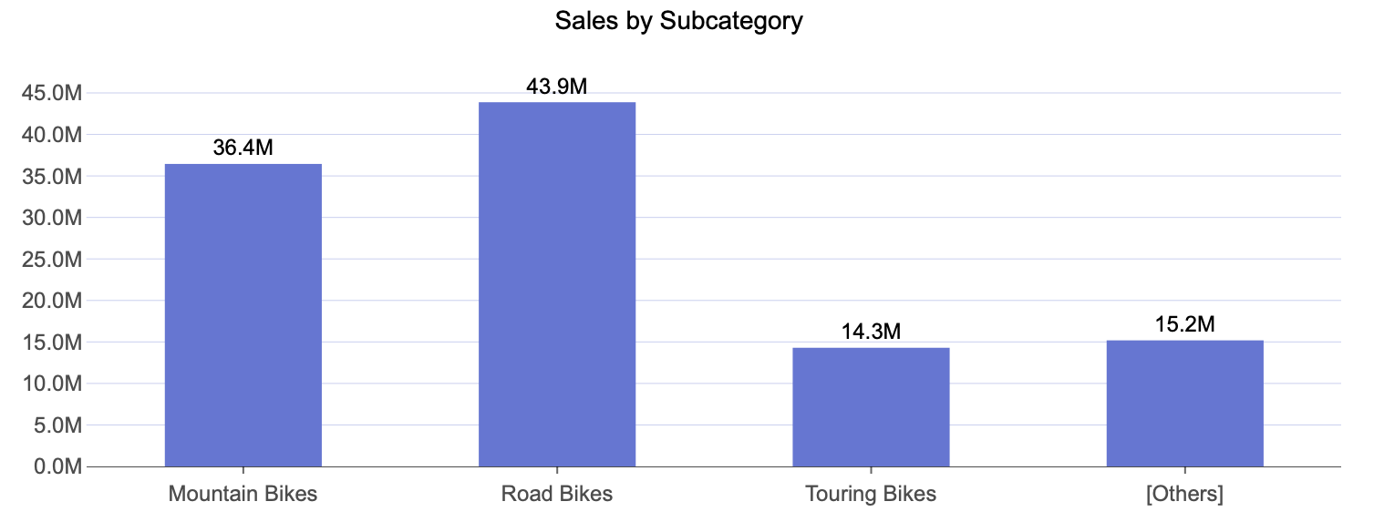
Top N Grouping allows you to focus your chart on the highest-performing categories by displaying only the top N results and consolidating all remaining categories into a single Other group. This makes it easier to compare your most significant values against the rest of the dataset without clutter or noise.
Once Top N Grouping is enabled, you can specify the number of top categories to display. The default is 3, but you can set any number based on your analysis needs.
This feature is particularly useful when you want to highlight leading contributors, show concentration of values, or simplify complex datasets by grouping long tails.
Here is an example of a column chart that displays Sales by Subcategory for the top three subcategories.
Include All Dimensions
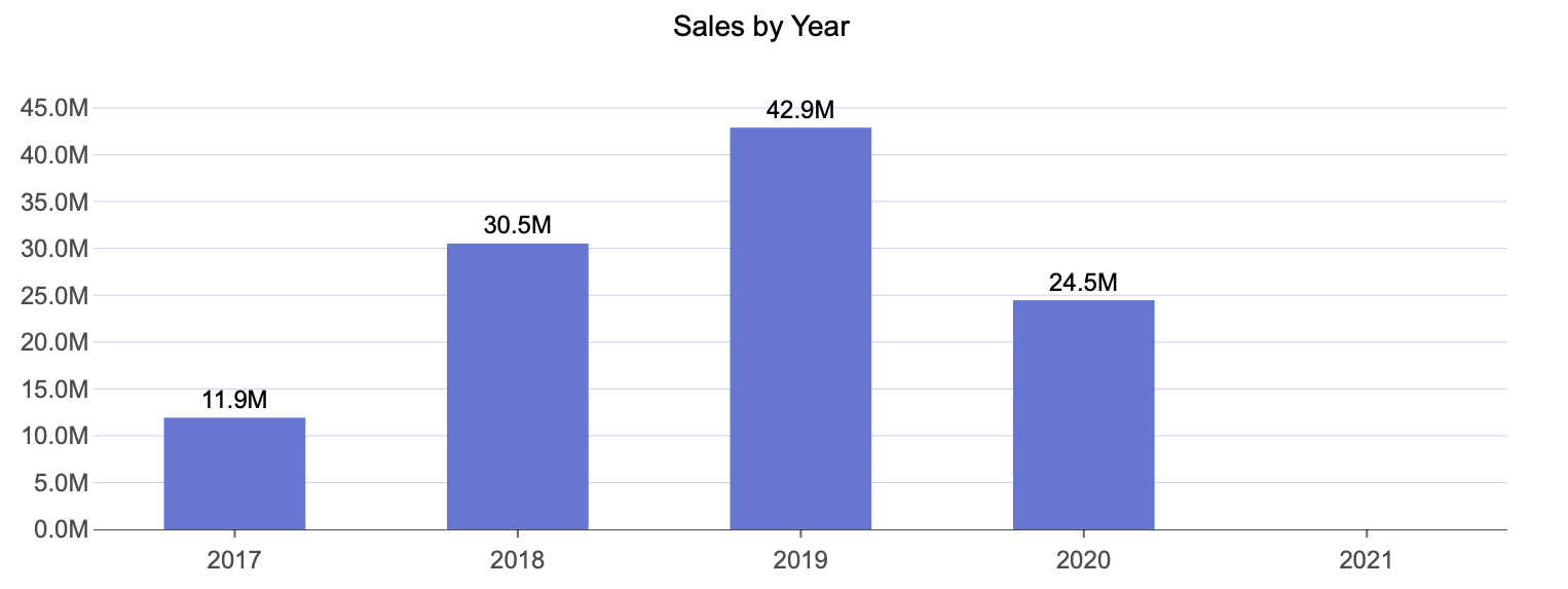
Include All Dimensions ensures that all dimension members appear in the visualization—even when no data values exist for them. When this option is enabled, categories without associated measures are still displayed on the axis, allowing the viewer to see the full range of possible dimension values rather than only those with data.
This is useful when you want to:
Show continuity across time periods
Display complete category ranges
Highlight missing or zero-value data explicitly
For example, in a Sales by Year column chart, the dataset may not contain values for 2021. When Include All Dimensions is enabled, the year 2021 still appears on the axis, even though no bar is plotted for that year.