- Getting Started
- Administration Guide
-
User Guide
- An Introduction to Wyn Enterprise
- Document Portal for End Users
- Data Governance and Modeling
- Working-with-Resources
- Working with Reports
- Working with Dashboards
- View and Manage Documents
- Understanding Wyn Analytical Expressions
- Section 508 Compliance
- Developer Guide
Gauge
Gauges are unique way to display dynamic information in the exact graphical representation you desire. Gauges are better than simple labels because they also display a range, allowing users to determine instantly whether the current value is low, high, or intermediate. You can use different colors to represent different progress ranges within a gauge.
Design a Gauge Scenario in Wyn Enterprise
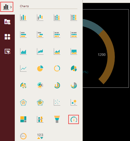
From the Dashboard Toolbox, open the Data Visualization node and drag-drop the Gauge scenario onto the design area.
Bind Dataset to Gauge Scenario
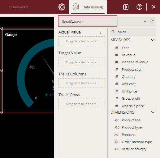
With the scenario selected, from the Data Binding tab, select the dataset. Once the dataset is successfully loaded in the designer, the data binding panel automatically expands and displays the data attributes available in the dataset.
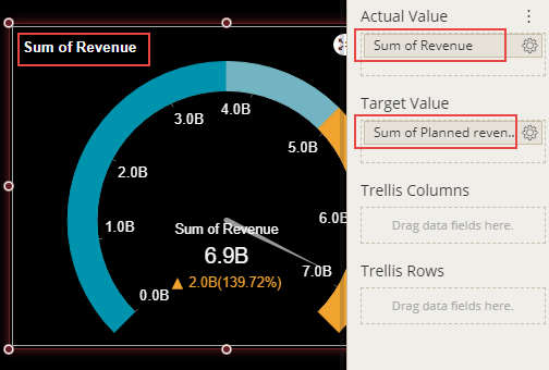
The following image shows the gauge scenario bound to 'RetailDataset' dataset.
On dragging and dropping the data attributes to the data binding area of the scenario, the gauge is plotted accordingly, with a default title on the design area.
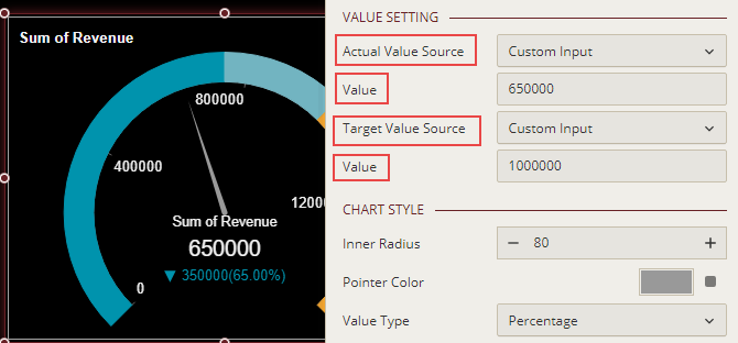
If you do not want to bind the scenario with the dataset attributes, then manually enter custom input data for the actual and target values. To do this, navigate to the Inspector tab of the scenario and set the Actual Value Source and Target Value Source to Custom Input as shown below. Then enter the data values into their corresponding Value fields.
Format Data Attributes
To format the data attributes and control the display of data, you can perform a variety of operations such as renaming, modifying data format and display unit, creating a hierarchy field, applying an aggregation method, etc.
For more information about these operations, see Data Attributes.
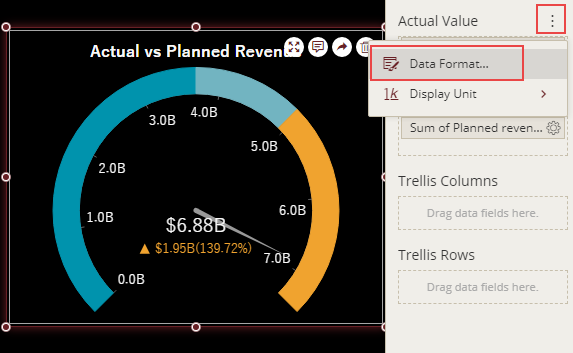
In the following image, the data format for the data attributes is modified to display the actual and planned revenue in 'currency'.
Analyze Data
Wyn Dashboards scenarios support rich data analysis and exploration capabilities that can help analyze massive amounts of information and make data-driven decisions. For example, adding filters to the scenarios, applying conditional formatting, etc. Note that you can apply all these operations using the Action Bar corresponding to each scenario in the designer.
For more information, see Data Analysis and Interactivity in Dashboards.
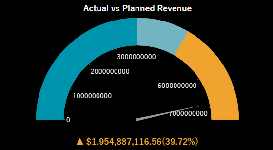
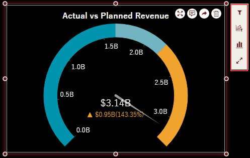
In the following image, data is filtered to show the sales revenue for the years - 2015 and 2016.
Customize Appearance
You can customize the default appearance by setting properties in the Inspector tab of the scenario such as adding a border, modifying data labels, setting style, renaming title, etc.
Set Gauge Style
You can customize the predefined range of colors for the gauge scenario by using the Range Color property in the Inspector tab. Set the 'High', 'Mid', and 'Low' values to some suitable colors from the color palette.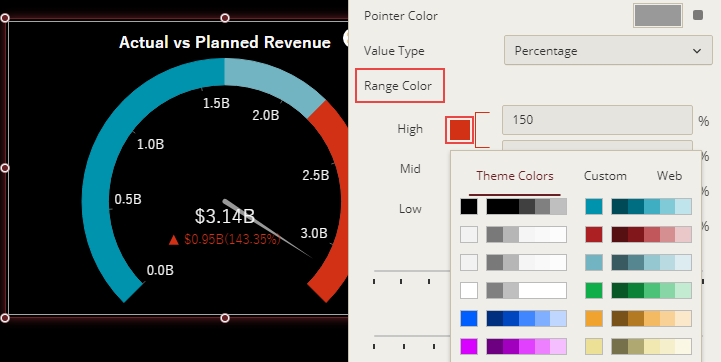
Modify Label Style
The default label style is to show both the delta symbol and the percentage value in the Gauge scenario. You can choose to hide the delta symbol or the percentage value by setting the Show Symbol and Show Percentage properties to 'False'.
You can also specify the calculation mode for the label to 'Ratio' or 'Delta' using the Calculation Mode property. By default, this property is set to 'Ratio'.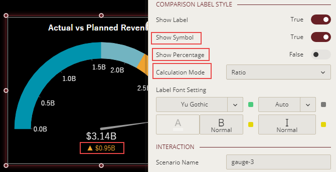
Set Inner Radius
Specify the inner radius for the dial in the gauge scenario by using the Inner Radius property in the Inspector tab. The value of the innner radius must lie in range 1 to 99.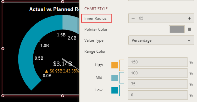
Format Angle Properties
Specify the start and stop angle in the gauge scenario by using the Start Angle and Sweep properties in the Inspector tab.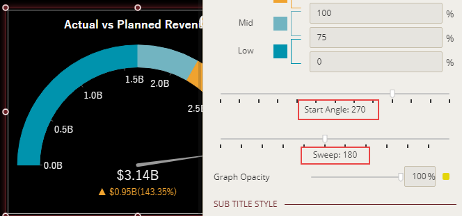
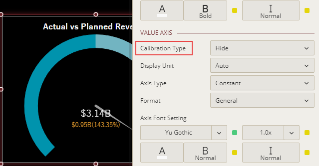
Hide Value Axis
To hide the value axis in the gauge scenario, set the Calibration Type property to 'Hide'. By default, this property is set to 'Complete'.