


- Getting Started
- Administration Guide
-
User Guide
- An Introduction to Wyn Enterprise
- Document Portal for End Users
- Data Governance and Modeling
- Working-with-Resources
- Working with Reports
- Working with Dashboards
- View and Manage Documents
- Understanding Wyn Analytical Expressions
- Section 508 Compliance
- Developer Guide
Liquid Fill Gauge
The Liquid Fill Gauge chart is a gauge that can represent the data labels in percentage value and numbers. The data is displayed with the water level along with animations. It has many liquid shapes like Circle, Ellipse, Rectangle, Diamond. The liquid fills up to the relevant value with water wave animation.
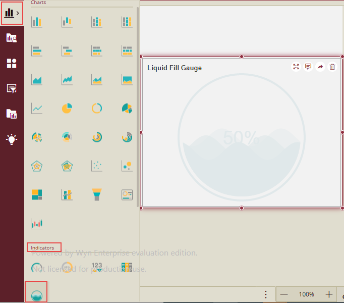
Design a Liquid Fill Gauge Scenario
From the Dashboard Toolbox, open the Data Visualization node and drag-drop the Liquid Fill Gauge scenario under Indicators, onto the design area.
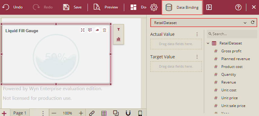
Bind Dataset to Liquid Fill Gauge Scenario
With the scenario selected, from the Data Binding tab, select the dataset. Once the dataset is successfully loaded in the designer, the data binding panel automatically expands and displays the data attributes available in the dataset.
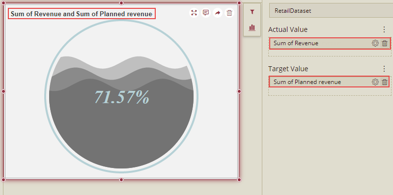
The following image shows the Liquid Fill Gauge scenario bound to 'RetailDataset' dataset.
On dragging and dropping the data attributes to the data binding area of the scenario, the liquid fill gauge is plotted accordingly, with a default title on the design area.
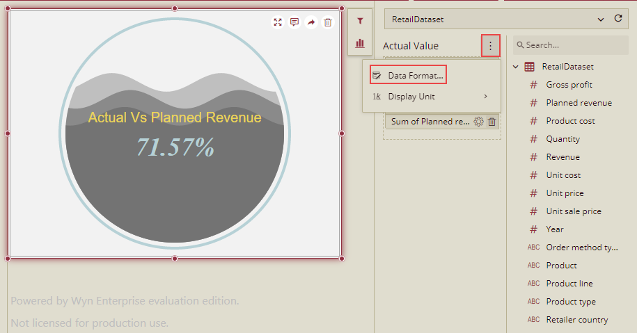
Format Data Attributes
To format the data attributes and control the display of data, you can perform a variety of operations such as renaming, modifying data format and display unit, creating a hierarchy field, applying an aggregation method, etc.
For more information about these operations, see Data Attributes.
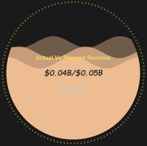
In the following image, the data format for the data attributes is modified to display the actual and planned revenue in 'currency'.
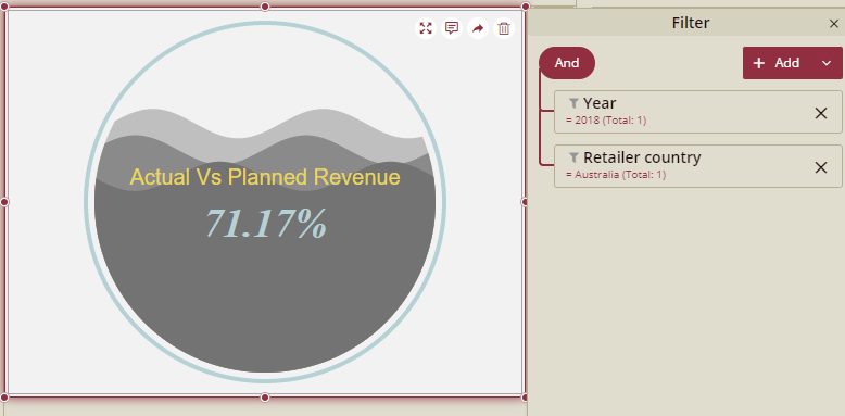
Analyze Data
Wyn Dashboards scenarios support rich data analysis and exploration capabilities that can help analyze massive amounts of information and make data-driven decisions. For example, adding filters to the scenarios, applying conditional formatting, etc. Note that you can apply all these operations using the Action Bar corresponding to each scenario in the designer.
For more information, see Data Analysis and Interactivity in Dashboards.
In the following image, data is filtered to show Australia's sales revenue for the year - 2018.
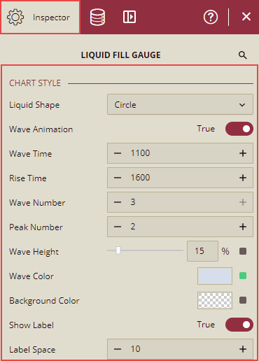
Customize Appearance
You can customize the default appearance by setting properties in the Inspector tab of the scenario such as selecting the liquid shape, wave animation, adding a border, modifying sub- titles, setting style, etc.
Designing part is divided into the following 5 sections:
Chart Style
You can customize the following properties under the Chart Style.
Property | Description |
|---|---|
Liquid Shape | To set the liquid shape in the chart, you can select any of the following shapes: Circle,Ellipse,Rectangle,Diamond. Default shape is Circle. |
Wave Animation | Set this to True, to apply animation on the liquid wave. |
Wave Time | To set the duration of a wave animation. |
Rise Time | To set the wave rise time when updating the scenario. |
Wave Number | To set the wave number in the container (from 1 to 3). |
Peak Number | To set the peak number of each wave in the container (from 1 to 10). |
Wave Height | To set the proportion of wave height in the container. |
Wave Color | To set the color of the wave. |
Background Color | To set the background color of the liquid shape. |
Show Label | Set this option to True to display all the labels. |
Label Space | To set the label space between each line. This option is enabled, when "Show Label" is set to "True" |
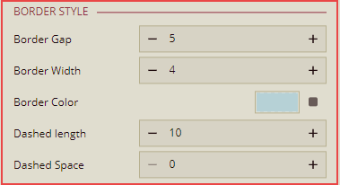
Border Style
You can customize the following properties under the Border Style.
Property | Description |
|---|---|
Border Gap | To set the gap from border to inner liquid shape(circle,Ellipse,Rectangle,Diamond). |
Border Width | To set the width of the border. |
Border Color | To set the color of the border. |
Dashed Length | To set the length of the dashed border. |
Dashed Space | To set the space between the border dashes. |
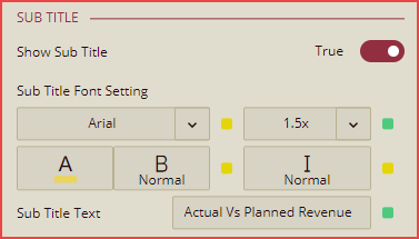
Sub Title
You can customize the following properties under the Sub Title.
Note: This option is displayed only when the Show Label is set to True under Chart Style.
Property | Description |
|---|---|
Show Sub Title | Set this option to True to show the sub title in the liquid shape. |
Sub Tittle Font Setting | To customize the font size, color, type, etc. for the Sub Title text. |
Sub Title Text | Here, you can type the text for the Sub Title to be displayed, as per your requirement. |
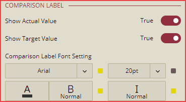
Comparison Label
This section will display the comparison between the actual and target values. You can customize the following properties under Comparison Label.
Note: This option is displayed only when the Show Label is set to True under Chart Style.
Property | Description |
|---|---|
Show Actual Value | Set this option to True to display the Actual Value in the liquid shape. |
Show Target Value | Set this option to True to display the Target Value in the liquid shape. |
Comparison Label Font Setting | To customize the font size, color, type, etc. for the Actual Value and Target Value text. |
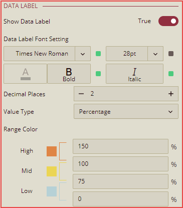
Data Label
You can customize the following properties under Data Label.
Note: This option is displayed only when the "Show Label" is set to True under Chart Style.
Property | Description |
|---|---|
Show Data Label | Set this option to True to display the data label in percentage or numbers, in the liquid shape. |
Data Label Font Setting | To customize the font size, color, type, etc. for the data label text. |
Decimal Places | You can set the decimal places for the data label. |
Value Type | To set the ratio format of data label in Percentage or Number. |
Range Color | To set the range color according to ratio. |