- Getting Started
- Administration Guide
-
User Guide
- An Introduction to Wyn Enterprise
- Document Portal for End Users
- Data Governance and Modeling
- Working-with-Resources
- Working with Reports
- Working with Dashboards
- View and Manage Documents
- Understanding Wyn Analytical Expressions
- Section 508 Compliance
- Developer Guide
KPI Matrix
Use a KPI Matrix to display and visualize the unlimited number of business metrics in a single table. A KPI Matrix helps users to extract useful insights about the company's performance and its growth from the dashboard easily.
When you add a KPI Matrix to a dashboard, you can use the following data visualizations in the scenario like number, HBar graph, pareto graph, bullet graph, diagram, and image, each explained below:
Number: It is used to display the numeric values of the bound attribute, similar to a column in a data table.
HBar Graph: It is used to compare the categorical data through horizontal bars, where the length of each bar depends on the data value it represents.
Pareto Graph: It is a combination of bar and line graphs. It displays the proportion and distribution of the data through horizontal bars, where each bar has a progress proportion percentage with a line that represents the cumulative total.
Bullet Graph: It is used to compare a performance measure with a target measure and relate those to qualitative ranges.
Diagram: It is used to insert mini-charts in the table cells like trend, bar, area, and win-loss.
Image: It is used to render the image data through text, image (URL), and image (binary).
Design a KPI Matrix in Wyn Enterprise
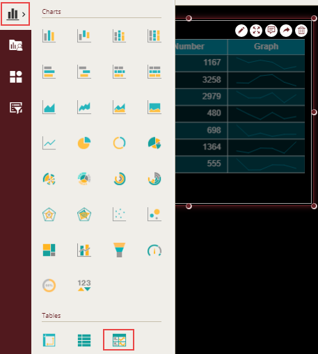
From the Dashboard Toolbox, open the Data Visualization node and drag-drop the KPI Matrix scenario onto the design area.
Bind Dataset to KPI Matrix Scenario
With the scenario selected, from the Data Binding tab, select the dataset. Once the dataset is successfully loaded in the designer, the data binding panel automatically expands and displays the data attributes available in the dataset.
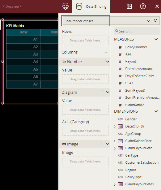
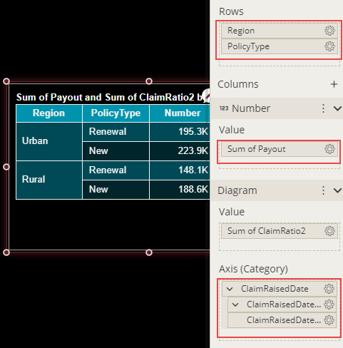
The following image shows the KPI Matrix scenario bound to the 'InsuranceDataset' dataset. The Columns in the Data Binding area by default consists of Number, Diagram, and Image.
We will first drag-drop the required data attributes to the Rows, Number, and Diagram data binding area of the scenario as shown below. Note that we have removed ClaimRaisedDate(Day) from the ClaimRaisedDate hierarchy.
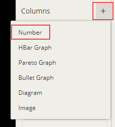
Click the Plus button  next to the Columns in the Data Binding area to add a new column in the KPI Matrix to display the average claim loss.
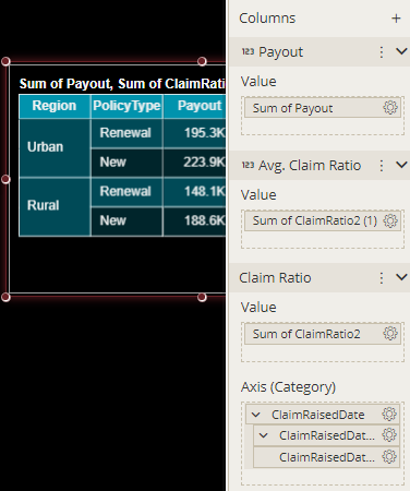
Rename and reposition the columns within the KPI Matrix with the help of Edit  and Ellipse
  buttons in the Data Binding area as shown below.
Format Data Attributes
You can format the data attributes in a dataset by performing a variety of operations such as renaming, modifying data format and display unit, creating a hierarchy field, applying an aggregation method, etc. Using these operations, you can control the display of data attributes in a scenario.
For more information about these operations, see Data Attributes.
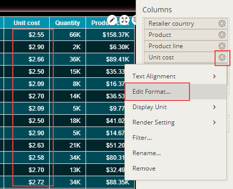
In the following KPI Matrix scenario, we are modifying the data format for the data attribute to display the unit cost in 'currency'.
Analyze Data
Wyn Dashboards scenarios support rich data analysis and exploration capabilities that can help analyze massive amounts of information and make data-driven decisions. For example, adding filters to scenarios, sorting data, and applying conditional formatting. Note that you can apply all these operations using the Action Bar corresponding to each scenario in the designer.
For more information, see Data Analysis and Interactivity in Dashboards.
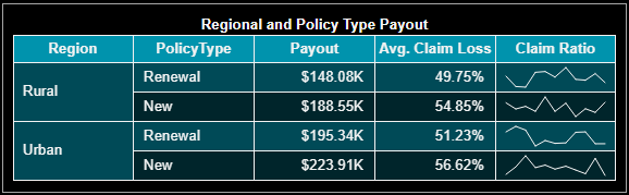
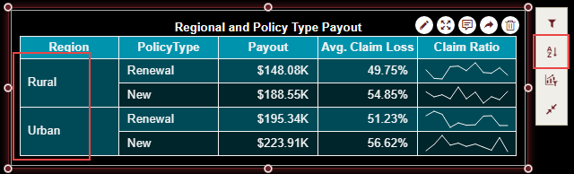
The following image organizes the data in the scenario by sorting the 'Region' data attribute in ascending order.
Customize Appearance
You can customize the default KPI Matrix appearance by setting properties in the Inspector tab of the scenario such as adding a border, adjusting text alignment, renaming the KPI Matrix title, changing the background color, enabling automatic scrolling, etc.
General Settings
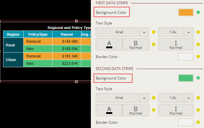
Modify Data Stripes
Wyn Enterprise uses default colors for the alternate data stripes in a KPI Matrix scenario. To change the default color, use the Background Color properties for the first and second data stripes and set them to a suitable color from the color palette. Also, you can disable the alternate row style in the KPI Matrix by setting the Use Alternate Row Style to 'False'.
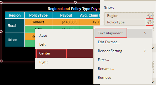
Adjusting Text Alignment
In Wyn Enterprise, you can easily manage the text alignment within a KPI Matrix by using the Text Alignment property in the Data Binding area.
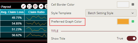
Changing Graph Color
To change the graph color in the KPI Matrix, set the Preferred Graph Color property in the Inspector tab to a suitable color from the color picker.
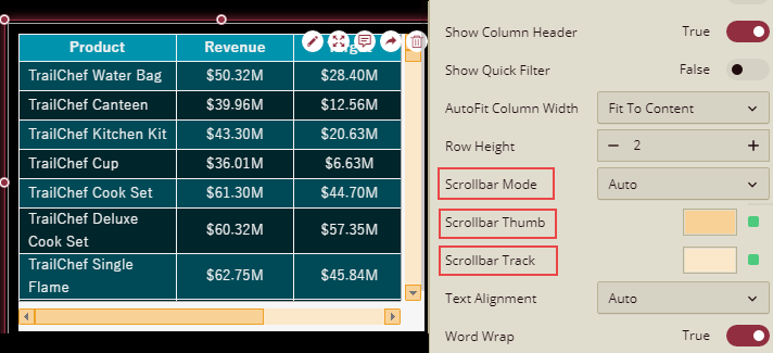
Customize Scrollbars
The default colors of the thumb and the track in a scrollbar are inherited in the following order - Document Theme > Dashboard Level Settings > Component Level Setting. You can change the default colors of the scrollbar for the KPI Matrix using the Scrollbar Thumb and Scrollbar Track properties available in the dashboard designer. The Scrollbar Thumb property specifies the color for the scrollbar thumb (i.e. the moveable part of the scrollbar along with the upward and downward scroll buttons) and the Scrollbar Track property specifies the color for the scrollbar track (i.e. the fixed part of the scrollbar). Furthermore, you can control the visibility of the scrollbars in the table scenario by setting the Scrollbar Mode property to 'Auto', 'Hidden', 'Visible', or 'Hover to Display'.
Advanced Settings
Enable Automatic Scrolling
When your KPI Matrix contains thousands of rows or even more, it becomes difficult to scroll through the data. In such cases, you can enable automatic scrolling using the Auto Scroll property and set the scrolling speed to either 'Slow' or 'Fast'. By default, the scrolling speed is set to 'Normal'. You can also enable the automatic turning of pages when scrolling using the Page Turning property.
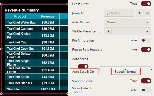
The data within the KPI Matrix scroll automatically on previewing the dashboard, as shown.
Show Row Number
To display row numbers for each row in a pivot table, set the Show Row Number property to True. By default, the value of the Show Row Number property is set to False. When the Show Row Number property is set to True, four sub-properties, Row Number Text, Row Number For, Row Number Scope, and Row Number Position appear in the Table Settings section. Define the settings as described below,
Row Number Text: Use the Row Number Text property to define the header of the row number column. To set different headers for multiple row number columns, set the Number Rows For property to All and follow the below instructions,
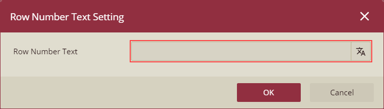
Switch to the Data Binding panel, click the settings icon of the data role in the Rows section, and select the Row Number Text option from the context menu.
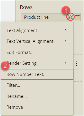
Row Number Text Setting dialog will appear on your screen. Enter the header text for the selected row number column and click Ok to save.
Number Rows For: Specify whether you want to insert the row numbers for the top row group, details row, or all. By default, this property is set to Top Row Group.
Row Number Scope: Specify the scope of the row number count in a table. By default, this property is set to Global.
Row Number Position: Control the position of row numbers relative to the row headers in the table, that is, whether you want to display the row numbers before or after the row headers.
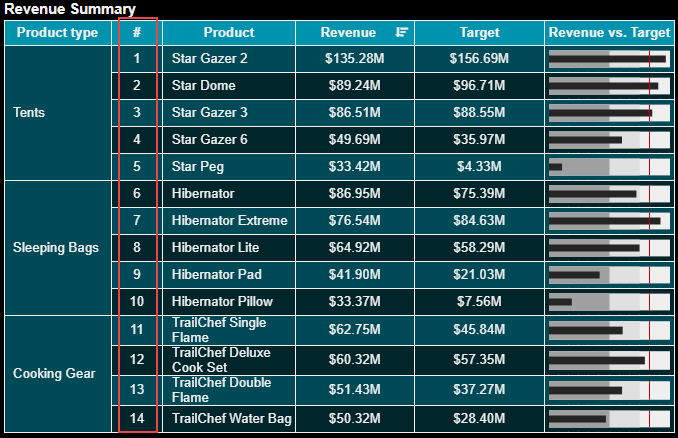
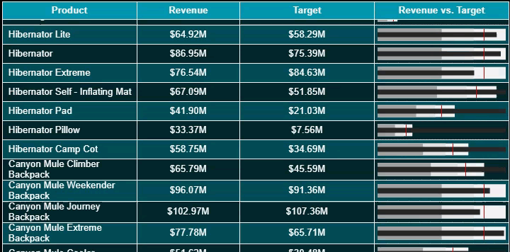
In the below KPI Matrix, we have enabled automatic row numbering for the details row with its scope set to 'Global'.