- Getting Started
- Administration Guide
-
User Guide
- An Introduction to Wyn Enterprise
- Document Portal for End Users
- Data Governance and Modeling
- Working with Resources
- Working with Reports
-
Working with Dashboards
- Dashboard Designer
- Dashboard Templates
- Selecting a Dataset
- Data Attributes
- Dashboard Scenarios
- Component Templates
- 3D Scene
- Explorer
- Visualization Wizard
- Data Analysis and Interactivity
- Dashboard Appearance
- Preview Dashboard
- Export Dashboard
- Dashboard Lite Viewer
- Using Dashboard Designer
- Animating Dashboard Components
- View and Manage Documents
- Understanding Wyn Analytical Expressions
- Section 508 Compliance
- Subscribe to RSS Feed for Wyn Builds Site
- Developer Guide
Mobile Designer
Mobile Designer is a dashboard designer element used to design the dashboard scenario for mobile devices. Mobile Designer options is available in the Page Setup Bar at the bottom of the dashboard designer.
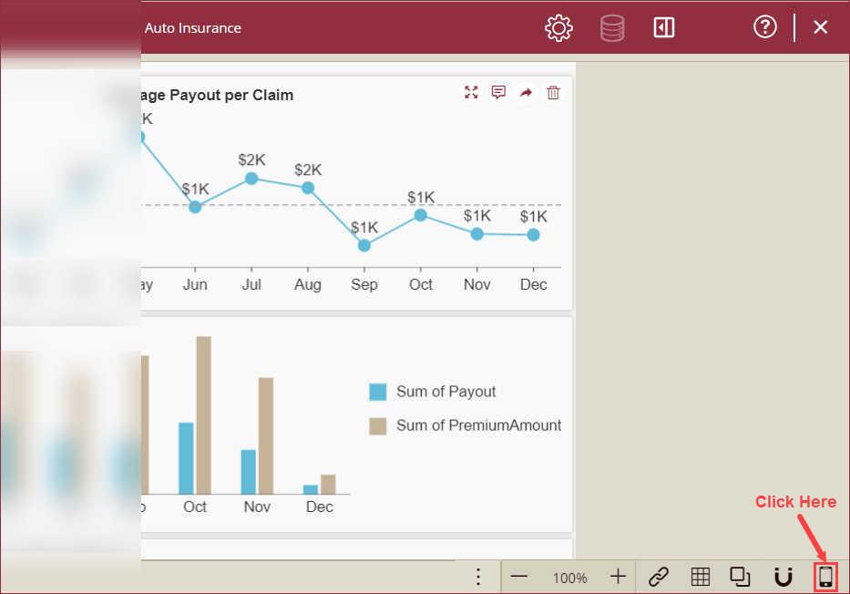
To setup the layout mode of the dashboard scenarios in mobile view, navigate to the dashboard designer page and follow the below instructions,
Click the Mobile Designer option from the Page Setup Bar.

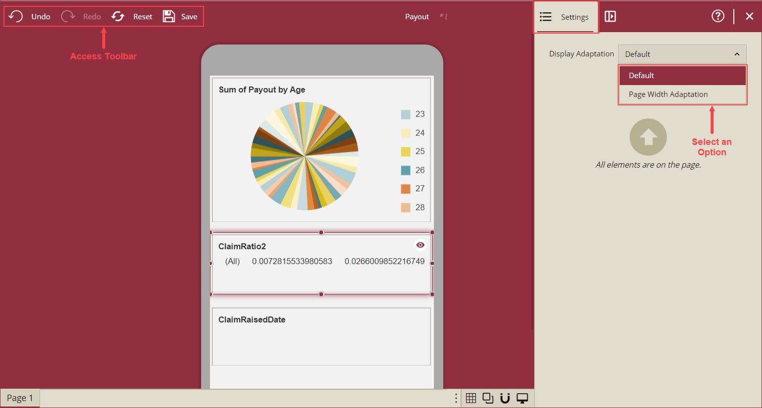
Mobile Designer settings page will appear on your screen. From the Settings panel on the right side, select an option from the Display Adaptation dropdown to set the mobile view to desktop mode or adapt to the page width. To undo, redo, reset or save the dashboard design use the Undo, Redo, Reset, and Save options from the Access Toolbar.

Options of the Display Adaptation dropdown as described below,
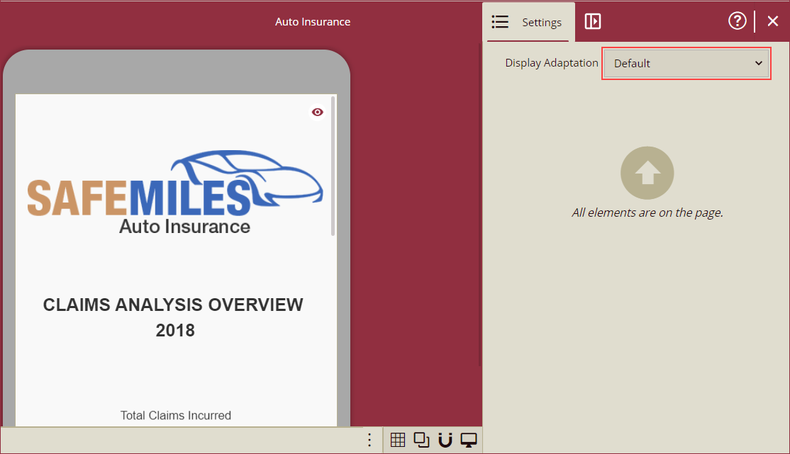
- Default - With the Default option selected, the dashboard will render in the desktop view on your mobile browser and the rendered dashboard width will be equal to the width of the mobile screen.

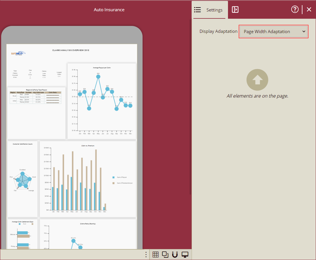
- Page Width Adaptation - With the Page Width Adaptation option, the rendered dashboard will fit to the screen on the mobile browser.

- Default - With the Default option selected, the dashboard will render in the desktop view on your mobile browser and the rendered dashboard width will be equal to the width of the mobile screen.
Note: The Page size and fixed size will take no effect on the mobile browser.


