-
Interactive DashboardsCreate interactive BI dashboards with dynamic visuals.
-
End-User BI ReportsCreate and deploy enterprise BI reports for use in any vertical.
-
Wyn AlertsSet up always-on threshold notifications and alerts.
-
Localization SupportChange titles, labels, text explanations, and more.
-
Wyn ArchitectureA lightweight server offers flexible deployment.
-
 Wyn Enterprise 7.1 is ReleasedThis release emphasizes Wyn document embedding and enhanced analytical express...
 -
 Choosing an Embedded BI Solution for SaaS ProvidersAdding BI features to your applications will improve your products, better serve your customers, and more. But where to start? In this guide, we discuss the many options.
-
Visual GalleryInteractive sample dashboards and reports.
-
BlogExplore Wyn, BI trends, and more.
-
WebinarsDiscover live and on-demand webinars.
-
Customer SuccessVisualize operational efficiency and streamline manufacturing processes.
-
Knowledge BaseGet quick answers with articles and guides.
-
VideosVideo tutorials, trends and best practices.
-
WhitepapersDetailed reports on the latest trends in BI.
-
 Choosing an Embedded BI Solution for SaaS ProvidersAdding BI features to your applications will impr...
 -

Designer
The designer settings in the Admin Portal allow you to modify the default behavior of the Wyn dashboard designer. These settings include controlling the visibility of the visualization wizard for a new dashboard, the component categories, the Inspector or Component panel when opening a dashboard, the Dashboard Explorer option, the mobile designer button, and the help and support icon in the designer.
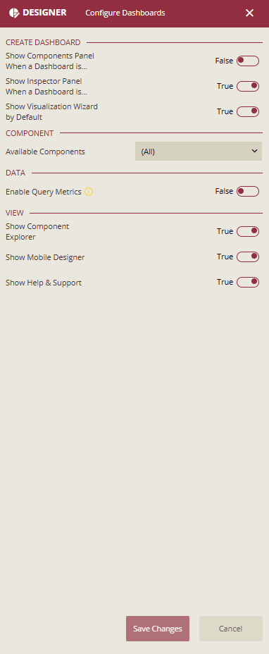
Create Dashboard
The designer settings in the Admin Portal allow you to modify the default behavior and visibility of certain elements in the dashboard designer when users create or edit dashboards. The following screenshot shows the elements that can be enabled or disabled.
Show Components Panel When a Dashboard is Opened
Controls the default state (expand or collapse) of the Component Panel when you open the dashboard designer. The Component panel includes scenarios, components, slicers, reusable widgets, and smart scenarios for creating and designing dashboards.
By default, this property is set to 'False'. It means the Component panel is collapsed when the end-user opens or creates a dashboard. In this way, the design area also widens horizontally, giving users more space for dashboard design. To make the Component panel appear expanded, set this property to 'True'.
Note: When you pin the Component panel, the content in the design area gets shifted to the right side of the designer.
Show Inspector Panel When a Dashboard is Opened
Controls the default state (expand or collapse) of the Inspector panel when you open the dashboard designer. By setting this property to 'False', it will let you hide the Inspector panel from the end-users when they initially open or create a dashboard. However, this panel will appear automatically as soon as a scenario is dropped into the design area. By default, this property is set to 'True'.
Show the Visualization Wizard by Default
Determines whether to display the Visualization Wizard window automatically when creating a new dashboard. By default, this option is set to 'False'. For more information, please visit the Visualization Wizard article.
Component
Available Components
Defines which components are available for use in dashboards. You can select all components or limit the selection to specific ones. For instance, you can disable custom visualizations or ECharts if they are not used.
Category Name | Category Description |
|---|---|
Data Visualization | Contains built-in scenarios such as charts, tables, and maps. For more information, visit this article. |
Custom Visualization | Contains user-defined scenarios. For more information, visit this article. |
Components | Contains components such as containers, tab containers, rich text, and images, to help organize the data in dashboards. For more information, visit this article. |
Slicers | Contains label slicer, multi-dimensional slicer, multi-dimensional dropdown slicer, data range slicer, date range slicer, and a relative dates slicer, which are used to filter the data dynamically. For more information, visit this article. |
Component Template | Contains a list of component templates that can be reused in the current dashboard. The template retains all the settings of the component saved as a template, such as title, appearance, data binding, and others. For more information, visit this article. |
Visualization Wizard | Generates smart scenarios for better data visualization. This is extremely beneficial for new users without prior knowledge of the BI tools. For more information, please visit this article. |
E-Charts | Help you design charts with custom visualization. Enhanced functionalities of E-charts include more chart functions, automatic animations, and detailed setting options. E-Charts redefine the way of visualizing data, granting you the freedom to craft charts that match your unique requirements. For more information, please visit this article. |
Topology | Contains shapes like rectangles, circles, arrows, lines, etc. that you can add to your dashboard to enhance its appearance and functionality. These shapes can be customized as per requirements. For more information, please visit this article. |
Data
Enable Query Metrics
Enable this option to allow the dashboard's data queries to additionally return debug information and performance metrics (such as SQL execution text, SQL execution time, cache hit status, etc.) SQL execution text may contain security-sensitive information. Use this only in development environments. Do not enable it in production.
Once this option is enabled, open the dashboard you want to debug. Open the browser DevTools and switch to the Network tab. You will see the requests sent from each of the dashboard scenarios. Select the request from the scenario you want to debug, like a pivot table or chart, and in the responses, you will find the metricsInfo object that contains the debug information about the query.
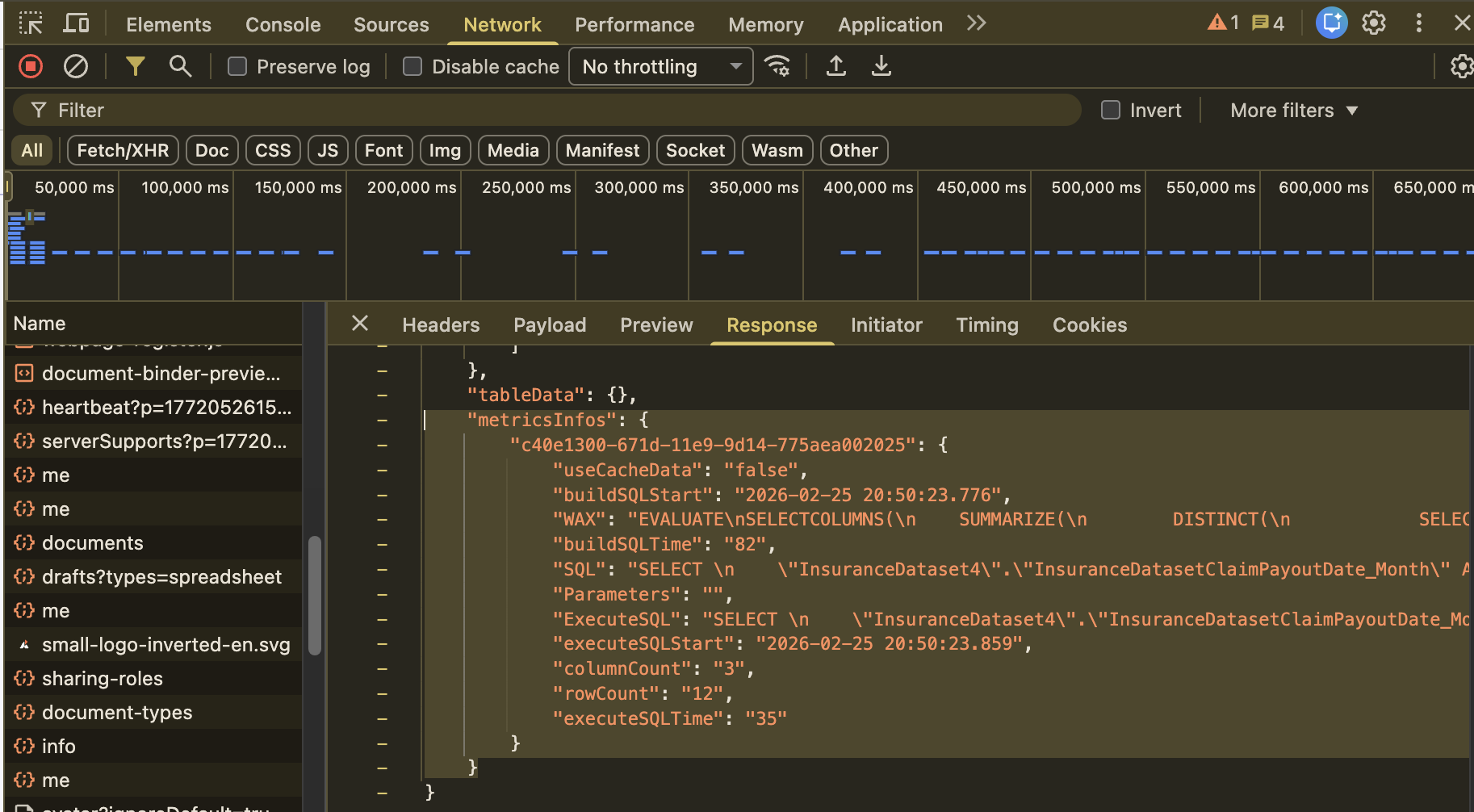
For a better viewing experience, you can copy the metricsInfo object and paste it into a text editor, save it as a JSON file, then open it in your favourite JSON viewer.
View
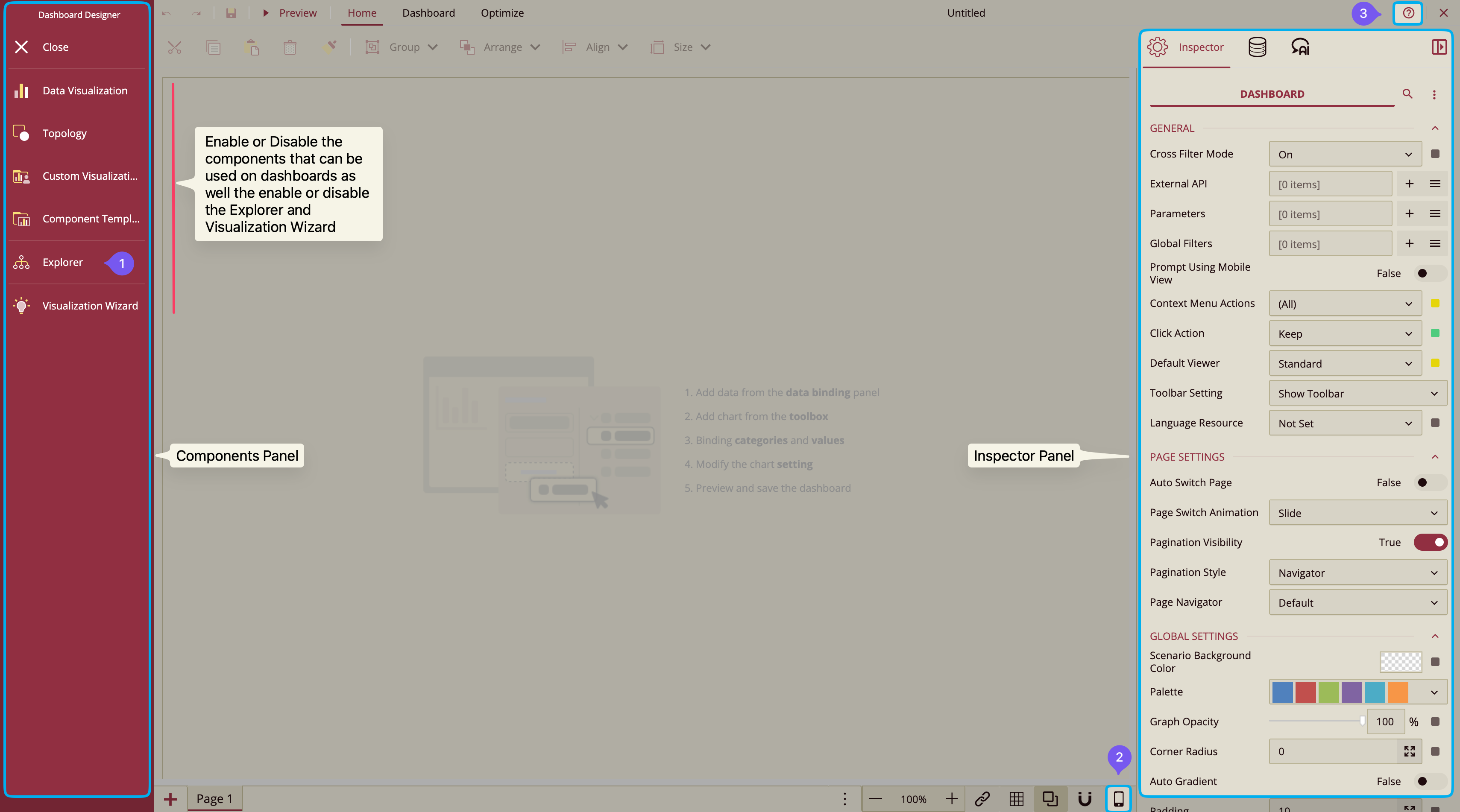
Show Component Explorer
Controls the visibility of the Explorer option in the dashboard designer. The default value for this property is True. By setting this property to False, it will hide the Explorer option when you initially open or create a dashboard.
Show Mobile Designer
Controls the visibility of the Mobile Designer option in the Page Setup Bar of the dashboard designer. The default value for this property is 'True'.
Show Help & Support
Controls the default state (show or hide) of the Help and Support option that appears in the top-right corner of the dashboard designer. On clicking this option, an About Wyn Dashboards dialog box appears that shows the version details of the Wyn dashboard plugin. The default value for this property is 'True'.