-
Interactive DashboardsCreate interactive BI dashboards with dynamic visuals.
-
End-User BI ReportsCreate and deploy enterprise BI reports for use in any vertical.
-
Wyn AlertsSet up always-on threshold notifications and alerts.
-
Localization SupportChange titles, labels, text explanations, and more.
-
Wyn ArchitectureA lightweight server offers flexible deployment.
-
 Wyn Enterprise 7.1 is ReleasedThis release emphasizes Wyn document embedding and enhanced analytical express...
 -
 Choosing an Embedded BI Solution for SaaS ProvidersAdding BI features to your applications will improve your products, better serve your customers, and more. But where to start? In this guide, we discuss the many options.
-
Visual GalleryInteractive sample dashboards and reports.
-
BlogExplore Wyn, BI trends, and more.
-
WebinarsDiscover live and on-demand webinars.
-
Customer SuccessVisualize operational efficiency and streamline manufacturing processes.
-
Knowledge BaseGet quick answers with articles and guides.
-
VideosVideo tutorials, trends and best practices.
-
WhitepapersDetailed reports on the latest trends in BI.
-
 Choosing an Embedded BI Solution for SaaS ProvidersAdding BI features to your applications will impr...
 -

- Getting Started
- Administration Guide
-
User Guide
- An Introduction to Wyn Enterprise
- Document Portal for End Users
- Data Governance and Modeling
- View and Manage Documents
- Working with Resources
- Working with Reports
- Working with Dashboards
- Working with Notebooks
- Wyn Analytical Expressions
- Section 508 Compliance
- Subscribe to RSS Feed for Wyn Builds Site
- Developer Guide
Banded List
In Wyn Enterprise, the Banded List is a collection of free-form bands where you can place other report controls. By default, the Banded List consists of three bands: a header, a footer, and a details band. You can add multiple numbers of bands to the Banded List.
A report control bound to the Banded List in the details band repeats itself for every row of data. The header and footer bands render data once at the beginning and end of the Banded List. The header and footer place details such as titles and grand totals.
In this help article, you will find information on the following:
Structure
The Banded List control is described below.
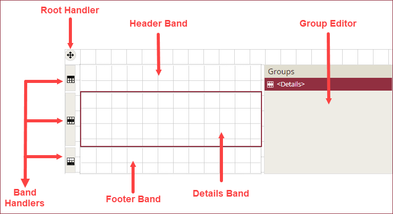
Header Band: The Header band appears at the beginning of the banded list. The Header band is generally used to display the title or logo at the top of the report.
Details Band: The Details band appears in the middle of the banded list and repeats for each dataset record bound to the banded list. For example, when using the employee details in the banded list, the details band can display the name, title, email, phone number, and photo of each employee.
Footer Band: The Footer band appears at the end of the banded list. You can use the Footer band to display summary items like the total.
To add a Banded List control to a report, navigate to the Report Designer and follow the instructions below:
Drag and drop the Banded List control onto the design area from the Designer Toolbar.
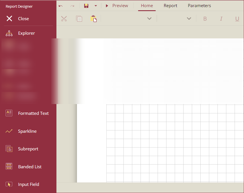
Using the Inspector Panel on the right side of your screen, customize the appearance of the Banded List control. See the Inspector Panel Properties section for more information on the properties of the Banded List control. You can also customize the properties of the Header, Details, and Footer bands using the Inspector Panel.
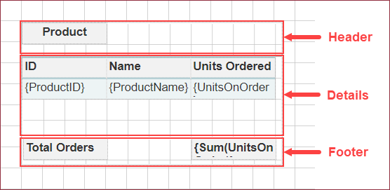
In the example below, a Banded List is created for a product order summary. The header band has a textbox with a static value, Products, the details band has a table with Product ID, Product Name, and Units Ordered, and the footer band has the sum of total units ordered.
The banded list control on the report designer area is shown in the image below:
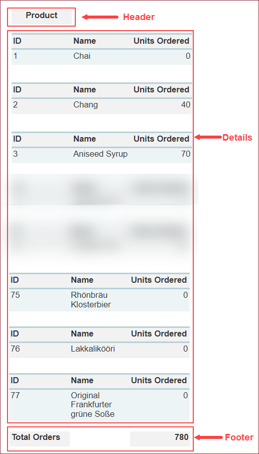
On preview, the banded list appears in the report as shown in the image below:
Grouping
Adding Groups
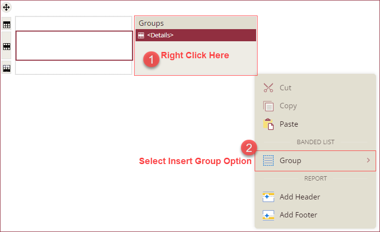
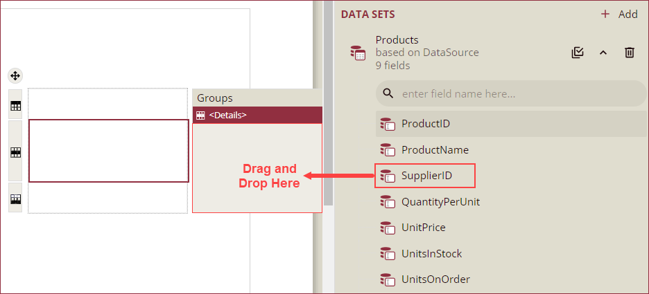
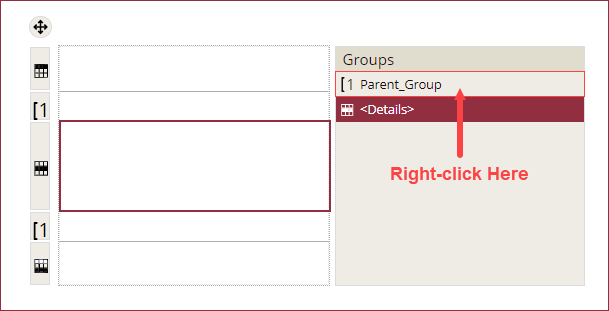
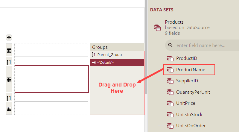
With the Banded List control, you can group the Details band. Use one of the following two methods to add groups to a banded list:
From the Groups editor, right-click on the option and select the Group >> Insert Group option from the context menu. Or,
Drag and drop a field you wish to group by from the Data Panel onto the Group Editor.
Group Configuration Settings
You can customize the name, group expressions, and other details of the groups by clicking the group and using the Inspector Panel. The Inspector Panel properties of a group are described in the tables below:
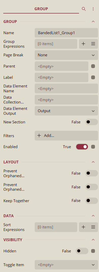
Group
Property | Description |
|---|---|
Name | Add a unique name to the group. Special characters such as period (.), space ( ), forward slash (/), backslash (\), exclamation marks (!), and hyphens (-) are not supported. You can use an underscore (_) in the name of the group. |
Group Expressions | Enter a value or expression for the groups. Group Expressions are a collection of bound field references or advanced expressions. Distinct values of the group expressions generate optional group headers, details, and footer bands. |
Page Break | Select a page break option (None, Start, End, StartAndEnd, or Between) for group instances. |
Parent | Specify the parent group for nested grouping structures. When set, the current group becomes a child of the selected parent group, allowing hierarchical data grouping within the report. |
Label | Set a label for the group, which is used for bookmarks and document maps in exported reports. This makes navigation easier in exported PDF and other document formats. |
Data Element Name | Specify a custom name for the group in exported XML and CSV documents. This allows you to control the element name when exporting report data for integration with other systems. |
Data Collection Name | Associate the group with a named data collection when exporting data. This property is used for advanced scenarios where grouped data needs to be collected under a specific data collection name in exports. |
Data Element Output | Specify whether the group’s data should be included in exported XML or CSV documents. Options: Output (include data), NoOutput (exclude data). |
New Section | When set to True, forces the group to start on a new section within the report layout. Useful for controlling layout structure and ensuring grouped data begins in a separate section. |
Filters | Add filters to filter out the data from the report. See the Filter Data help article for more information. |
Enabled | Use this property to show or hide groups at preview. If set to False, the group will be hidden. By default, this property is set to True. |
Layout
Property | Description |
|---|---|
Prevent Orphaned Header | To move the orphaned group headers to the next page, set the Prevent Orphaned Header option to True. By default, this option is set to False. |
Prevent Orphaned Footer | To move the last Details band to appear on the next page with the orphaned group footer, set the Prevent Orphaned Footer setting to True. By default, this option is set to False. |
Keep Together | When set to True, attempts to keep the entire group (headers, details, footers) on the same page if space allows, improving readability. By default, this property is set to False. |
Data
Property | Description |
|---|---|
Sort Expressions | Set a sort expression using this property. See the Sort Data help article for more information. |
Visibility
Property | Description |
|---|---|
Hidden | Set this property to True to hide the group in the report at preview and export. Can be used with expressions to dynamically control visibility. |
Toggle Item | Specify a report item (e.g., a textbox) that will control the visibility of the group, enabling drill-down functionality for expanding or collapsing the group during report viewing. |
Insert Parent or Child Groups
In a Banded List, you can arrange the data in nested groups. To insert a child group,
Right-click the parent group name in the Group Editor and select the Group >> Insert Group option from the context menu. Or,
Drag and drop a field from the Data Panel onto the Group Editor. A new group will be added to the Group editor with the existing groups.
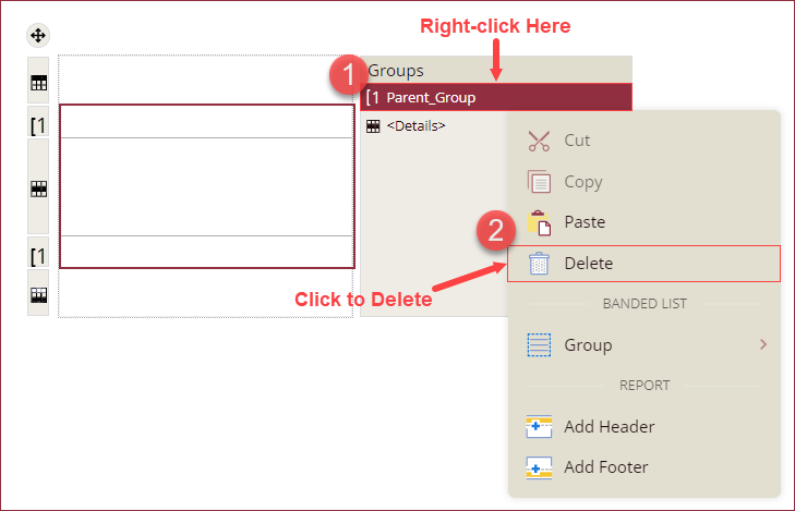
Delete a Group
To delete or remove a group from the Banded List control, right-click on the group name in the Group editor and click the Delete option from the context menu.
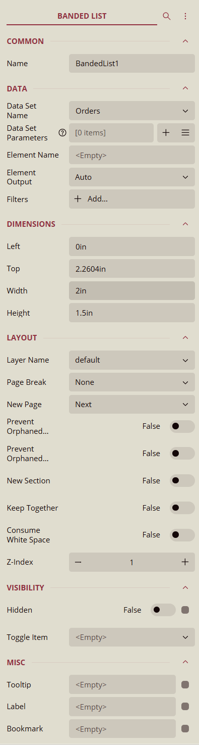
Inspector Panel Properties
BANDED LIST
Common
Property | Description |
|---|---|
Name | Add a unique name to the Banded List control. Special characters such as period (.), space ( ), forward slash (/), backslash (\), exclamation marks (!), and hyphens (-) are not supported. You can use an underscore (_) in the name of the control. |
Data
Property | Description |
|---|---|
Data Set Name | Select a dataset from the dropdown to bind the data to the Banded List control. |
Data Set Parameters | Add parameters to the dataset using the + button. Dataset parameters can be values or expressions. |
Filters | Add filters to filter out the data from the report. See the Filter Data help article for more information. |
Dimensions
Property | Description |
|---|---|
Left | Set the left margin of the Banded List control. |
Top | Set the top margin of the Banded List control. |
Width | Set the width of the Banded List control. |
Height | Set the height of the Banded List control. |
Layout
Property | Description |
|---|---|
Page Break | Select a page break option (None, Start, End, StartAndEnd, or Between) generated by banded list instances. |
New Page | Select an option to start the content after a page break. The available options are Next, Odd, and Even. |
Prevent Orphaned Header | To display the orphaned header on the next page, set this flag to True. By default, this flag is set to False. |
Prevent Orphaned Footer | To display the orphaned footer on the next page, set this flag to True. By default, this flag is set to False. |
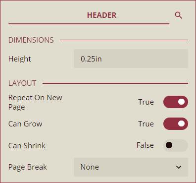
HEADER
Dimensions
Property | Description |
|---|---|
Height | Enter the height of the header band. |
Layout
Property | Description |
|---|---|
Repeat on New Page | To repeat the header band on every page, set the Repeat on New Page flag to True. By default, this property is set to False. |
Can Grow | To disable the data region from growing vertically, set this flag to False. By default, this option is set to True. |
Can Shrink | To enable the data region to shrink when the data is not enough data, set this flag to True. By default, this option is set to False. |
Page Break | Select a page break option (None, Start, End, StartAndEnd, or Between) for the Header band. |
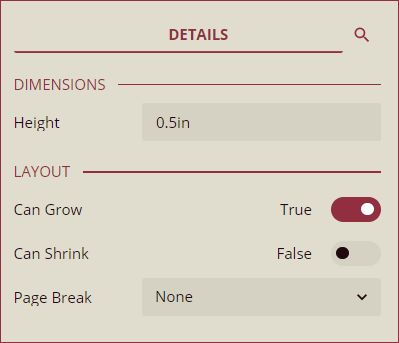
DETAILS
Dimensions
Property | Description |
|---|---|
Height | Enter the height of the details band. |
Layout
Property | Description |
|---|---|
Can Grow | To disable the data region from growing vertically, set this flag to False. By default, this option is set to True. |
Can Shrink | To enable the data region to shrink when the data is not enough data, set this flag to True. By default, this option is set to False. |
Page Break | Select a page break option (None, Start, End, StartAndEnd, or Between) for the Details band. |
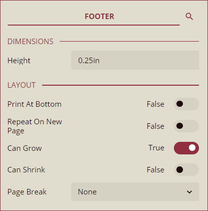
FOOTER
Dimensions
Property | Description |
|---|---|
Height | Enter the height of the footer band. |
Layout
Property | Description |
|---|---|
Print at Bottom | To print the footer band at the bottom of the page, set this option to True. By default, this option is set to False. |
Repeat on New Page | To repeat the footer band on every page, set the Repeat on New Page flag to True. By default, this property is set to False. |
Can Grow | To disable the data region from growing vertically, set this flag to False. By default, this option is set to True. |
Can Shrink | To enable the data region to shrink when the data is not enough data, set this flag to True. By default, this option is set to False. |
Page Break | Select a page break option (None, Start, End, StartAndEnd, or Between) for the Footer band. |