- Getting Started
- Administration Guide
-
User Guide
- An Introduction to Wyn Enterprise
- Document Portal for End Users
- Data Governance and Modeling
- View and Manage Documents
- Working with Resources
- Working with Reports
- Working with Dashboards
- Working with Notebooks
- Wyn Analytical Expressions
- Section 508 Compliance
- Subscribe to RSS Feed for Wyn Builds Site
- Developer Guide
CheckBox
The CheckBox control is used to visually represent a Boolean value in a report. It has two parts: "Icon" and "Text", as shown in the following figure.

To add a Checkbox in a Report Designer
Follow the steps below to add a Checkbox.
From the Report Toolbox on the left, drag and drop the CheckBox control onto the design area.
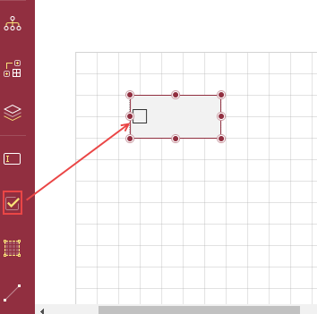
To add the text directly into the control, double-click the CheckBox control and enter text. Alternatively, you can enter the text in the Text field on the Properties tab under the Common section. You can also select the fields and bind them to the dataset.
You can format text in the CheckBox control using the toolbar, or you can modify it using the Properties tab.
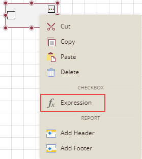
You can also use expressions in the checkbox. Right-click the checkbox and select the option Expression.
Select the check box and set the Checked option on the Properties tab under the section Common to True to be checked, and set it to False to be unchecked. If the Checked option is set to True, then a small box appears with a tick mark in it; and if the Checked option is set to False, then the box is empty. By default, the checkbox is empty without any tick mark.
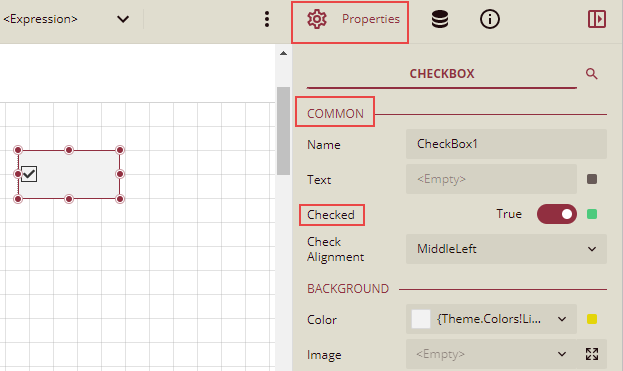
Properties Tab
You can customize the default checkbox appearance by setting properties in the Properties tab of the checkbox control. Properties like adding a border, editing font size, font type, background color, etc., can be customized.
Listed below are the common properties.
Property Section | Property Description |
|---|---|
Common | |
Background | This sets the background of the checkbox. |
Text | This sets the text formatting in the checkbox. You can set the Font Color, Family, Size, Style, Weight, Decoration, and Word Wrap Mode. |
Border | This option sets the border of the checkbox.
|
Dimensions | This sets the location and size of the checkbox. |
Layout | This sets the checkbox layout in a report as a whole. |
Visibility | This sets the visibility of the checkbox control on the report preview. |
Data |
|
Misc Options |
|
Example: In the example below, we will create a report that displays information on products that are discontinued. The checkbox against the products that are discontinued will be checked in the table.
Follow the steps below to create this report using the CheckBox control:
Drag and drop a table on the report designer and bind it to the dataset.
Drag and drop the desired data fields in the table.
Add another column to the right of the last column (Unit Price) and drag a Checkbox control into the details cell.
Now, drag and drop the data field Discontinued in this checkbox control.
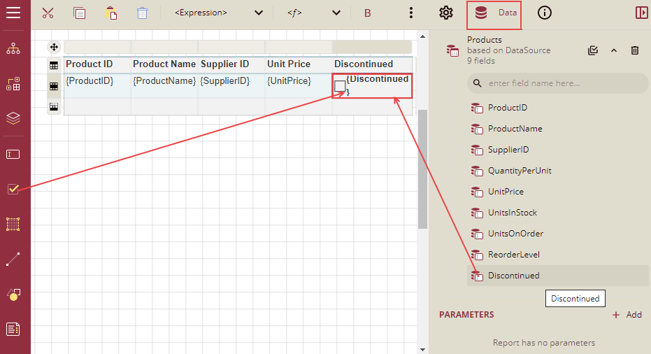
Select the checkbox control and go to the Properties tab. Under the section Common, set the Checked property to True and click the Data Binding option, and then click the Expression option from the list.
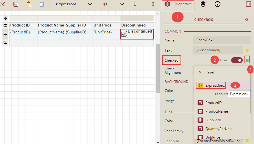
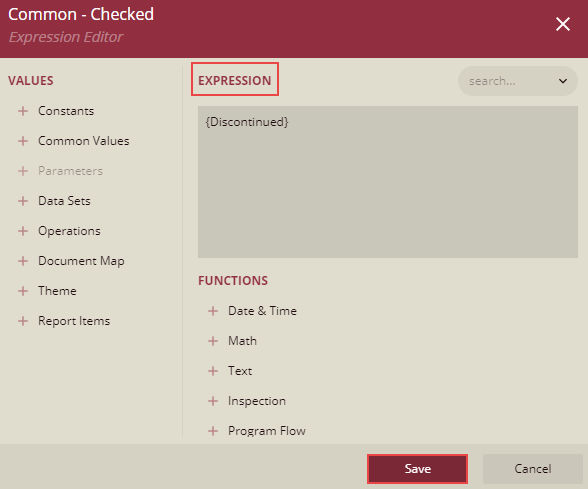
The Expression Editor is displayed. Write the field name Discontinued in the expression editor and click the Save button.
Now you can format the report and click Preview. The report will look similar to the one shown below.
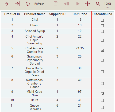
So, we can see that in the product list, the products that are discontinued have checkboxes that are checked under the column Discontinued.


