-
Interactive DashboardsCreate interactive BI dashboards with dynamic visuals.
-
End-User BI ReportsCreate and deploy enterprise BI reports for use in any vertical.
-
Wyn AlertsSet up always-on threshold notifications and alerts.
-
Localization SupportChange titles, labels, text explanations, and more.
-
Wyn ArchitectureA lightweight server offers flexible deployment.
-
 Wyn Enterprise 7.1 is ReleasedThis release emphasizes Wyn document embedding and enhanced analytical express...
 -
 Choosing an Embedded BI Solution for SaaS ProvidersAdding BI features to your applications will improve your products, better serve your customers, and more. But where to start? In this guide, we discuss the many options.
-
Visual GalleryInteractive sample dashboards and reports.
-
BlogExplore Wyn, BI trends, and more.
-
WebinarsDiscover live and on-demand webinars.
-
Customer SuccessVisualize operational efficiency and streamline manufacturing processes.
-
Knowledge BaseGet quick answers with articles and guides.
-
VideosVideo tutorials, trends and best practices.
-
WhitepapersDetailed reports on the latest trends in BI.
-
 Choosing an Embedded BI Solution for SaaS ProvidersAdding BI features to your applications will impr...
 -

- Getting Started
- Administration Guide
-
User Guide
- An Introduction to Wyn Enterprise
- Document Portal for End Users
- Data Governance and Modeling
- View and Manage Documents
- Working with Resources
- Working with Reports
- Working with Dashboards
- Working with Notebooks
- Wyn Analytical Expressions
- Section 508 Compliance
- Subscribe to RSS Feed for Wyn Builds Site
- Developer Guide
Explorer
The Explorer panel displays a hierarchical view of the report structure, starting from the top-level Report, followed by nested sections like Continuous Section and Body. This layout helps users understand the organization of report components and navigate between them efficiently. The panel highlights the selected item and allows switching to others with a single click. It supports basic actions such as pinning the panel and integrates with the Properties panel for quick editing of selected elements.
Report
Layout

Themes
Allows selection and management of visual themes for the report.
Active is selected by default.
Themes affect colors, fonts, and overall styling.
Data Binding supported.
Consume White Space
Toggle to optimize layout spacing.
When set to True, unused white space is minimized.
Layers
Manages visual stacking of report elements.
Displays current layer count (e.g.,
[1 item]).Add Items (+): Insert new layers.
Three-line menu: Edit or remove layers.
Embedded Resources
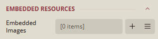
Embedded Images
Manages images embedded directly into the report.
Displays current image count (e.g.,
[0 items]).Add Items (+): Insert new images.
Three-line menu: Edit or remove images.
Preview
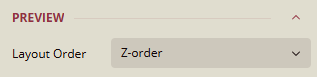
Layout Order
Controls the rendering order of elements.
Set to Z-order for depth-based stacking.
Data
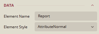
Element Name
Logical name of the report element.
Default:
Report.Can be renamed for clarity.
Data Binding supported.
Element Style
Defines the visual style of the report element.
Current value:
AttributeNormal, other valuesAutoandElementNormal
Document Map

Levels
Defines hierarchical navigation structure.
Displays current level count (e.g.,
[0 items]).Add Items (+): Insert new levels.
Three-line menu: Edit or remove levels.
Numbering Style
Controls section numbering.
Current value:
None.Data Binding supported.
Source
Specifies the data source for the document map.
Current value:
All, other values,Labels,Headings, andNone.Data Binding supported.
Misc
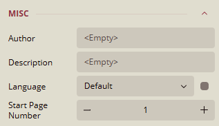
Author
Field for specifying the report author.
Default:
<Empty>
Description
Field for describing the report's purpose or content.
Default:
<Empty>
Language
Sets the language for the report.
Default:
DefaultData Binding supported.
Start Page Number
Defines the starting page number.
Default:
1Use (-) to decrease and (+) to increase the number of pages.
Continuous Section
Common
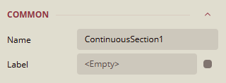
Name
Current value:
ContinuousSection1Can be renamed to a meaningful label.
Label
Optional label for the section.
Default:
<Empty>Data Binding supported.
Margins
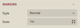
Style
Defines the margin style applied to the section.
Current value:
Normal.Options:
Normal,None,Narrow,Wide.
Sizes
Specifies the margin size around the section.
Default:
1inExpand for detailed sizes.
Data Binding supported.
Layout

Columns
Sets the number of columns in the section.
Default:
1Use (+) and (-) to adjust the number of columns.
Column Spacing
Defines the spacing between columns.
Default:
0in
Page Size
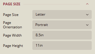
Page Size
Specifies the paper size used for the section.
Default:
Letter.Options:
Letter,Tabloid,Legal,Executive,A3,A4,A5,A6,B4 (JIS),B5 (JIS),B6 (JIS),B5 (ISO).
Page Orientation
Default:
PortraitOptions:
Portrait,Landscape
Page Width
To set the width of the page.
Default:
8.5in
Page Height
To set the height of the page.
Default:
11in
Visibility

Hidden
Controls whether the section is visible in the report.
Toggle switch set to
False(visible)Data Binding supported.
Data
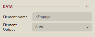
Element Name
Logical name of the section element.
Default:
<Empty>
Element Output
Controls whether the section outputs its data element.
Default:
AutoOptions:
Auto,Output,NoOutput,ContentsOnly.
BODY
Background
Color
Sets the background color of the body section.
Current value:
Transparent, other options:Palettes,Other Colors,Web Colors.Data Binding supported.
Image
Adds an image to the body section.
Default:
<Empty>Specifies the origin of the image used in the background:
Shared,Embedded, orDatabase.When expanded:
Source
Current value:
ExternalOptions:
Embedded,Database,ExternalData Binding: Supported
Value
Defines the path or expression used to retrieve the image.
Current value:
<Empty>Data Binding: Supported
MIME Type
Indicates the format of the image (e.g.,
image/png,image/jpeg).Current value:
<Empty>Data Binding: Supported
Repeat
Controls how the background image is repeated.
Current value:
RepeatOptions:
Repeat,NoRepeat,RepeatX,RepeatYData Binding: Supported
Border
Width
Sets the thickness of the border around the body section.
Default value:
1ptExpanded Properties: Allows adjusting per side.
Data Binding supported.
Style
Defines the border style for the body section.
Current value: None
Options:
Dotted,Dashed,Solid,Double,Groove,Ridge,Inset,Outset, etc.Expanded Properties: Allows setting individual styles for each side.
Data Binding supported.
Color
Sets the color of the border.
Current value:
Black, other options:Palettes,Other Colors,Web Colors.Expanded Properties: Allows adjusting per side.