-
Interactive DashboardsCreate interactive BI dashboards with dynamic visuals.
-
End-User BI ReportsCreate and deploy enterprise BI reports for use in any vertical.
-
Wyn AlertsSet up always-on threshold notifications and alerts.
-
Localization SupportChange titles, labels, text explanations, and more.
-
Wyn ArchitectureA lightweight server offers flexible deployment.
-
 Wyn Enterprise 7.1 is ReleasedThis release emphasizes Wyn document embedding and enhanced analytical express...
 -
 Choosing an Embedded BI Solution for SaaS ProvidersAdding BI features to your applications will improve your products, better serve your customers, and more. But where to start? In this guide, we discuss the many options.
-
Visual GalleryInteractive sample dashboards and reports.
-
BlogExplore Wyn, BI trends, and more.
-
WebinarsDiscover live and on-demand webinars.
-
Customer SuccessVisualize operational efficiency and streamline manufacturing processes.
-
Knowledge BaseGet quick answers with articles and guides.
-
VideosVideo tutorials, trends and best practices.
-
WhitepapersDetailed reports on the latest trends in BI.
-
 Choosing an Embedded BI Solution for SaaS ProvidersAdding BI features to your applications will impr...
 -

- Getting Started
- Administration Guide
-
User Guide
- An Introduction to Wyn Enterprise
- Document Portal for End Users
- Data Governance and Modeling
- View and Manage Documents
- Working with Resources
- Working with Reports
- Working with Dashboards
- Working with Notebooks
- Wyn Analytical Expressions
- Section 508 Compliance
- Subscribe to RSS Feed for Wyn Builds Site
- Developer Guide
Data Table
The Data Binding tab for the Data Table controls which data attributes are displayed in the table and which are available as tooltips when hovering over rows.
1. Columns
The Columns binding slot defines what fields are displayed in the table.
Drag and drop any data attributes (such as
Product Name,Sales Amount,Order Date) into this slot.Each attribute becomes a column in the table, shown in the order you add them.
You can rename the columns, reorder them, or apply formatting once they are added.
2. Tooltip
The Tooltip binding slot defines additional data that appears when a user hovers over a row.
Drag and drop any data attributes you want to show in the tooltip (for example,
Category,Manager Name,Forecast).Tooltip data does not appear directly in the table — it is only revealed on hover.
Customization
You can further customize your data table using the following properties.
Table Setting
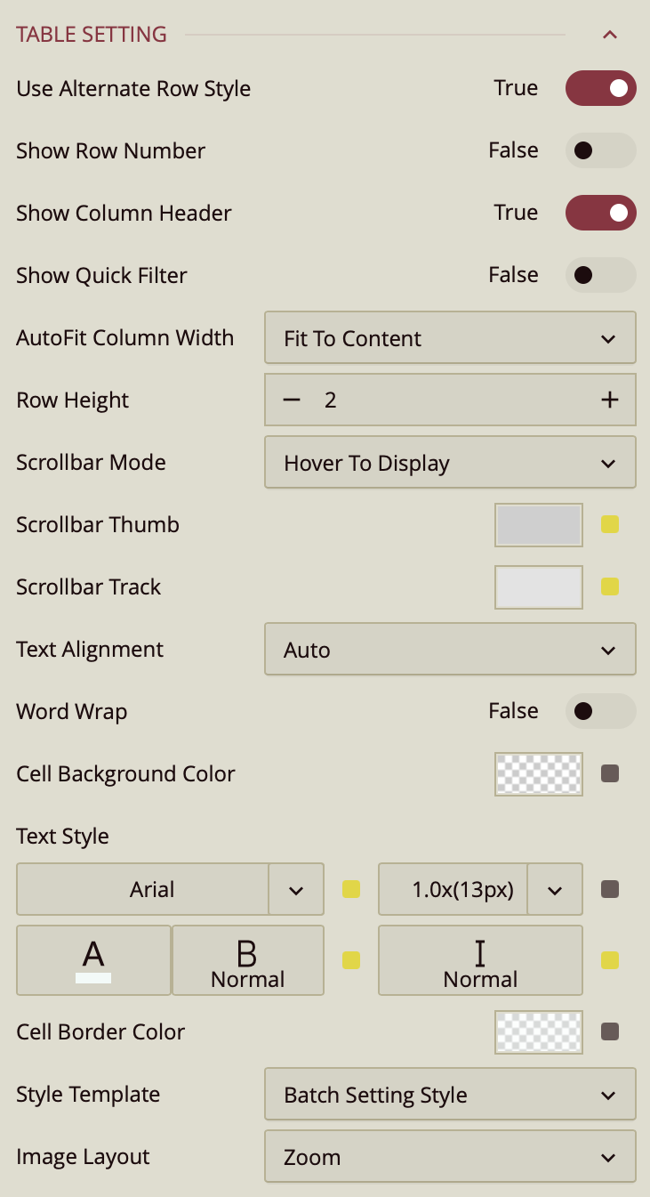
Use Alternate Row Style – Toggles alternating background colors for rows to improve readability. Enabled (True) by default.
Show Row Number – Toggles a row number column on the left side of the table. Disabled (False) by default.
Show Column Header – Toggles the display of column headers. Enabled (True) by default.
Show Quick Filter – Toggles a quick filter control for filtering visible data without adjusting main filters. Disabled (False) by default.
AutoFit Column Width – Determines how columns adjust their width.
Fit to Content (default) – Adjusts each column to fit its cell contents.
Fit to Header – Adjusts columns to fit the header text.
None – Keeps columns at a fixed width.
Row Height – Sets the height of table rows. Enter a numeric value in pixels.
Scrollbar Mode – Controls when scrollbars appear.
Hover to Display (default) – Shows scrollbars only when hovering over the table.
Auto – Displays scrollbars when content exceeds the table bounds.
Hidden – Hides scrollbars entirely.
Visible – Always shows scrollbars.
Scrollbar Thumb – Sets the color of the draggable portion of the scrollbar.
Scrollbar Track – Sets the color of the scrollbar track background.
Text Alignment – Aligns text within cells. Options are Auto (default), Left, Center, or Right.
Word Wrap – Toggles wrapping text within cells so long content appears on multiple lines. Disabled (False) by default.
Cell Background Color – Sets the background color for table cells.
Text Style – Configures font family, size, color, weight, and style (normal or italic) for table text.
Cell Border Color – Sets the color of cell borders.
Style Template – Applies a predefined style template to the table. Options include “Batch Setting Style,” built-in Excel-style templates, or Add New Style… to create a custom style.
Image Layout – Controls how images are displayed in table cells.
Zoom (default) – Scales the image proportionally to fill the cell as much as possible without cropping.
Origin – Displays the image at its original size and position.
Fill – Stretches the image to completely fill the cell, which may change its aspect ratio.
Interaction
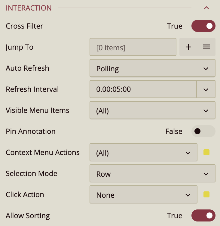
The Interaction section defines how users can interact with a Data Table at runtime. These settings control behaviors such as filtering, navigation, selection handling, and refresh logic. Many of the items in this section open additional menus or configuration windows and are part of a broader interaction workflow rather than simple visual properties.
Cross-Filter
Cross-Filter controls whether the Data Table participates in cross-filtering with other visualizations on the dashboard. When enabled, selecting data in the table applies corresponding filters to other visuals. When disabled, interactions with the Data Table do not affect other visualizations.
Jump To
Jump To allows you to configure navigation actions that users can trigger from the Data Table. You can add a new Jump To action using the Add (+) button, which opens the Jump To configuration window, or manage existing actions from the Jump To list menu (accessed via the menu button with three horizontal lines).
In the Jump To window, you define a name for the action and associate it with a target dimension. You then specify a destination, which can be another dashboard, a report, or an external URL, selected from the Document dropdown. Additional options control how the destination opens, such as in a dialog, a new window, or other supported modes.
Auto Refresh
Auto Refresh applies when the Data Table is bound to a streaming dataset, where data is updated continuously or at frequent intervals.
Three modes are available:
None: Disables automatic refreshing.
Polling: Refreshes data at a fixed interval, configurable in days, hours, minutes, and seconds.
Real Time: Updates automatically as new data becomes available.
Visible Menu Items
Visible Menu Items controls which interaction buttons appear when users hover over the Data Table in preview mode. You can show all available items or selectively enable specific ones.
Common menu items include:
Clear Selection, which appears only when a selection is active and removes the current selection.
Focus, which expands the Data Table to fill the dashboard preview area.
Export, which enables data export options.
Additional actions are available through the ellipsis ( … ) menu, which opens a side panel containing other available commands.
Selection Mode
Selection Mode determines how user selections are interpreted in the Data Table. When set to Row, clicking anywhere within a row selects the entire row. When set to Cell, selections are based on individual cells. This setting affects what is considered a selection and how interaction actions are triggered.
Click Action
Click Action defines what happens when a user clicks within the Data Table. By default, no action is applied. Available actions include showing a tooltip, keeping or excluding selected data, triggering a Jump To action, or executing a command. The configured action is triggered based on the current Selection Mode.
Allow Sorting
Allow Sorting controls whether users can sort the Data Table by clicking column headers. When enabled (the default), clicking a header sorts the table by that column. Disabling this option prevents sorting interactions, which can be useful when accidental sorting would disrupt the intended data order.
Pagination Setting
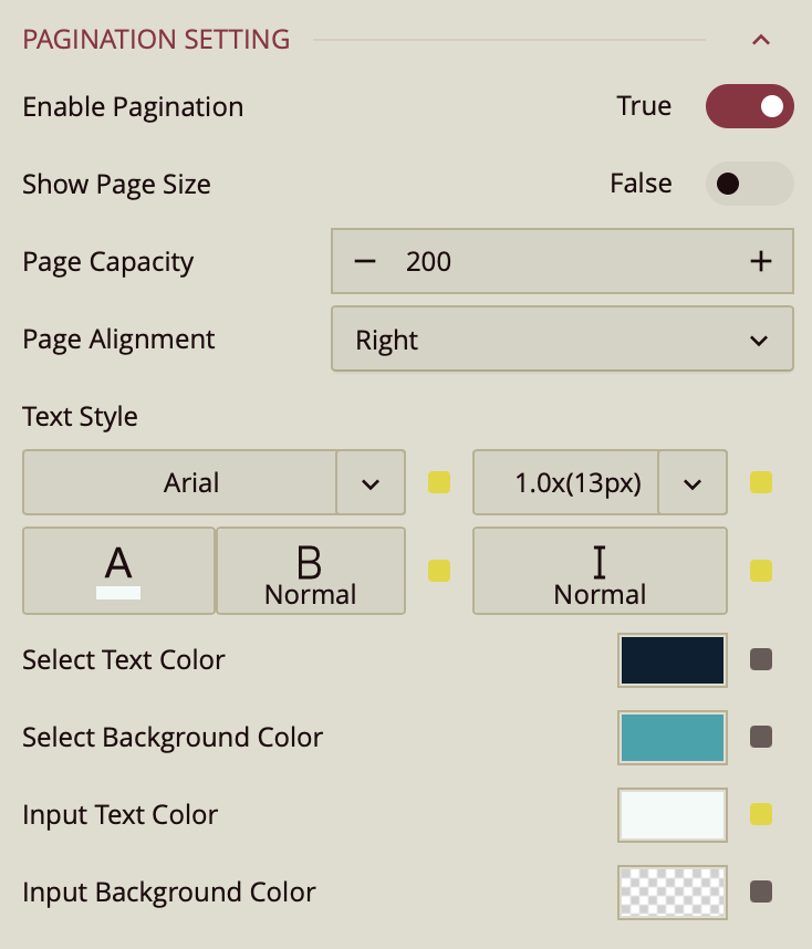
Enable Pagination – Toggles pagination for the table. When enabled, data is divided into pages. Enabled (True) by default.
Show Page Size – Toggles the display of the page size selector. Disabled (False) by default.
Page Capacity – Sets the maximum number of rows displayed per page. The default is 200.
Page Alignment – Aligns the pagination controls within the table footer. Options are Right (default), Left, or Center.
Text Style – Configures font family, size, color, weight, and style (normal or italic) for pagination text.
Select Text Color – Sets the text color for the active page number. Defaults to the palette color.
Select Background Color – Sets the background color for the active page number. Defaults to the palette color.
Input Text Color – Sets the text color for page number input fields. Defaults to the palette color.
Input Background Color – Sets the background color for page number input fields. Defaults to the palette color.
Tooltip
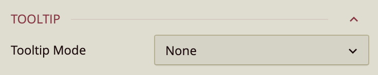
Tooltip Mode – Determines how tooltips are displayed when hovering over the chart:
None – Disables tooltips.
Data Point (default) – Shows a tooltip for the specific data point under the pointer.
Category – Shows a tooltip for all data points that share the same category value.
Column Headers
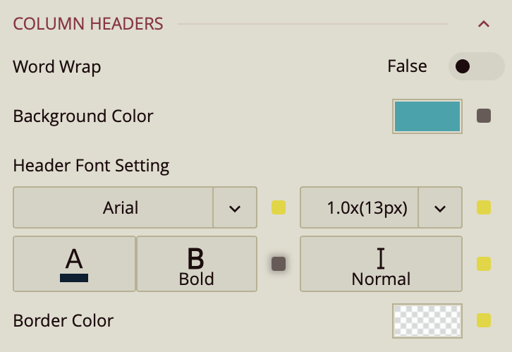
Word Wrap – Toggles wrapping of header text (False by default).
Background Color – Sets the background color for the header area.
Header Font Setting – Configures font family, size, color, weight, and style for header text.
Border Color – Sets the border color for the header area.
First Data Stripe
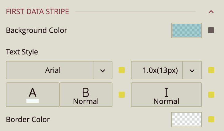
First Data Stripe – Sets the background color, text style, and border color for alternating data rows in the first stripe pattern.
Second Data Stripe
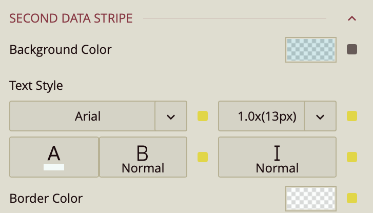
Second Data Stripe – Sets the background color, text style, and border color for alternating data rows in the second stripe pattern.
Totals Area
The Totals Area refers specifically to the row that is generated when a Total Method is applied to one or more fields in the Columns binding slot. Once a column total is configured (for example, Sum, Count, or Average), the table automatically creates a totals row. The Totals Area settings control the behavior, placement, and styling of that generated totals row.
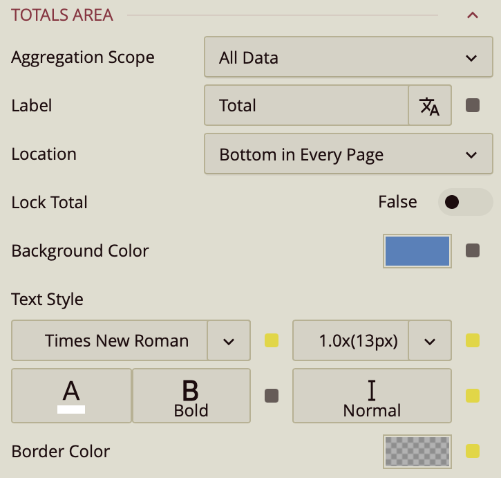
Aggregation Scope – Determines the data range used to calculate totals. By default, this is set to All Data, meaning totals are calculated using the entire dataset, regardless of pagination. It can also be set to Current Page, which limits the calculation to only the records displayed on the active page.
Label – Defines the text displayed in the totals row to identify it (for example, “Total” or “Grand Total”). The label is displayed when Show Row Number is enabled.
Location – Specifies where the totals row is positioned within the table. The default setting is Bottom in Every Page*, which displays a totals row at the bottom of each paginated page. Additional options include:
Top in Every Page – Displays the totals row at the top of each page.
Top of Table – Displays a single totals row at the very top of the entire table.
Bottom of Table – Displays a single totals row at the very bottom of the entire table.
Lock Total – Toggles whether the totals row remains fixed (sticky) at the top or bottom of the table while scrolling. When enabled, the totals row stays visible at all times, preventing the need to scroll to view aggregated values.
Background Color – Sets the background color and opacity of the totals row.
Text Style – Controls the font family, size, color, weight, and italic styling of the totals row text.
Border Color – Sets the border color and opacity applied to the totals row.