-
Interactive DashboardsCreate interactive BI dashboards with dynamic visuals.
-
End-User BI ReportsCreate and deploy enterprise BI reports for use in any vertical.
-
Wyn AlertsSet up always-on threshold notifications and alerts.
-
Localization SupportChange titles, labels, text explanations, and more.
-
Wyn ArchitectureA lightweight server offers flexible deployment.
-
 Wyn Enterprise 7.1 is ReleasedThis release emphasizes Wyn document embedding and enhanced analytical express...
 -
 Choosing an Embedded BI Solution for SaaS ProvidersAdding BI features to your applications will improve your products, better serve your customers, and more. But where to start? In this guide, we discuss the many options.
-
Visual GalleryInteractive sample dashboards and reports.
-
BlogExplore Wyn, BI trends, and more.
-
WebinarsDiscover live and on-demand webinars.
-
Customer SuccessVisualize operational efficiency and streamline manufacturing processes.
-
Knowledge BaseGet quick answers with articles and guides.
-
VideosVideo tutorials, trends and best practices.
-
WhitepapersDetailed reports on the latest trends in BI.
-
 Choosing an Embedded BI Solution for SaaS ProvidersAdding BI features to your applications will impr...
 -

- Getting Started
- Administration Guide
-
User Guide
- An Introduction to Wyn Enterprise
- Document Portal for End Users
- Data Governance and Modeling
- View and Manage Documents
- Working with Resources
- Working with Reports
- Working with Dashboards
- Working with Notebooks
- Wyn Analytical Expressions
- Section 508 Compliance
- Subscribe to RSS Feed for Wyn Builds Site
- Developer Guide
Data Insights
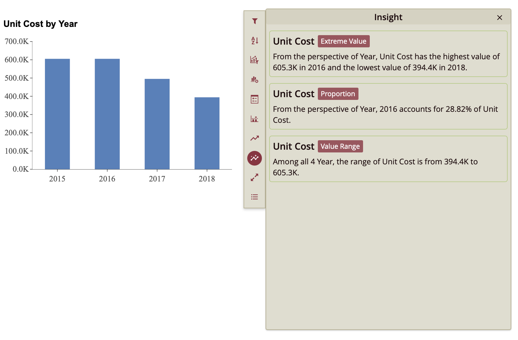
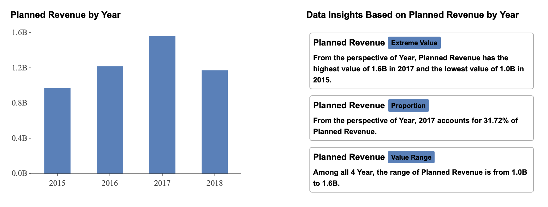
Data Insights provide automated analytical observations that help users quickly interpret the data behind a scenario. These insights are available in two ways:
Through the insights data exploration button in preview mode.
Through a dedicated InsightIQ scenario added to the dashboard.
Both approaches surface system-generated insight cards that describe patterns such as trends, outliers, proportions, and value ranges. Because these are dashboard-level settings, any configuration you apply affects all insights—whether they are opened through the insights data exploration button or displayed inside an InsightIQ scenario.
The first two properties in this section—Insight Patterns and Confidence Level [0, 100]—control how insights are generated for both methods. Additional formatting properties apply specifically to InsightIQ.
Viewing Insights in Preview
When previewing the dashboard, each scenario includes an ellipsis menu in its upper-right corner.
To view insights:
Click the ellipsis menu on the scenario.
Select the insights data exploration button from the vertical toolbar on the right-hand side.
The system analyzes the bound dataset and displays generated insight cards.
Each insight appears as a structured card that includes:
A title
An insight pattern label (such as Extreme Value or Proportion)
A descriptive statement explaining the detected pattern
The insights shown depend on the enabled patterns and the configured confidence level.
Adding and Configuring an InsightIQ Scenario
In addition to preview-based insights, you can add a dedicated InsightIQ scenario directly to the dashboard.
To add InsightIQ:
Open the Data Visualization tab.
Drag InsightIQ onto the designer surface.
Click Configure InsightIQ.
When you select Configure InsightIQ, a configuration window appears with a dropdown list of all scenarios in the dashboard. Scenarios are listed by their Scenario Name. By default, scenarios are named according to their visualization type (for example, Column Chart, Column Chart-1, and so on). Renaming scenarios in the Inspector Panel is recommended so they can be easily identified during configuration.
After selecting a scenario from the dropdown, InsightIQ generates and displays insights based on that scenario’s data.
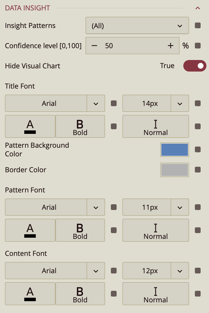
Insight Generation Properties
The following properties control how insights are generated across both the insights data exploration button and InsightIQ.
Insight Patterns
This dropdown defines which analytical patterns are eligible to appear.
By default, (All) is selected. Individual patterns can be enabled or disabled by checking or clearing them in the list.
Available patterns include:
Trend
Time Series Outlier
Low Variance
Category Outlier
Majority
Change Point
Correlation
Extreme Value
Proportion
Value Range
If a pattern is unchecked, insights of that type will not be generated.
Confidence Level [0, 100]
The Confidence Level determines the statistical threshold required for an insight to be displayed. It is expressed as a percentage and defaults to 50.
Higher values make the system more selective, displaying only stronger and more statistically significant insights.
Lower values make the system more permissive, allowing weaker patterns to appear.
Adjusting this value controls the sensitivity of insight detection.
Additional Dashboard Property
Hide Visual Chart
The Hide Visual Chart property controls the visibility of the Data Visualization panel. When toggled while the Data Visualization tab is open, the visual chart area is closed. This setting affects the layout of the designer interface but does not change how insights are generated.
InsightIQ Formatting Properties
The following properties apply only to InsightIQ. They control the visual presentation of individual insight cards displayed within the InsightIQ scenario.
Each insight card contains:
A title
A pattern label
A descriptive content section
A border
Title Font
Controls the typography of the insight title. You can modify:
Font family
Size
Color
Weight
Style (italic or normal)
This setting affects the heading of each generated insight card.
Pattern Background Color
Defines the background color of the insight pattern label—the small label that appears next to each insight title (for example, Proportion or Value Range).
This setting controls only the background of that label element.
Border Color
Controls the border color of each individual insight card.
You can effectively remove the border by setting the border color opacity to 0%, making it fully transparent.
Pattern Font
Defines the typography of the insight pattern label. You can configure:
Font family
Size
Color
Weight
Style (italic or normal)
This affects only the small label indicating the type of insight.
Content Font
Controls the typography of the descriptive text within each insight card. You can modify:
Font family
Size
Color
Weight
Style (italic or normal)
This ensures the explanatory content aligns with the overall dashboard design and remains readable.