-
Interactive DashboardsCreate interactive BI dashboards with dynamic visuals.
-
End-User BI ReportsCreate and deploy enterprise BI reports for use in any vertical.
-
Wyn AlertsSet up always-on threshold notifications and alerts.
-
Localization SupportChange titles, labels, text explanations, and more.
-
Wyn ArchitectureA lightweight server offers flexible deployment.
-
 Wyn Enterprise 7.1 is ReleasedThis release emphasizes Wyn document embedding and enhanced analytical express...
 -
 Choosing an Embedded BI Solution for SaaS ProvidersAdding BI features to your applications will improve your products, better serve your customers, and more. But where to start? In this guide, we discuss the many options.
-
Visual GalleryInteractive sample dashboards and reports.
-
BlogExplore Wyn, BI trends, and more.
-
WebinarsDiscover live and on-demand webinars.
-
Customer SuccessVisualize operational efficiency and streamline manufacturing processes.
-
Knowledge BaseGet quick answers with articles and guides.
-
VideosVideo tutorials, trends and best practices.
-
WhitepapersDetailed reports on the latest trends in BI.
-
 Choosing an Embedded BI Solution for SaaS ProvidersAdding BI features to your applications will impr...
 -

- Getting Started
- Administration Guide
-
User Guide
- An Introduction to Wyn Enterprise
- Document Portal for End Users
- Data Governance and Modeling
- View and Manage Documents
- Working with Resources
- Working with Reports
- Working with Dashboards
- Working with Notebooks
- Wyn Analytical Expressions
- Section 508 Compliance
- Subscribe to RSS Feed for Wyn Builds Site
- Developer Guide
Tooltip
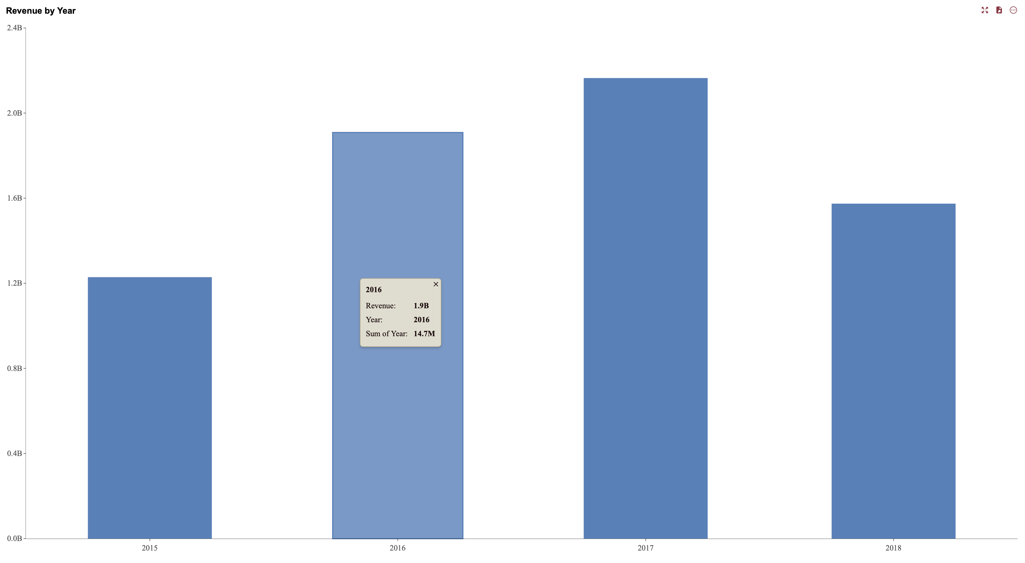
Tooltip properties define the visual presentation of tooltips that appear when users hover over data points in a scenario. A tooltip is enabled by binding a data field to the Tooltip data binding slot in the Data Binding tab. Once a field is bound, the tooltip adopts the styles configured in these settings.
Tooltip Settings
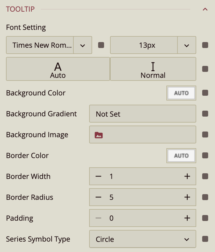
Font Setting
Controls the typography of the tooltip content. You can define the font family, font size, and font color, as well as apply italic styling. These options ensure that tooltip text remains readable and consistent with the overall visual design of the dashboard.
Background Color
Specifies a solid background color for the tooltip. The color picker allows you to select both the color and its opacity, making it possible to create fully opaque tooltips or subtle, semi-transparent overlays.
Background Gradient
Applies a gradient background instead of a solid color. You can choose the gradient style, including its direction and fade behavior, along with the colors used in the gradient. This allows for more visually dynamic tooltip designs.
Background Image
Replaces the standard tooltip background with an image. When applied, the tooltip displays the selected image while still presenting the bound tooltip content. This option is useful when you want tooltips to reflect branding elements or thematic visuals.
Border Color
Defines the color of the tooltip border. This can be used to visually separate the tooltip from the background or reinforce brand styling.
Border Width
Controls the thickness of the tooltip border. Increasing the width makes the border more prominent.
Border Radius
Adjusts the curvature of the tooltip’s corners. Higher values create more rounded corners, while lower values produce sharper edges.
Padding
Determines the internal spacing between the tooltip content and its edges. Increasing padding creates additional space around the text, improving readability and preventing the content from appearing crowded.