- Getting Started
- Administration Guide
-
User Guide
- An Introduction to Wyn Enterprise
- Document Portal for End Users
- Data Governance and Modeling
- Working with Resources
- Working with Reports
-
Working with Dashboards
- Dashboard Designer
- Dashboard Templates
- Selecting a Dataset
- Data Attributes
- Dashboard Scenarios
- Component Templates
- 3D Scene
- Explorer
- Visualization Wizard
- Data Analysis and Interactivity
- Dashboard Appearance
- Preview Dashboard
- Export Dashboard
- Dashboard Lite Viewer
- Using Dashboard Designer
- Animating Dashboard Components
- View and Manage Documents
- Understanding Wyn Analytical Expressions
- Section 508 Compliance
- Subscribe to RSS Feed for Wyn Builds Site
- Developer Guide
Line Chart
Line charts are the most basic charts that are created by connecting the data points with straight or curved lines. These charts are used to visualize a trend in data by comparing values against periodic intervals such as time, temperature, etc. This chart is also used to depict the data values plotted over time to display the trends. It shows continuous data over time on an evenly scaled axis.
Design a Line Chart in Wyn Enterprise
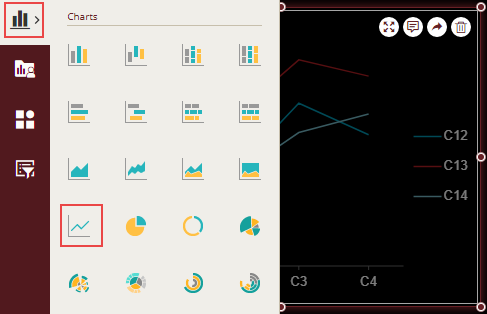
From the Dashboard Toolbox, open the Data Visualization node and drag-drop the Line Chart scenario onto the design area.
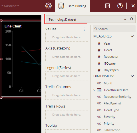
Bind Dataset to Chart Scenario
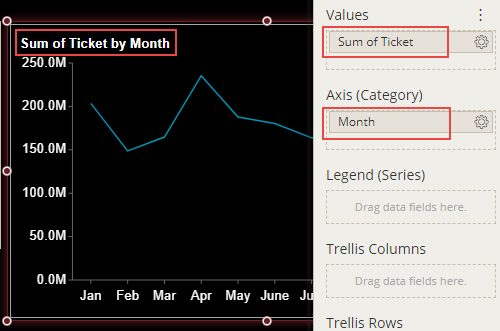
With the scenario selected, from the Data Binding tab, select the dataset. Once the dataset is successfully loaded in the designer, the data binding panel automatically expands and displays the data attributes available in the dataset.
The following image shows the chart scenario bound to the 'TechnologyDataset' dataset.
On dragging and dropping the data attributes to the data binding area of the scenario, the chart is plotted accordingly, with a default chart title on the design area.
Format Data Attributes
You can format the data attributes and control the display of data by performing a variety of operations such as
renaming, modifying data format and display unit, creating a hierarchy field, applying an aggregation method, etc. Using these operations, you can control the display of data attributes in a scenario.
For more information about these operations, see Data Attributes.
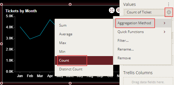
In the following chart scenario, count aggregation is applied to the 'Ticket' attribute to show the count of tickets.
Analyze Data
Wyn Dashboards scenarios support rich data analysis and exploration capabilities that can help analyze massive amounts of information and make data-driven decisions. For example, adding filters to scenarios, sorting data, reference lines, trend lines, etc. Note that you can apply all these operations using the Action Bar corresponding to each scenario in the designer.
For more information, see Data Analysis and Interactivity in Dashboards.
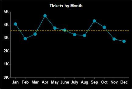
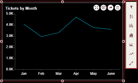
The following image shows filtered data in the chart scenario for the first six months i.e. Jan, Feb, Mar, Apr, May, and June.
Customize Chart Appearance
You can customize the default chart appearance by setting properties in the Inspector tab of the scenario such as adding a border, modifying data labels, setting chart style, renaming chart title, changing line style, etc.
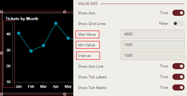
Change Axis Scale
To customize the scale values for the Value axis of a chart scenario, select the axis and set the Max Value, Min Value, or Interval properties.
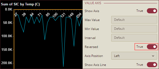
Reverse Value Axis Position
To reverse the direction of the Value Axis, set the Reversed property to True. By default, this property is set as False.
Change Axis Position
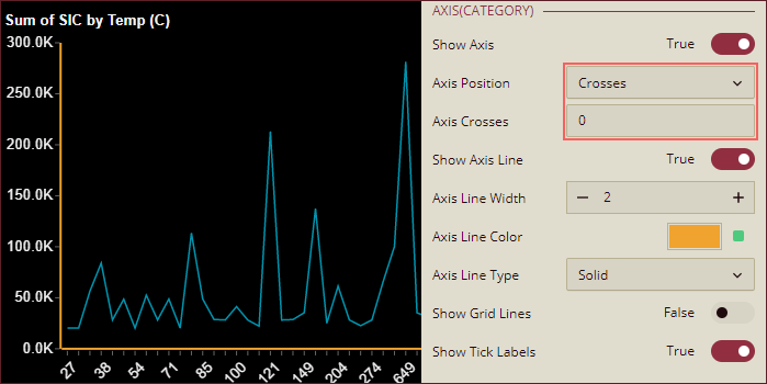
Axis (Category): To change the position of the Category Axis, use the Axis Position property dropdown to select an option from Crosses, Bottom, or Top. When Crosses is selected, Axis Crosses property appears below the Axis Position property where you can enter a value at which the Category Axis crosses the Value Axis.
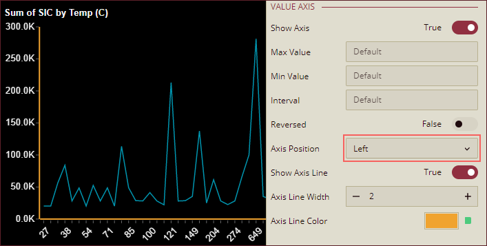
Value Axis: To change the position of the Value Axis, use the Axis Position property dropdown to select an option from Left or Right.
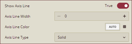
Show Axis Lines
To hide the axis lines of the Value Axis or the Category Axis, set the Show Axis Line property to False. By default, this property is set as True. You can also specify the width, color, and type (solid or dashed) of the axis lines using the Axis Line Width, Axis Line Color, and Axis Line Type properties.
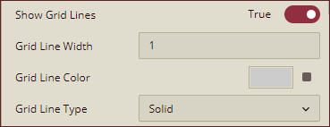
Show Grid Lines
To display horizontal and vertical grid lines in a chart scenario, set the Show Grid Lines property of the Value Axis and Axis (Category) to True. By default, this property is set as False. You can also specify the width, color, and type (solid or dashed) of the grid lines using the Grid Line Width, Grid Line Color, and Grid Line Type properties.
Format Axes Titles
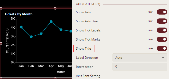
You can show or hide axis titles for a chart by using the Show Title property for the Value and Category axes. When you set the Show Title property to 'True', the axis titles are enabled. Wyn Dashboards set data attributes' names as the axis titles. You can provide a custom name to the axis title by renaming the attributes in the data binding area. For more information on renaming data attributes, see the topic on Rename an Attribute.
Change Line Style
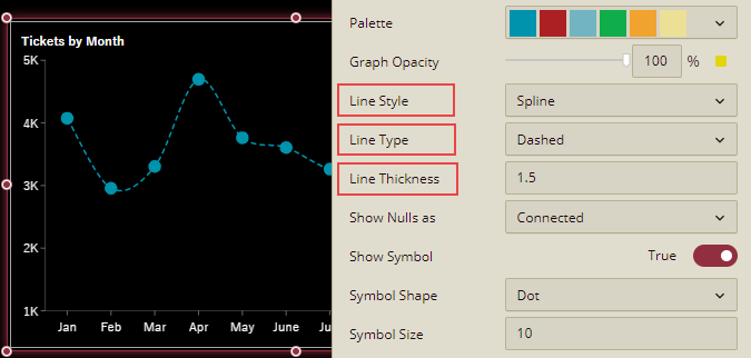
By default, Wyn Dashboards use straight lines to connect the data points in a line chart. To change the default line style in the chart, use the Line Style property and set it to Spline or Step. In addition, you can specify the line type and width in the chart through the Line Type and Line Thickness properties, respectively. The available options for line type are Solid and Dashed.
Use Symbols for Data Points
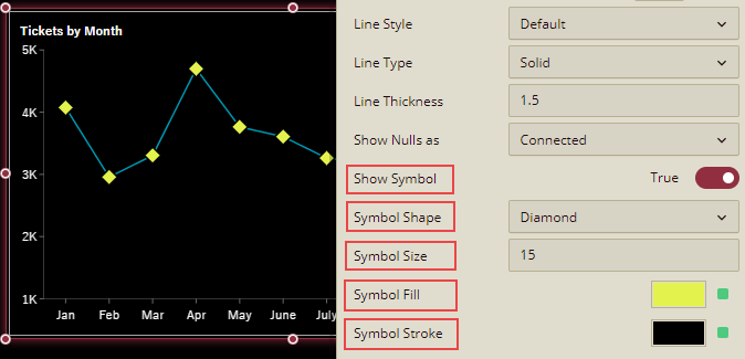
Highlight the data points in a line chart to make them easy to read and understand. To do so, use the Show Symbol property of the scenario and set it to 'True'. Define the shape and color for the symbol through the Symbol Shape and Symbol Size properties. The supported shape types are dot (default), box, triangle, diamond, plus, and X. Furthermore, use the Symbol Fill and Symbol Stroke properties to set the symbol fill color and border color, respectively.
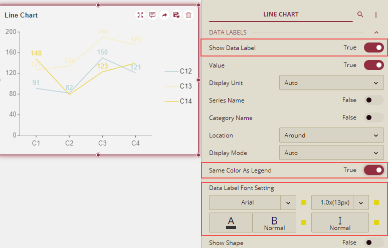
Format Data Labels
You can show or hide data labels in a chart using the Show Data Label property. When you set the Show Data Label property to True, the data labels are enabled. You can customize the data label's appearance using the Same Color As Legend and Data Label Font Setting properties. When you set the Same Color As Legend property to True, the color of the data labels changes to the same as the data points. However, Data Label Font Setting allows you to set font style and color as per your choice.