- Getting Started
- Administration Guide
-
User Guide
- An Introduction to Wyn Enterprise
- Document Portal for End Users
- Data Governance and Modeling
- Working with Resources
- Working with Reports
- Working with Dashboards
- View and Manage Documents
- Understanding Wyn Analytical Expressions
- Section 508 Compliance
- Subscribe to RSS Feed for Wyn Builds Site
- Developer Guide
Expand and Collapse Groups
In a Tablix data region, you can show or hide the rows and columns associated with groups using the expand and collapse toggle icons. This is extremely beneficial when you are working with a large amount of data. For example, in the below tablix, you can collapse the Product Line group to hide the details about each product's costing and quantities over the year.
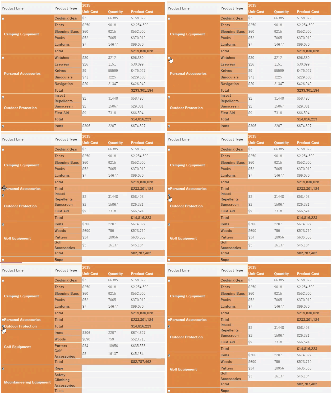
In Wyn Enterprise, the easiest way to enable users to expand and collapse groups in a Tablix data region is through the Expand/Collapse Groups option in the Tablix Wizard. For more information, see the Tablix article.
This can also be achieved by setting the visibility properties for the group item. You need to specify the textbox name where you want to display the expand and collapse toggle icons in the data region, represented by plus (+) and minus (-) signs at the time of preview. For more details, refer to the below section.
The ability to expand and collapse groups in a Tablix data region allow users to drill down into the data they want to focus on.
To Expand and Collapse Groups in a Tablix Data Region
Follow the below steps to expand and collapse groups in a tablix.
Click anywhere inside the tablix data region.
From the Group Editor on the left, select the appropriate group for which you want to hide or show the associated rows or columns.
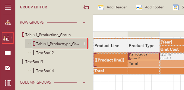
Once the group is selected, you will see the Tablix Member properties in the Properties pane.
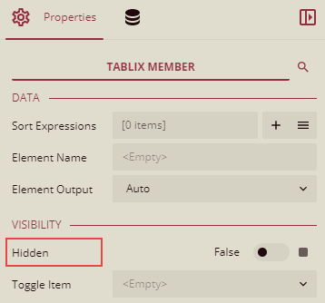
The Hidden property sets the visibility for the selected group item each time you run a report.
- Set the property to 'True' to hide the group item.
- Set the property to 'False' to display the group item.
In the Toggle Item property, choose the textbox from the drop-down where you want to show the toggle icons.
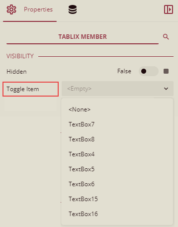
Note: The textbox with the toggle icon cannot be the group for which you want to hide or show the associated rows or columns. It must be the textbox associated with a parent group.
Then, select the textbox associated with the parent group.

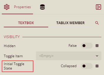
To specify the initial state of the toggle icons to be displayed on previewing the report, set the Initial Toggle State property to either 'Collapsed' or 'Expanded' in the TextBox properties.
- If you set this property to 'Collapsed', plus (+) sign is displayed in the initial state.
- If you set this property to 'Expanded', minus (-) sign is displayed in the initial state.
Preview the report.


