-
Interactive DashboardsCreate interactive BI dashboards with dynamic visuals.
-
End-User BI ReportsCreate and deploy enterprise BI reports for use in any vertical.
-
Wyn AlertsSet up always-on threshold notifications and alerts.
-
Localization SupportChange titles, labels, text explanations, and more.
-
Wyn ArchitectureA lightweight server offers flexible deployment.
-
 Wyn Enterprise 7.1 is ReleasedThis release emphasizes Wyn document embedding and enhanced analytical express...
 -
 Choosing an Embedded BI Solution for SaaS ProvidersAdding BI features to your applications will improve your products, better serve your customers, and more. But where to start? In this guide, we discuss the many options.
-
Visual GalleryInteractive sample dashboards and reports.
-
BlogExplore Wyn, BI trends, and more.
-
WebinarsDiscover live and on-demand webinars.
-
Customer SuccessVisualize operational efficiency and streamline manufacturing processes.
-
Knowledge BaseGet quick answers with articles and guides.
-
VideosVideo tutorials, trends and best practices.
-
WhitepapersDetailed reports on the latest trends in BI.
-
 Choosing an Embedded BI Solution for SaaS ProvidersAdding BI features to your applications will impr...
 -

- Getting Started
- Administration Guide
-
User Guide
- An Introduction to Wyn Enterprise
- Document Portal for End Users
- Data Governance and Modeling
- View and Manage Documents
- Working with Resources
- Working with Reports
- Working with Dashboards
- Working with Notebooks
- Wyn Analytical Expressions
- Section 508 Compliance
- Subscribe to RSS Feed for Wyn Builds Site
- Developer Guide
Appearance
The Appearance group of properties allows you to customize the visual styling of the area that a scenario occupies. These properties control aspects such as background color, padding, margin, borders, and shadows. They are considered ancillary properties, meaning they enhance the presentation of your scenario without affecting the underlying data or visualization logic.
Background Color
You can set the background color and adjust the opacity of the scenario to match the desired look and feel. This allows you to create visual contrast or align the scenario with your dashboard’s theme.
Padding
Padding defines the space between the visualization itself and the edges of the background. By increasing the padding, you can create breathing room around your chart or other visual elements inside the scenario.
Margin
Margin is the space between the border of the scenario and the outer edge of the background. Adjusting the margin changes how the scenario is positioned relative to other components on your dashboard or within the layout boundaries.
Visibility
The Visibility property determines whether the scenario is displayed. By default, it is set to True, making the scenario visible. Toggling this property to False hides the scenario from view.
Background Image
You can set an image as the background of the scenario to enhance its visual appeal. Once a background image is added, several dependent properties become available:
Repeat
The Repeat property controls how the background image is tiled within the scenario:
No Repeat: The image appears only once.
Repeat: The image repeats both horizontally and vertically.
RepeatX: The image repeats horizontally.
RepeatY: The image repeats vertically.
Space: The image repeats as many times as possible without cropping, leaving space between each instance.
Round: The image is repeated and scaled to fit evenly within the background, so that no cropping occurs and the image fills the area uniformly.
Image Size
The Image Size property defines how the background image is scaled within the scenario:
Original: Maintains the original dimensions of the image.
Contain: Scales the image to fit within the background while maintaining the aspect ratio.
Cover: Scales the image to completely cover the background while maintaining aspect ratio, potentially cropping parts of the image.
Stretched: Scales the image to fill the background completely, ignoring the original aspect ratio.
V-Align and H-Align
These properties control the vertical and horizontal alignment of the background image within the scenario:
V-Align: Set to Top, Middle, or Bottom. The default is Middle.
H-Align: Set to Left, Center, or Right. The default is Center.
Border Color
You can define the color and opacity of the scenario border. Keep in mind that the border will only be visible if the Border Width property is set to a value greater than zero.
Border Width
The Border Width property determines the thickness of the border around the scenario. Any value above zero will make the border visible and allow the color and style to be applied.
Border Radius
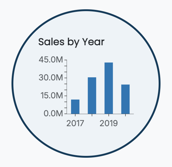
The Border Radius property rounds the corners of the scenario border. Higher values create more rounded corners, and if you adjust the size of the scenario along with padding and margin, you can achieve a fully circular border.
For example: a scenario with a width of 300, height of 300, padding of 40, margin of 30, and a border radius of 200 will appear as a circle.
Shadow
You can add shadows to the scenario border for depth and emphasis. Options for the shadow include:
None
Inner
Outer
Both
You can also customize the shadow color and choose the thickness as Thin, Medium, or Thick.
Example
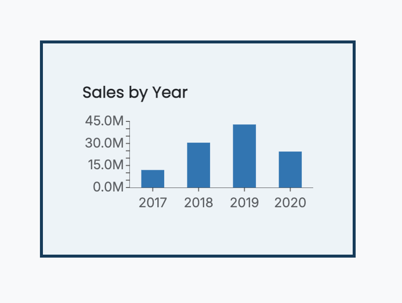
For instance, a scenario could have the following Appearance properties applied:
Background color: Light Blue
Padding: 40
Margin: 40
Border color: Dark Blue
Border width: 3