-
Interactive DashboardsCreate interactive BI dashboards with dynamic visuals.
-
End-User BI ReportsCreate and deploy enterprise BI reports for use in any vertical.
-
Wyn AlertsSet up always-on threshold notifications and alerts.
-
Localization SupportChange titles, labels, text explanations, and more.
-
Wyn ArchitectureA lightweight server offers flexible deployment.
-
 Wyn Enterprise 7.1 is ReleasedThis release emphasizes Wyn document embedding and enhanced analytical express...
 -
 Choosing an Embedded BI Solution for SaaS ProvidersAdding BI features to your applications will improve your products, better serve your customers, and more. But where to start? In this guide, we discuss the many options.
-
Visual GalleryInteractive sample dashboards and reports.
-
BlogExplore Wyn, BI trends, and more.
-
WebinarsDiscover live and on-demand webinars.
-
Customer SuccessVisualize operational efficiency and streamline manufacturing processes.
-
Knowledge BaseGet quick answers with articles and guides.
-
VideosVideo tutorials, trends and best practices.
-
WhitepapersDetailed reports on the latest trends in BI.
-
 Choosing an Embedded BI Solution for SaaS ProvidersAdding BI features to your applications will impr...
 -

- Getting Started
- Administration Guide
-
User Guide
- An Introduction to Wyn Enterprise
- Document Portal for End Users
- Data Governance and Modeling
- View and Manage Documents
- Working with Resources
- Working with Reports
- Working with Dashboards
- Working with Notebooks
- Wyn Analytical Expressions
- Section 508 Compliance
- Subscribe to RSS Feed for Wyn Builds Site
- Developer Guide
Title
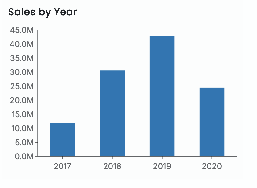
The Scenario Title provides a clear, descriptive label for your visualization and is automatically generated based on the fields you bind to the scenario’s data binding slots. By default, the title reflects both the aggregation applied to the measure and the category used for grouping.
For example, if you bind Sales Amount to the Values slot and Year to the Axis (Category) slot of a column chart, the scenario title is automatically generated as “Sum of Sales Amount by Year.” You can edit this text at any time—for instance, simplifying it to “Sales by Year.”
Show or Hide the Title
You can remove the title from the scenario by toggling Show Title to False. Hiding the title can be helpful in cases where the visualization already contains descriptive elements. For example, KPI Kanban cards typically include their own labels, so the scenario title is often unnecessary.
Title Alignment
You can control the horizontal alignment of the title. Titles can be aligned:
Left
Center
Right
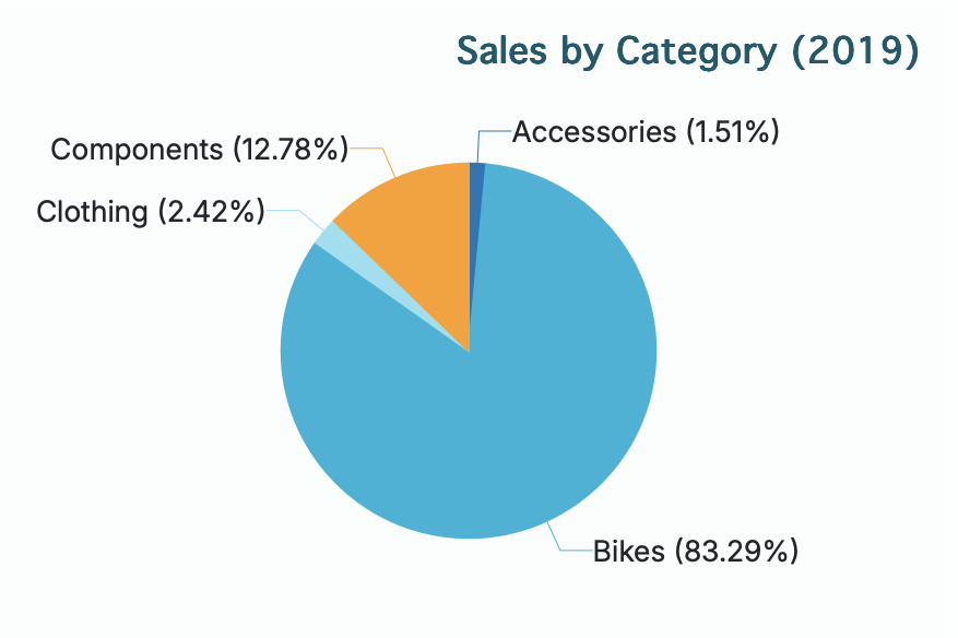
Here is an example of a pie chart with its title aligned to the right.
Title Font and Styling
The title’s appearance can be customized through the font settings. You can configure:
Font family
Font size
Font color
Font weight (e.g., regular, bold)
Font style (normal or italic)
You can also fine-tune the title’s placement by adjusting the padding, which adds spacing around the title within the scenario.
Here is an example demonstrating custom font settings and padding.