-
Interactive DashboardsCreate interactive BI dashboards with dynamic visuals.
-
End-User BI ReportsCreate and deploy enterprise BI reports for use in any vertical.
-
Wyn AlertsSet up always-on threshold notifications and alerts.
-
Localization SupportChange titles, labels, text explanations, and more.
-
Wyn ArchitectureA lightweight server offers flexible deployment.
-
 Wyn Enterprise 7.1 is ReleasedThis release emphasizes Wyn document embedding and enhanced analytical express...
 -
 Choosing an Embedded BI Solution for SaaS ProvidersAdding BI features to your applications will improve your products, better serve your customers, and more. But where to start? In this guide, we discuss the many options.
-
Visual GalleryInteractive sample dashboards and reports.
-
BlogExplore Wyn, BI trends, and more.
-
WebinarsDiscover live and on-demand webinars.
-
Customer SuccessVisualize operational efficiency and streamline manufacturing processes.
-
Knowledge BaseGet quick answers with articles and guides.
-
VideosVideo tutorials, trends and best practices.
-
WhitepapersDetailed reports on the latest trends in BI.
-
 Choosing an Embedded BI Solution for SaaS ProvidersAdding BI features to your applications will impr...
 -

- Getting Started
- Administration Guide
-
User Guide
- An Introduction to Wyn Enterprise
- Document Portal for End Users
- Data Governance and Modeling
- View and Manage Documents
- Working with Resources
- Working with Reports
-
Working with Dashboards
- Tour the Dashboard Designer
- Create a Dashboard
- Configure Dashboard
- Dashboard Data Binding
- Scenarios
- Appearance
- Component Management
- Parameters
- Interactions
- Finalize Your Dashboard
- Using AI in Wyn
- Working with Notebooks
- Wyn Analytical Expressions
- Section 508 Compliance
- Subscribe to RSS Feed for Wyn Builds Site
- Developer Guide
Relative Dates Slicer
The Relative Date Slicer allows users to filter dashboard data based on a time period relative to the current date or anchor dates that the dashboard designer chooses or the dashboard users choose—such as "Last 7 days", "Next quarter", or "Previous year". It is perfect for time-based filtering without requiring users to pick specific calendar dates.
When to Use a Relative Date Slicer
Use this slicer when:
You want to show dynamic, auto-updating time periods (e.g., always showing "last 30 days").
Users need flexible filtering options like “last week” or “next month”.
You want to reduce manual date selection for frequently accessed dashboards.
Examples:
Filter by "Last 90 days" in a sales dashboard.
Show KPIs for "Next 2 weeks" in a project planning dashboard.
Analyze performance for "Previous Quarter".
Data Binding
Columns – Bind the date field you want to use for filtering. The slicer will filter data relative to the current date, such as the last 7 days or the next month.
Customization Options
Slicers can be extensively styled and configured using the Inspector panel. Below are key settings you can modify:
Slicer Style
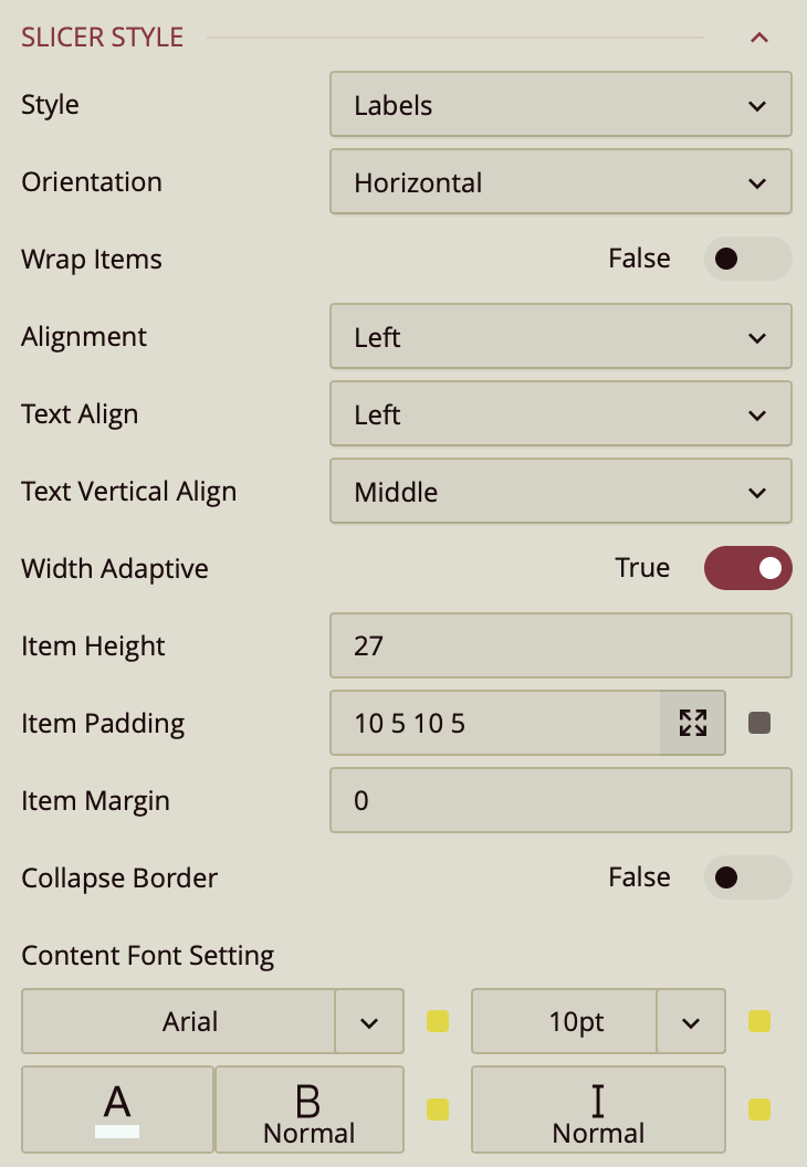
The Style property group controls the appearance and layout of the relative dates slicer. These settings allow you to customize how slicer values are displayed and aligned on the screen.
Style
Controls the visual style of the slicer options. Options include: Labels, List, Button Group, Underline, Gradient1, Gradient2, Gradient3,
Cool1, Cool2, Cool3.
Each style offers a different look and feel, from minimal labels to more modern gradient and button layouts.
Orientation
Sets the layout direction of the slicer options.
Default:
HorizontalCan be switched to
Verticalif desired.
Wrap Items
A toggle option (True/False) that controls whether slicer items automatically wrap to the next line when there's not enough space.
Default:
False
Alignment
Controls the alignment of slicer items within the available space.
Options:
Left,Center,RightDefault:
Left
Text Align
Sets the horizontal alignment of the text within each slicer item.
Same options as Alignment:
Left,Center,RightDefault:
Left
Text Vertical Align
Controls the vertical positioning of text within each slicer item.
Options:
Top,Middle,BottomDefault:
Middle
Width Adaptive (Toggle)
Purpose unclear: Presumably allows slicer items to adjust their width based on content or container size.
Default: Typically
False
Item Height
Allows you to set a custom height for each slicer item.
Enter a numeric value (in pixels).
Item Padding & Margin
Fine-tunes the spacing inside (padding) and around (margin) each slicer item.
Values can be set individually for top, right, bottom, and left.
Collapse Border (Toggle)
Purpose unclear: Possibly removes or merges borders between adjacent slicer items for a cleaner look.
Default:
False
Content Font
Controls all text styling inside the slicer:
Font Family – Choose the typeface
Font Size – Set text size (in px)
Font Color – Choose a hex or theme-based color
Font Weight – e.g. Normal, Bold
Font Style – e.g. Regular, Italic
Group Style
The Group Style properties affect the overall appearance of the slicer group container and the background visuals for individual slicer items. These settings help you create a more polished, branded, or visually distinctive slicer layout.
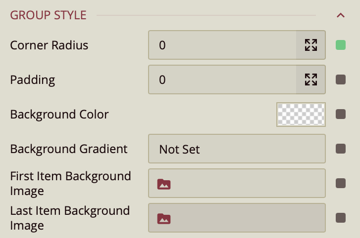
Corner Radius
Sets the curvature of the slicer corners.
Higher values result in more rounded edges.
Useful for softening the slicer’s visual appearance or matching a dashboard theme.
Padding
Defines the inner spacing between the slicer items and the edges of the slicer container.
Can be set individually (top, right, bottom, left) or as a uniform value.
Background Color
Sets the solid background color for the slicer group.
You can select from theme colors or define a custom color using a hex code.
Background Gradient
Adds a gradient overlay to the slicer background.
Can be used alongside or instead of a solid background color for a more dynamic look.
First Item Background Image
Allows you to set a background image specifically for the first slicer item.
Useful for highlighting or branding the first item in the list.
Last Item Background Image
Similar to the first, but applied to the last slicer item.
Useful for design balance or for creating bookend visuals in slicer navigation.
State-Based Styles:
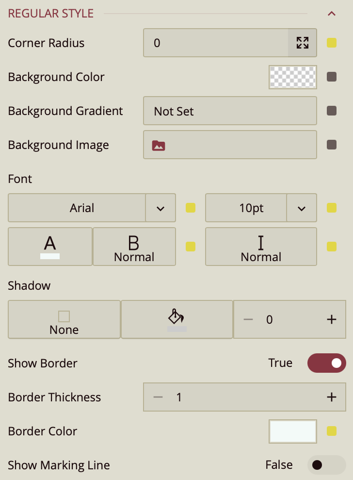
You can further style the label slicer items based on the stated: unselected items have the style as configured in the Regular Style. When the user hovers over an item, it will be styled as configured in the Hover Style group and selected items are styled as configured in the Selected Style group. All groups have the following same properties:
Corner Radius: Adjusts the curvature of the button’s corners.
Background Color: Sets the fill color of the selected button.
Background Gradient: Applies a gradient overlay to the background for visual depth.
Background Image: Allows you to set an image as the background of the selected button.
Font: Customize the text inside the selected button, including:
Font Family
Font Size
Font Weight
Font Style
Font Color
Shadow: Add shadow effects to the selected button:
Shadow Type: Choose from none, inner, outer, or both
Shadow Color
Shadow Size (increase or decrease intensity)
Show Border (toggle): When enabled, reveals:
Border Thickness
Border Color
Show Marking Line (toggle): When enabled, displays a marking line with the following options:
Position: Top, Bottom, Left, or Right
Length
Thickness
Offset
Color
This style is particularly useful for helping users clearly identify which slicer value is currently selected, especially when multiple slicer options are displayed at once.